|
| Group |
Round |
C/R |
Comment |
Date |
Image |
| 33 |
Oct 21 |
Reply |
Thank you Paul for your feedback |
Oct 16th |
| 33 |
Oct 21 |
Reply |
Thank you Marilyn! |
Oct 12th |
| 33 |
Oct 21 |
Reply |
thank you Bob for your feedback |
Oct 12th |
| 33 |
Oct 21 |
Reply |
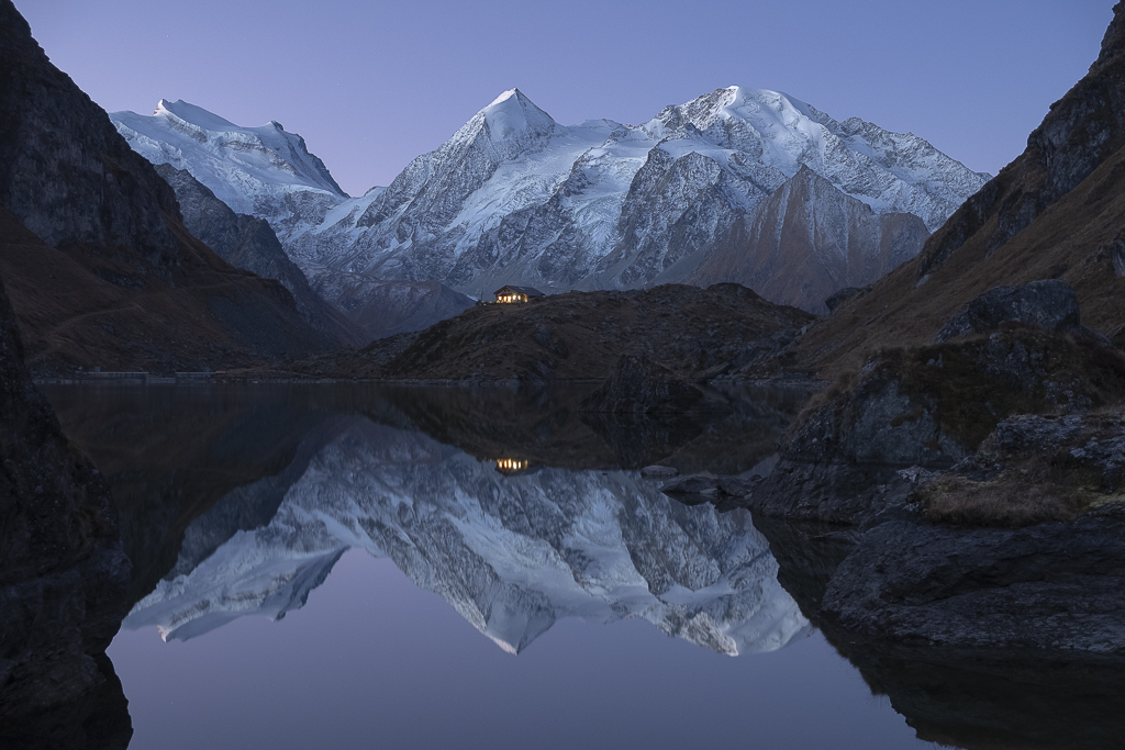
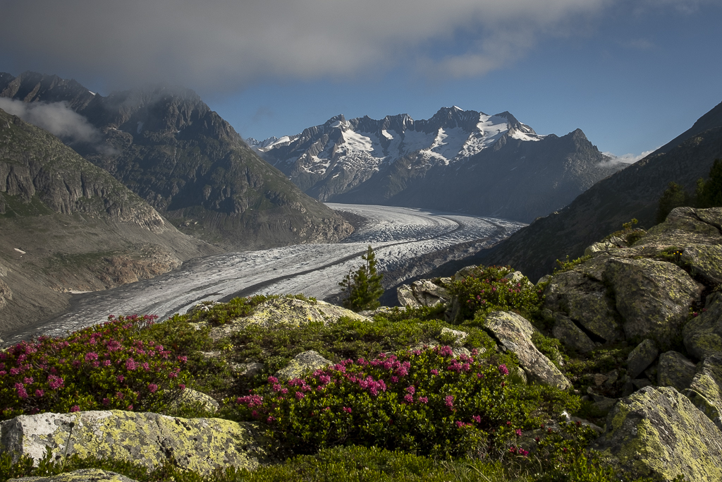
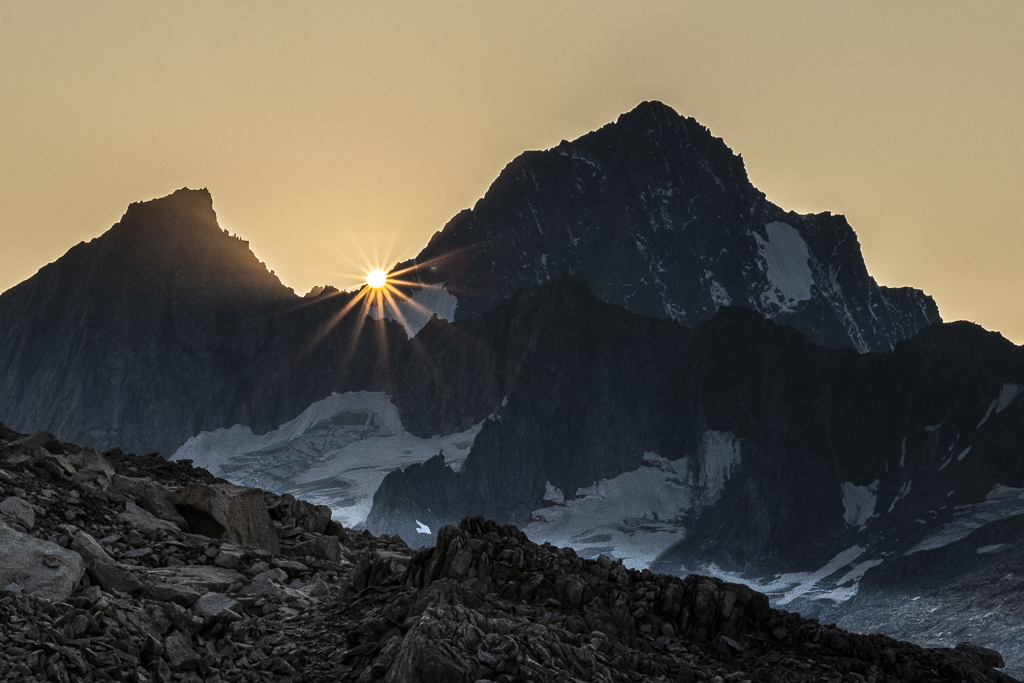
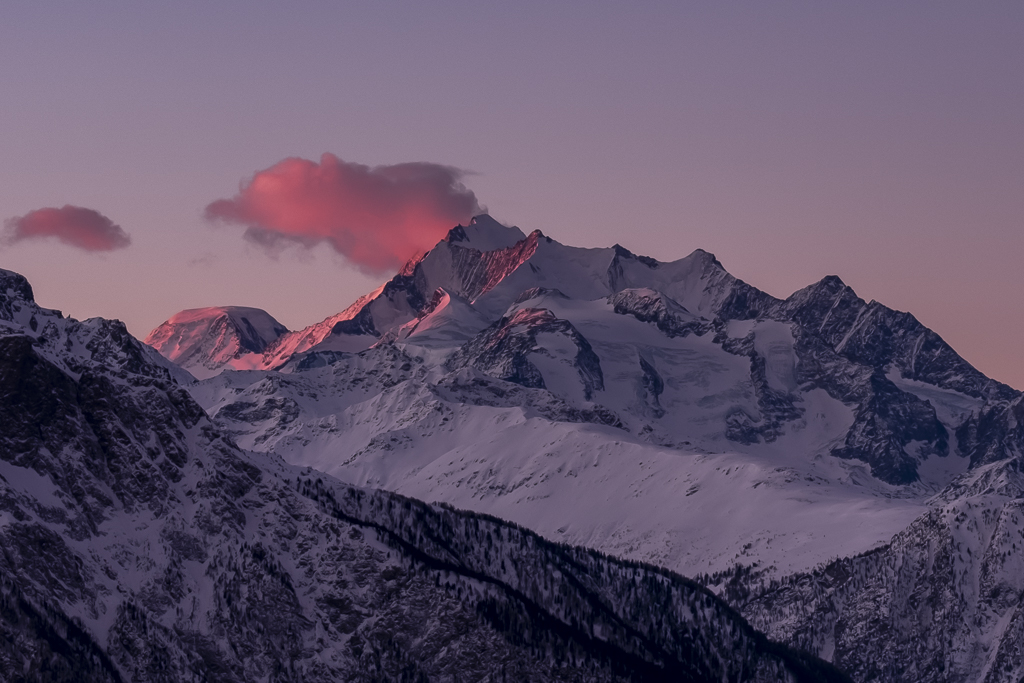
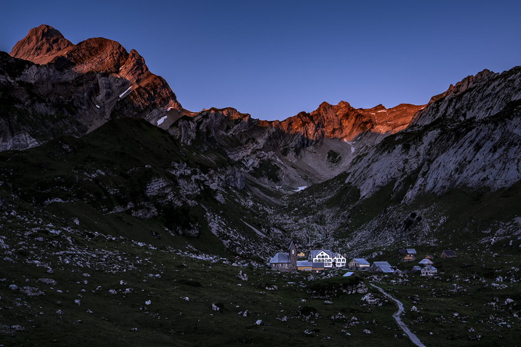
Thanks Lin for your feedback. The sun rays are related to the aperture: with f/32 they would have been longer, but would have disturbed the image from my point of view. Two friends and I stayed in tents on this alp, so I could photograph the sunrise in comfort. |
Oct 12th |
| 33 |
Oct 21 |
Reply |
Thank you Arief |
Oct 12th |
| 33 |
Oct 21 |
Reply |
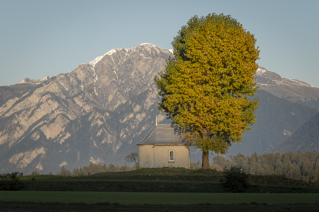
Thank you very much for the feedback. I made the mountains lighter in the background (see attached image). I think the mood is more accentuated with the dark background. I like the contrast of the light cross against the dark background. |
Oct 12th |
 |
| 33 |
Oct 21 |
Comment |
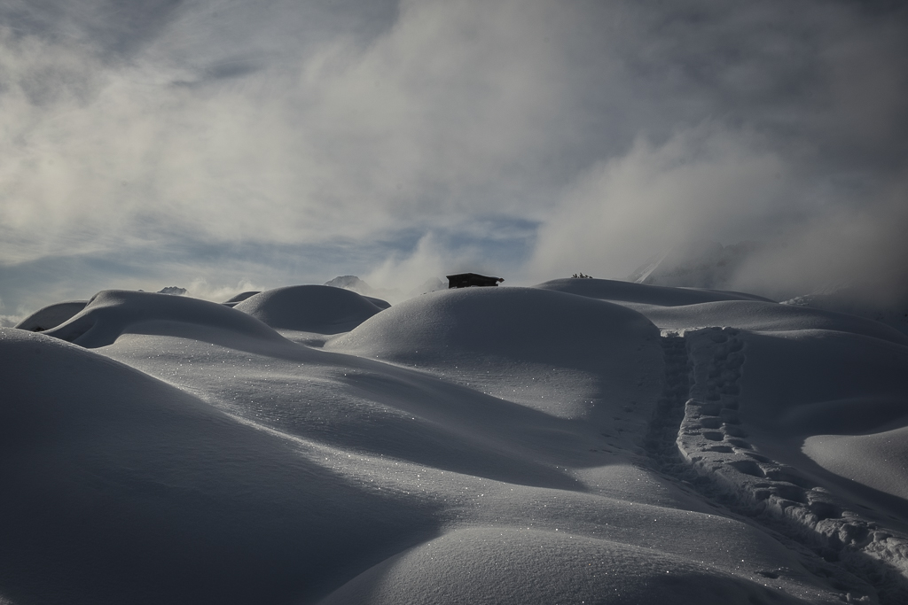
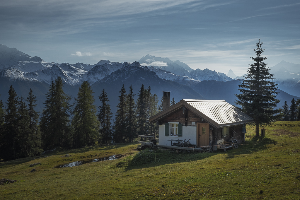
A nice picture with a good composition, successful colors and the appropriate panoramic format. I am a little irritated by the building, which is not quite horizontal and gives the impression of being somewhat reclined. |
Oct 12th |
| 33 |
Oct 21 |
Comment |
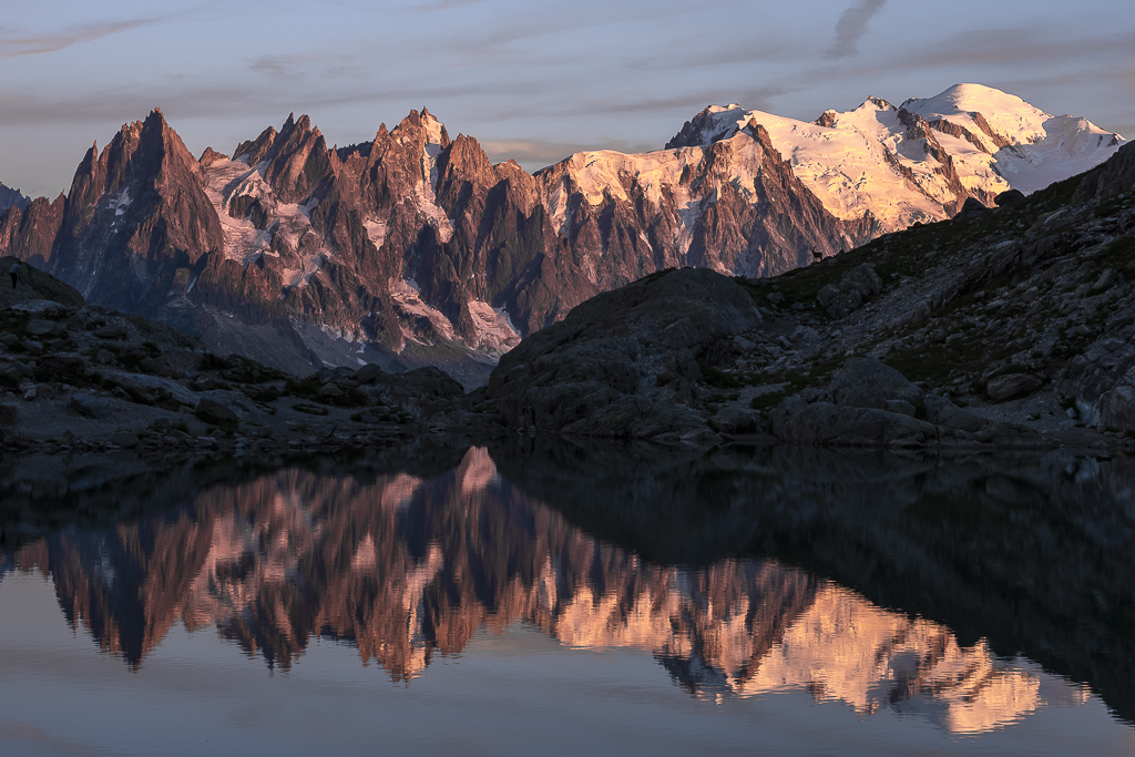
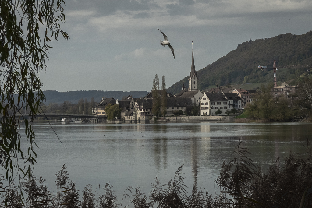
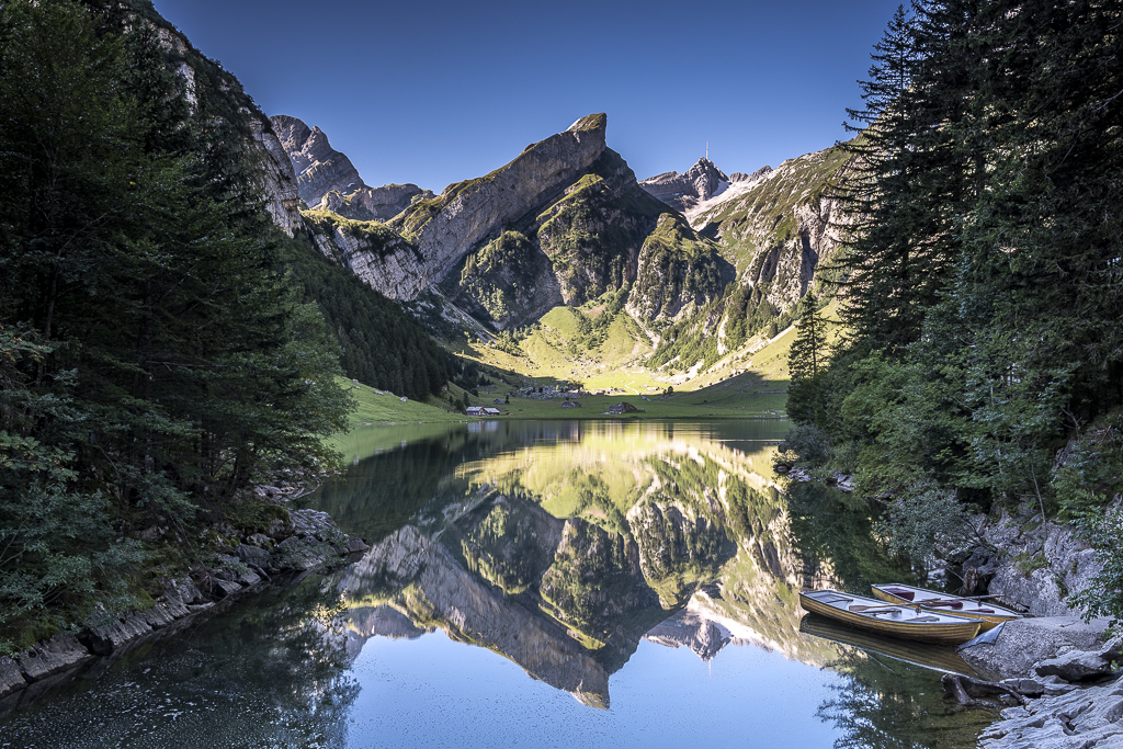
Beautiful image with successful colors and an interesting perspective. I agree that omitting part of the foreground makes the image better. A 16:9 format would fit here in my opinion. |
Oct 12th |
| 33 |
Oct 21 |
Comment |
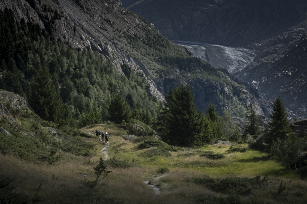
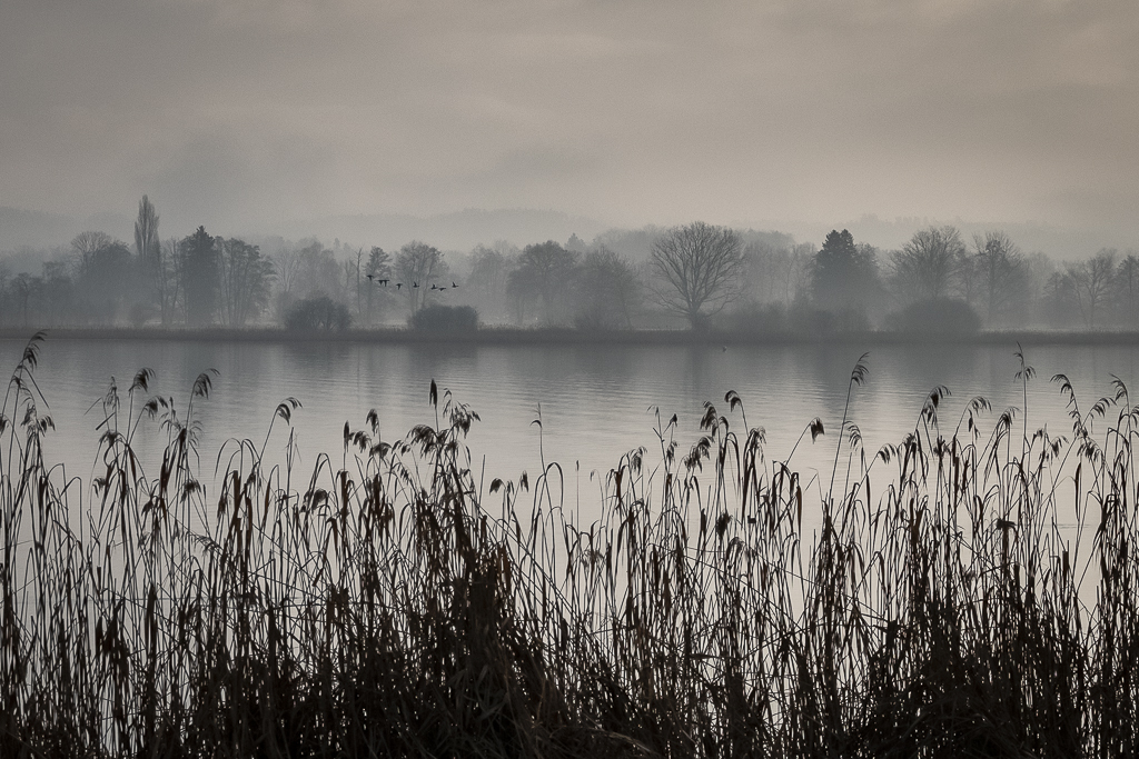
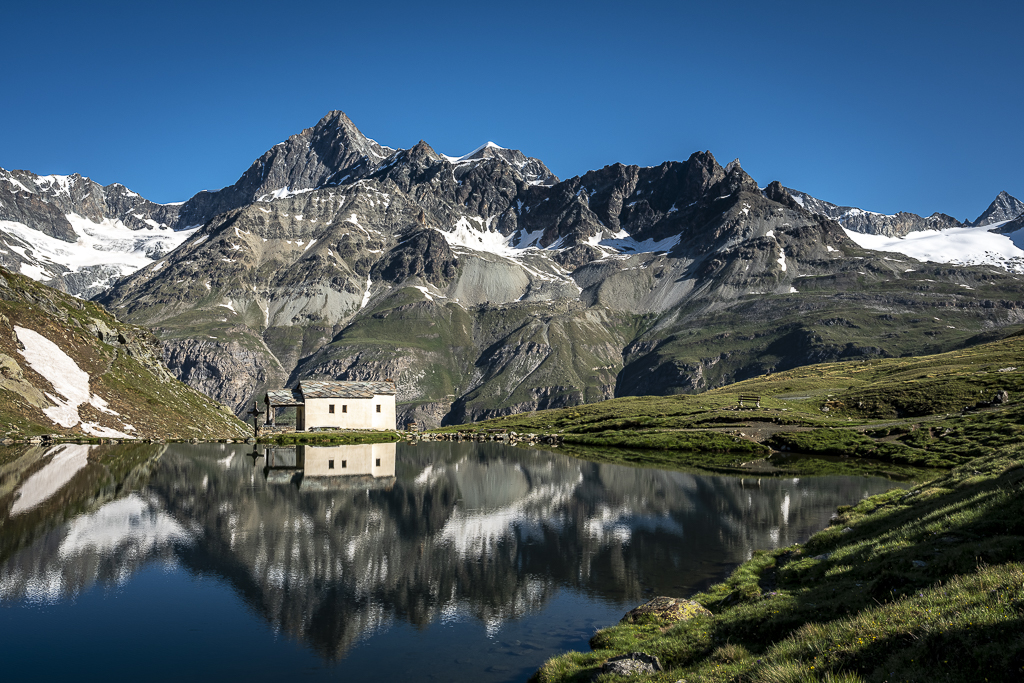
Great picture with a very nice reflection of the trees. The slightly diffuse reflection give the image a painterly effect. Also nice that the continuation of the image cut off above is visible in the reflection. |
Oct 12th |
| 33 |
Oct 21 |
Comment |
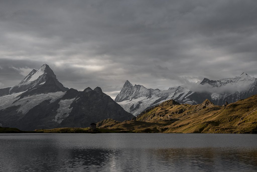
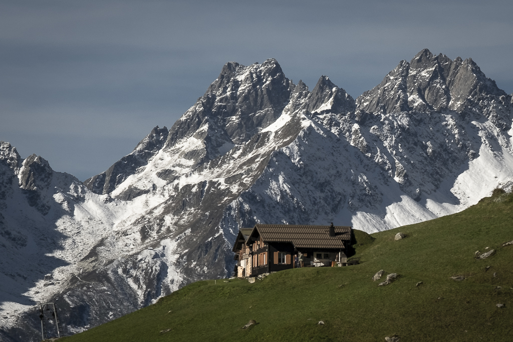
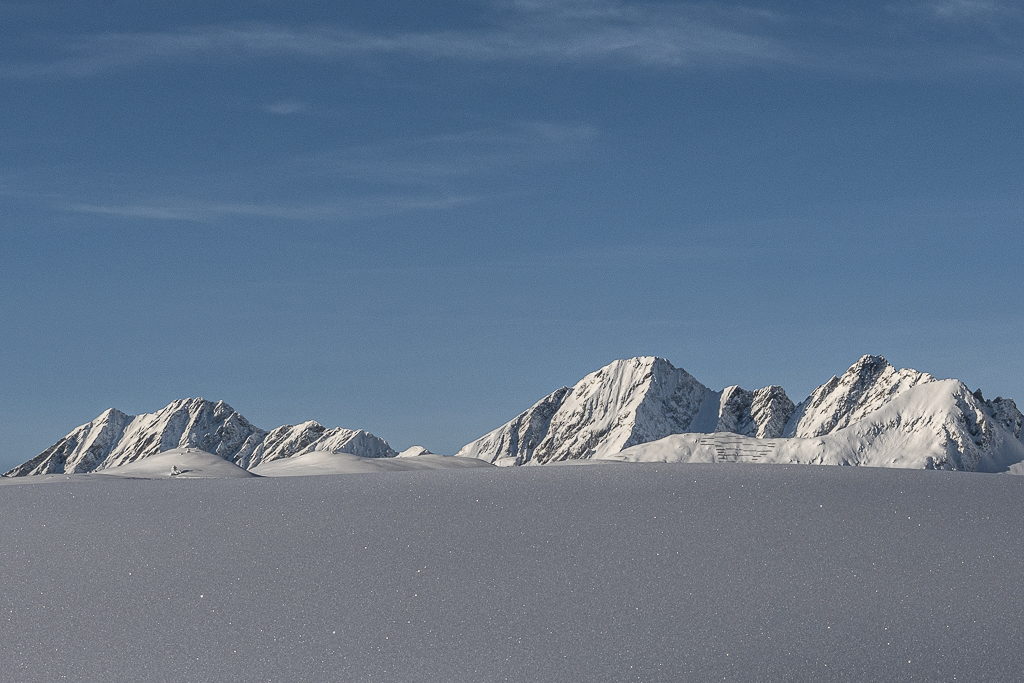
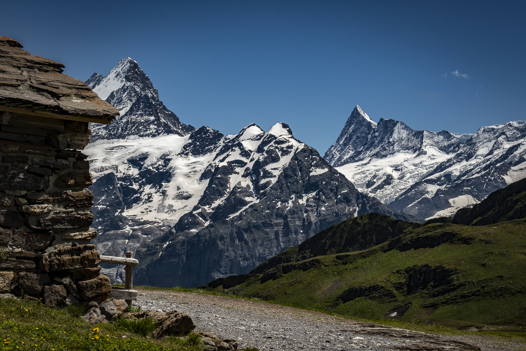
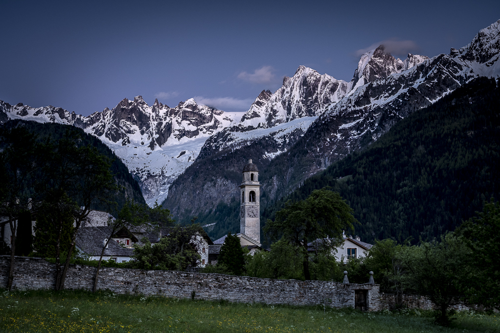
A beautiful image with a good composition, interesting colors and clouds that make the scene interesting and dynamic. The white of the cottage goes well with the snow in the mountains. I also think that the house is very well placed. The temptation to give more contrast to accentuate the clouds has been resisted, which is good for the image. |
Oct 12th |
| 33 |
Oct 21 |
Comment |
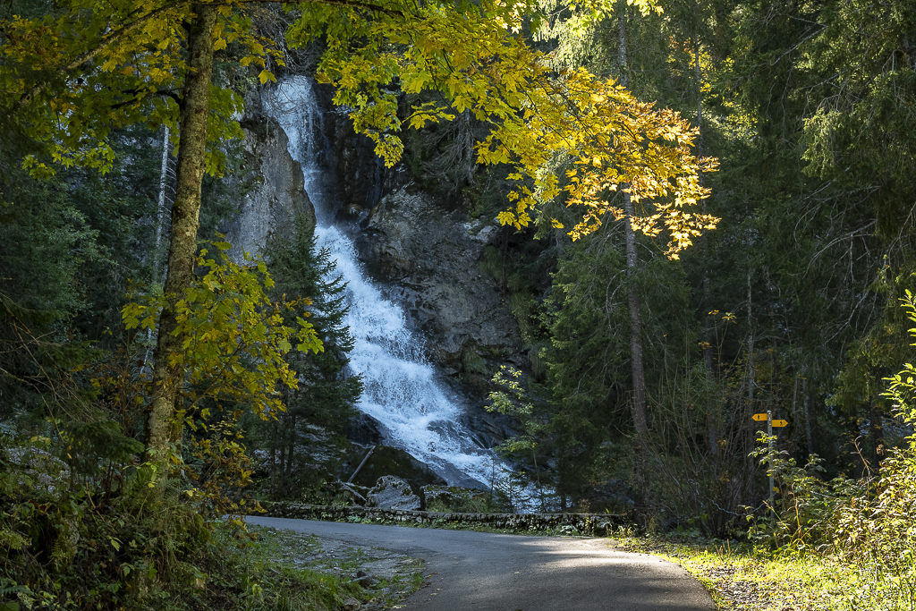
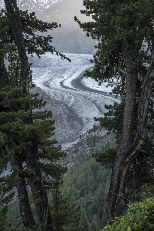
I like the picture with the beautiful colors and the successful composition. Comparing the images, I like the second image (without branches in the right foreground) better. It would be interesting to see this image in 16:9 format. |
Oct 12th |
5 comments - 6 replies for Group 33
|
5 comments - 6 replies Total
|