|
| Group |
Round |
C/R |
Comment |
Date |
Image |
| 35 |
Jan 22 |
Reply |
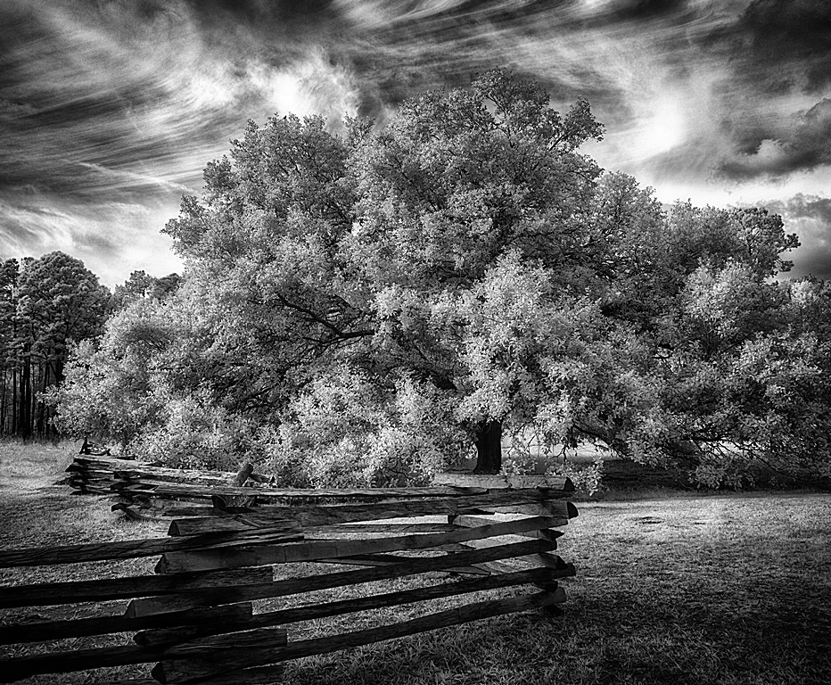
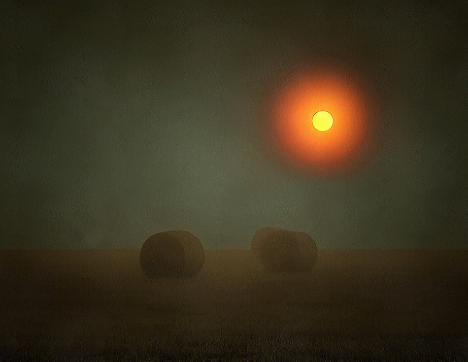
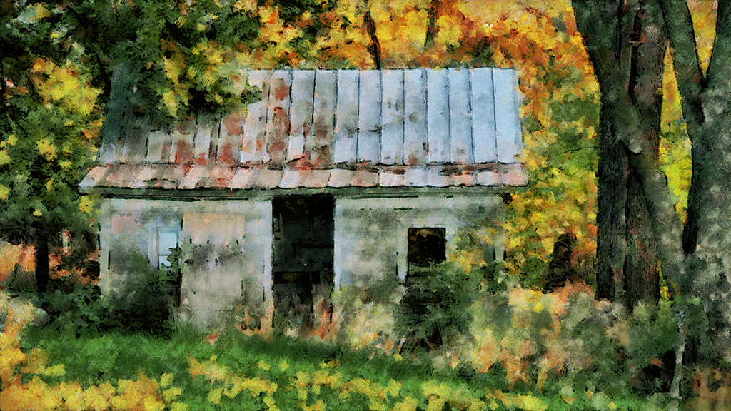
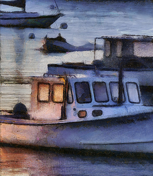
We were driving back to Boone, North Carolina when came across a line of about 7-8 pieces of old equipment, some vehicles and some farm implements with that low split rail fence across the front of them. Had to stop. While photographing them the owner came home and stopped. He said it was OK to shoot them and then wanted to know if we wanted to buy any of them :)
I wish I had taken some colour images. The rust across the hood and fenders had a lovely tone.
|
Jan 21st |
| 35 |
Jan 22 |
Comment |
This is a great shot.
I was tempted to copy and paste the comments you made about my truck picture and use them to describe this picture �
I really like how you brought out the shadow details in the piano, makes it look more alive.
|
Jan 8th |
| 35 |
Jan 22 |
Comment |
Thank you for the kind comments.
Not HDR, but a whole slew of localized curves adjustments. Window, grass, rails, wheel wells, fender, hood, on and on. Each has its own curve.
The thing I couldn't bring out was the whole license plate. Only revealed the "Vote."
|
Jan 8th |
2 comments - 1 reply for Group 35
|
| 56 |
Jan 22 |
Reply |
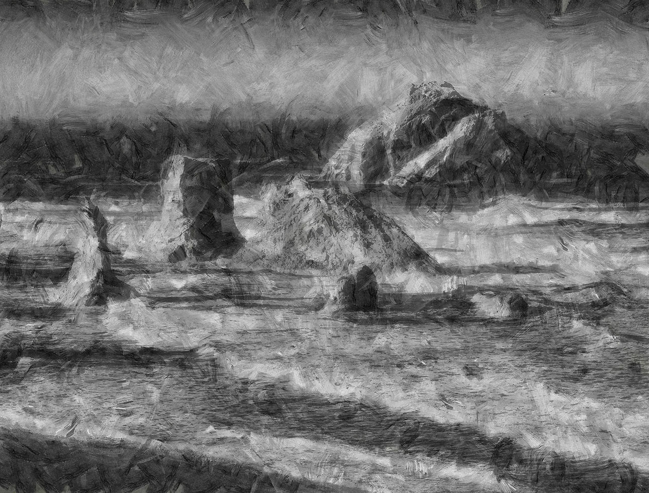
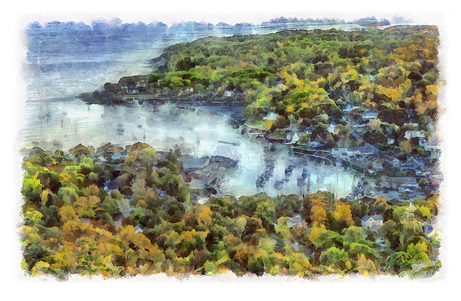
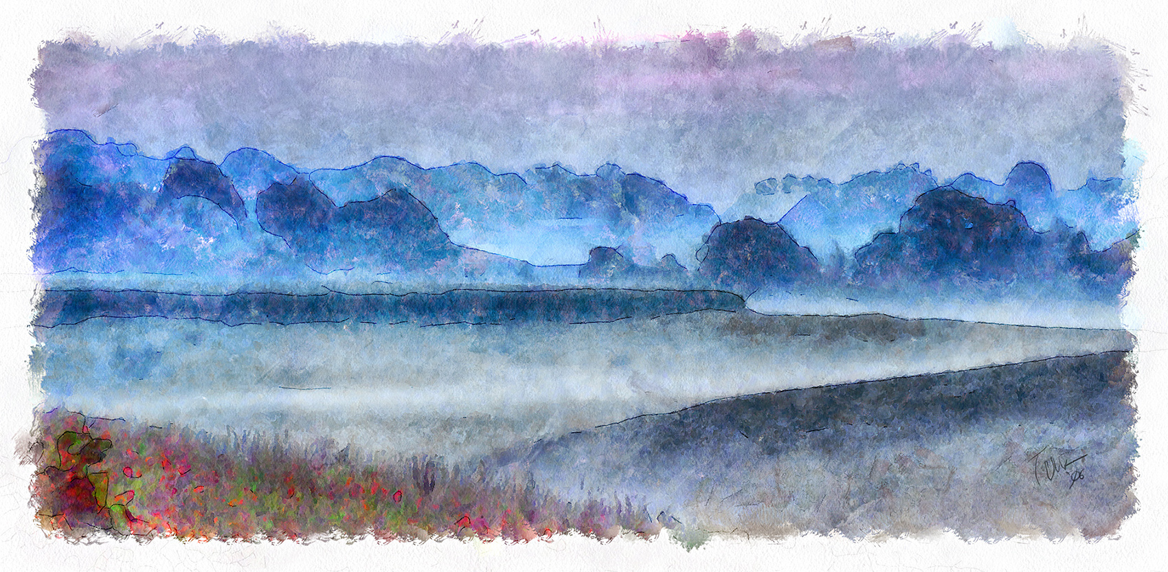
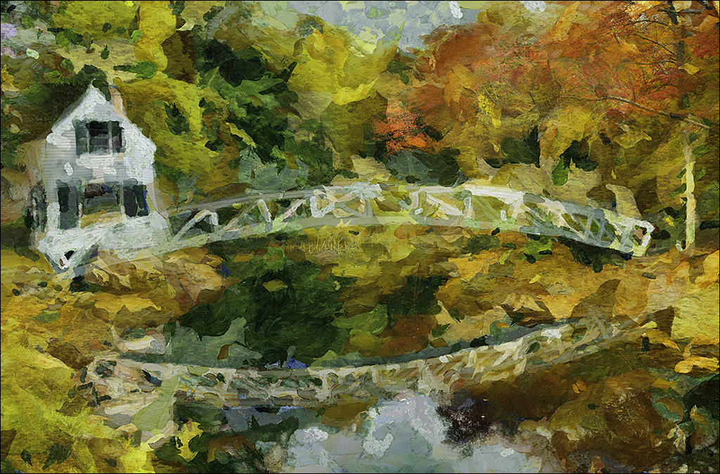
There is something about the greens of Ireland. But this was October and they were fading as you may notice all the brown in the original.
As I said in the intro I was not happy with the sea I had produced when I had the land completed. When I did the DAP Wet on Wet version it made the water quite blue, which I could accept. But mainly I really liked the horizontal brush strokes in the sea. I felt like Monet painting The Road Bridge at Argenteuil. I once saw the original in the National Gallery, looked very close and saw he had produced the look of water with just a field of short horizontal brush strokes.
BTW. I have gone back and straighten every tree trunk and a house edge! |
Jan 24th |
| 56 |
Jan 22 |
Comment |
Your right. I was concentrating on the sea and the road and missed the tilt.
Thank you.
|
Jan 15th |
| 56 |
Jan 22 |
Comment |
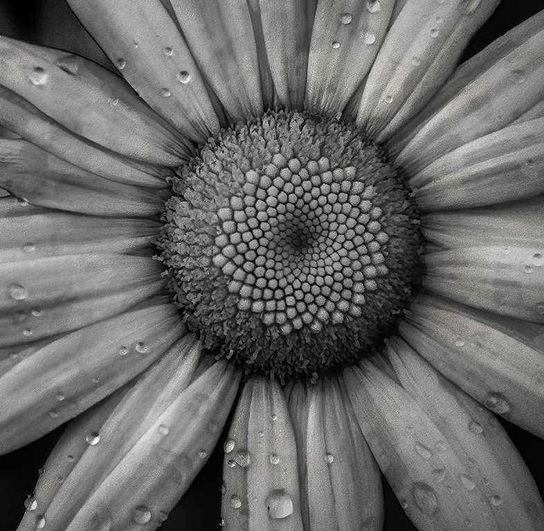
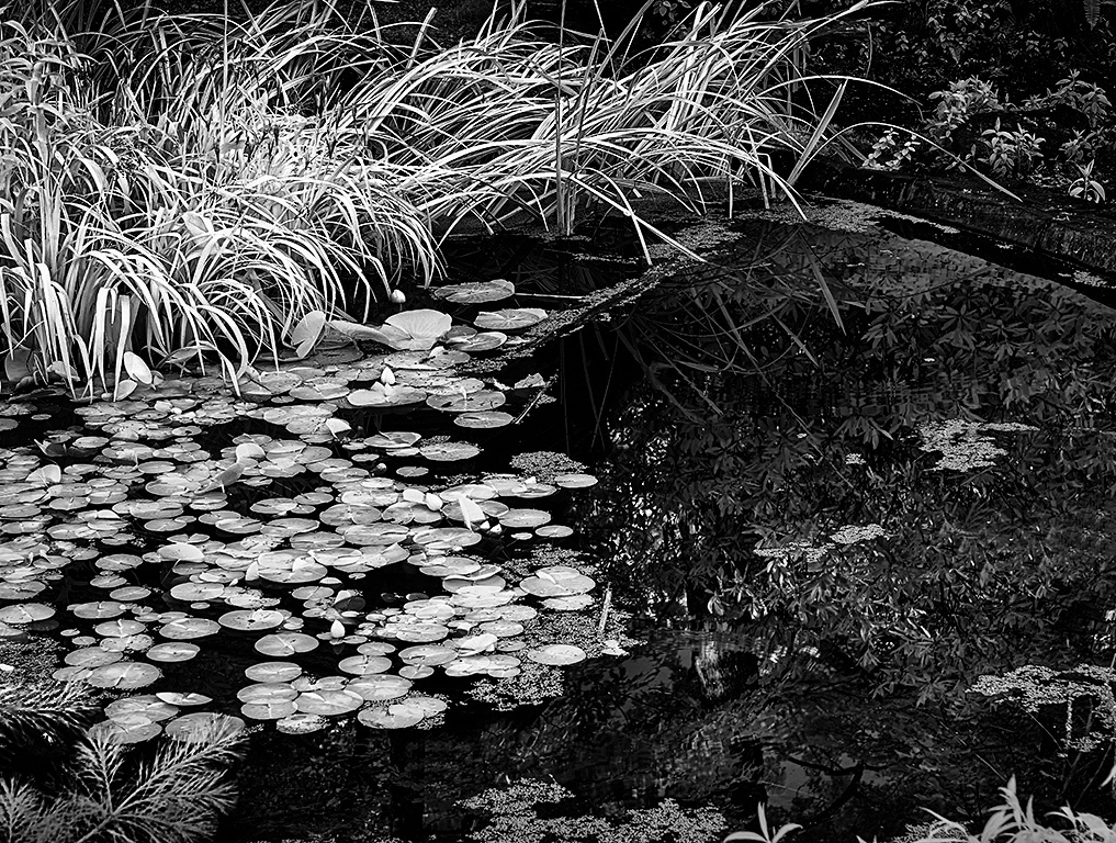
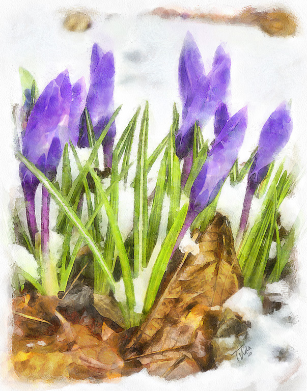
This is SO lush.
I do so like dew drops on petals and I hate to see them go, but the end results are worth it. I might have kept a couple more along the front petal.
Tall slender images work as prints on a wall but not so well on our horizontal monitors. I would suggest cropping just a little off the bottom to improve the screen fit but if printing this (and I would) keep the whole thing.
|
Jan 9th |
| 56 |
Jan 22 |
Comment |
This is excellent! Good brush strokes.
I love the buffalo's look of resignation. The blue colour is great.
Suggestions: if you make the background a little darker it will help to separate it from the animals and give the image some more depth. The horns are so black in the original I might try, keeping the same hue, but reducing their luminosity a little.
Keep up the good work.
|
Jan 9th |
3 comments - 1 reply for Group 56
|
5 comments - 2 replies Total
|