|
| Group |
Round |
C/R |
Comment |
Date |
Image |
| 35 |
Dec 21 |
Reply |
Yes, Silver Effects (SE) |
Dec 20th |
| 35 |
Dec 21 |
Reply |
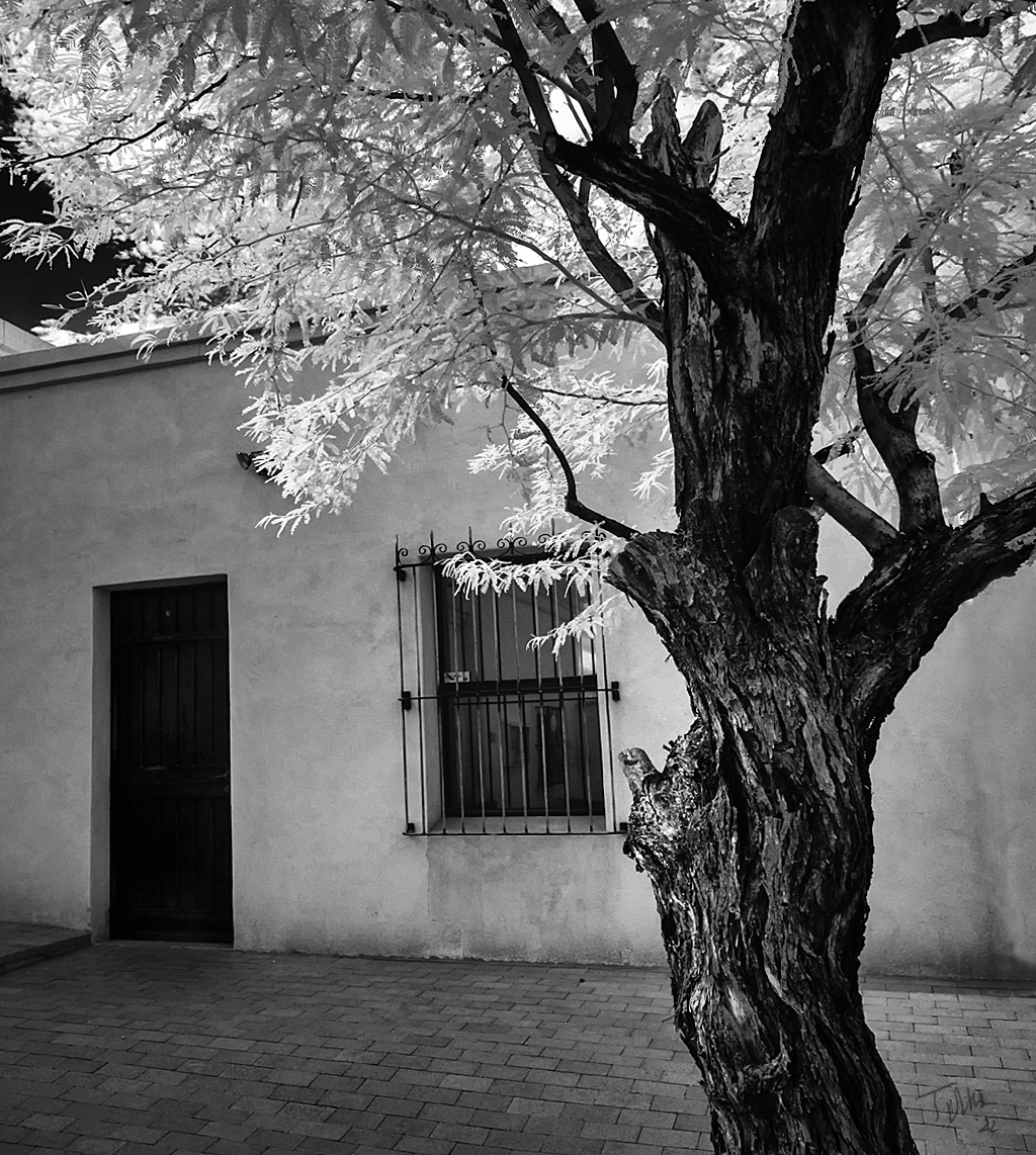
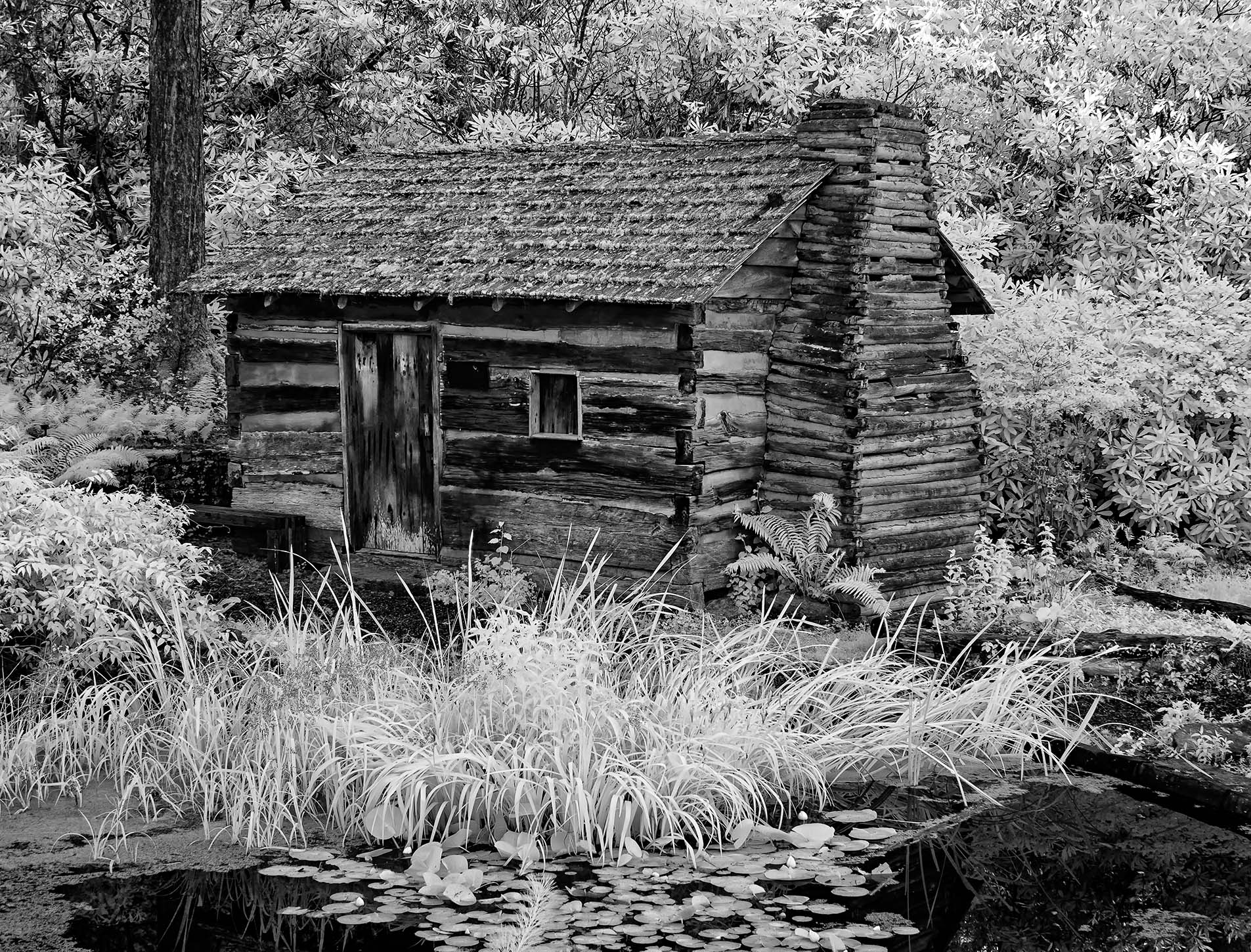
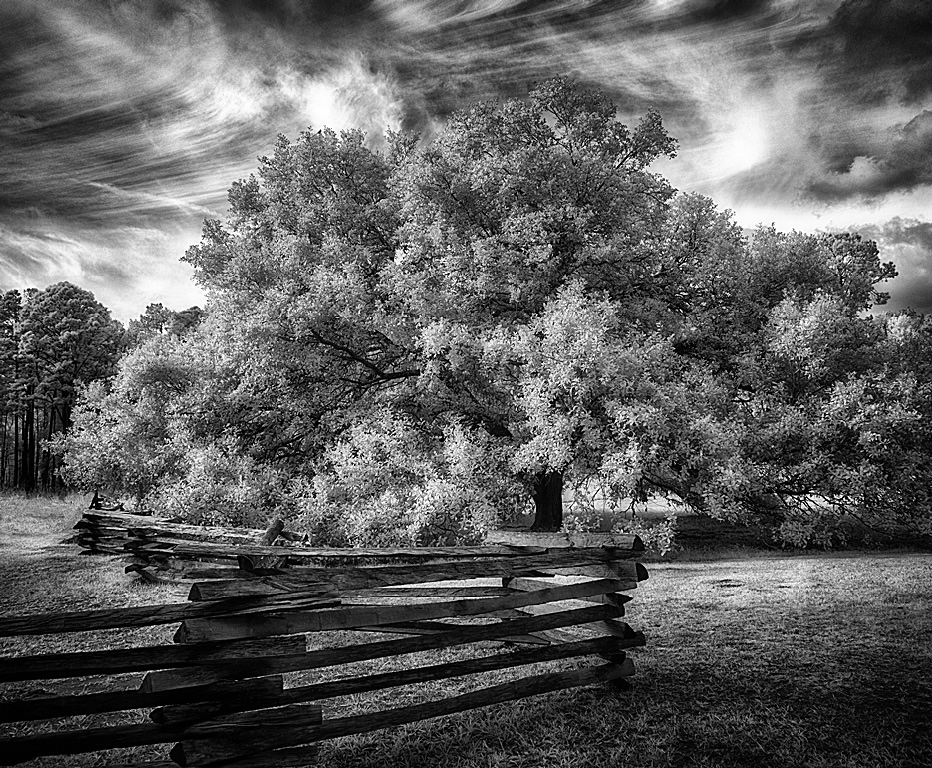
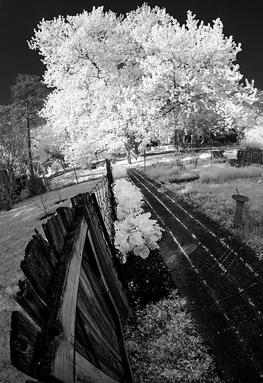
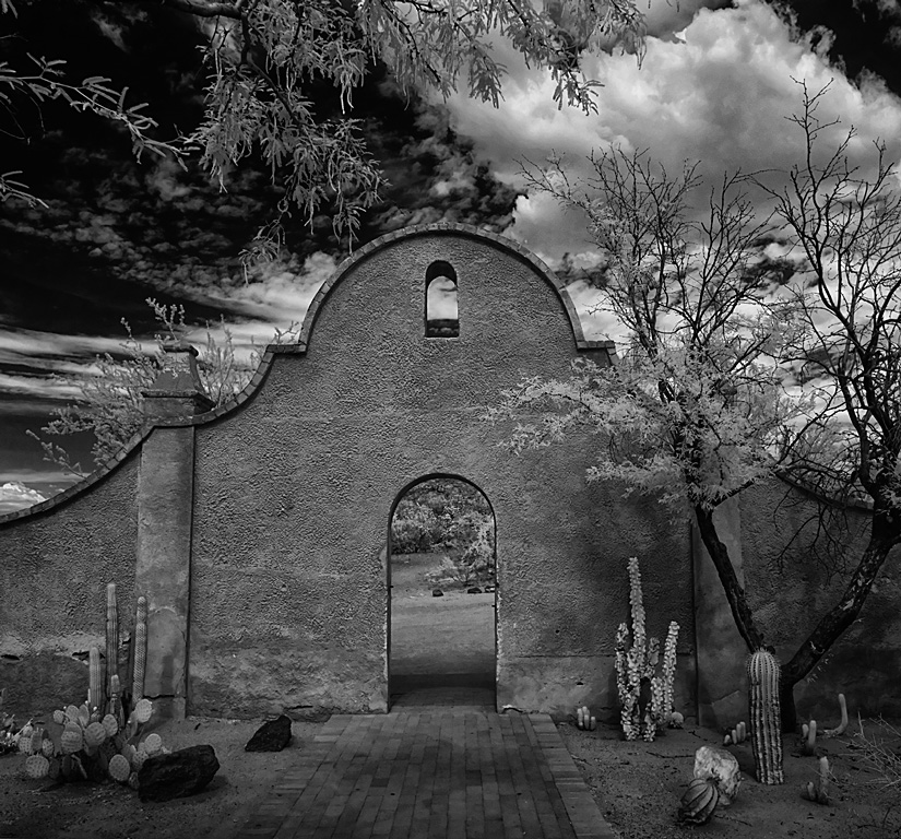
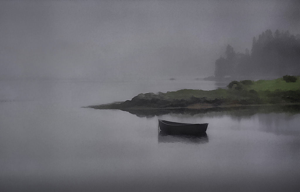
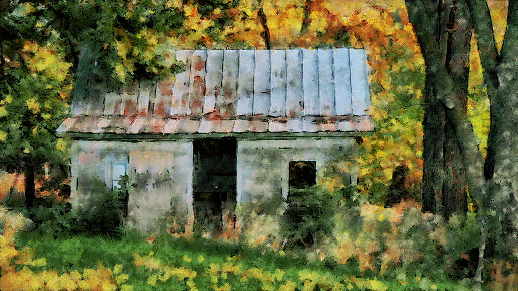
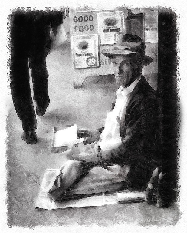
It is in the Daniel Boone park in Boone North Carolina. I doubt it is used for anything, just a prop. |
Dec 19th |
| 35 |
Dec 21 |
Comment |
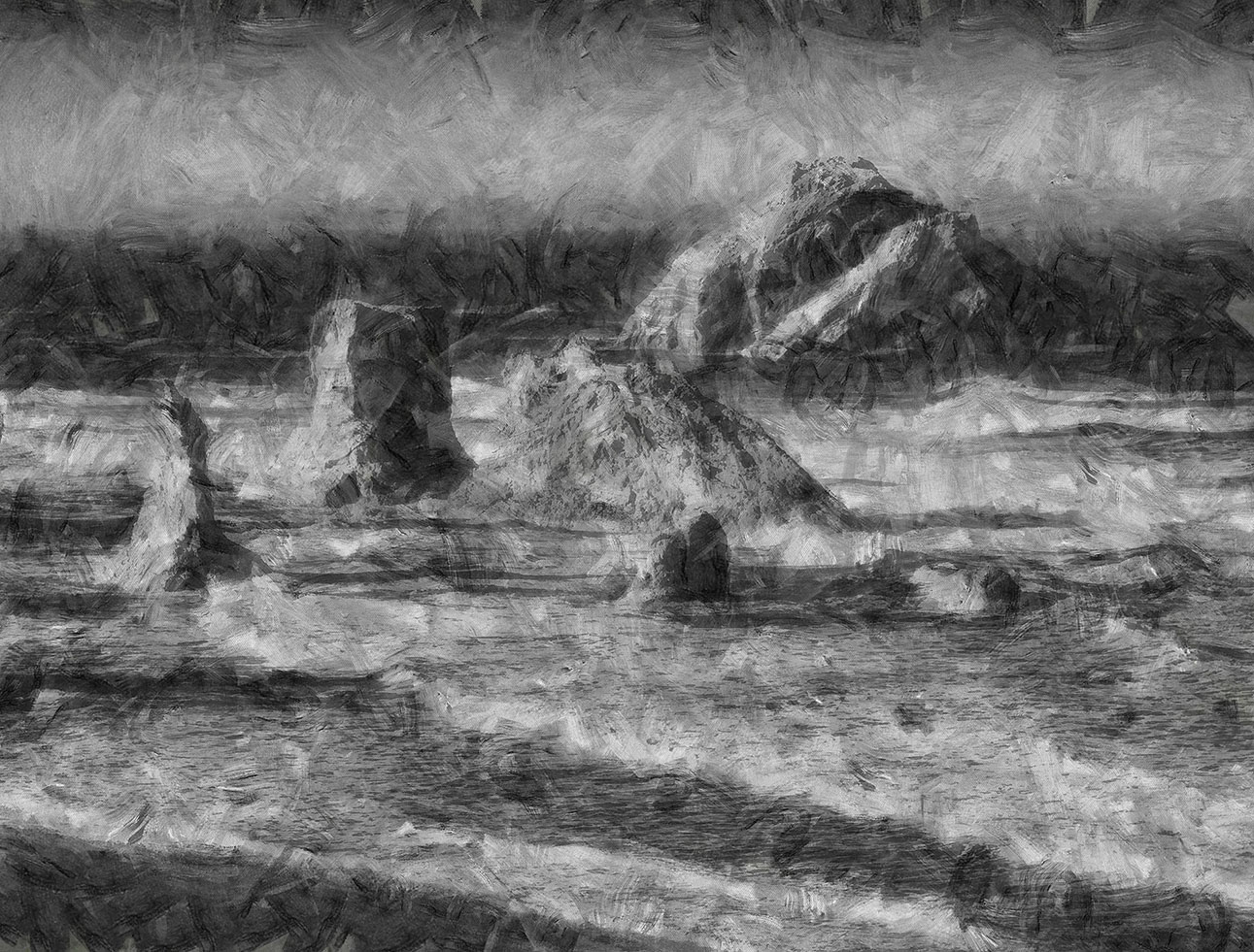
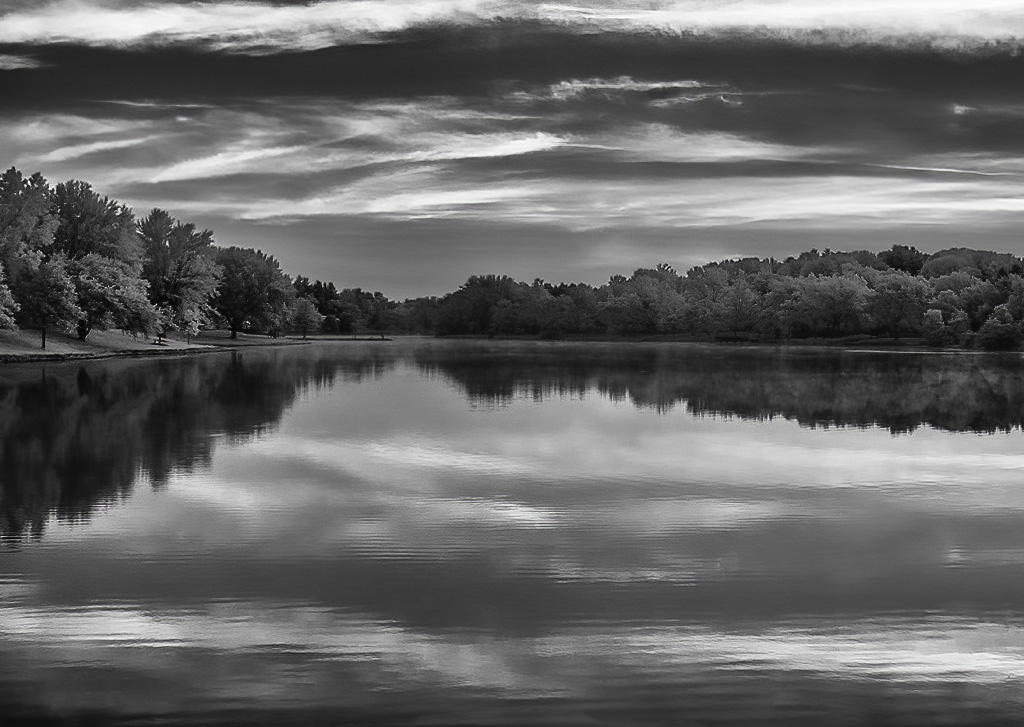
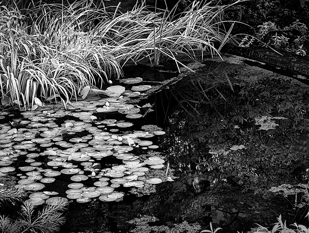
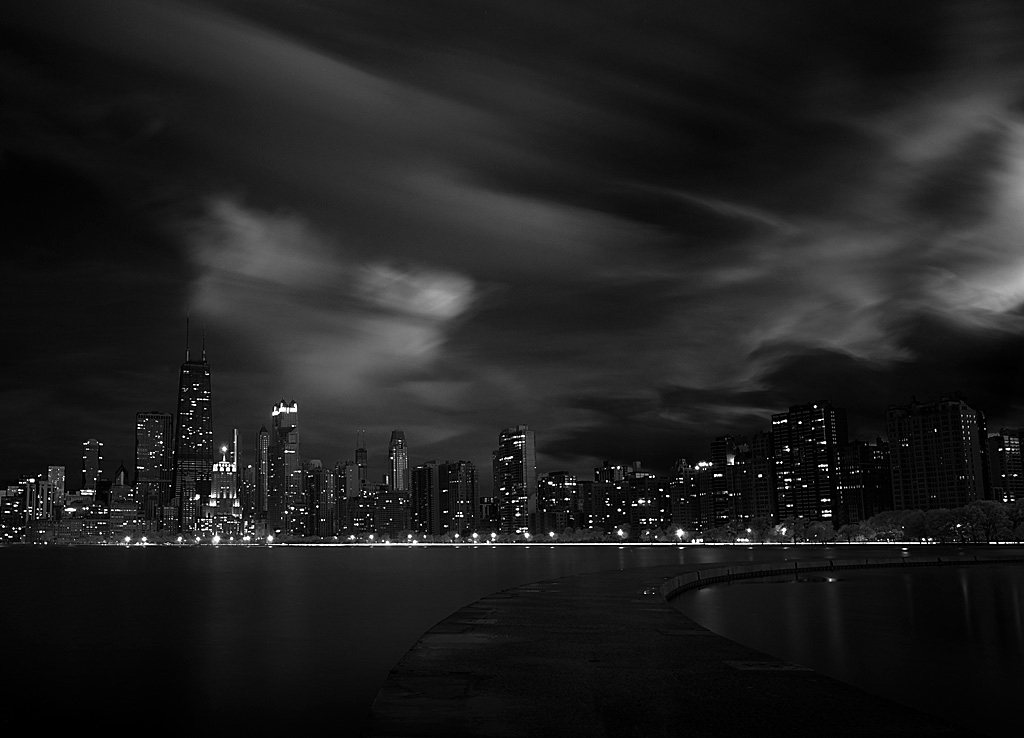
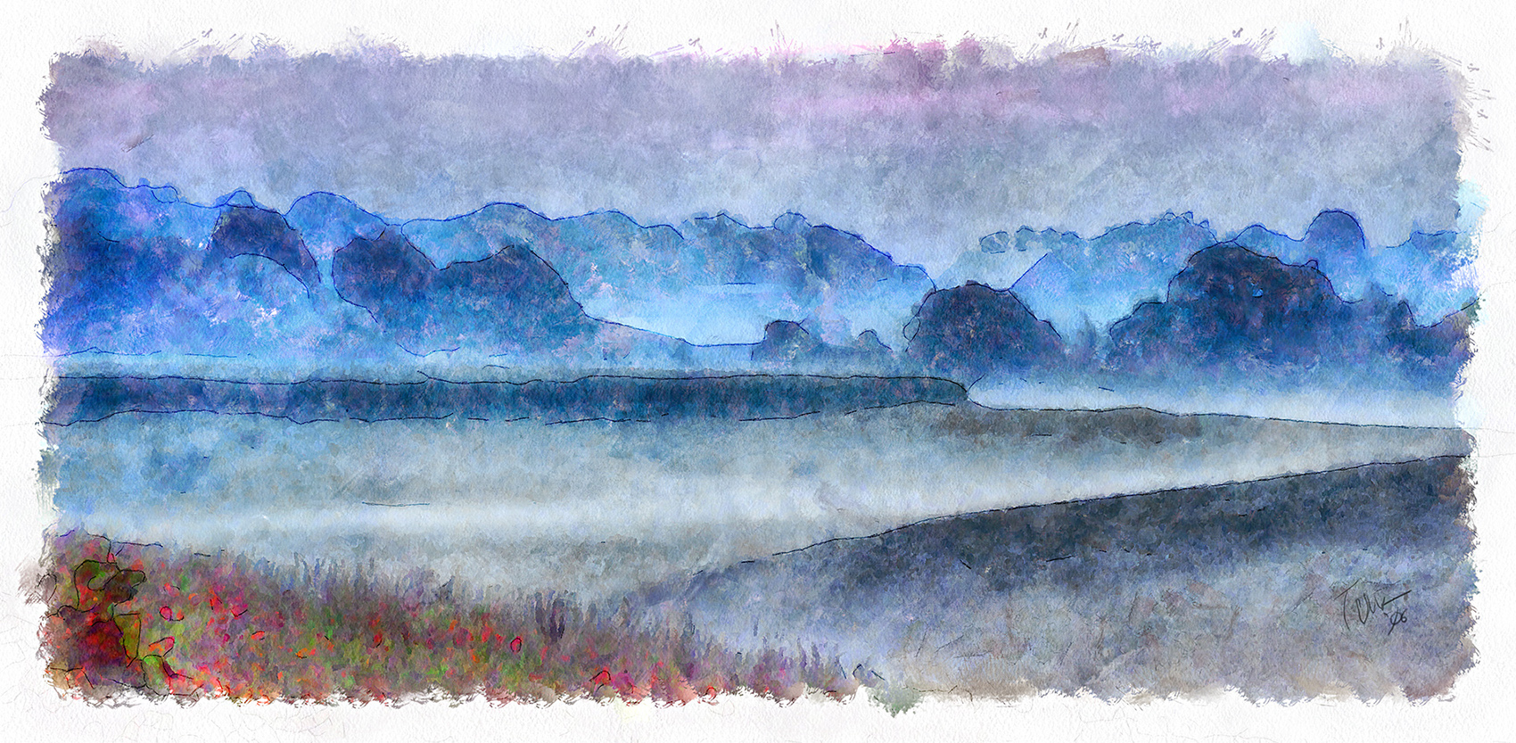
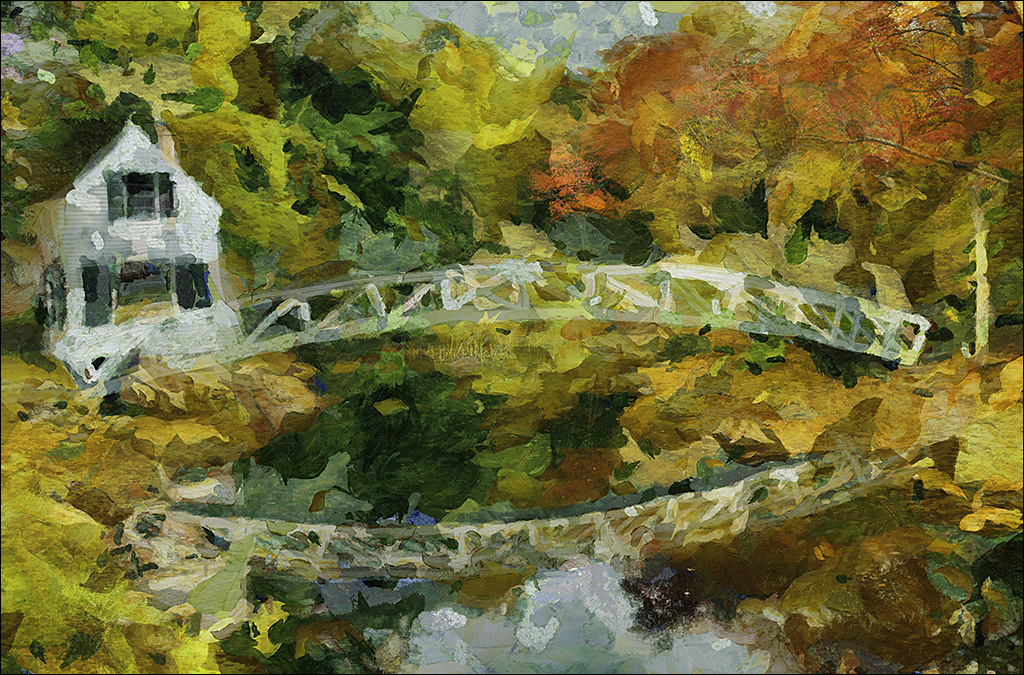
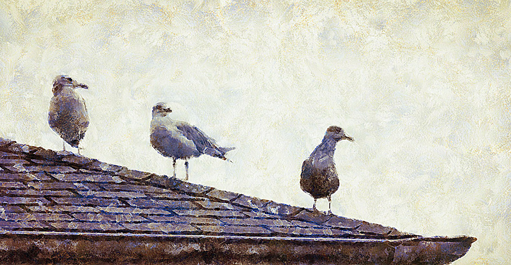
The clouds mimic the trees, fulfilling the image.
I learned, from studying works of the Hudson School of Art, that those painters usually made the lower edge darker to force the viewer to look up at the more interesting areas of the image. So, I add a gradient layer (with 10-20% opacity) to the bottom of most images. Do you think this might work on this image? |
Dec 11th |
| 35 |
Dec 21 |
Comment |
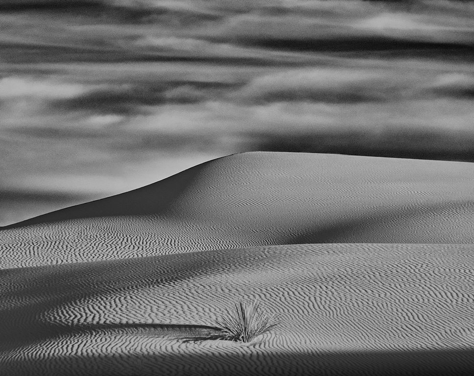
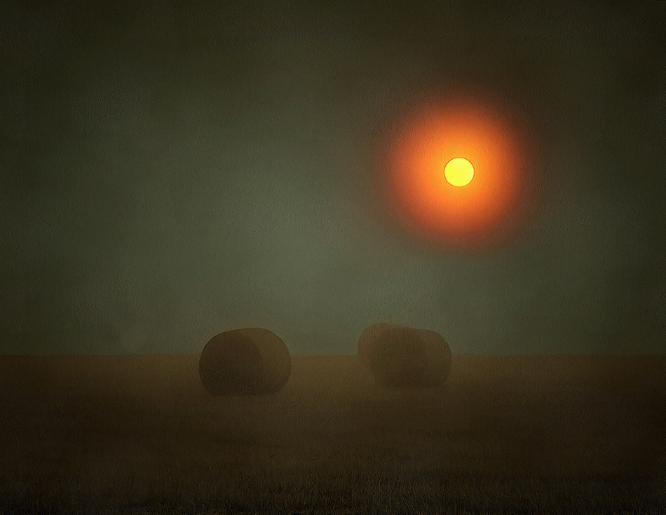
Checking the file, it lists one layer as SE Push 15 and the other as SE High Structure. As to why I did this, I can rarely remember why I do things an hour later... Checking the layers and their histograms it looks like Push 15 stretched the tones quite a bit but was a little heavy in the shadows. The High Struc., which was only applied with 80% opacity, elevated the lighter end of the histogram thus balancing the curve. It also gave the image a bit of crispness. The overall image histogram nearly fills the spectrum from black to near the white end and almost to the top, without clipping. |
Dec 8th |
| 35 |
Dec 21 |
Comment |
I meant 79, fine art group. |
Dec 6th |
| 35 |
Dec 21 |
Comment |
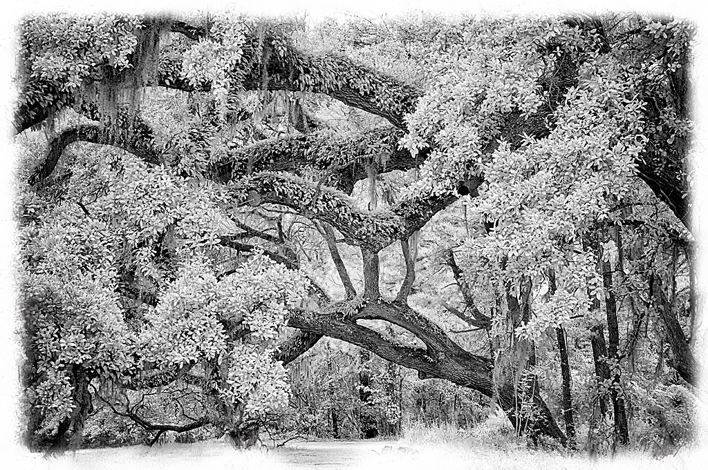
White trees is one of the reasons I shoot in infrared. |
Dec 6th |
| 35 |
Dec 21 |
Comment |
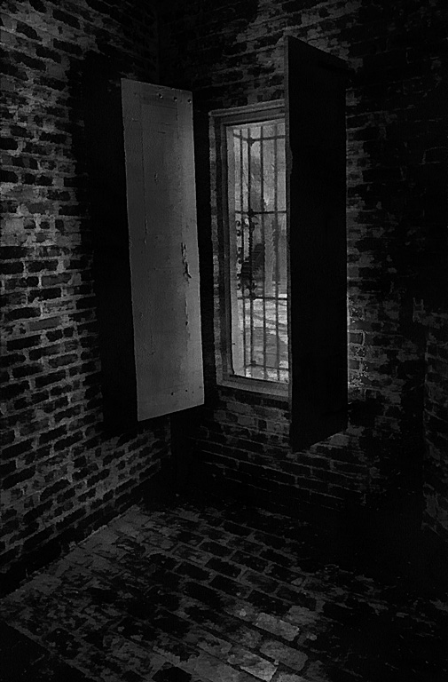
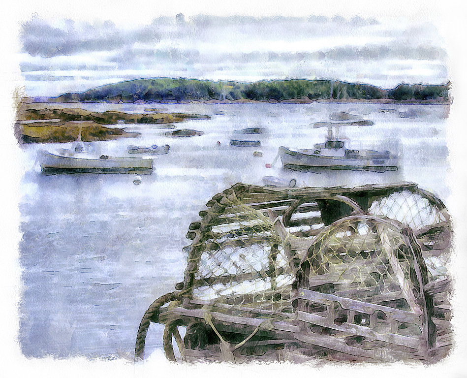
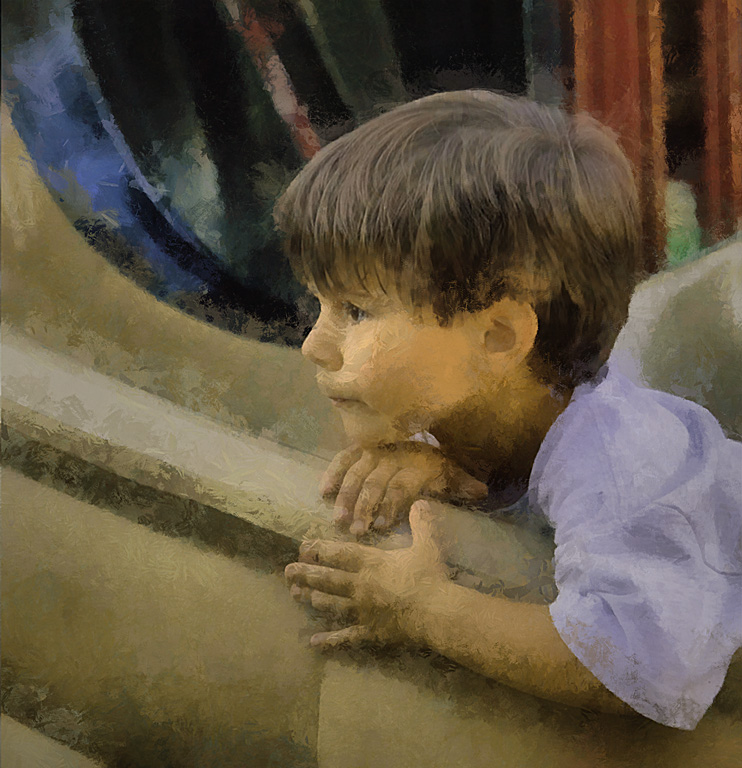
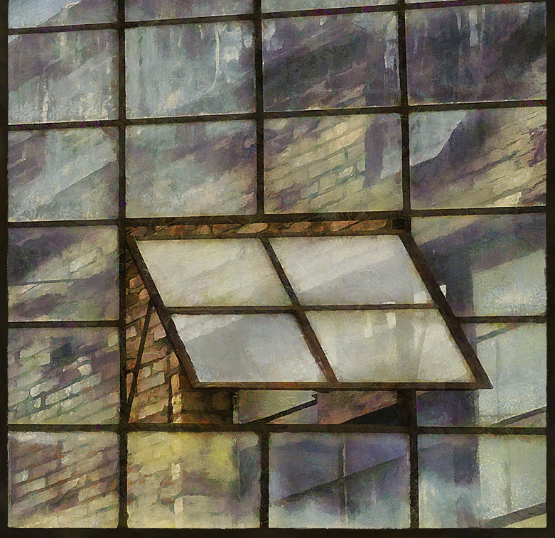
I'll bet there are oodles of shots in that place.
I am glad to see you were able to extract some good tones in the roof, it looked blown out in the original. Actually, looking at the original, I really like the "sepia-ish" overall tone, looks appropriate for an old photo. If you have the Nik tools you could experiment with color effects pro and see what you get for an old timey look.
The story is in the rotting windows. I don't know how you would isolate those windows with the number but that is the area my eye returns to.
Thank you for this.
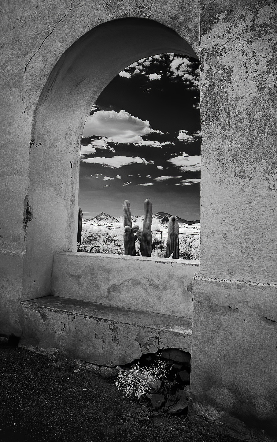
BTW, I really like the Cacti you submitted to group 76 |
Dec 6th |
5 comments - 2 replies for Group 35
|
| 56 |
Dec 21 |
Comment |
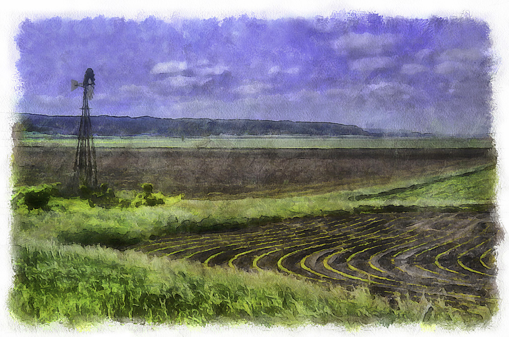
I like the lines. I think they give the image a bit of firmness and in areas where there is not much seperation of tones the lines help differentiate.
|
Dec 18th |
| 56 |
Dec 21 |
Comment |
Butterflies always seem to be creatures of fantasy and your image certainly conveys a dreamy fantasy world. Very nice. |
Dec 16th |
| 56 |
Dec 21 |
Comment |
That wrinkly skin was just made for pen-ink sketching. Great effect.
I think the left side of the image could have been cropped just a bit. There isn't much of interest over there and a bit tighter would make the rhino even more prominent. |
Dec 16th |
3 comments - 0 replies for Group 56
|
8 comments - 2 replies Total
|