|
| Group |
Round |
C/R |
Comment |
Date |
Image |
| 35 |
Oct 21 |
Comment |
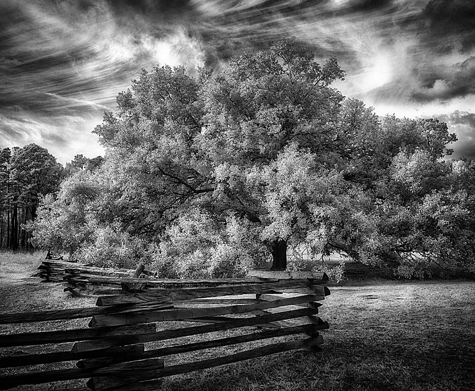
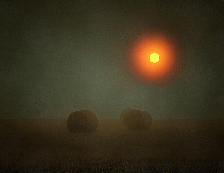
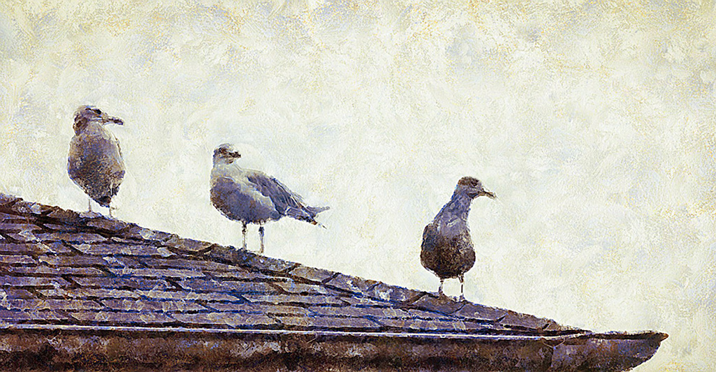
I agree with Julie that cropping some off the top would emphasize the car. I don't think loss of the height of the tree would lessen the impact of a tree growing out of the old car. |
Oct 18th |
| 35 |
Oct 21 |
Comment |
I like duotones and this works well.
It would be much less interesting in mono.
I might apply a bit of contrast or additional texture to the whole truck to see if it makes it pop a bit more. |
Oct 18th |
| 35 |
Oct 21 |
Reply |
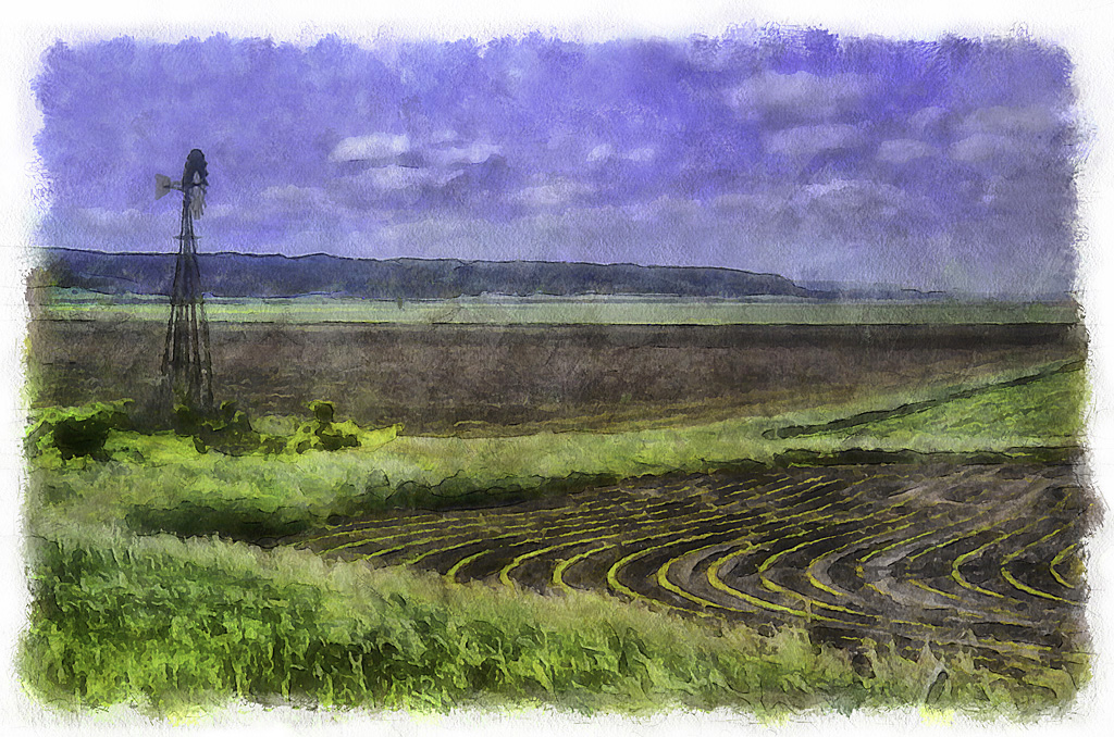
I agree. Trimming the top a bit shifts the focus more to the building. |
Oct 18th |
| 35 |
Oct 21 |
Comment |
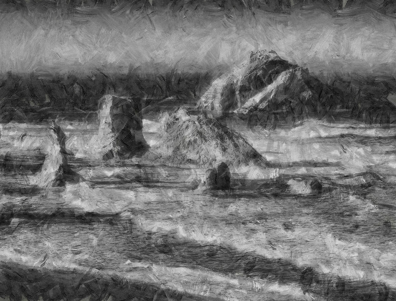
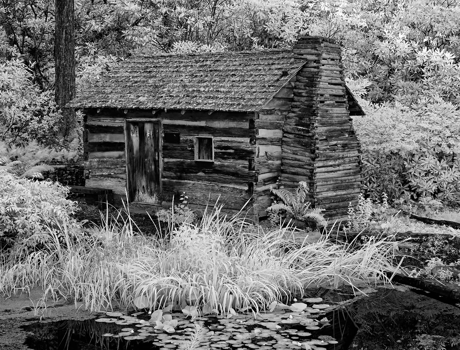
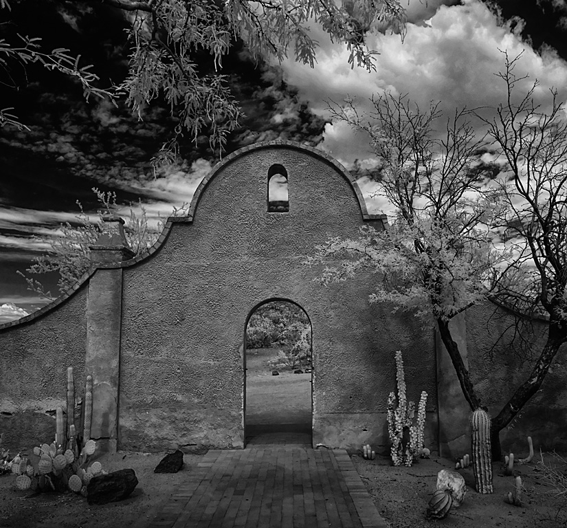
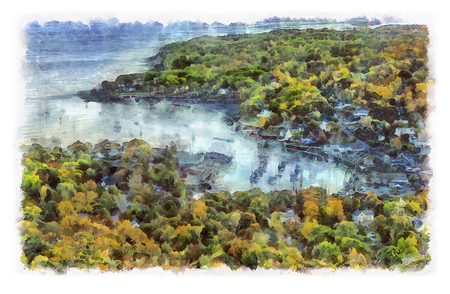
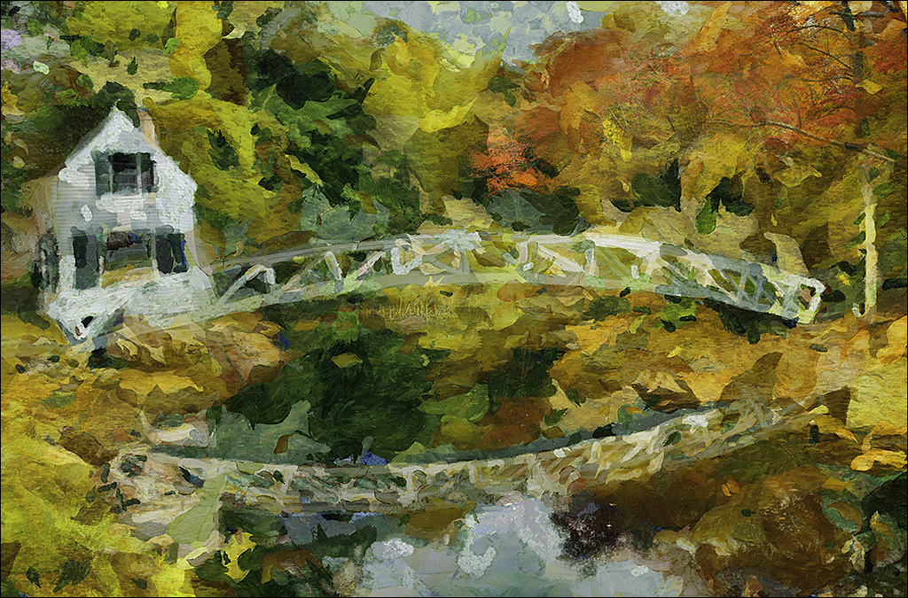
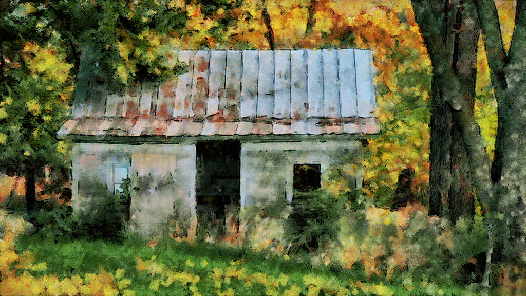
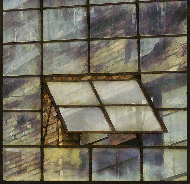
This looks like it could have come out of a Sci-Fi movie! That tower is bizarre. I really like the look of the building nestled amongst the trees.
The tonality is well balance.
Nicely done! |
Oct 18th |
| 35 |
Oct 21 |
Comment |
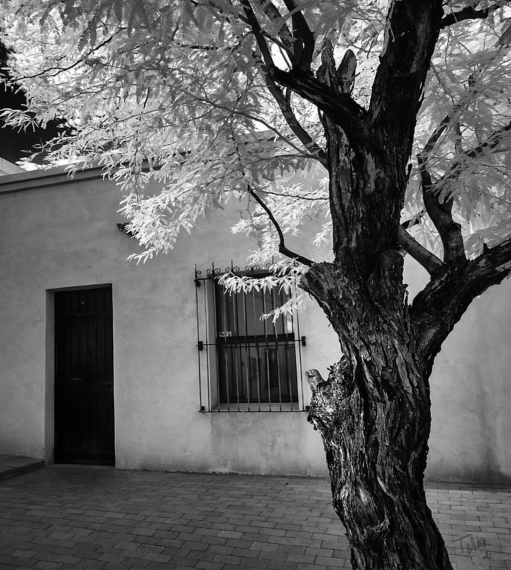
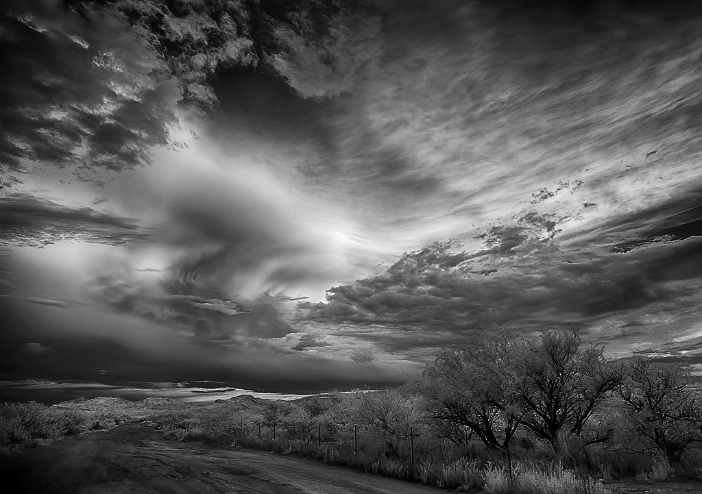
Thank you Julie.
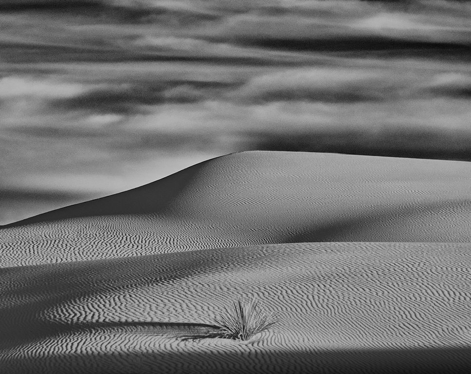
I think the ragged tree tops are consistent with the ragged clouds above. |
Oct 13th |
| 35 |
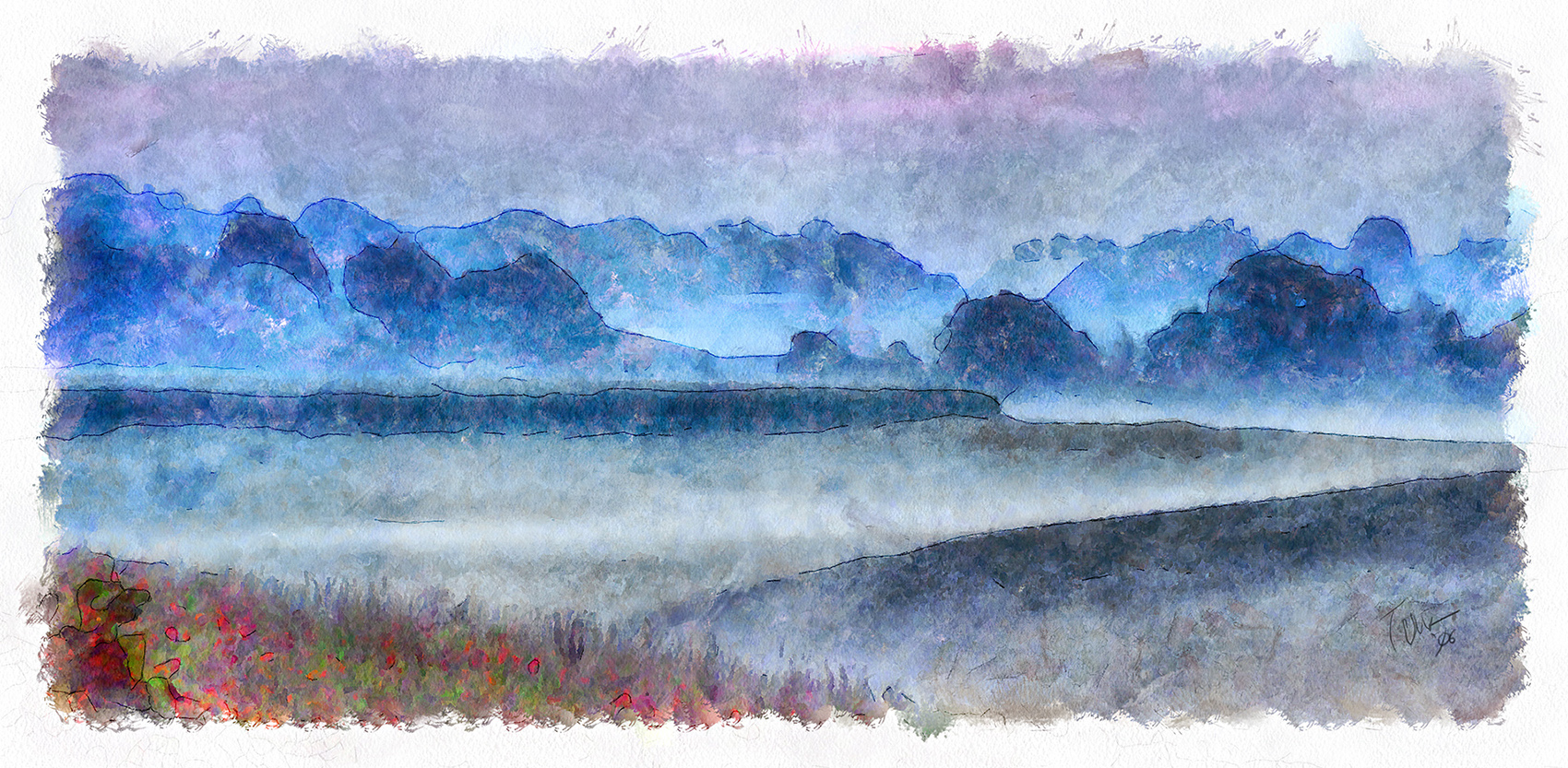
Oct 21 |
Comment |
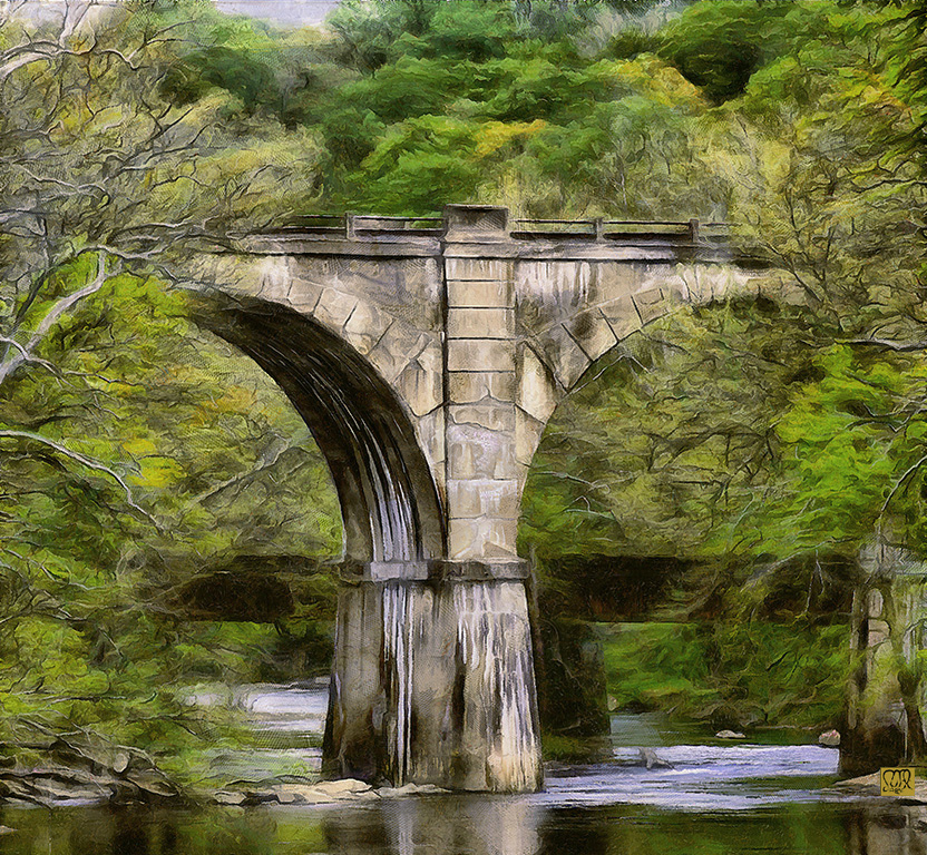
Like the composition, curves always grab my eye.
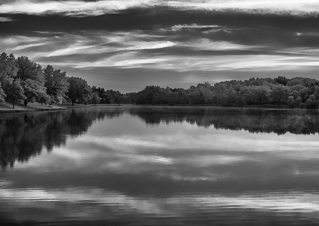
After looking at the original I wonder how this would look in faux colour? Maybe even do it as a duotone and keep the church in monochrome with a blue sky and yellow or pink
Just thinking�� |
Oct 9th |
5 comments - 1 reply for Group 35
|
| 56 |
Oct 21 |
Reply |
Yeah, when I looked at it again I see the eyes need to be darker.
There were a number of kids dancing that evening but she was having the most fun. Always wished I could have identified her parents to give them a copy, but to no avail, and now she would be a teenager. |
Oct 22nd |
| 56 |
Oct 21 |
Comment |
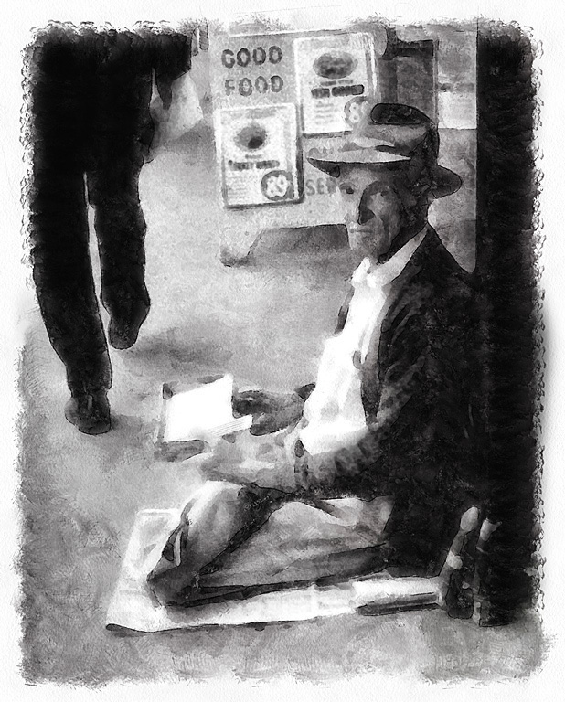
I agree with Mr. Levitas that an appropriate scene for those full sole shoes would be on a chair or stage. But, if I don't look at the original, or read your text, but just look at the final image then I have no problem with the door. It is rather neutral to the shoes which are the focus of the image. I am also amazed you drew that lovely door out from that scabrous original! |
Oct 18th |
| 56 |
Oct 21 |
Comment |
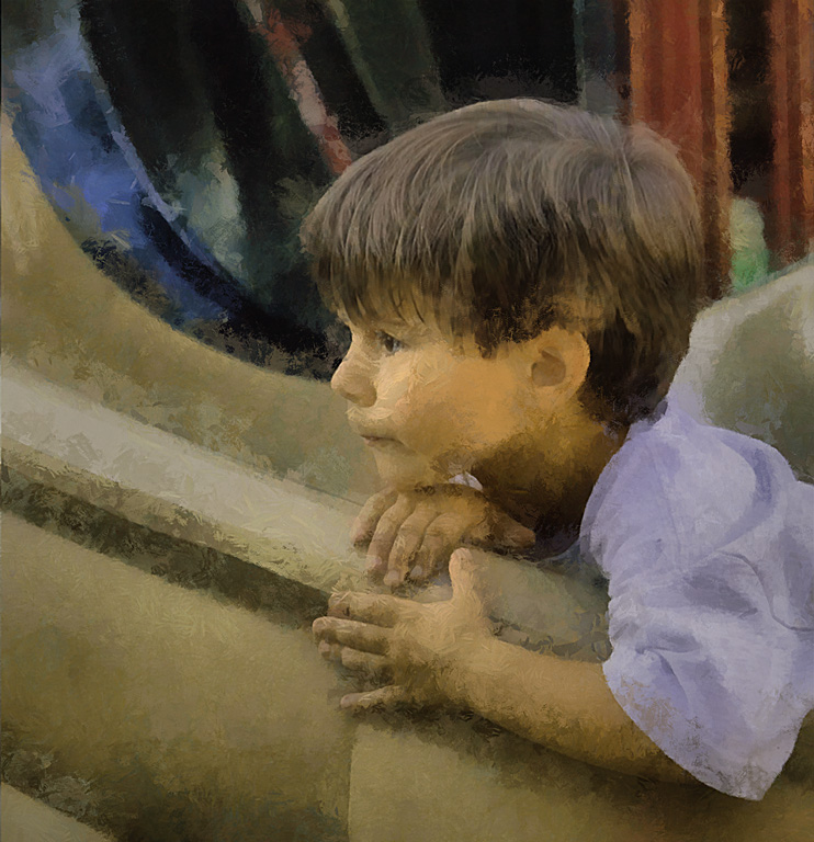
Yeah, you have to keep a look like that. Any idea what she was staring at?
Your new background is a bit grainy and the sharpness of all those little points attracts my attention more than it should. Have you tried blurring it a bit? That might shift the focus back to those lovely eyes. |
Oct 18th |
| 56 |
Oct 21 |
Comment |
You did a great job of creating an entire work out of a brief snapshot. Well done.
There is a bit of pinkish haze around the little girls right hand fingers that you might want to remove.
|
Oct 18th |
3 comments - 1 reply for Group 56
|
8 comments - 2 replies Total
|