|
| Group |
Round |
C/R |
Comment |
Date |
Image |
| 35 |
Sep 20 |
Reply |
"You see, ya can't please everyone
So ya got to please yourself"
-Ricky Nelson
Garden Party
|
Sep 14th |
| 35 |
Sep 20 |
Reply |
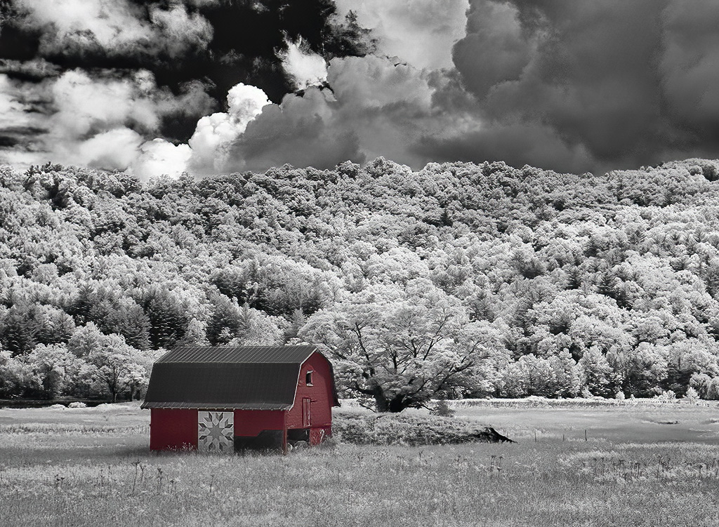
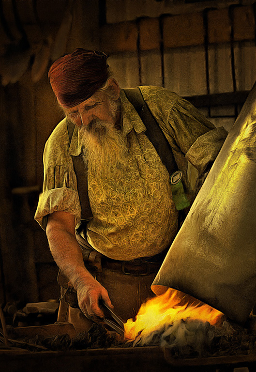
Oh what fun!
I think you did a great job on this very complicated structure. Like my duotone barn, having a red element in a monochrome image just lights up the whole thing.
And yes, tackling a tough job like this will make you a bit "gun shy." But now you know you can do it so climb back in the saddle. We await your next success!
|
Sep 7th |
| 35 |
Sep 20 |
Comment |
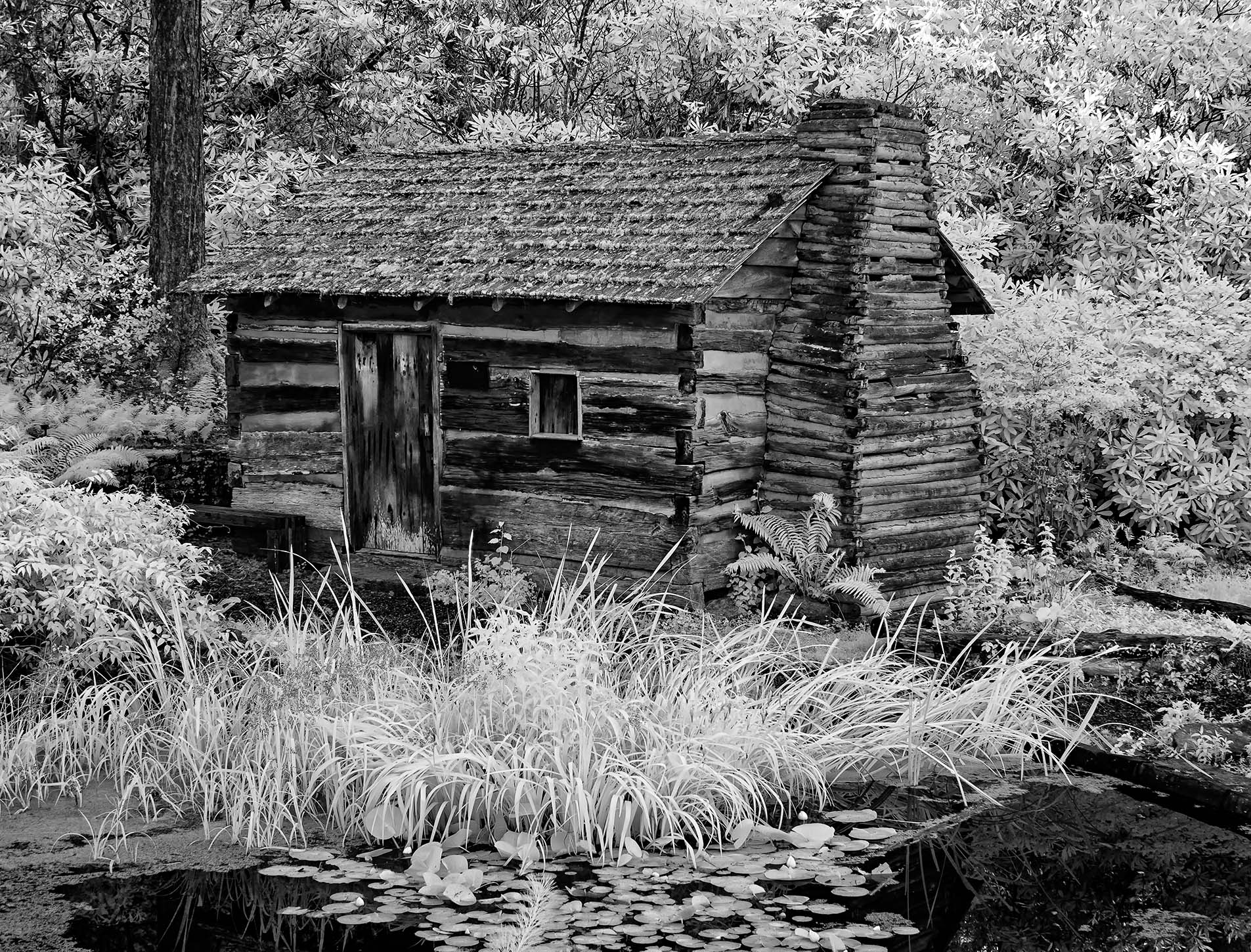
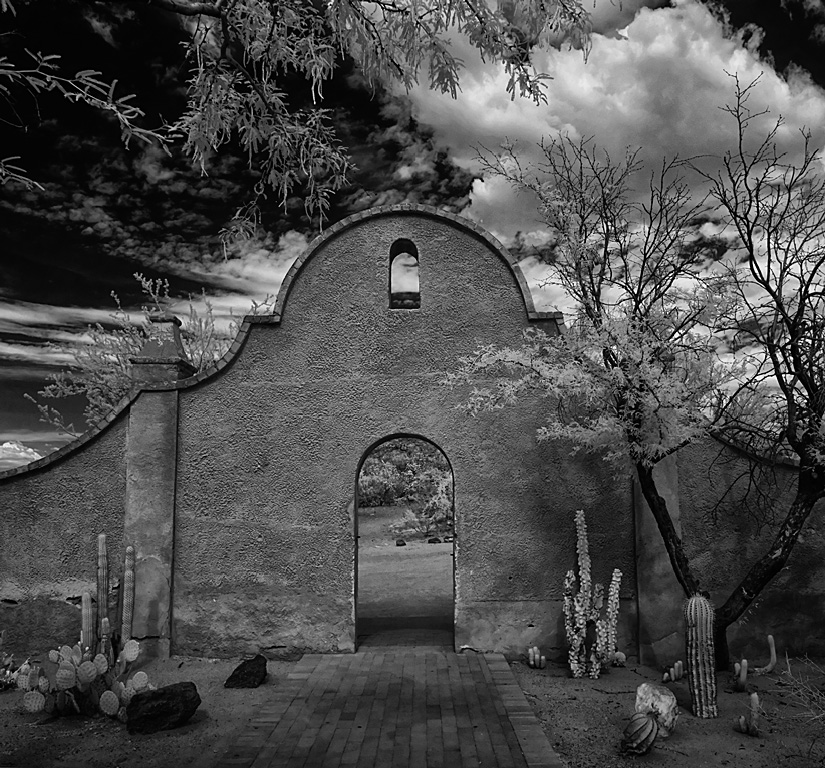
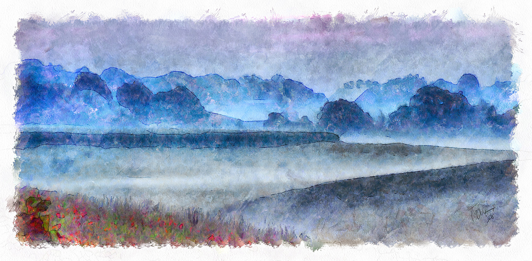
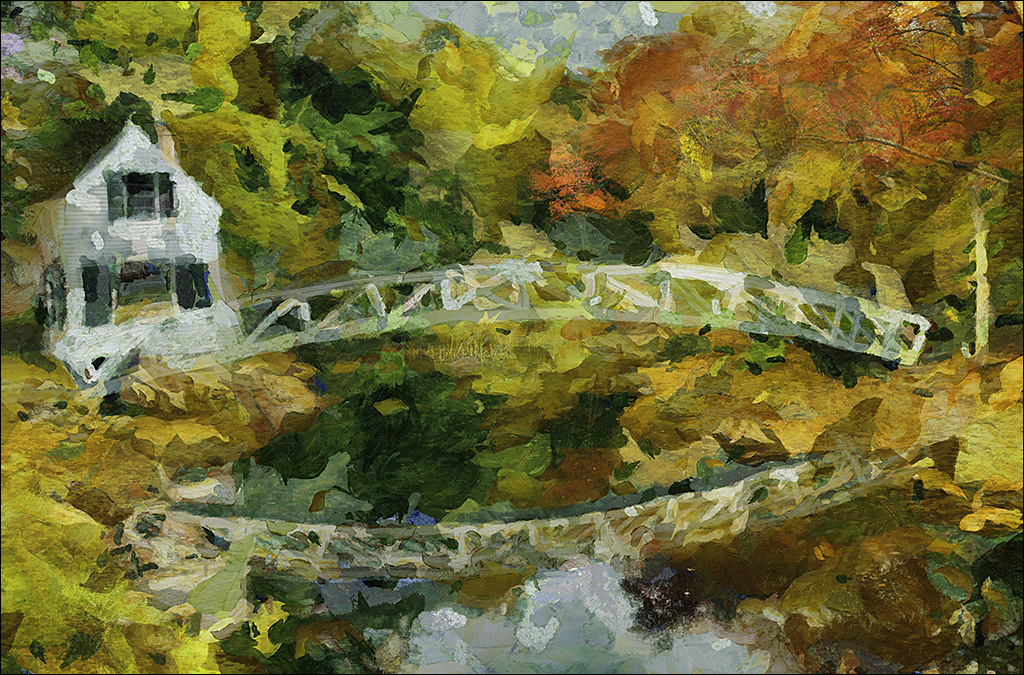
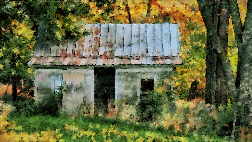
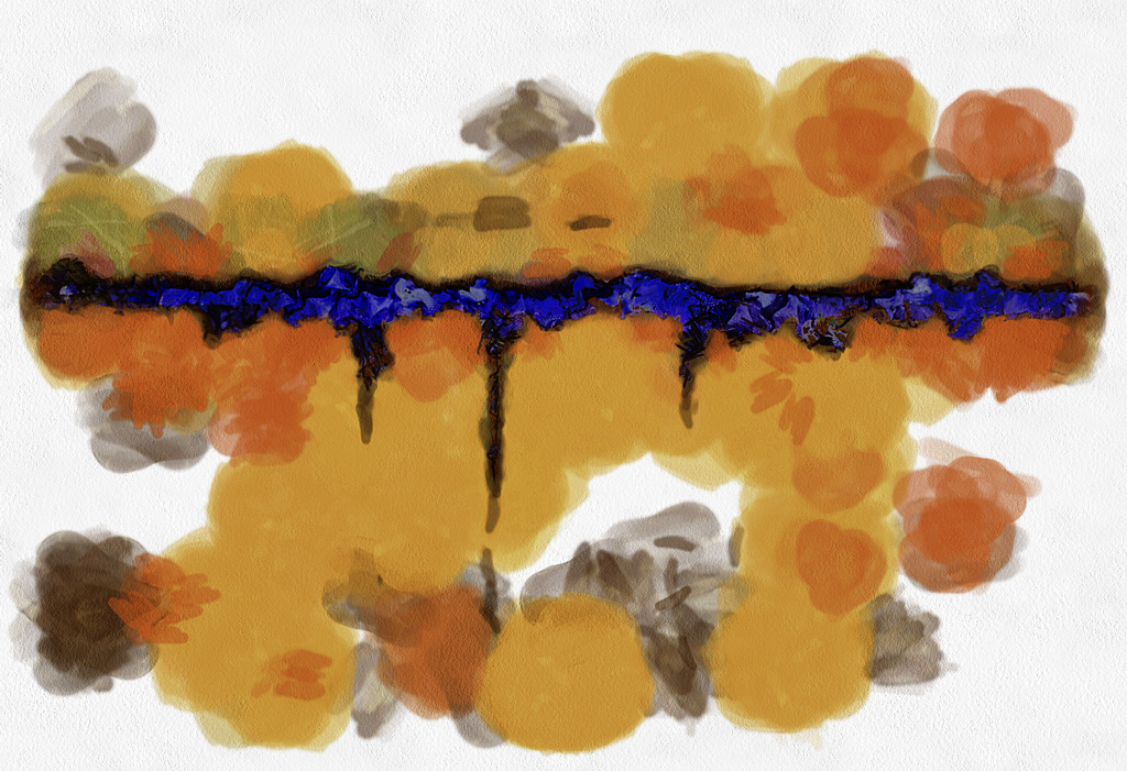
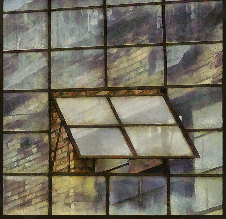
I really like the juxtaposition of the booth and the lamps.
Painting this red would look great but agree it would take a lot of work. The red barn I did last month is fairly simple compared to this booth. If I was attempting to paint this booth I would select it with several increments of the Magic Wand, adjusting the tolerances for the various tones. That rough mask could then be fine tuned using a quick mask and a hard edge brush. I would leave the interior in monochrome but what to do with the insides of the back of the booth case? Paint them or leave the grey? Painting them would be even more difficult.
With my barn I had to use a Color Balance adjustment layer to get the red I wanted. Have Fun! |
Sep 3rd |
| 35 |
Sep 20 |
Comment |
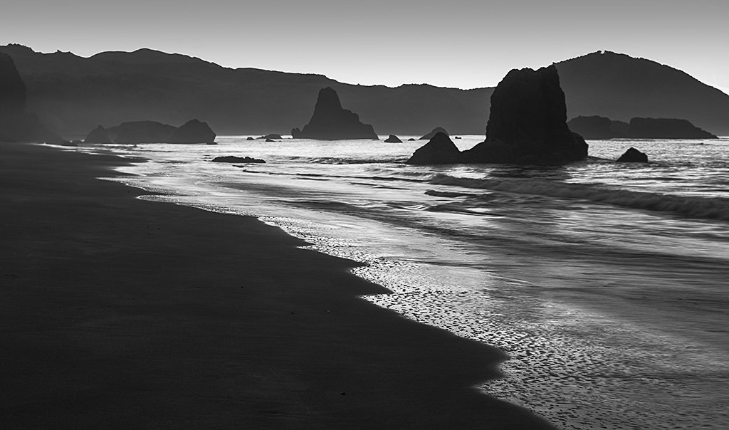
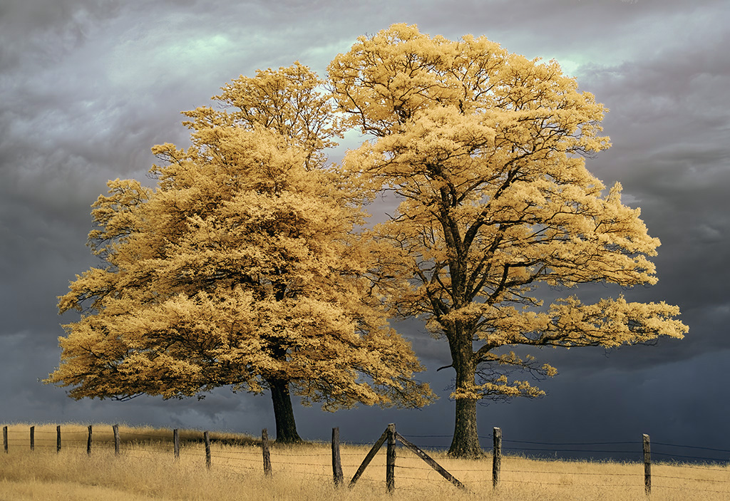
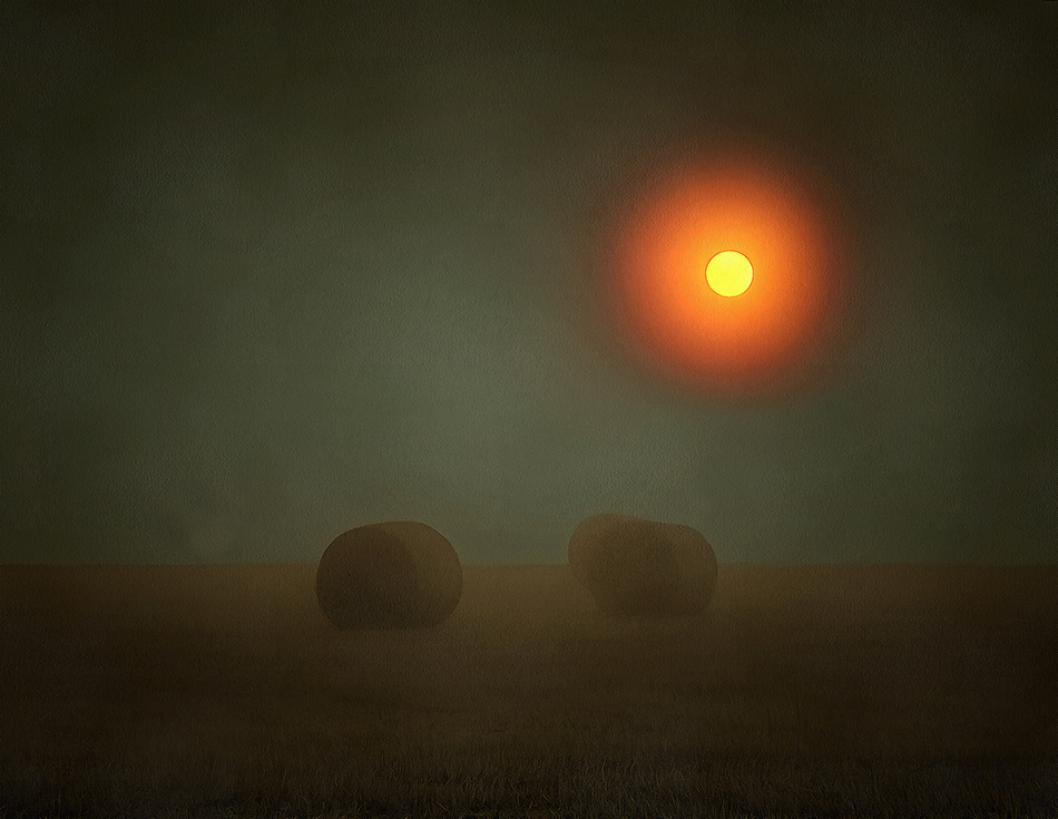
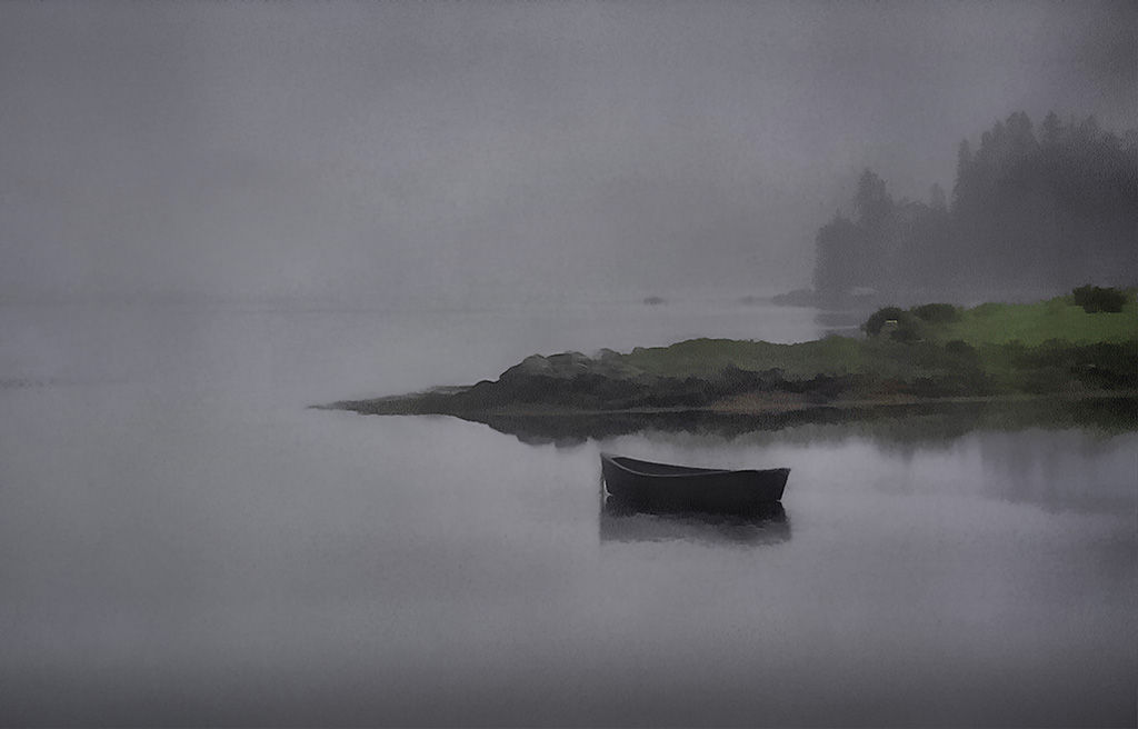
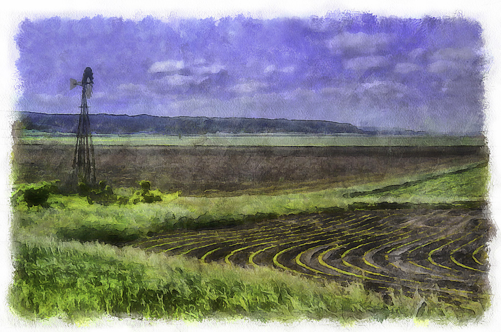
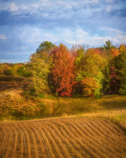
Great shot! Any yes, one HAS to grab a sky like that any time you can.
Very good composition. I like how the bush in the fence row lines up with the tree lending strength to that element. At first glance I did not like the dark gate. But then I realized it is the first thing I look at and then it leads me zooming along the fence into the rest of the image and up through that ragged sky. Well done. |
Sep 3rd |
| 35 |
Sep 20 |
Comment |
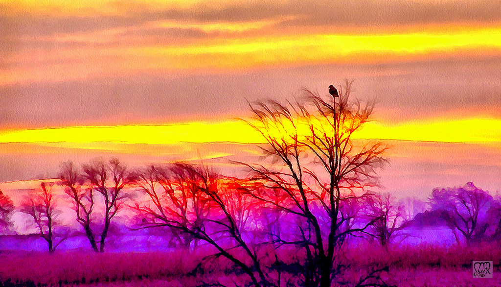
The soft pastels you found make a gorgeous treatment to the fairly harsh original. Nicely done.
Finding acceptance of our images by narrow minded judges is very frustrating. Your image is art, clear and simple, and should be judged as such. Not all art fits neatly into their little pigeon holes. Non illegitimi carborundum.
|
Sep 3rd |
3 comments - 2 replies for Group 35
|
| 56 |
Sep 20 |
Reply |
Yes Cindy.
Enough detail in the ledge so it looks "natural" and yet does not detract from the cat.
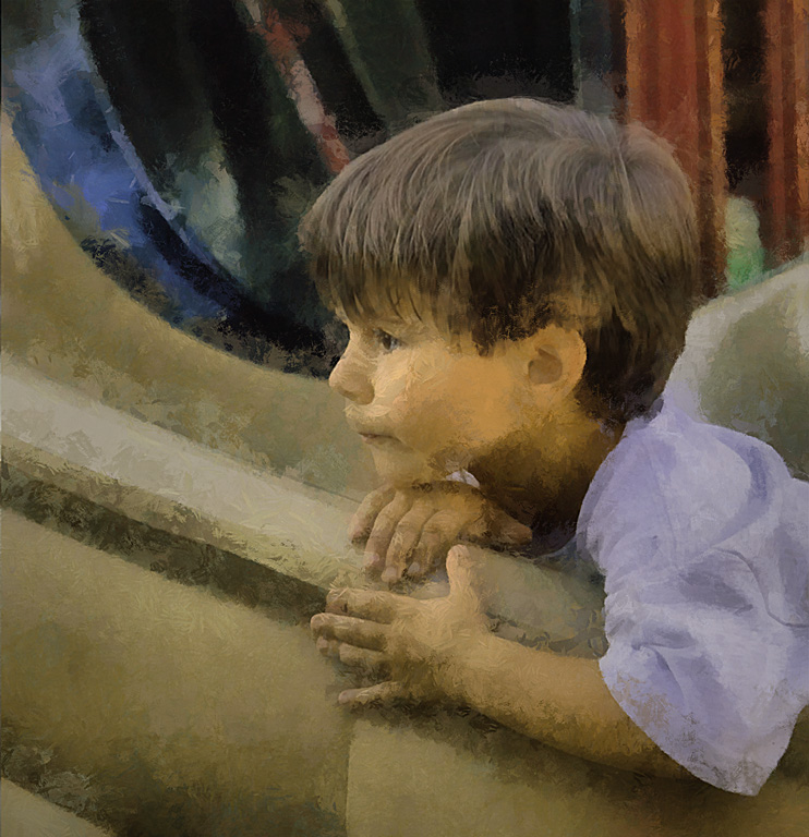
This is a great shot. Every time I look at this I think it should be adorning a wall somewhere. |
Sep 14th |
| 56 |
Sep 20 |
Reply |
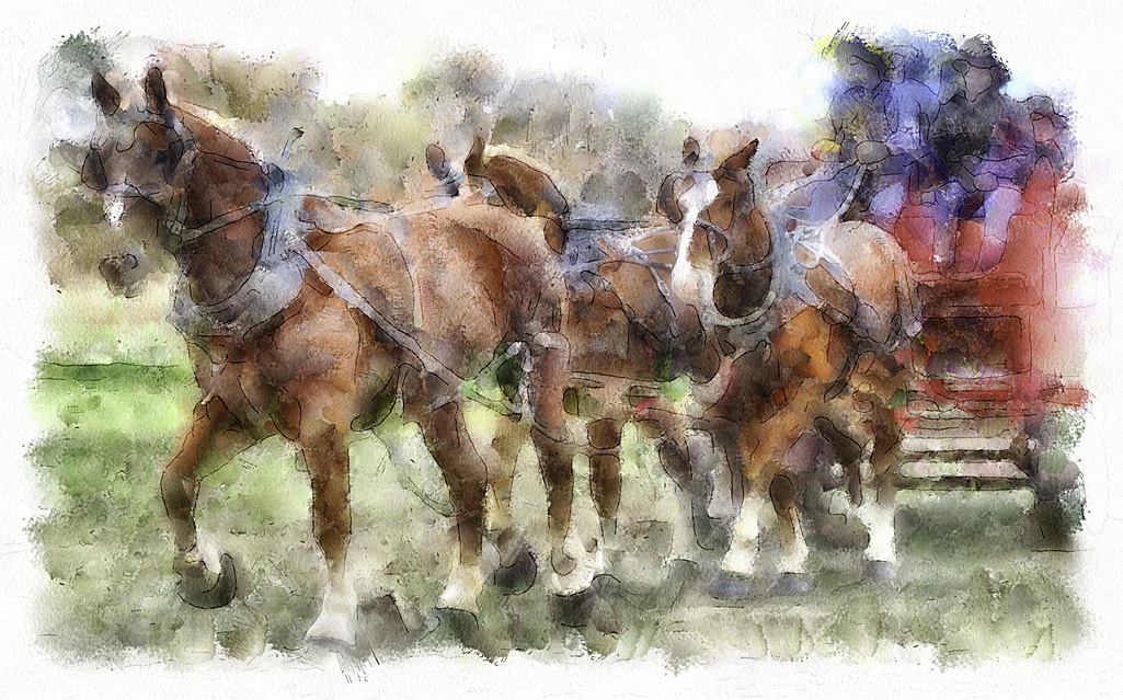
I always think this looks like an old horse drawn fire brigade with the red wagon and the guys with long coats and big hats.
I find that when photographing horses they will often look right at you, which adds a personal connection. |
Sep 14th |
| 56 |
Sep 20 |
Reply |
Now that I have looked at this several times I think the rock ledge may be smeared a bit too much. Keeping some of the original rocky texture would not detract from the cat nor compete with the background which only contacts the ledge at the edges. |
Sep 9th |
| 56 |
Sep 20 |
Comment |
I like this a lot. I agree with losing the original background and what is interesting is the new background resembles an African design, e.g. as seen on fabrics. A great addition to this image, really ties it together.
Keeping the water dribbling from the calf's trunk adds a bit of action.
The cow on the right certainly has a strange tusk. |
Sep 9th |
| 56 |
Sep 20 |
Comment |
This is great. It is Very Very Good. Congratulations. Hope to see more like this.
|
Sep 7th |
| 56 |
Sep 20 |
Comment |
This is great. Painted every spot! How neat. It does not look "painted" but neither does it look like a hard photo. You have produced a wonderful patina across that beautiful fur.
I prefer the mottled background. It is "neutral" so my eye is not drawn away from this lovely animal. Looks like a portrait.
|
Sep 3rd |
| 56 |
Sep 20 |
Comment |
Ah, lovely.
Corn rows can be such powerful structural elements. Living in Iowa I am immersed in them.
Really like the colours and overall brightness. Very timely.
I took the liberty of making a couple of slight adjustments to your image. I hope this loads. All I did was applied a black to clear gradient along top and bottom edges with opacity of about 15%. The idea is to darken those edges very slightly so the viewer's eye is drawn to the lighter central area, where lies all the lovely colours and shapes.
|
Sep 3rd |
 |
4 comments - 3 replies for Group 56
|
7 comments - 5 replies Total
|