|
| Group |
Round |
C/R |
Comment |
Date |
Image |
| 35 |
Aug 20 |
Reply |
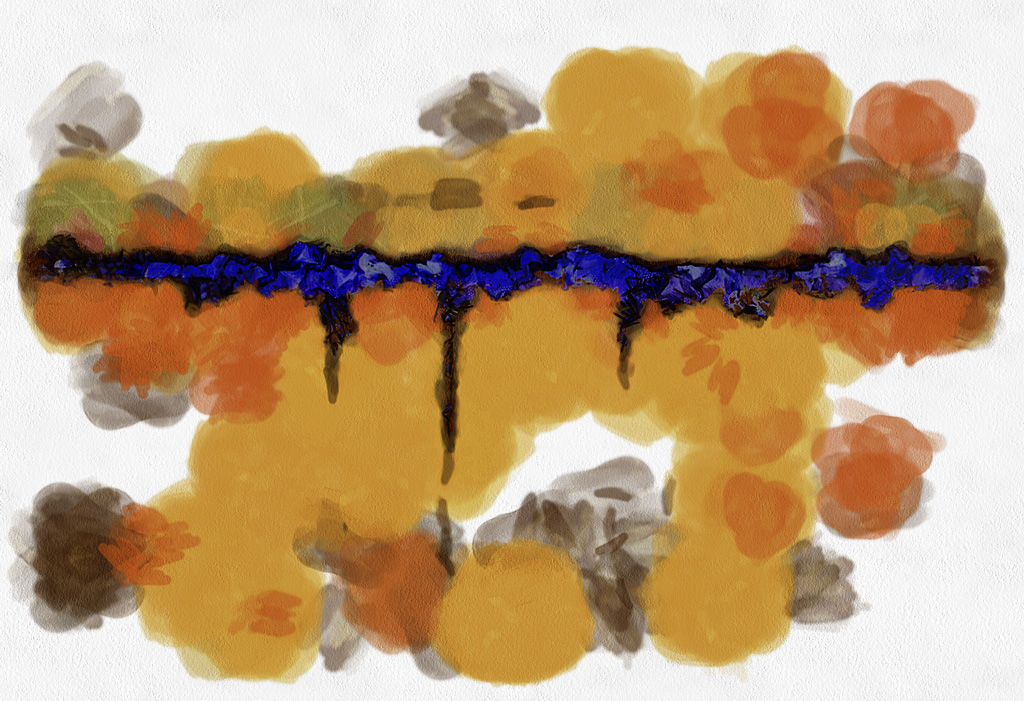
I have made a couple of other duo-tones where the majority of the image was monochrome with just a small area of color. It seems to work well with just that little attention getter in a field of black and white.
This Is my first IR duo-tone, it seemed to be a natural choice. With so much of my IR in monochrome I am going keep an eye out for other possible Duo-Tones and hope to see some from you. |
Aug 24th |
| 35 |
Aug 20 |
Reply |
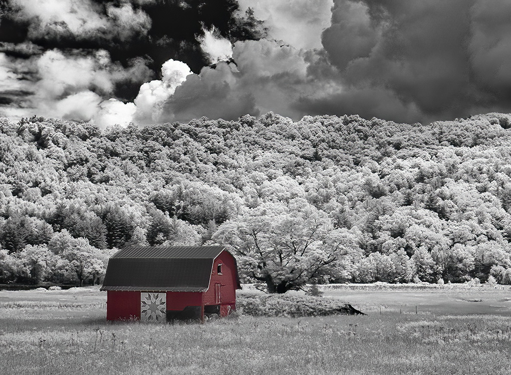
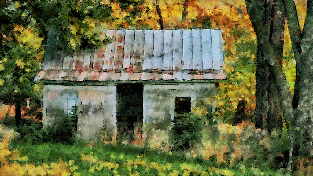
After converting the image to monochrome the barn was fairly dark and I knew simply painting it with red would make it way too dark. So I made a negative of the barn and adjusted the Color Balance for a bright red and then layered it over the (Dark) positive. A bit of edge tweaking and blending brought the color inline with my memory of the real barn.
Making Fun is a lot more pleasurable than finding fun! |
Aug 15th |
| 35 |
Aug 20 |
Reply |
See above for my reply to Sharon. |
Aug 13th |
| 35 |
Aug 20 |
Reply |
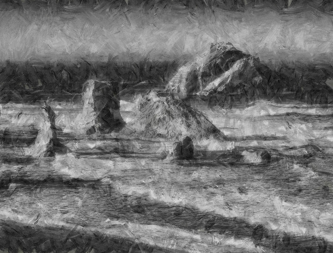
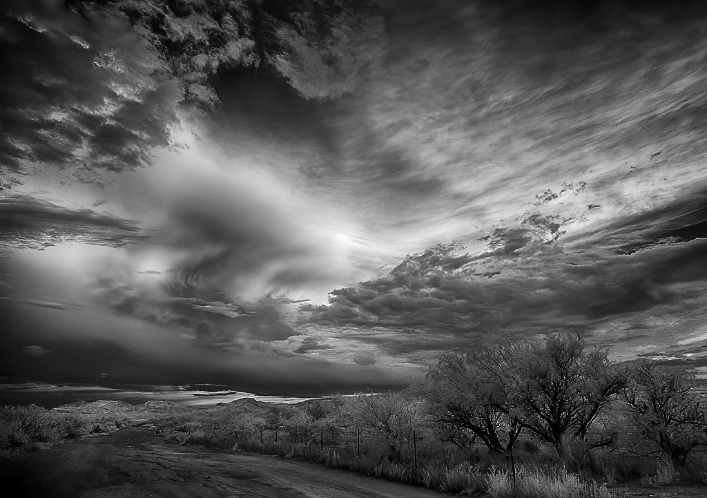
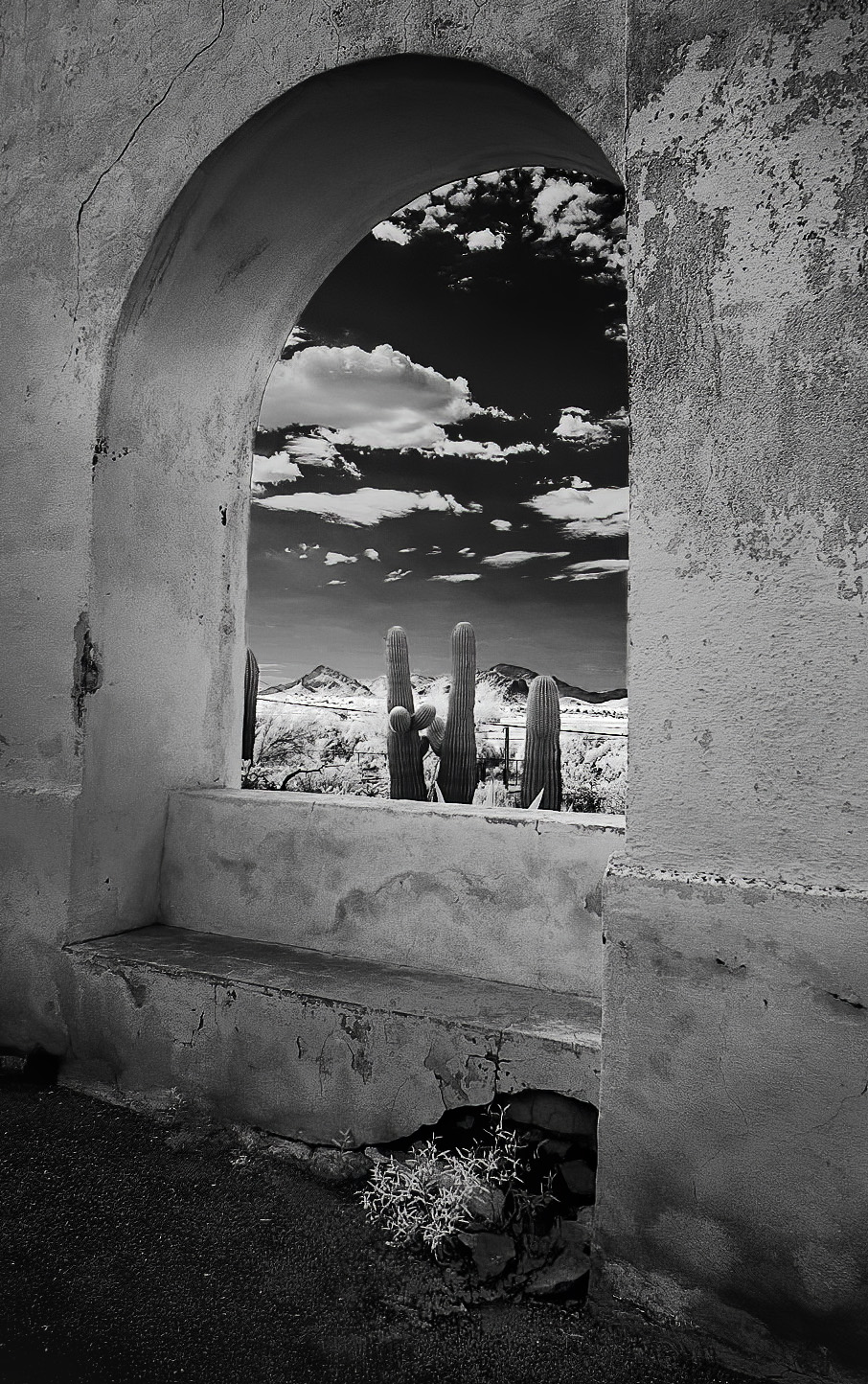
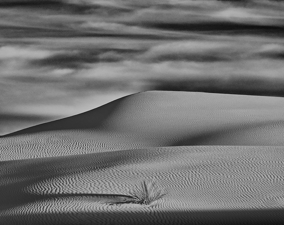
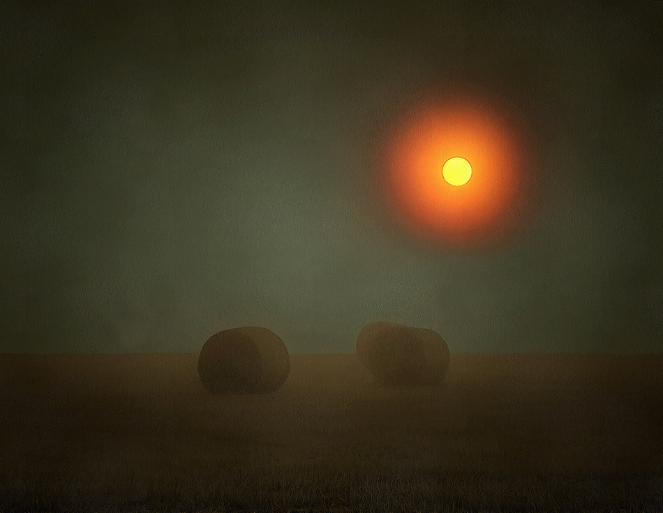
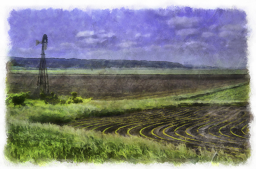
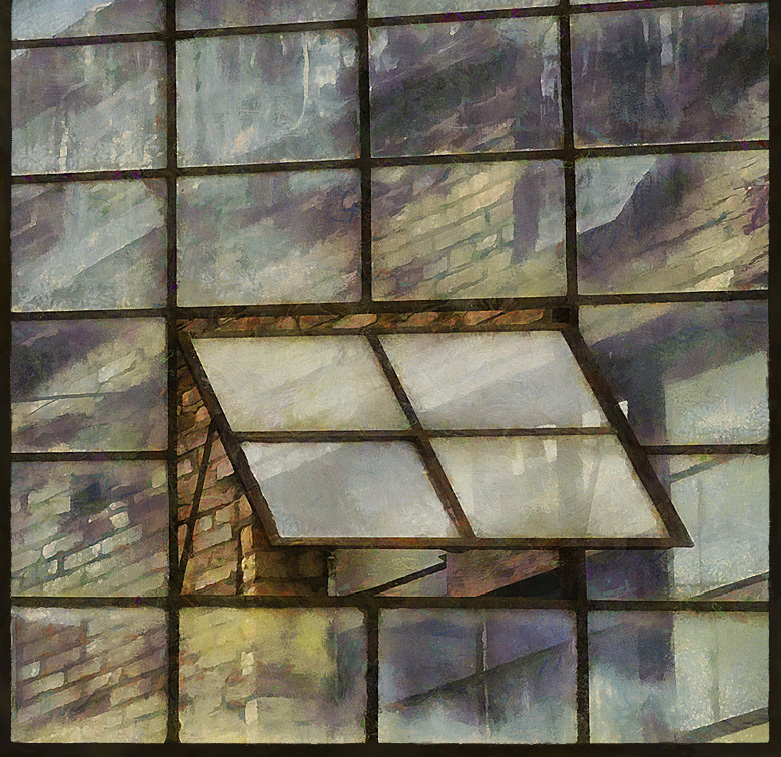
The barn is a counterpoint to the sky and mountain.
If I had shot this with a wider lens I would have made it an even smaller barn (and a bigger sky) to show the insignificance of human efforts compared to the power of nature.
The barn was colored (in great detail not visible in the little JPEG) . |
Aug 13th |
| 35 |
Aug 20 |
Comment |
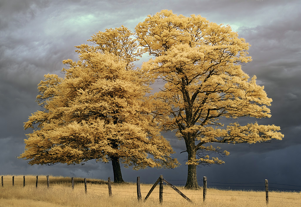
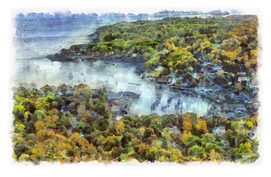
Great composition! I like the yellow trees, they look like they are made out of butter.
Did you try a little bit of Transform to reduce the keystoning of the tower?
Where is this Foggy Lights you used. Sounds like a handy tool?
|
Aug 7th |
| 35 |
Aug 20 |
Comment |
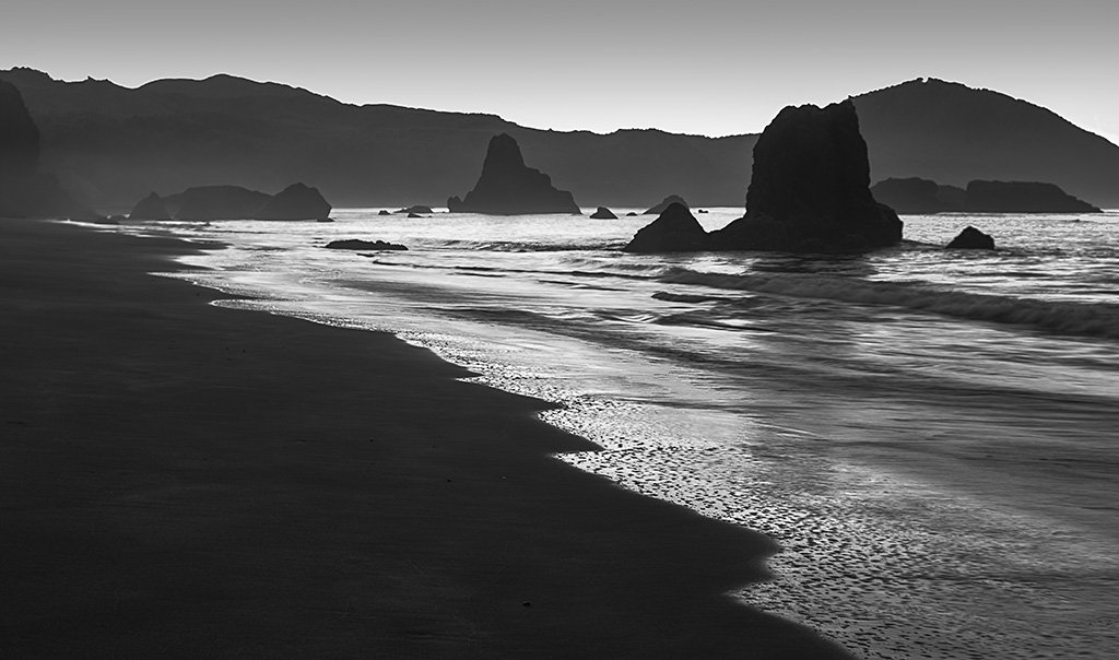
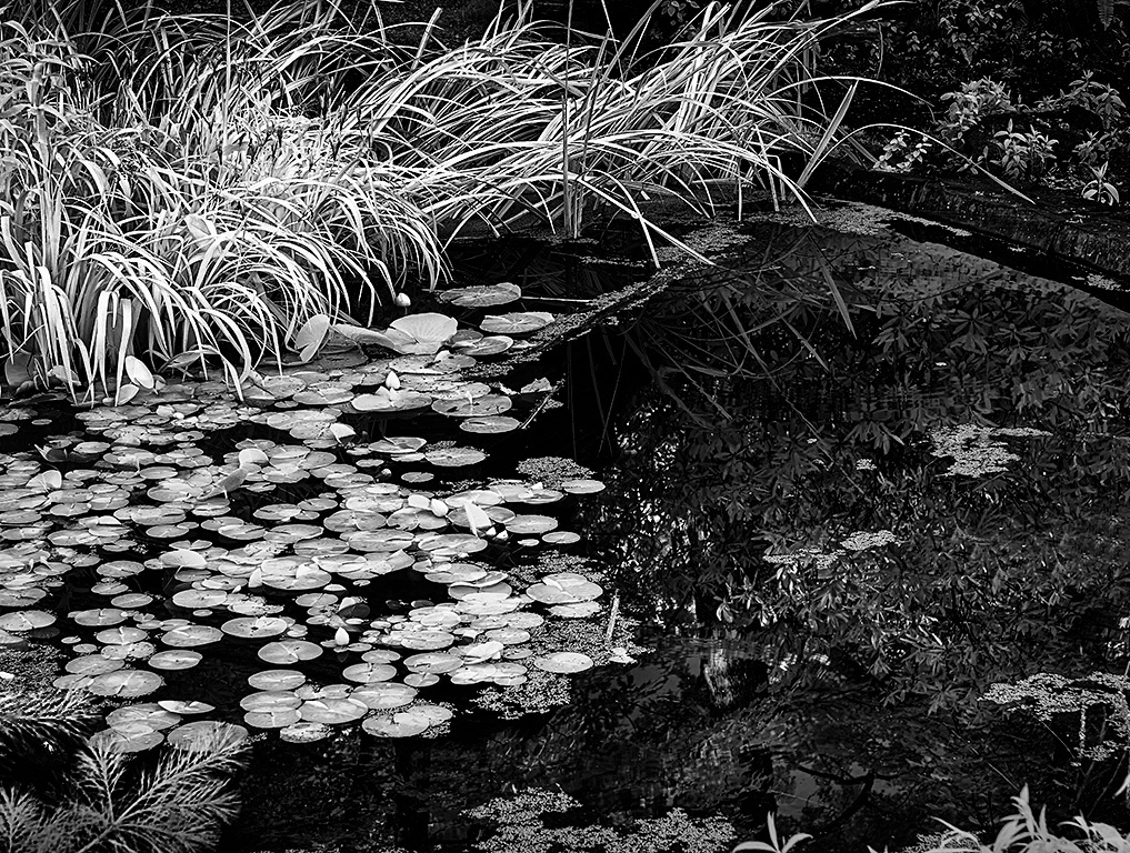
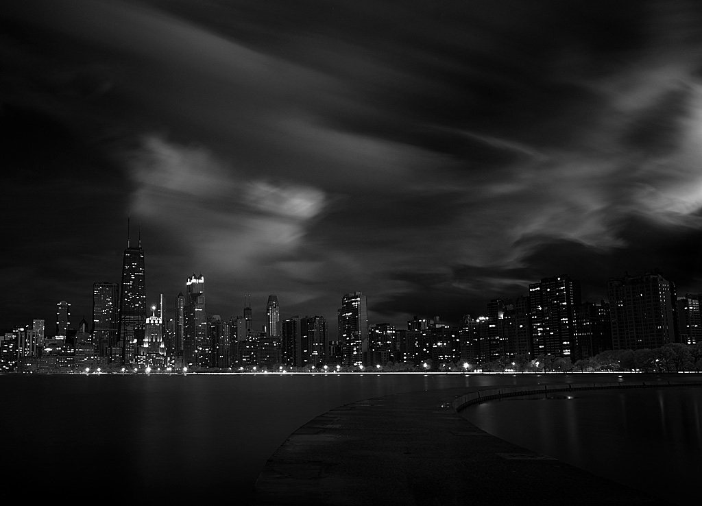
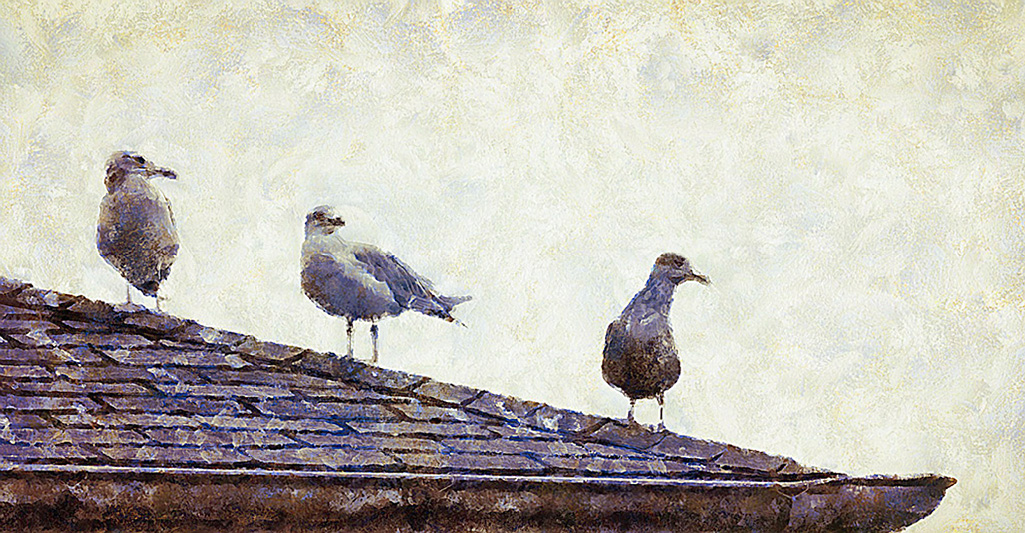
I like the colour version of this but agree it would do well in monochrome.
Suggestion: there is a fair amount foreground, which you need and should not crop. But to guide the viewer to the more interesting areas of the image you could try putting a slightly darkened area along the bottom edge. The viewer will then look to the lighter areas which is where all the interesting things are. |
Aug 7th |
| 35 |
Aug 20 |
Comment |
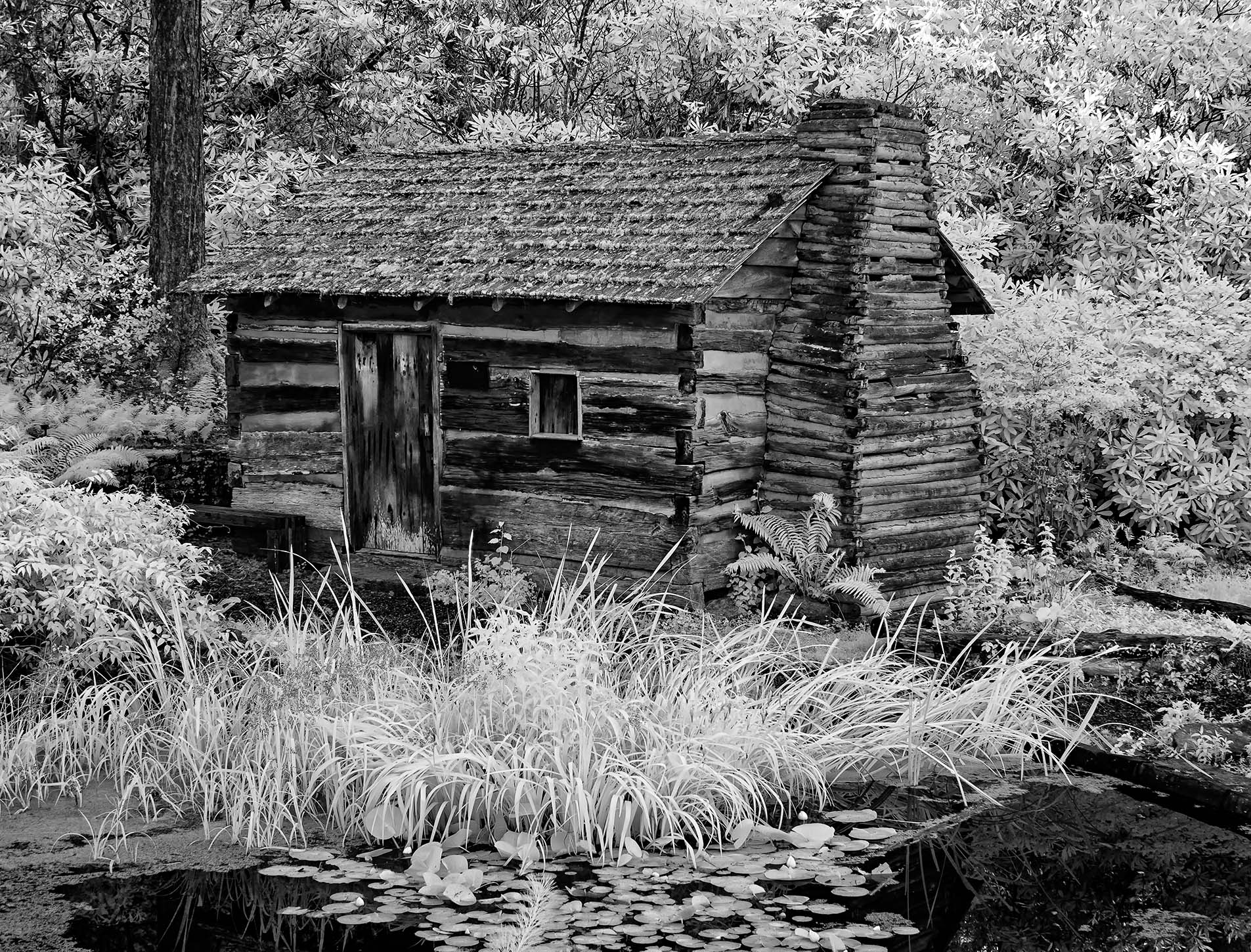
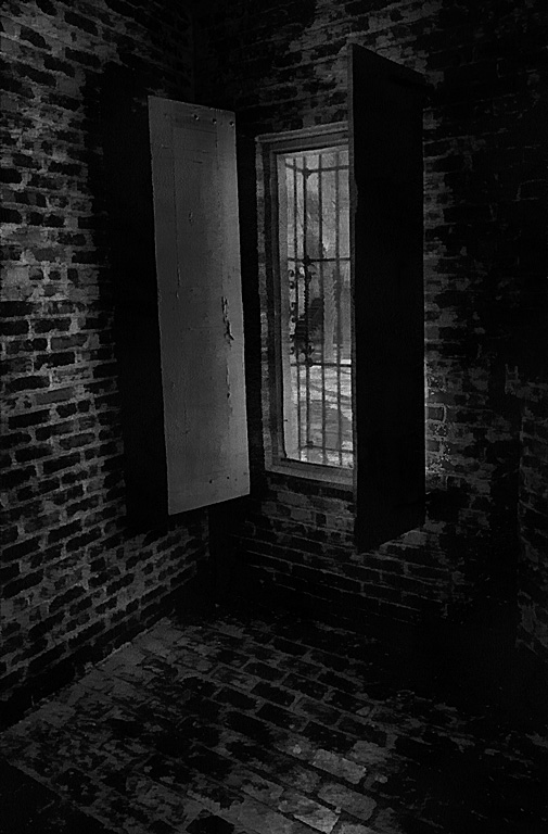
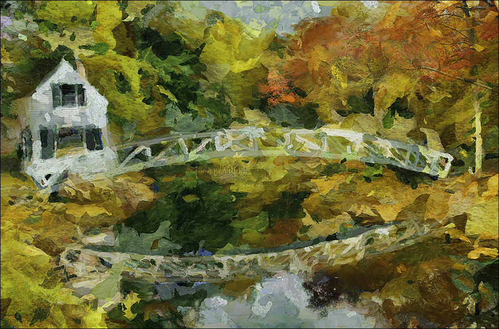
Yes, the rest of this images is just too good to be shackled with those dormers. Just scrumcious textures in the leaves, the wood door, the stones. Very nice.
I might tone down the top of the distance tree line, seems a bit bright next to your faux sky. |
Aug 7th |
3 comments - 4 replies for Group 35
|
| 37 |
Aug 20 |
Comment |
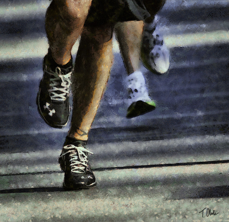
Just popped in here to say how much I like your scrum photo in the Showcase. Great composition and that player's face tells the whole story. |
Aug 20th |
1 comment - 0 replies for Group 37
|
| 39 |
Aug 20 |
Comment |
Just popped in here to say how much I like your Happy Texas shot in the Showcase. That sky makes me think of the IR shots I make.
Now that I'm here I must say this is also a lovely shot from Taos. Nice work. |
Aug 20th |
1 comment - 0 replies for Group 39
|
| 56 |
Aug 20 |
Reply |
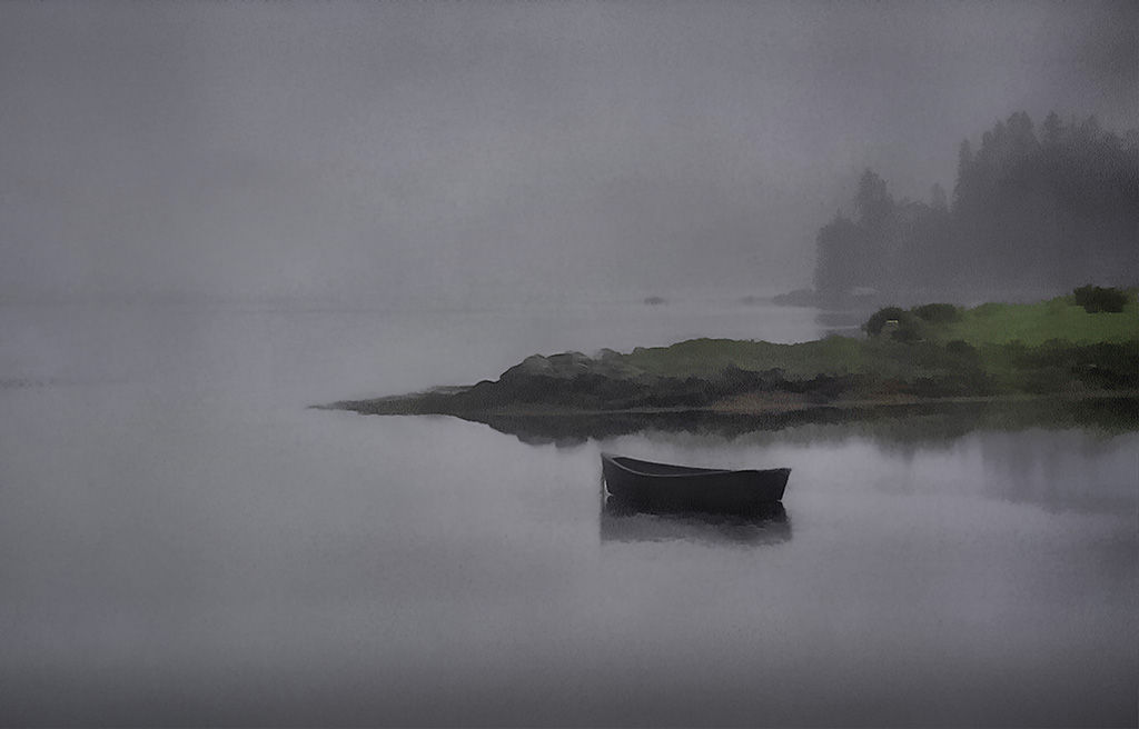
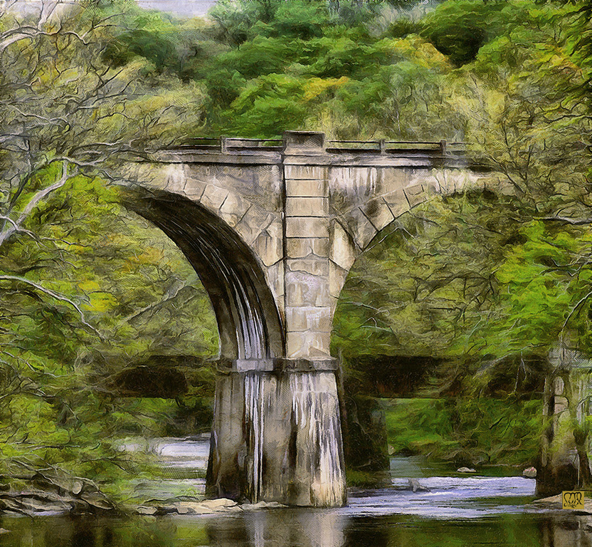
Thanks Trey,
I had not even noticed that small rock, but agree it should go.
I also find the bit of sky colour is reflected in the stream and so ties together.
I like the contrast of the rather wild natural tree branches with the rigid un-natural man made span. Maybe they are trying to tear it down. |
Aug 24th |
| 56 |
Aug 20 |
Comment |
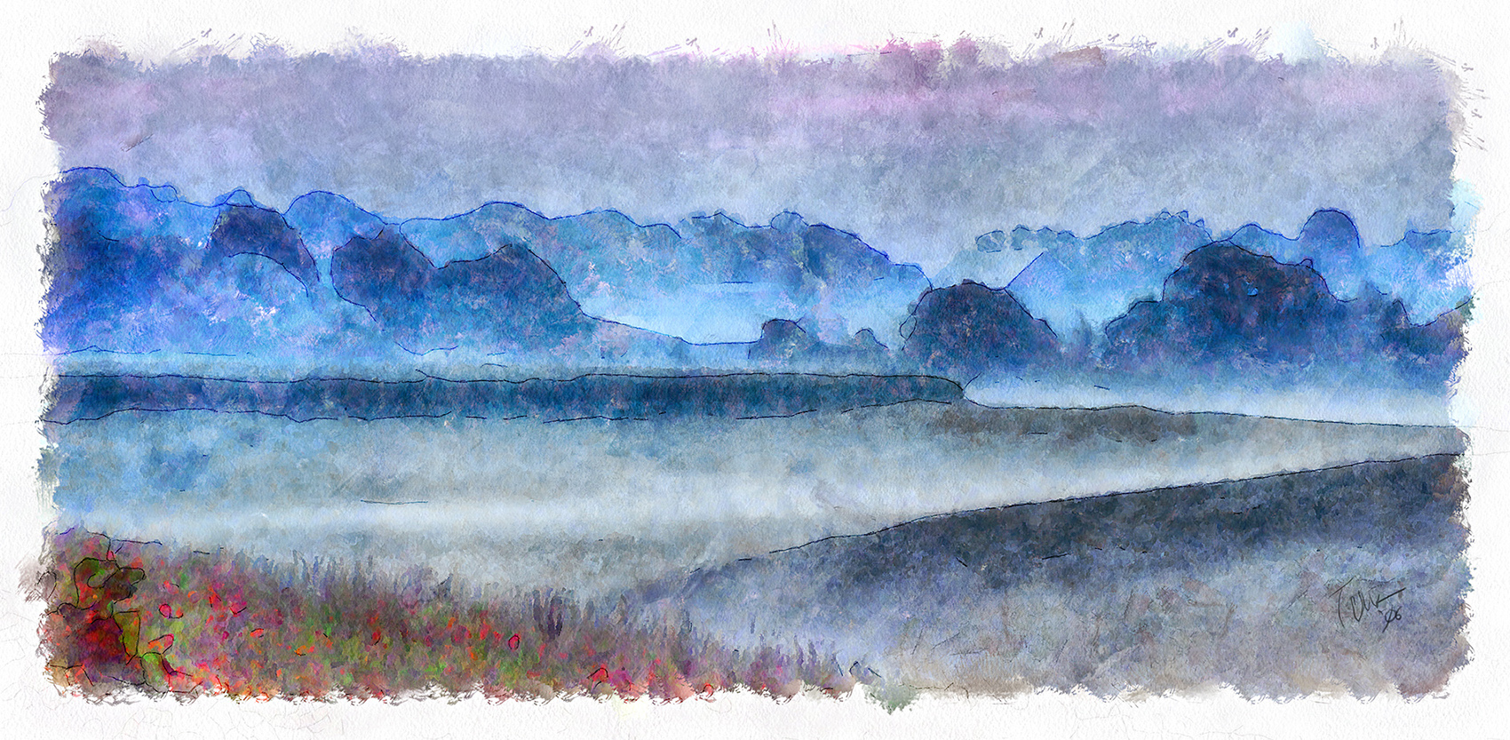
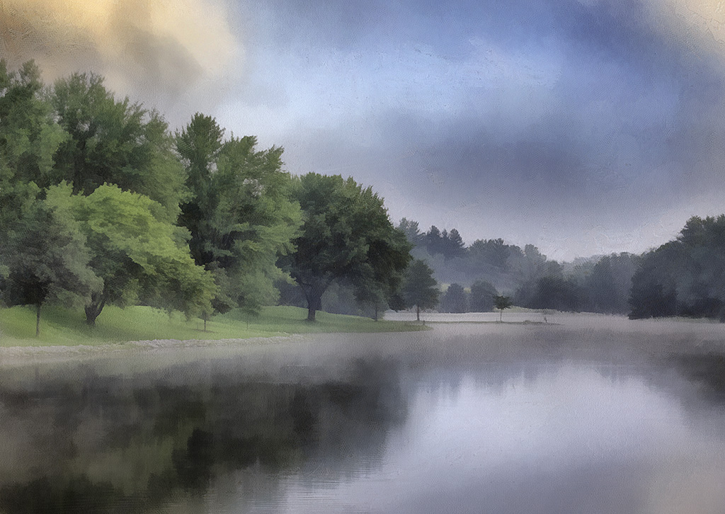
Lovely image. Don't you just love fog?
Did you know that August is the second foggiest month of the year? |
Aug 7th |
1 comment - 1 reply for Group 56
|
| 78 |
Aug 20 |
Comment |
Just popped in here to say how much I liked your jet photo in the Showcase.
While here I have looked as several other months and like a lot of your work. |
Aug 20th |
1 comment - 0 replies for Group 78
|
7 comments - 5 replies Total
|