|
| Group |
Round |
C/R |
Comment |
Date |
Image |
| 35 |
May 20 |
Reply |
I have only used the Pro versions of editions 4, 5 and now 6. |
May 19th |
| 35 |
May 20 |
Reply |
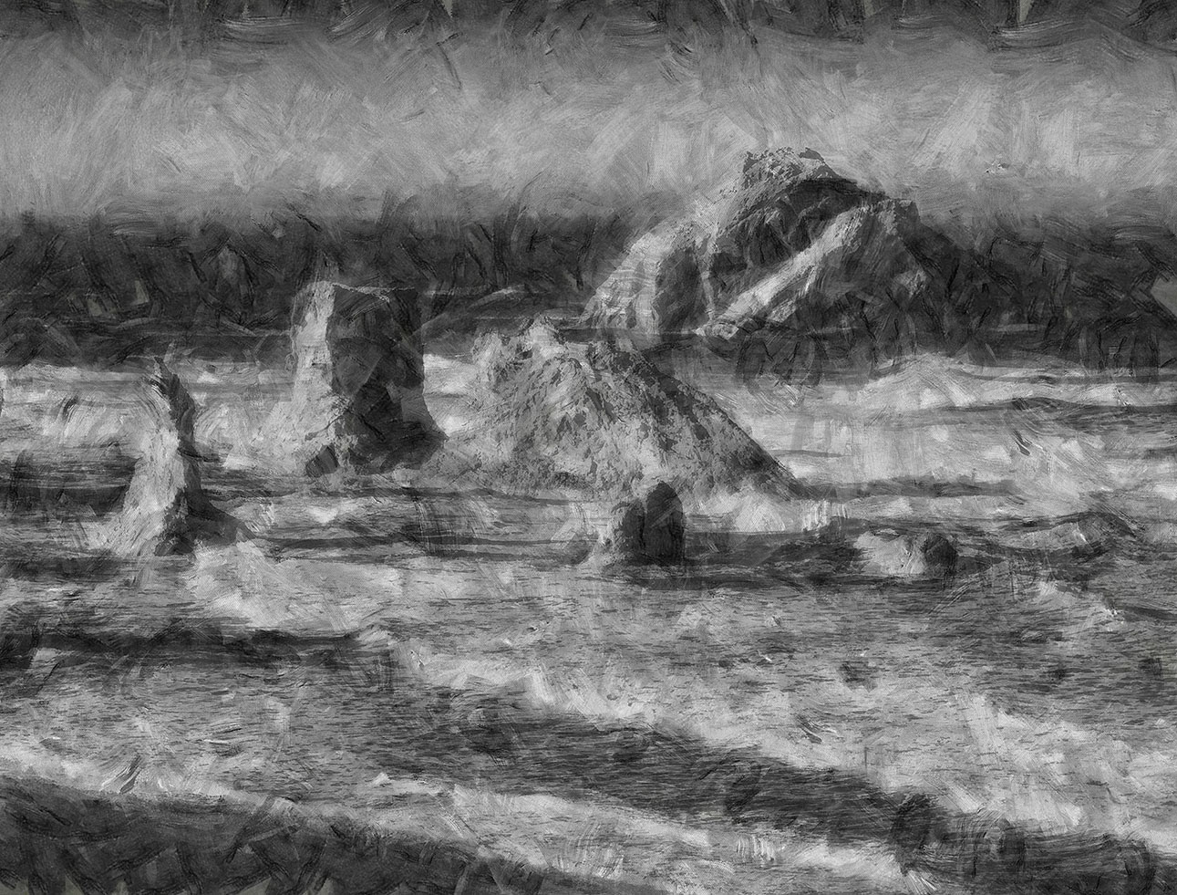
That filter is part of the Dynamic Auto Painter program, by Mediachance. The Pro version has about 50 primary filters that are designed to roughly resemble various artists, e.g. Monet, Van Gogh, Cezanne, Benson, Sargent, Klimt, Manet, Camille Pizzaro, etc. Several of the primary filters have one or more variants and then each has a number of adjustments that can give a wide range of interpretation.
The Pro version costs $89 and the home version $39.
|
May 19th |
| 35 |
May 20 |
Reply |
I looked at Tony Sweet's video and when he had the diffusion filter on he increased his exposure by about 3x without re-metering. Do you use a stock adjustment when using that filter, such as his, or do you meter through the diffusion filter for the new exposure?
|
May 18th |
| 35 |
May 20 |
Reply |
Yes, Mark was the co-leader of that workshop and since he lives there he was able to take us to some great sites.
Mark was scheduled to co-lead the Blue Ridge workshop this summer but has been restricted from any field work so Jaime will solider on.
|
May 16th |
| 35 |
May 20 |
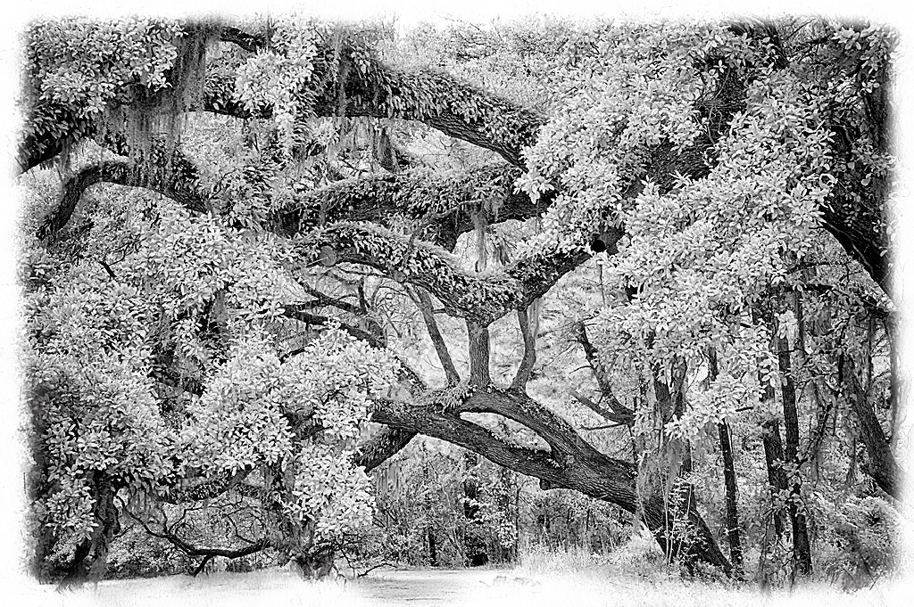
Reply |
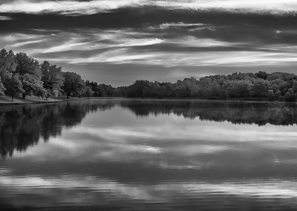
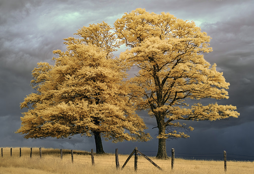
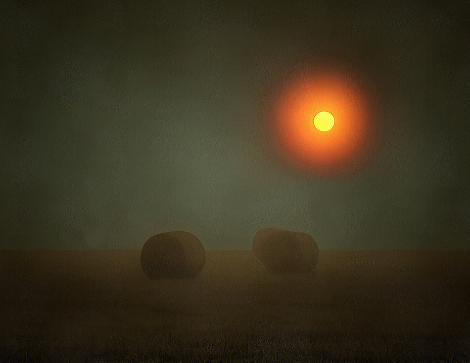
Thank you Julie for the kind comments.
Yeah, I really like this image. I have not been able to print it yet, due to some remodeling in the basement, but when I am up and running this will be one of the first to come off the printer.
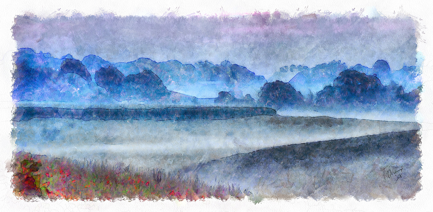
I took this during the IR workshop Debbie and I attended in Pawley's Island, South Carolina last fall. There are many live oaks through the area and gorgeous photography opportunities abound.
I don't like the Glamour Glow effect very much so used just a touch. I am thinking of ordering the Tony Sweet diffusion filter and see if it gives a better "glow." I think what really helped was this is an HDR. IR has such a narrow dynamic range I usually do at least triple exposures trying to stretch the range.
|
May 14th |
| 35 |
May 20 |
Reply |
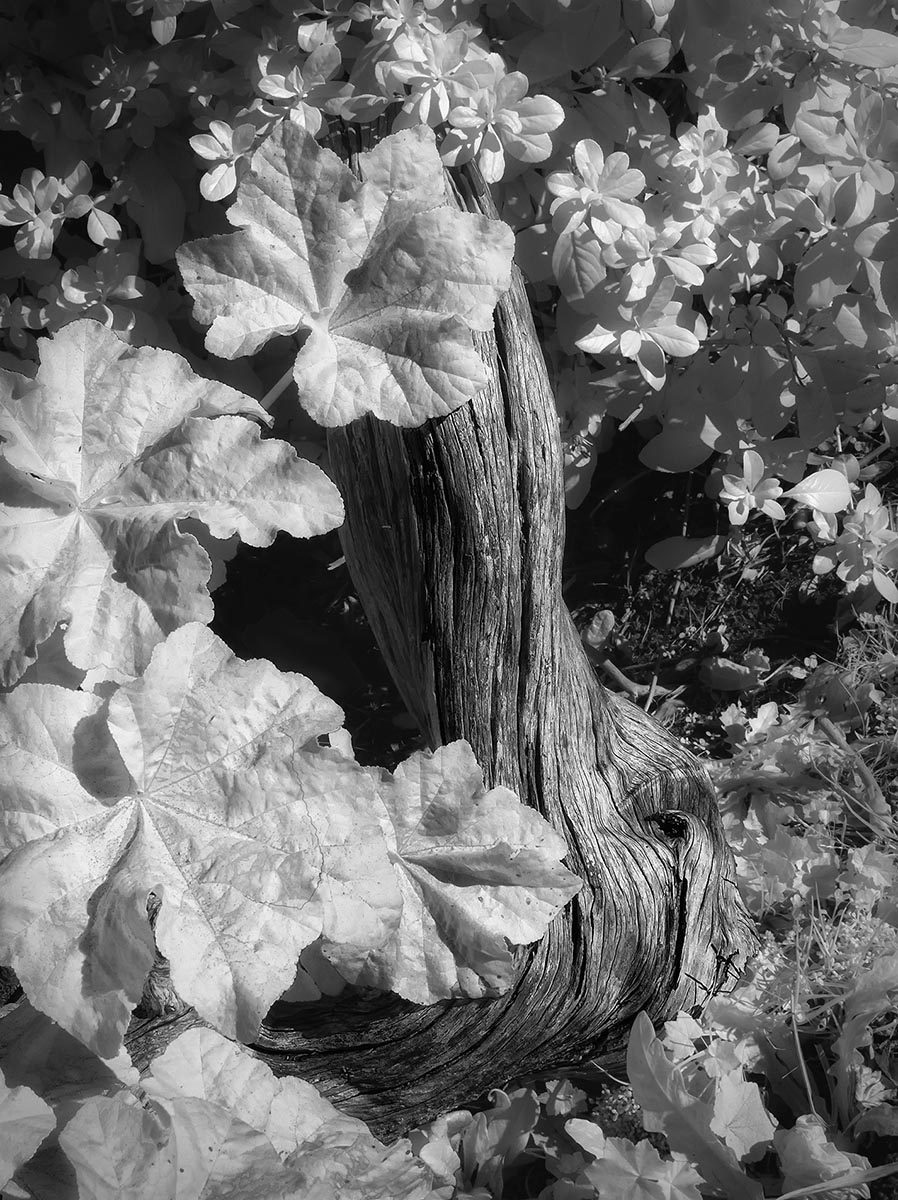
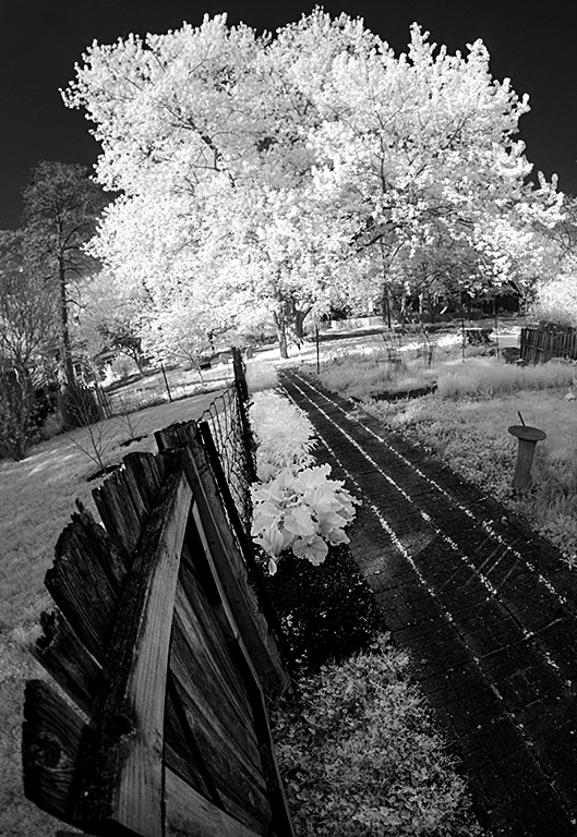
Thanks for the input.
The original was taken in fairly deep shade and it was pretty flat. I was able to darken the trunks quite a bit and I could have lightened the leaves more but I wanted them to have just a little tone so did not the push the gamma too far. But looking now at this I agree the leaves could be lighter. The trunks would look darker then.
|
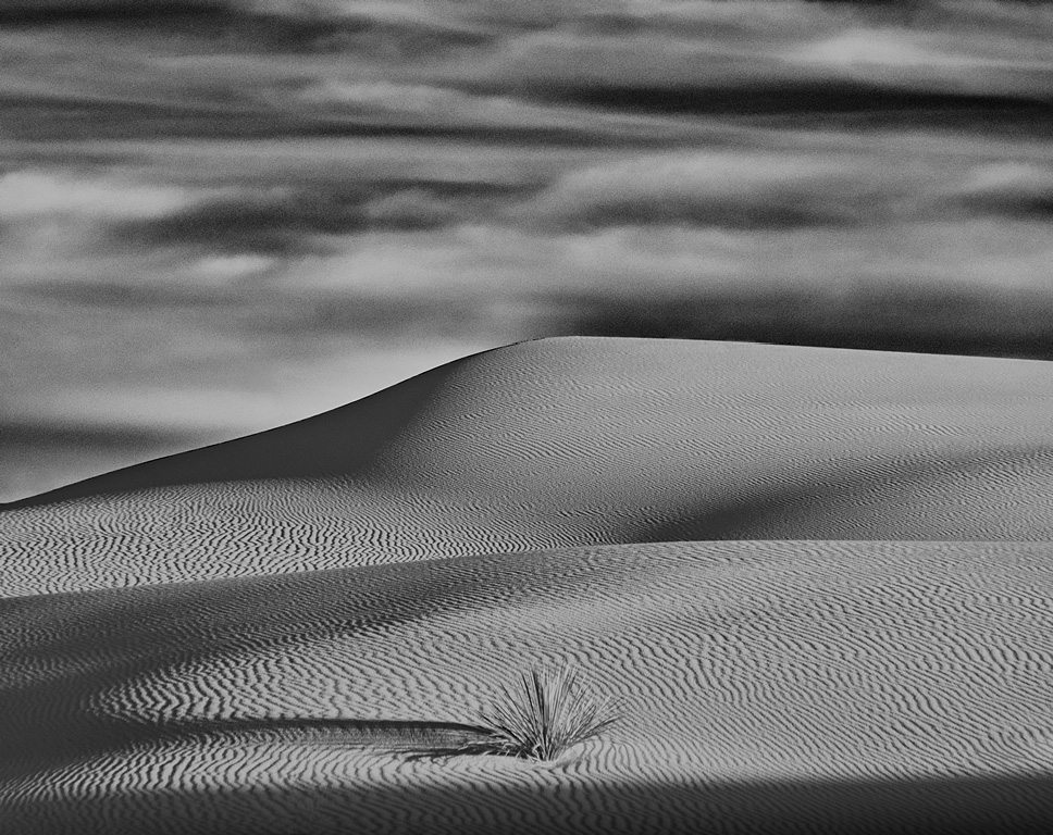
May 13th |
| 35 |
May 20 |
Comment |
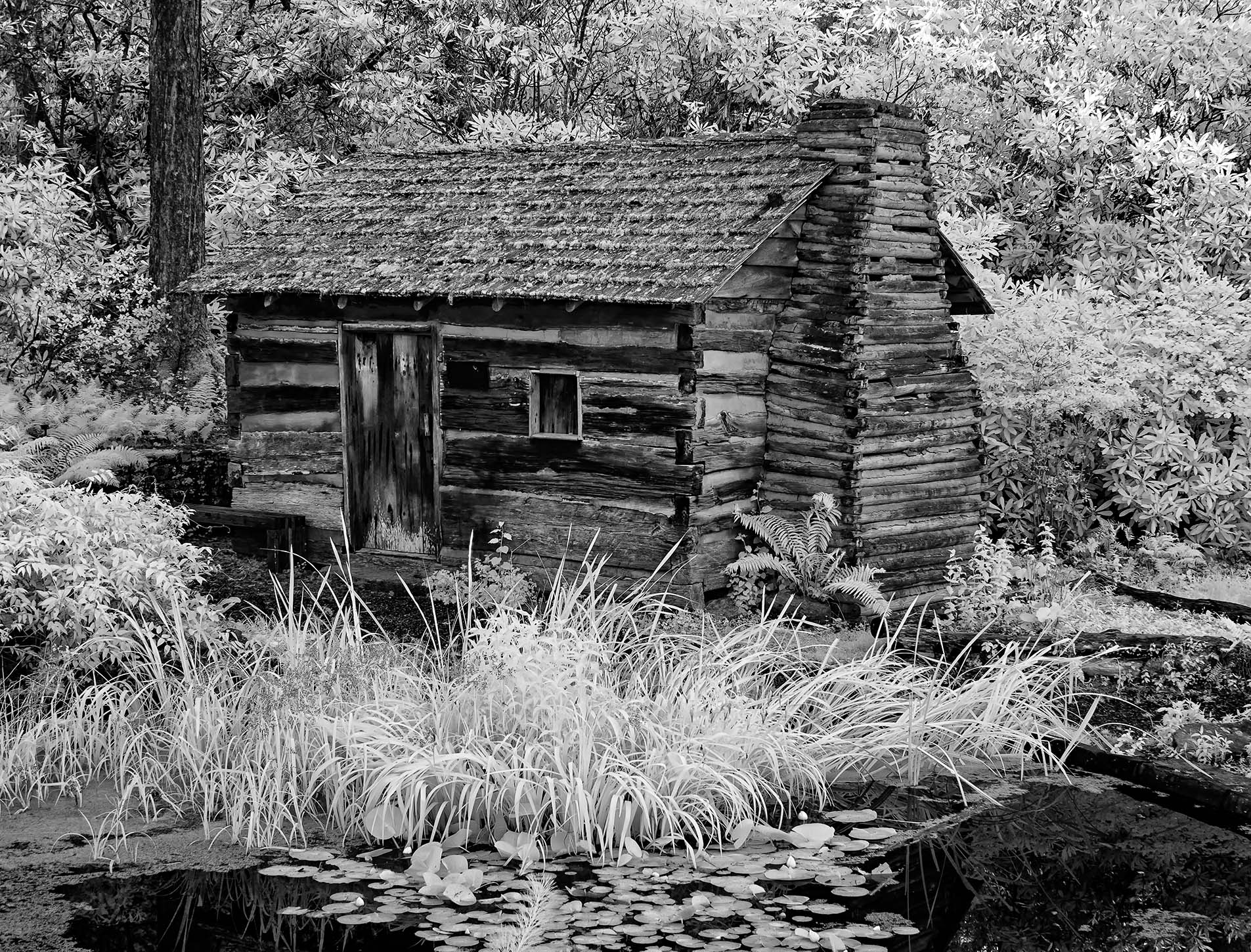
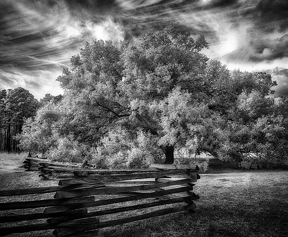
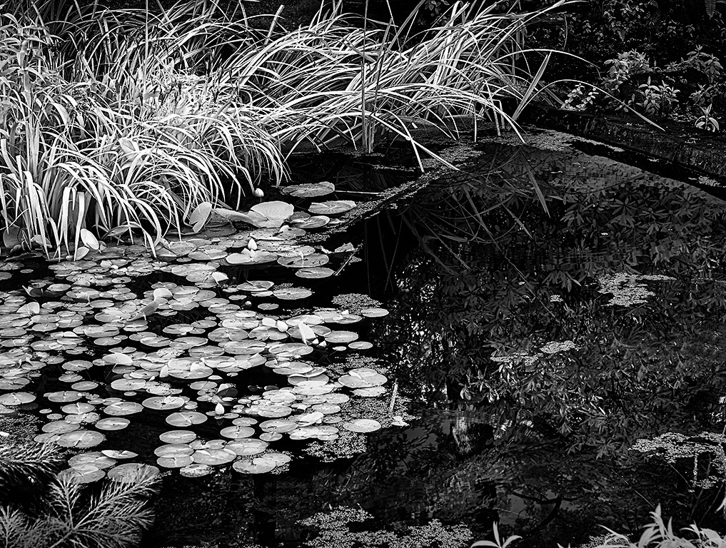
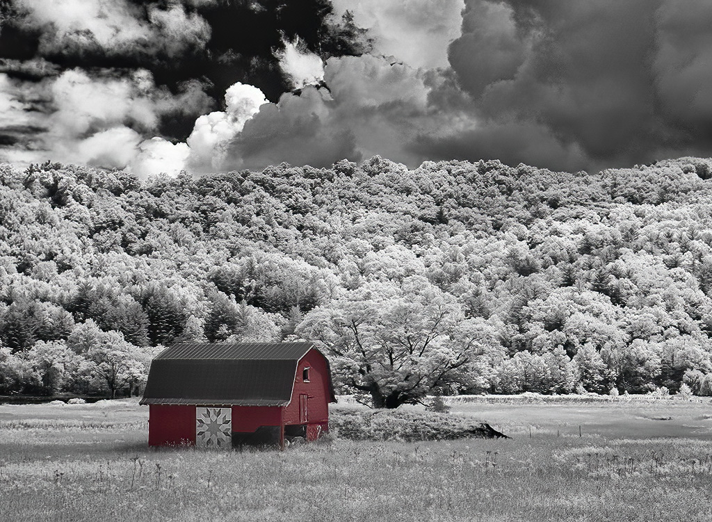
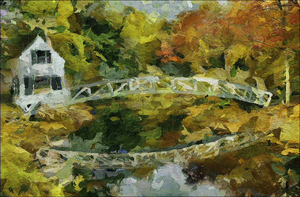
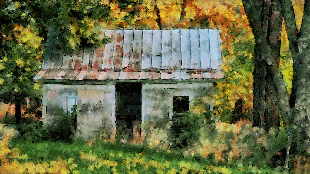
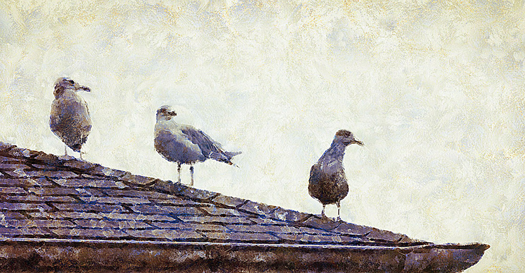
Those are Live Oaks. The "Old Ironsides" (USS Constitution) is made from Live Oak and cannonballs bounced off it due to the wood being so hard. There is a Live Oak in Charleston called the"Angel Oak" that spans a 183 feet.
I have a weakness for Spanish moss so I kept the Left side a little long so the "beard" stayed in the frame. |
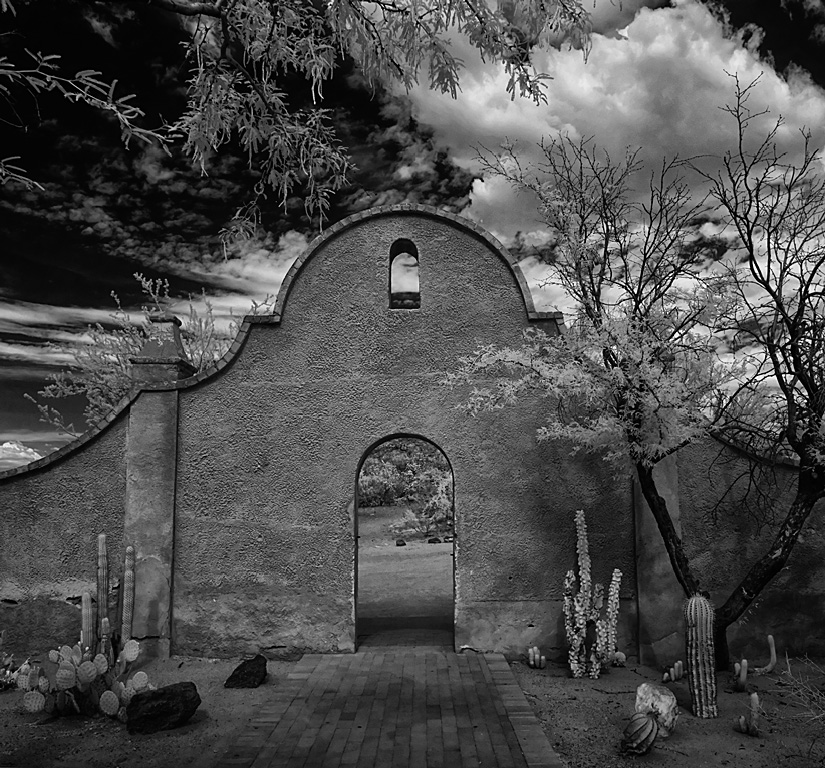
May 11th |
| 35 |
May 20 |
Comment |
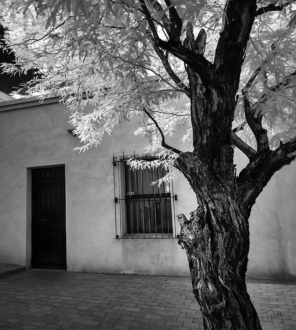
You have a much better picture of this church/tree than what I got!
I like the way you brought out the sky "drama" that not noticeable in the original
The tilt is completely acceptable since the tree is going every which way. Great crop.
Very nice.
|
May 7th |
| 35 |
May 20 |
Comment |
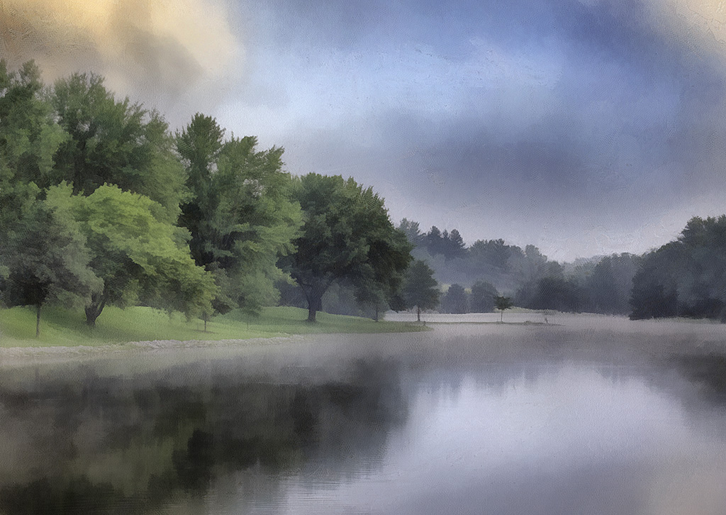
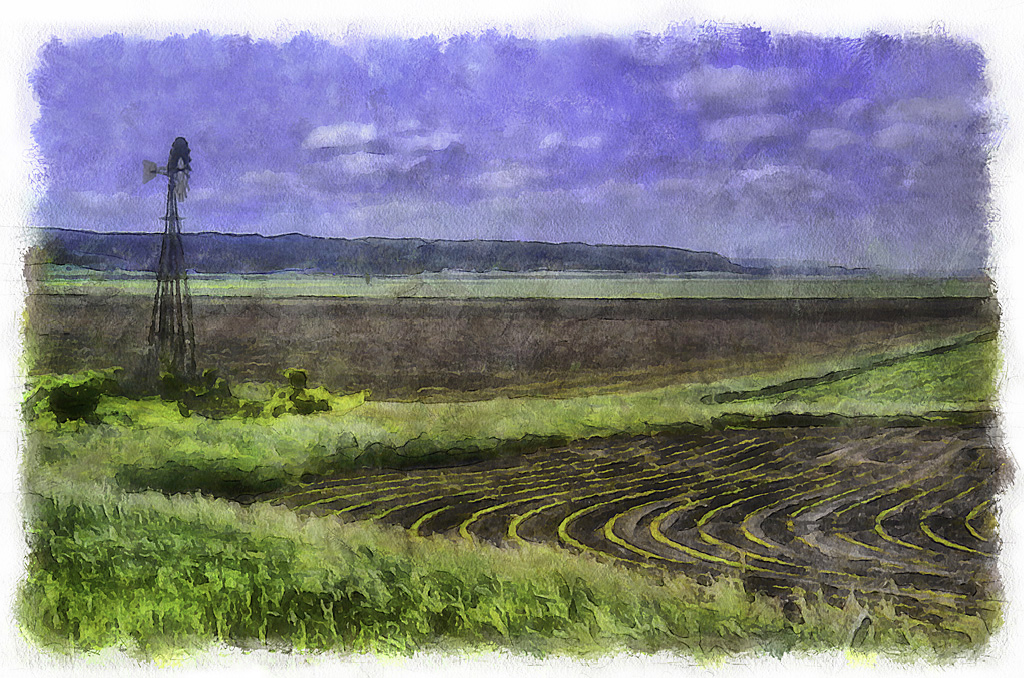
What a lovely image! The blues and pinks work together so well and it looks like a bright sunny day!
Yes, the brewery (how is their ale?), is a bit industrial looking but there are plenty of other elements to balance it, e.g. the foliage, the steeple, the stone wall and the babbling river.
I have this aversions to antennae so I would have cloned out those and I would have cropped off the fragment of building on the Right. Could you bring a bit more detail into the shadowed brewery smoke stacks?
Thanks for sharing. |
May 5th |
| 35 |
May 20 |
Comment |
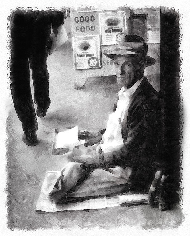
Very impressive. Nice bit of processing to pull this image together. I agree with going with the sepia, it gives this an "old time" feeling appropriate for the by-gone era.
The tower looms above us with a bit of perspective fall back. I wonder if you tried using Transform to pull the tower forwards?
|
May 3rd |
| 35 |
May 20 |
Comment |
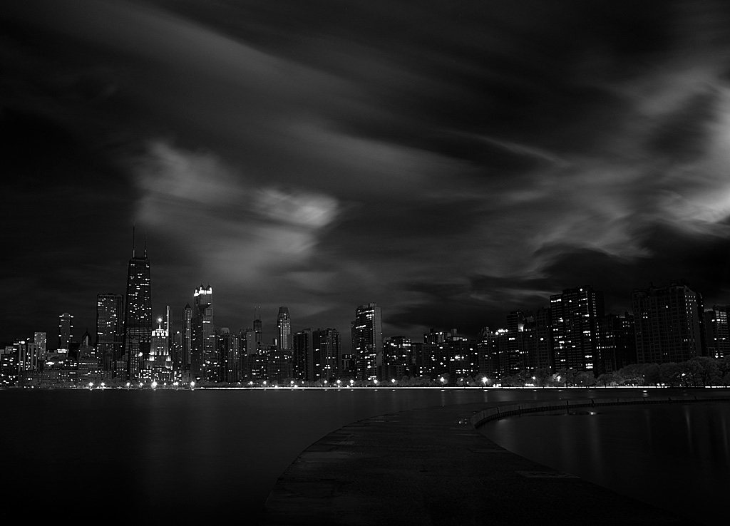
I like the brown/sepia tone, I think it is much more interesting than the monochrome. The blue-grey sky makes me think there is a storm coming.
I like how the curve caries the eye into the image.
This being a fairly tall image you could try darkening the lower edge so the viewer's gaze is directed up into the lighter mid portion.
|
May 2nd |
| 35 |
May 20 |
Comment |
Sometimes out of focus foregrounds can work but here the branch is actually bigger than the gazebo and thus I find it distracting.
I don't find the right side of the image adding much interest and I would have cropped some to keep the focus on the gazebo.
|
May 2nd |
6 comments - 6 replies for Group 35
|
| 56 |
May 20 |
Comment |
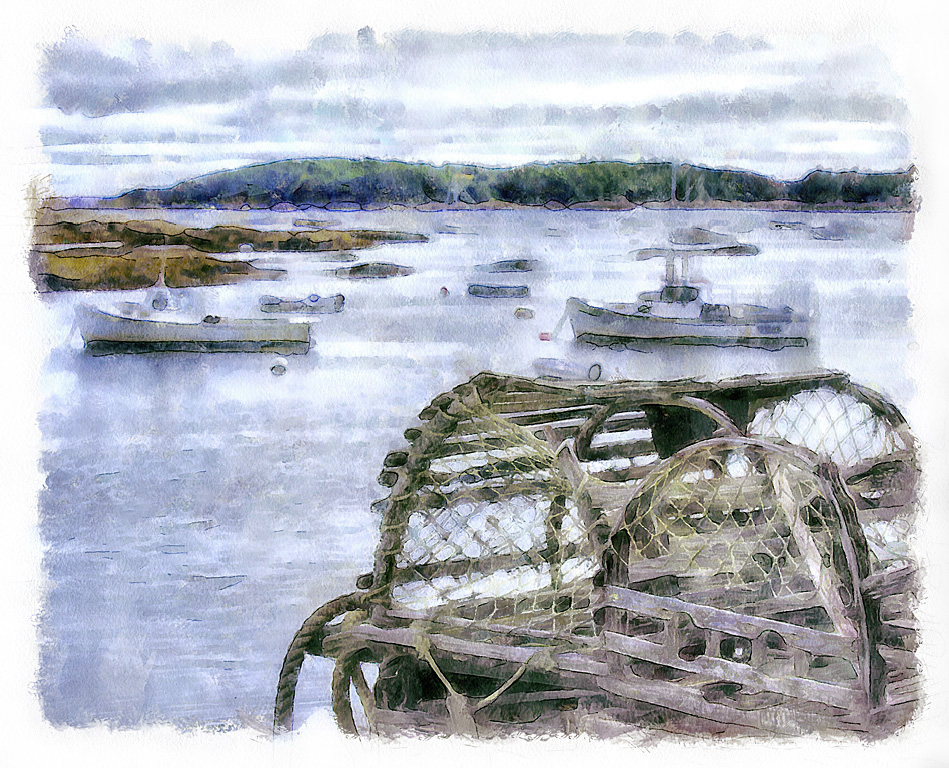
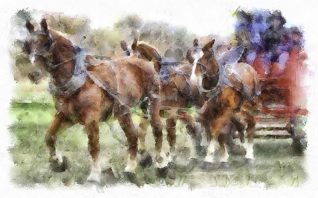
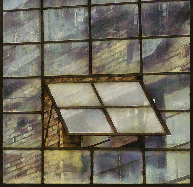
The DAP Watercolour filter (in addition to a few others in the DAP arsenel) produces the white border on any images it is applied onto.
I have even processed other images with that filter and erased almost all of the interior of that "pass" just so I could apply that border to those other images
|
May 7th |
| 56 |
May 20 |
Comment |
This is just brilliant. Not only in colour but in design. What a great idea.
You should submit these to one of those agencies that buys stock images. I think these would be of interest to photo editors. |
May 5th |
| 56 |
May 20 |
Comment |
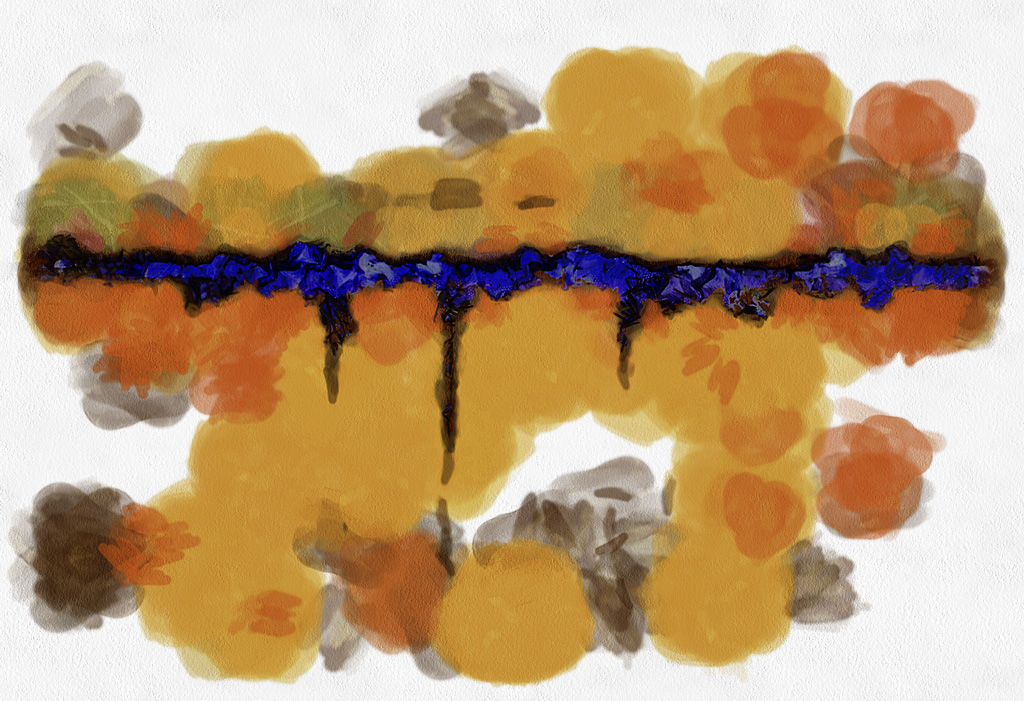
Wow, this is great!
I am wondering though if the texture of the blue sky is too different than the rest of the image textures?
Your collection of "originals" have some interesting images. I really like the blue and yellow one in the lower left corner.
|
May 5th |
3 comments - 0 replies for Group 56
|
9 comments - 6 replies Total
|