|
| Group |
Round |
C/R |
Comment |
Date |
Image |
| 35 |
Apr 20 |
Reply |
Julie,
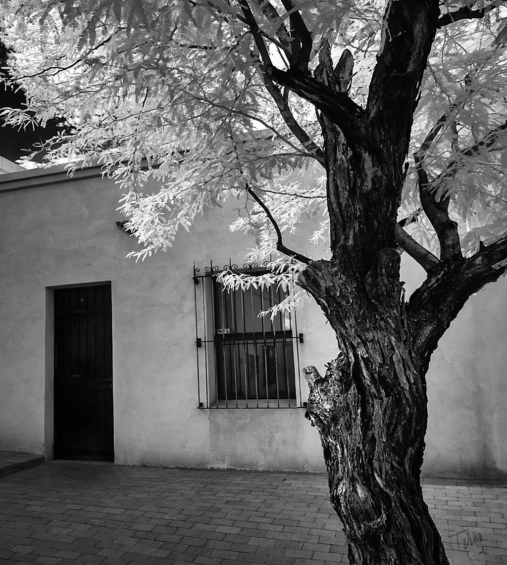
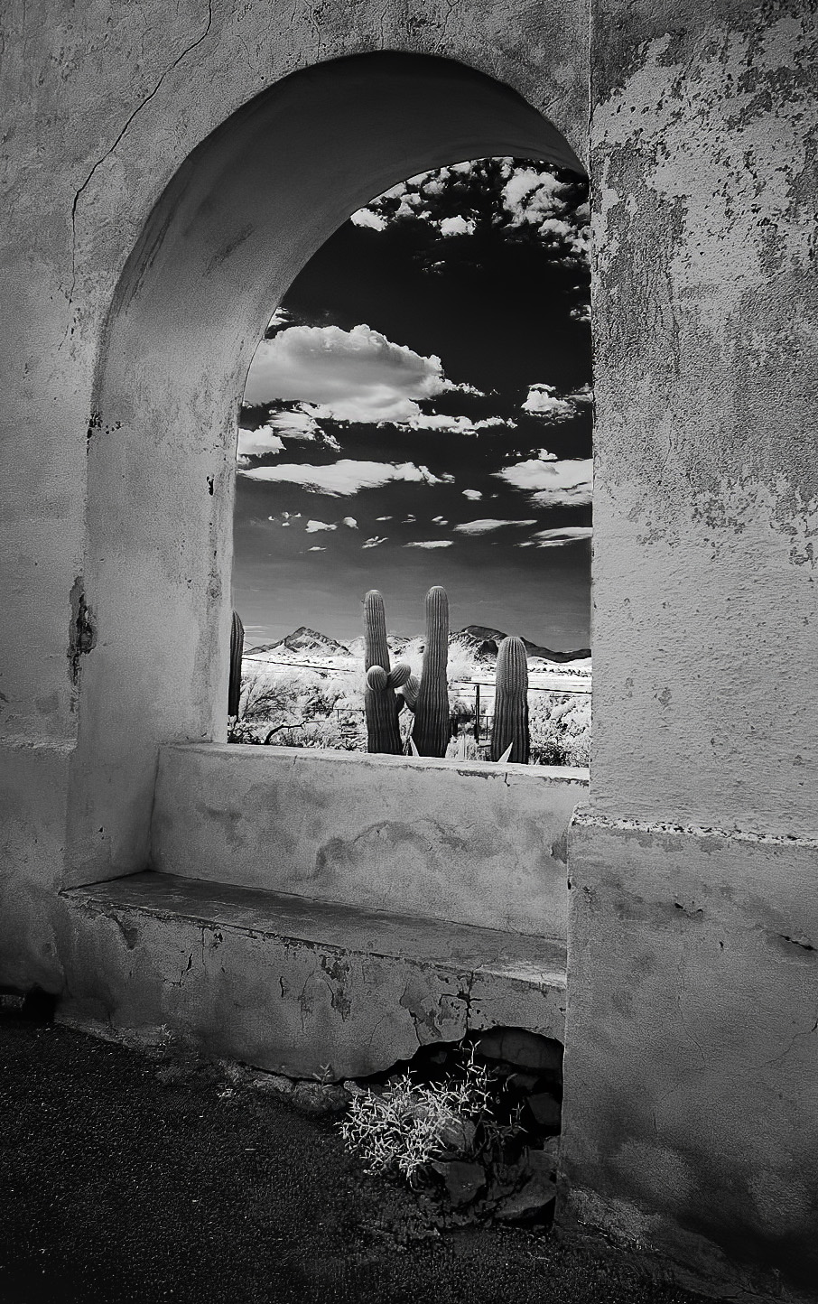
Thank you for your kind comments. I was in New Mexico in March, great area for IR!
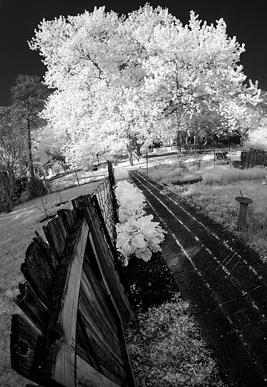
I did shoot this wall/garden from several angles but I could not avoid the branches unless I had been able to get very close to the wall (and I did not have an ultrawide lens with me). In hind sight I can rationalize that those branches help enclose the image and the thin leaves "blend" with the wispy clouds. What would we do without rationalizations?
I do think a slightly lower angle would have accentuated the perspective of the walkway carrying the viewer through the arch into the distance. That should have also increased the sky a bit. But one of the fun aspects of photography is the quest for that perfect shot! |
Apr 21st |
| 35 |
Apr 20 |
Comment |
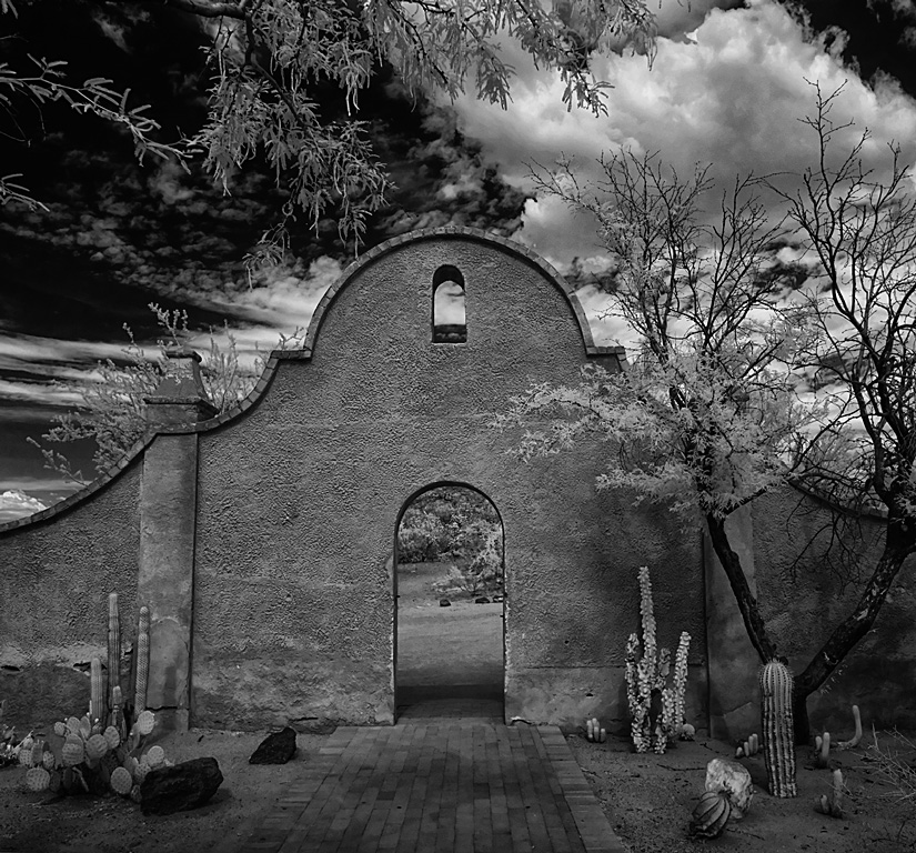
The interior of the Mission is really pretty, but I don't have any photos of that space. I hope to go back when I am in that area chasing storms in August. |
Apr 16th |
| 35 |
Apr 20 |
Comment |
Debbie,
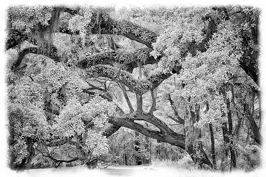
Were you at the Pawley's Island workshop with Mark Hillard in November? I just saw your image of the old motel and now you mention shooting this in South Carolina?
I was there and really enjoyed that workshop. Are your going to their IR workshop in Boone this June?
|
Apr 15th |
| 35 |
Apr 20 |
Comment |
Thank you all for your kind comments. In the coming months I hope to contribute images that meet the high level I have observed in your previous rounds.
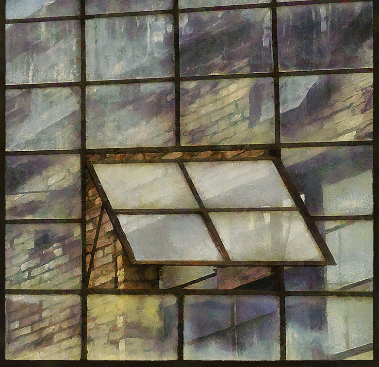
The Mission de San Xavier was started about 1780 and has several neat areas. I recommend stopping if you are in the Tucson area. I will probably submit a few more of its images in the future.
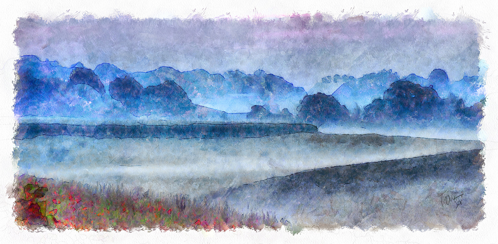
I agree this image seems to have two parts. I think that if you could remove the wall the foreground would mesh well with the background and sky. I think it works as a "straight" shot since the wall is nearly symmetrical with the path leading through the arch into the background.
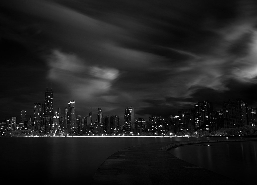
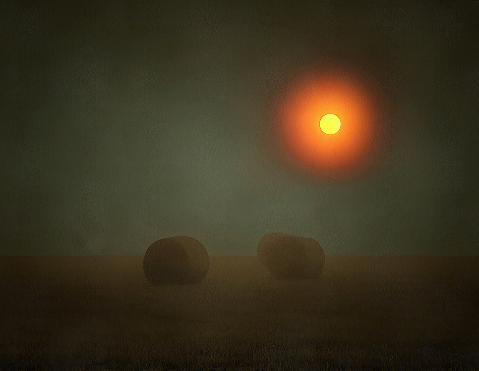
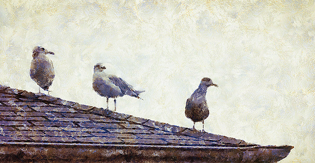
The black sky is what clues me that this is in IR. I was shooting almost directly away from the Sun and that usually gives the greatest IR effect. When shooting above 720nm I don't find a polarizer useful. I think I used the Fuji 14mm lens (21mm equivalent.)
Stuart, I agree. An image has its own dimensions and should not be cropped to "normal" sizes. But that means custom framing - OUCH! |
Apr 15th |
| 35 |
Apr 20 |
Comment |
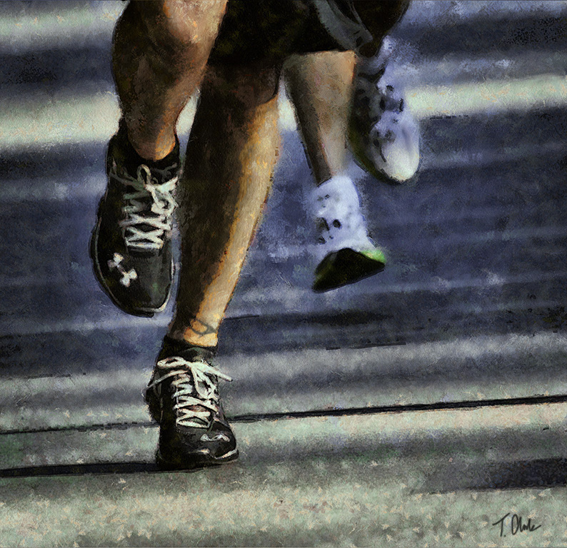
Well done!
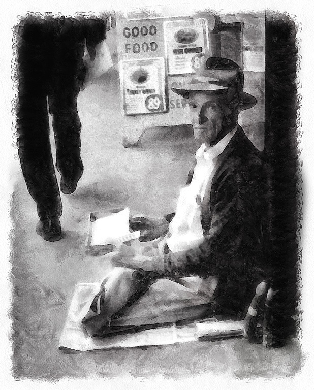
This is where monochrome shines. In colour this would be a mess. But in monochrome the viewer is forced to look at the shapes and textures.
I think the organized boots need the disorganized background to make them standout.
But I think the dial and cords on the left side are distracting from the central theme.
|
Apr 14th |
| 35 |
Apr 20 |
Comment |
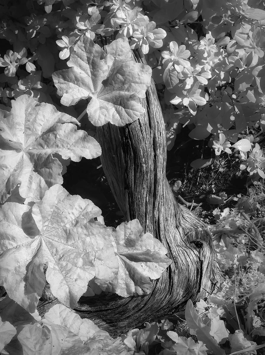
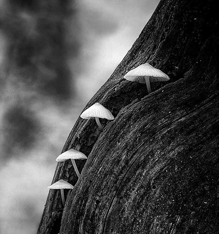
I like this a lot. It has a very Mesozoic feel. |
Apr 14th |
| 35 |
Apr 20 |
Comment |
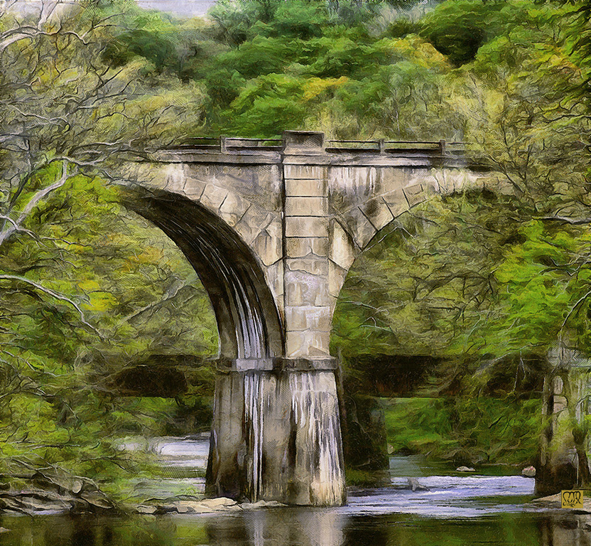
This a great image and your efforts are well worth your time.
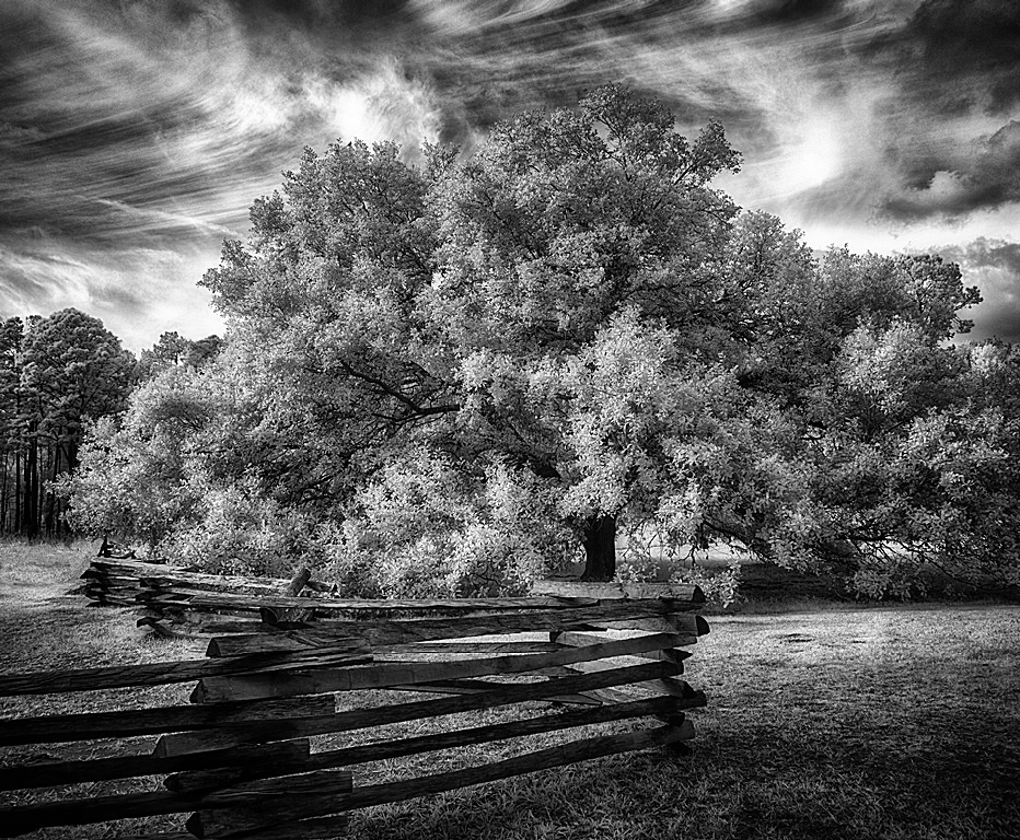
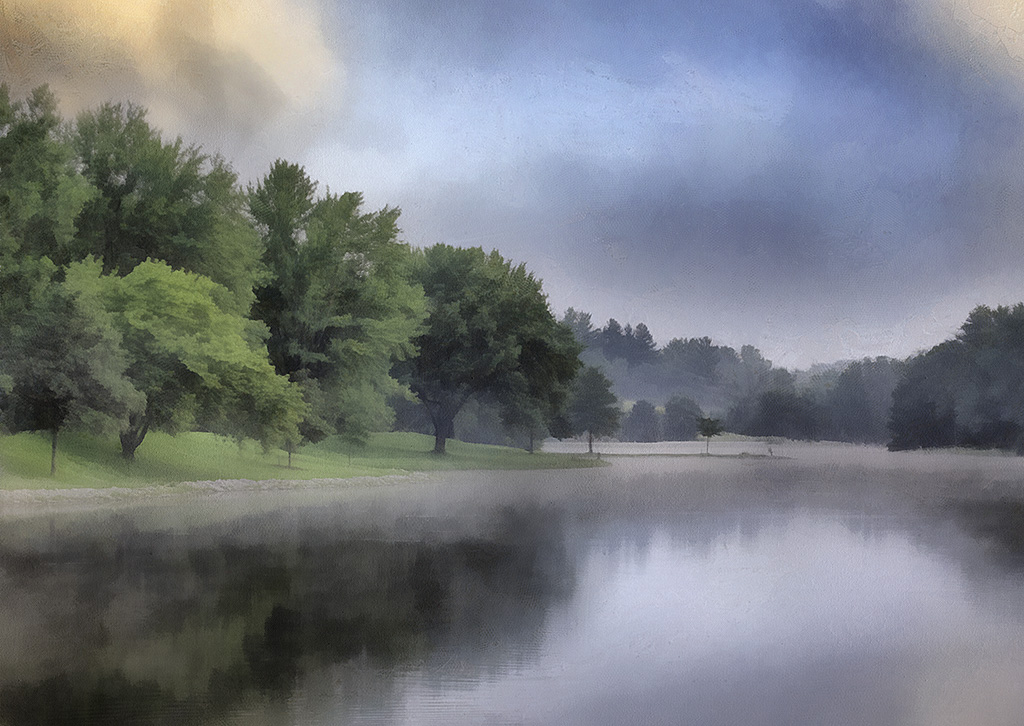
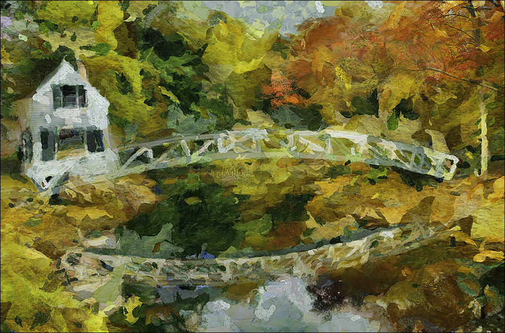
There are several great elements here that work well together. The organic trees in front of the industrial bridge is great. The shape of the trees mimics the curves of the bridge and the railings.
I agree about the lightness of the foreground. One thing I learned from the Hudson school of painting was how they darkened the lower foreground, forcing the viewer to raise their eyes to the "meat" of the image. I duplicate this by adding a layer with a black to transparent gradient from the bottom that is then reduced in opacity to a gentle darkening. |
Apr 14th |
6 comments - 1 reply for Group 35
|
| 56 |
Apr 20 |
Reply |
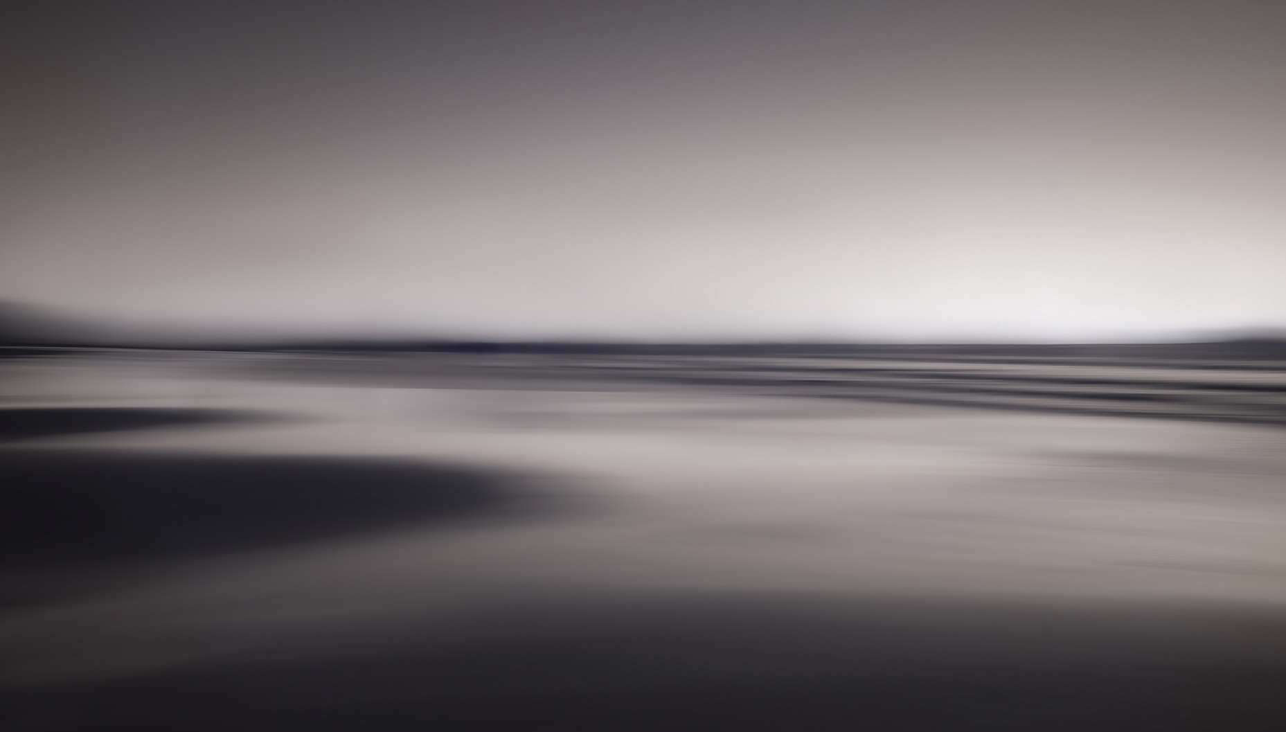
The original rust had that some of that blue quality you see sometimes when steel rusts. I know the addition of chromium to steel can give a blue colour but sort of doubt they would have put much chromium in the steel in a truck cab from the 30's or 40's.
The software brought that blue out and I liked it so I accentuated is some. |
Apr 8th |
| 56 |
Apr 20 |
Comment |
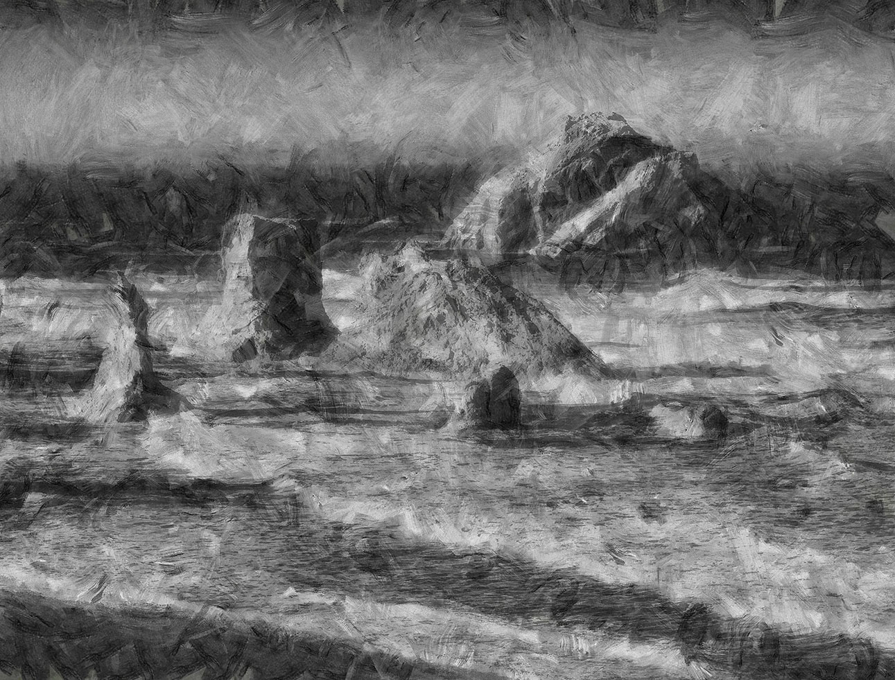
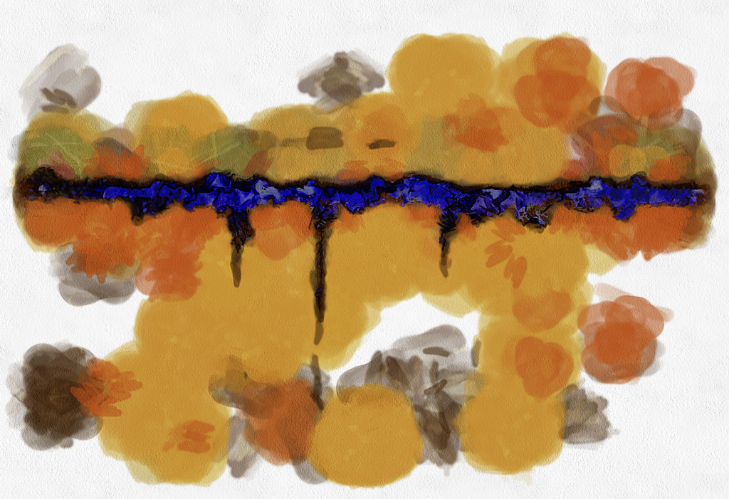
D.A.P. has a lot of flexibility. Besides the presets and the processing duration there are adjustments for brush sizes, palettes, amounts of impressionism or surrealism, etc.
I don't know Jack Davis. Could you point me to some of his work?
I agree the brown does not add much to this but I think the image would be lessened by removing it. As you say it "groundes" it.
Others have suggested other editing changes and it is an abstract so anything goes. But I still like the openness of the way I left it.
|
Apr 8th |
| 56 |
Apr 20 |
Comment |
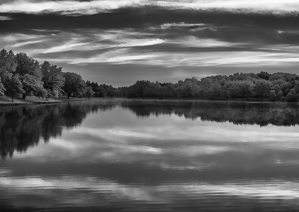
Love the juxtaposition of the horizontal lines with the vertical trees! I especially like the warm tone you brought into a "cold" image.
One trick I adapted from the Hudson School of painting group is to pull a black-clear gradient up from the bottom and then reduce the opacity so it just darkens the bottom slightly. This causes the viewer to lift their eyes up to the "meat" of the image. |
Apr 6th |
2 comments - 1 reply for Group 56
|
8 comments - 2 replies Total
|