|
| Group |
Round |
C/R |
Comment |
Date |
Image |
| 67 |
May 20 |
Comment |
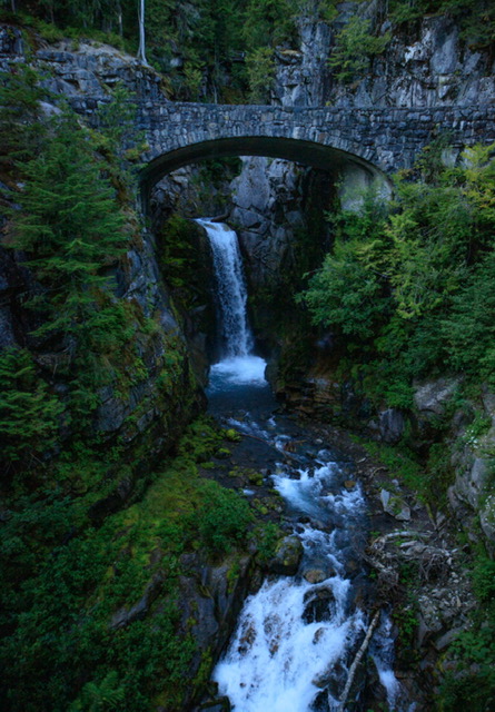
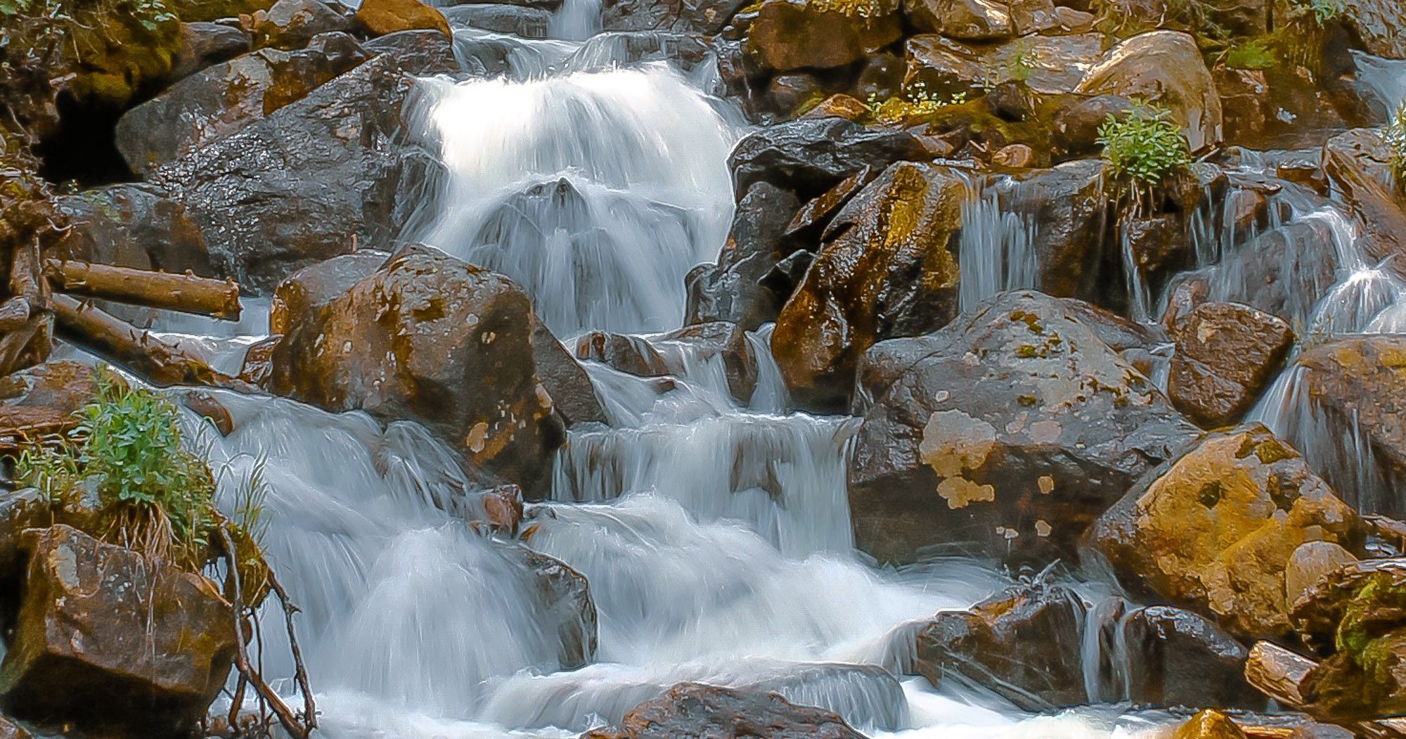
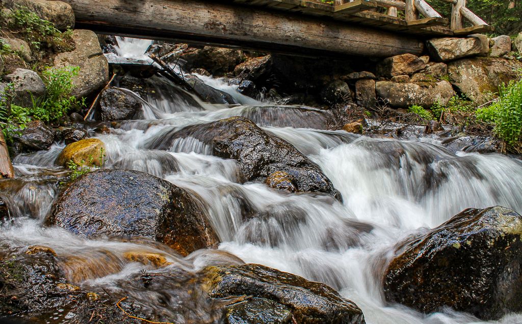
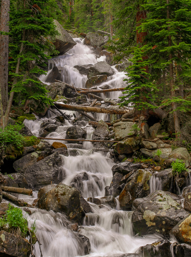
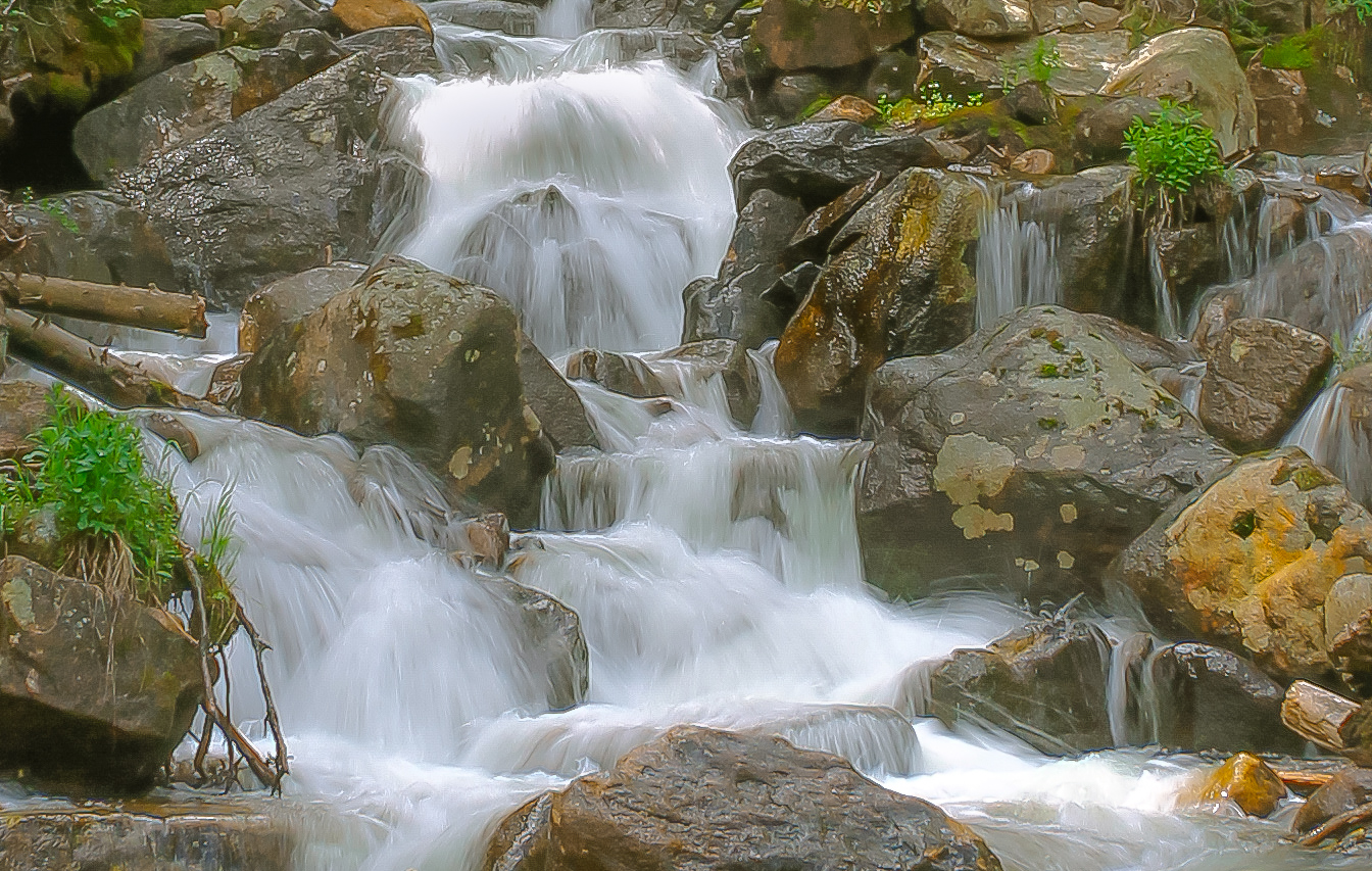
Here is the updated version. I softened up the image a little and when back to the "color" profile vs. the "modern 7" profile.
It was difficult to reduce the highlights on the upper water fall without degredation of the light. |
May 9th |
 |
| 67 |
May 20 |
Comment |
Larry, Madu, Michael, and Richard,
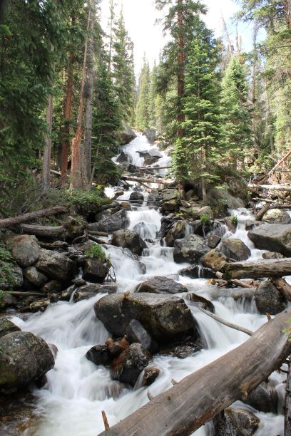
Love the feedback. Thank you! I have attached the original version of this image that I also used back a few months ago. I cropped the that image to make this one, versus using the original version.
Looking at this one, I can see the issues with the oversaturation of the rocks. I guess my goal was to provide a warmer version of the image, hence by using the modern 7 profile in LR, and making adjustments off of that, it really darkend the over image and made it too "orangy".
I play around a little more and will post that version as well.
|
May 9th |
 |
| 67 |
May 20 |
Comment |
What a balancing act! Remarkable shot Madu. The reach is incredible for these animals. Vertical composition is perfect for this in your cropped version and does this image justice. Looking at your original, it is really washed out, and you did a very nice job working the light, colors, shadows, contrast, highlights, etc. in Post-production. I like the warm hues you added for the afternoon light.
DOF is perfect and I feel that if you were any tighter on the subject, you would have lost some of the elephant. I would also suggest adding a little more light or decreasing the shadows to the face and eye. Even the tusks appear to have some light on them. Use that to your advantage. Very nice image my friend. |
May 9th |
| 67 |
May 20 |
Comment |
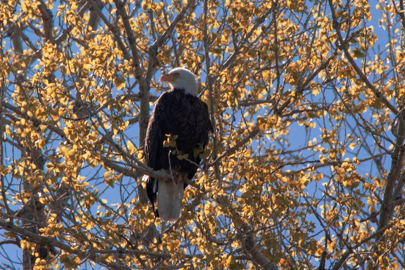
Way to use your time Richard. Your version is a good choice with the crop. It enhances the bird very well. The colors are nicely blended. Darkening the background would bring the colors our more and allow the bird to stand out a bit.
As Larry mentioned, the highlights on the branch really do whitewash the wood. It almost makes the branch look fake, compared to the original. Bringing those down and maybe increasing the contrast a bit would balance that out. Might have to play around with it.
It is definitely spring time with all the birds out an about. Very nice capture. |
May 9th |
| 67 |
May 20 |
Comment |
Way to sacrafice yourself for the shot Larry! Hope you had a change of clothes afterward :)
Very detailed capture from side-to-side with the water and bubbles and shore bird standing in the middle. I couldn't agree more with the light on the surf and bird's breast; beautiful capture! The light in the water's reflection in the background and bokah are perfect and just shaded enough to enhance the foreground. I like the image as it also looks like the bird is standing on one leg.
When I expand the image, there is one really cool feature I'm not sure anyone has seen. Right at the bottom of the roll just underneath the bird's breast is the reflection of the bird's head, beak and eye. |
May 9th |
| 67 |
May 20 |
Comment |
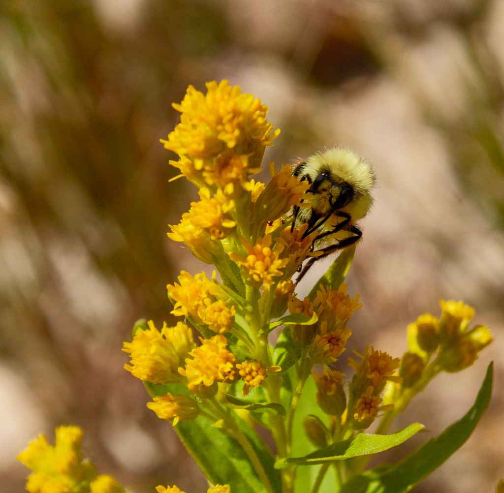
Jason, great close-up. Nice capture of the bee in motion with 1/90 sec. I do like the bokah in the background as it brings the eye to the foreground with bee nad the crocus flower.
There are three areas of detail that caught my attention. 1. Lack of sharpness of the flower. Lack of sharpness to the body of the bee, 3. when enlarged, I can count the pixels. I would attribute this to your aperture at f/4. If this were enlarged for print, it would realy be degraded by the noise. A smaller aperture f/8-f/11, would have likely brought in more detail in the foreground leaving your background still with bokah to blend in. Very nice natural light and the contrast with the shadows and light are nicely compensated. I would concur with Michael, that the noise could be caused by the high ISO.
Shooting these close-up shots is a definite challenge. I know, take a look at my previous image from August 2019 of the bee I shot and cropped. Not an easy feat. |
May 9th |
| 67 |
May 20 |
Comment |
Very nice composition Michael. Colors appear balanced as well as the light. Not sure what the original looks like, as far as detail, but this is done well and solidly places the Anole as the center subject. I personally like the larger version better as the re-cropped version, which cuts the tail off as well as the petal of the iris at the bottom, though it does bring the Anole in closer.
Overall the image is clear and sharp with some degredation/blurriness along the outer edges. BUT... those are not the focus, so it does work well. You have great detail in the Anole's body. Good dynamic range and not overwhelming. Nice blend of colors all around. Not knowing what the lighting was like, the one thing I do notice is the body appears just a bit highlighted, which suggests side lighting. |
May 9th |
7 comments - 0 replies for Group 67
|
7 comments - 0 replies Total
|
