|
| Group |
Round |
C/R |
Comment |
Date |
Image |
| 24 |
Jul 19 |
Comment |
Happy to say the printed version for the exhibition was awarded judges choice!
|
Jul 21st |
| 24 |
Jul 19 |
Comment |
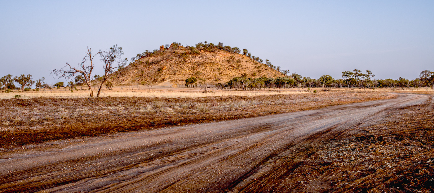
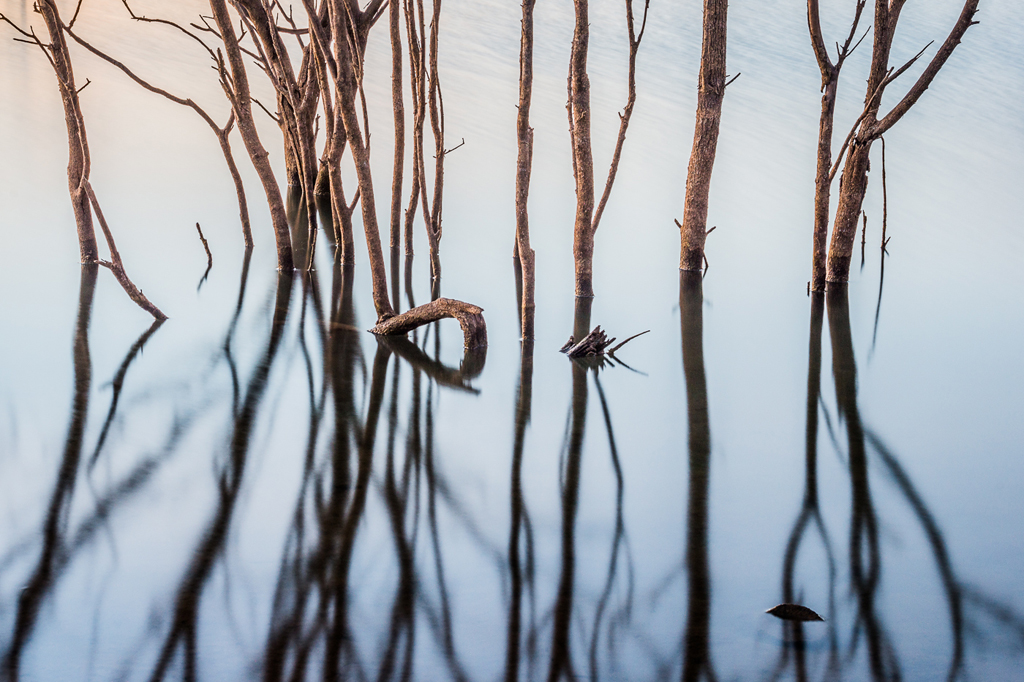
I do like the colour version. The coolness of the blue adds to the feeling of cold and harsh conditions. |
Jul 17th |
| 24 |
Jul 19 |
Comment |
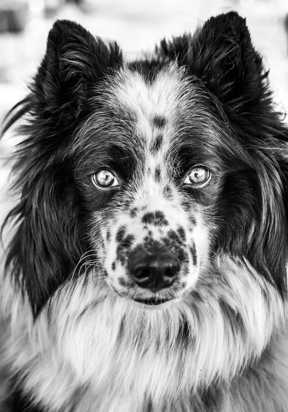
Yes, I am a fan as well. I like the desaturated look, as it adds a nostalgic feel. |
Jul 17th |
| 24 |
Jul 19 |
Comment |
Love the compression which makes the stacking all the more impressive. I too struggle with fast moving objects so appreciate the thought behind this
|
Jul 17th |
| 24 |
Jul 19 |
Comment |
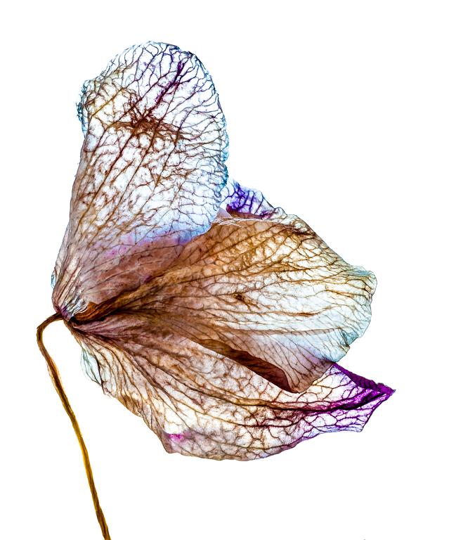
I love the contrast of the spiky cactus against the soft delicate tissue like softness of the flower. Black and white I think is a good choice to show this |
Jul 17th |
| 24 |
Jul 19 |
Comment |
I also agree with the comments given. I do like the coloured version as well, perhaps with the top section cropped to simplify it a little. |
Jul 12th |
| 24 |
Jul 19 |
Comment |
I love this image! So sharp and crisp. I think increasing the saturation was a good choice, as it adds to the life and energy of all that is going on. |
Jul 12th |
| 24 |
Jul 19 |
Comment |
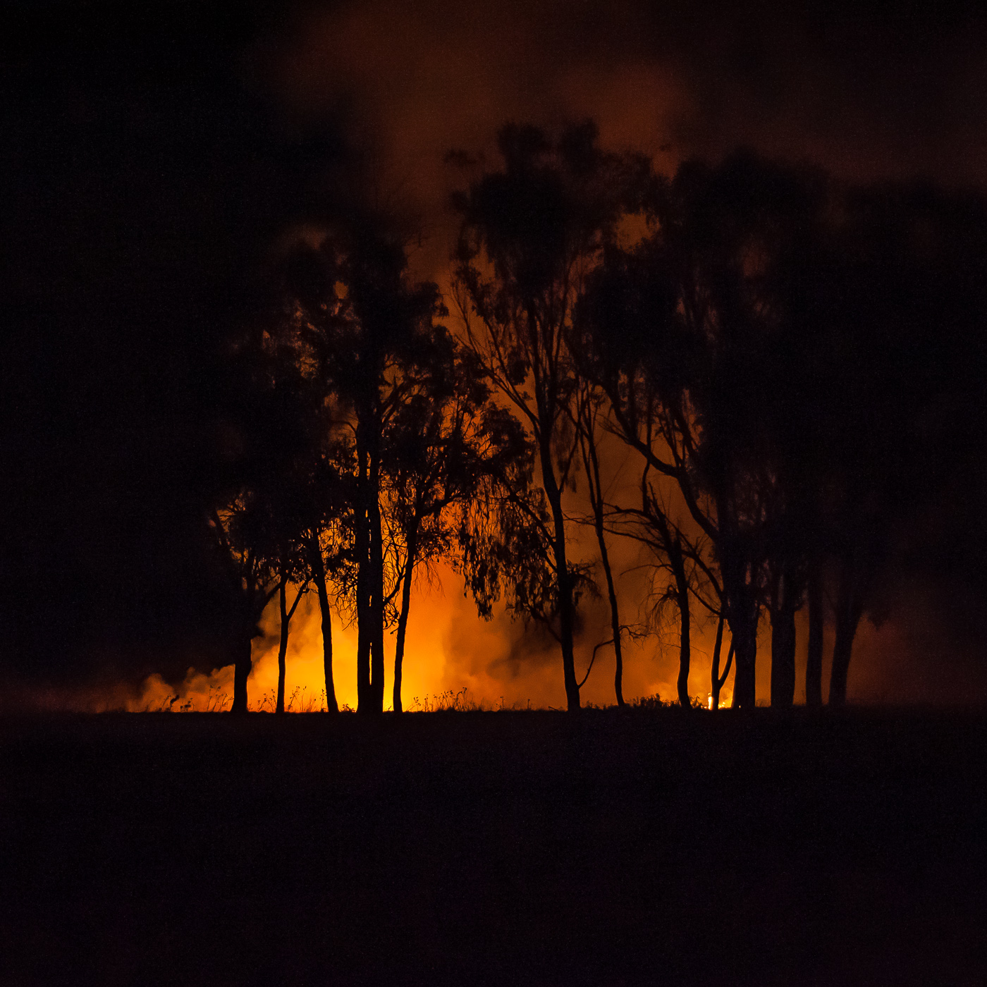
Thank you all for your comments. Laura, I did attempt to open up the shadows but there is some really ugly noise in there. I have just prepared the image for an exhibition, printed on rice paper, waxed and backed with gold leaf. Very happy with the result. I would share it however it would be difficult to capture the effect. The fire glows.
|
Jul 12th |
8 comments - 0 replies for Group 24
|
8 comments - 0 replies Total
|