|
| Group |
Round |
C/R |
Comment |
Date |
Image |
| 62 |
Dec 19 |
Comment |
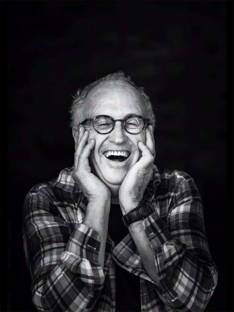
Sorry for late replay Israel - I've really been struggling back and forward, looking at the other edits and I even had a go myself. Overall, to my eye, your submitted image is my favourite edit. Your second edit gives extra information and I don't mind the man in the background, to me it gives context, and shows it is not a staged photo. However the one with the white line around it has too much light for my preference. I prefer your edits to the others offered.
Also, the little girl bothered me a bit, I would prefer there was a bit more light on her.
I always enjoy your images so much and thank you for another lovely image. |
Dec 24th |
| 62 |
Dec 19 |
Comment |
Hi Bob - I really like your original photo, and the idea of converting it to black and white (in which the leaves look amazing - so pretty and delicate) and then adding the moon (which also looks great).
I don't think it has quite realised its potential but I admire your attempt, having attempted a composite myself recently. It leaves me feeling unsettled having the moon over the tree like that - I want to pick it up and move it to the left of the tree altogether lol.
There is so much to think about with a light source in an image and its good for me to learn about too. I wonder if it would look pleasing to you if the whole image was lighter, like your original black and white, and the moon could still be added. I am guessing it would have less atmosphere though. Oh so many things to think about! Also, I don't think the moon is too big - sometimes we have a very low moon here and it looks enormous - much bigger than what you have done - size is perfect. |
Dec 22nd |
| 62 |
Dec 19 |
Comment |
Hi Gary - oh I don't like the sound of those two rough days at sea - it really puts me off ever doing a cruise!
I love the colours in the original, especially the amazing green of the sea. The black and white version puts more focus on the boat itself, which is your purpose. The composition is good and I imagine it was not easy to get the whole ship in the frame due to its size but you have done it well and given a little background for context.
On both of my screens the sky is pixelated in circular waves across the image. Oliver has darkened and smoothed the sky and it is an arrangement I like; however the ropes on Oliver's version look overprocessed I think. To me, the whites might be a tiny bit bright. Other than this its quite cool and I agree - it does look like those old fashioned posters of ships.
Wishing you a happy holiday season and look forward to seeing your images next year. |
Dec 22nd |
| 62 |
Dec 19 |
Comment |
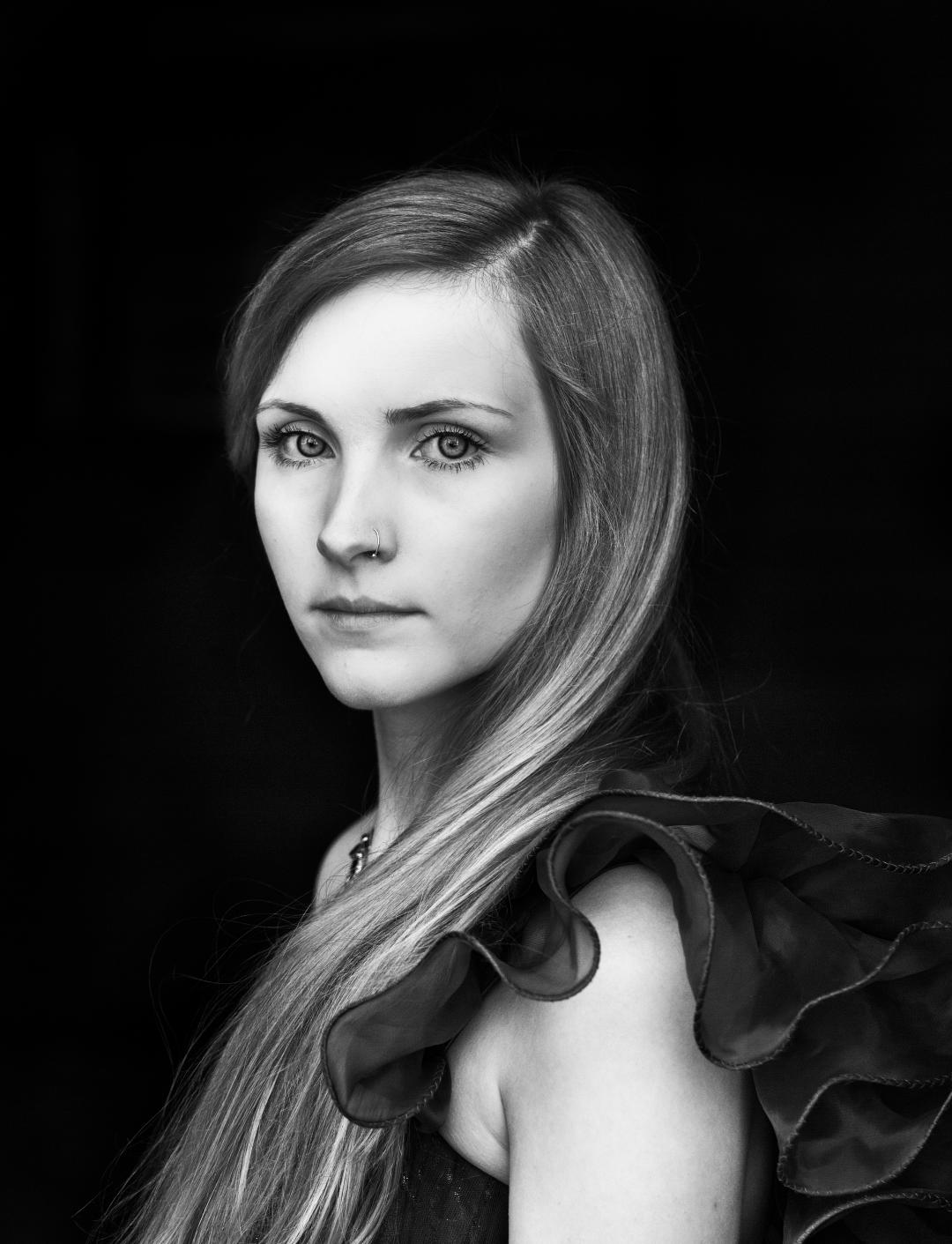
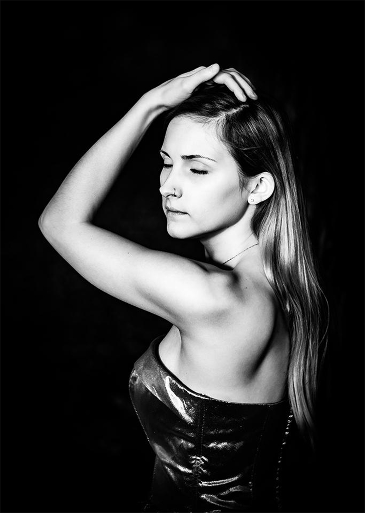
Hi Oliver - wow - what impact! Her face looks amazing! Her eyes look great lightened like that and are much much better than the original to me. I was thinking how shiny her hair looks - like fake hair but then I realised it likely is a wig! lol. I do think her skin of her body below the neck all looks a bit 'off' to me, also her bra strap - something odd going on with the blacks there - on my screen anyway. I love her face though and the detail everywhere else though. She's fab! |
Dec 22nd |
| 62 |
Dec 19 |
Comment |
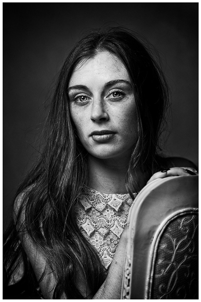
I think its a great portrait - you're right - she has a great twinkle in her eye and shows her personality in her expression. I love the flowing hair too. I like your crop - it gives her space to look off into. After looking at other people's comments I agree the white in the hat is probably a bit whiter than anywhere else, and you likely want the light on her face. Its really a great portrait and well done for taking such a shot from someone you don't know. I wouldn't know she has no teeth - I agree ... beautiful. |
Dec 22nd |
5 comments - 0 replies for Group 62
|
5 comments - 0 replies Total
|