|
| Group |
Round |
C/R |
Comment |
Date |
Image |
| 62 |
Jul 19 |
Reply |
I did not know that - thank you LuAnn! |
Jul 22nd |
| 62 |
Jul 19 |
Comment |
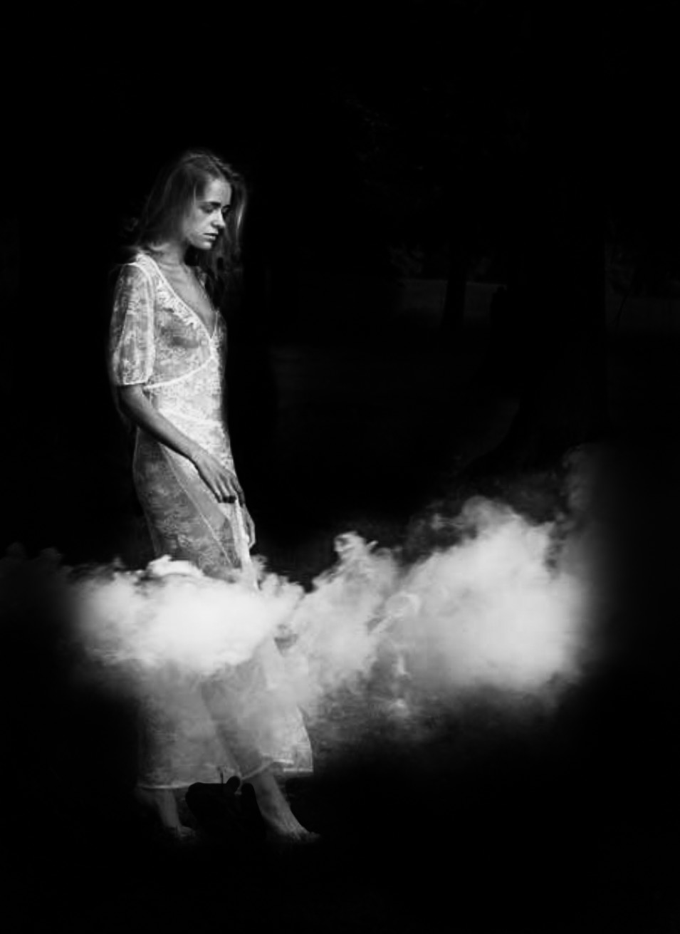
Well, first of all lucky you! What a great gift from your wife. I think the version you did after seeing Oliver's feedback enhanced your image, but if you wanted something really different I thought I would give you an alternative type of image! I've gone to the complete extreme! I like things dark - I'm really sorry I couldn't download your photo - I had to take a screenshot so this is just to give you an idea so it is poor quality.
I personally love the idea of her walking in clouds or something to that effect. Blacking out all of the other stuff brings it down to something a bit more abstract in meaning. I wonder what you think of this extreme version! |
Jul 22nd |
 |
| 62 |
Jul 19 |
Comment |
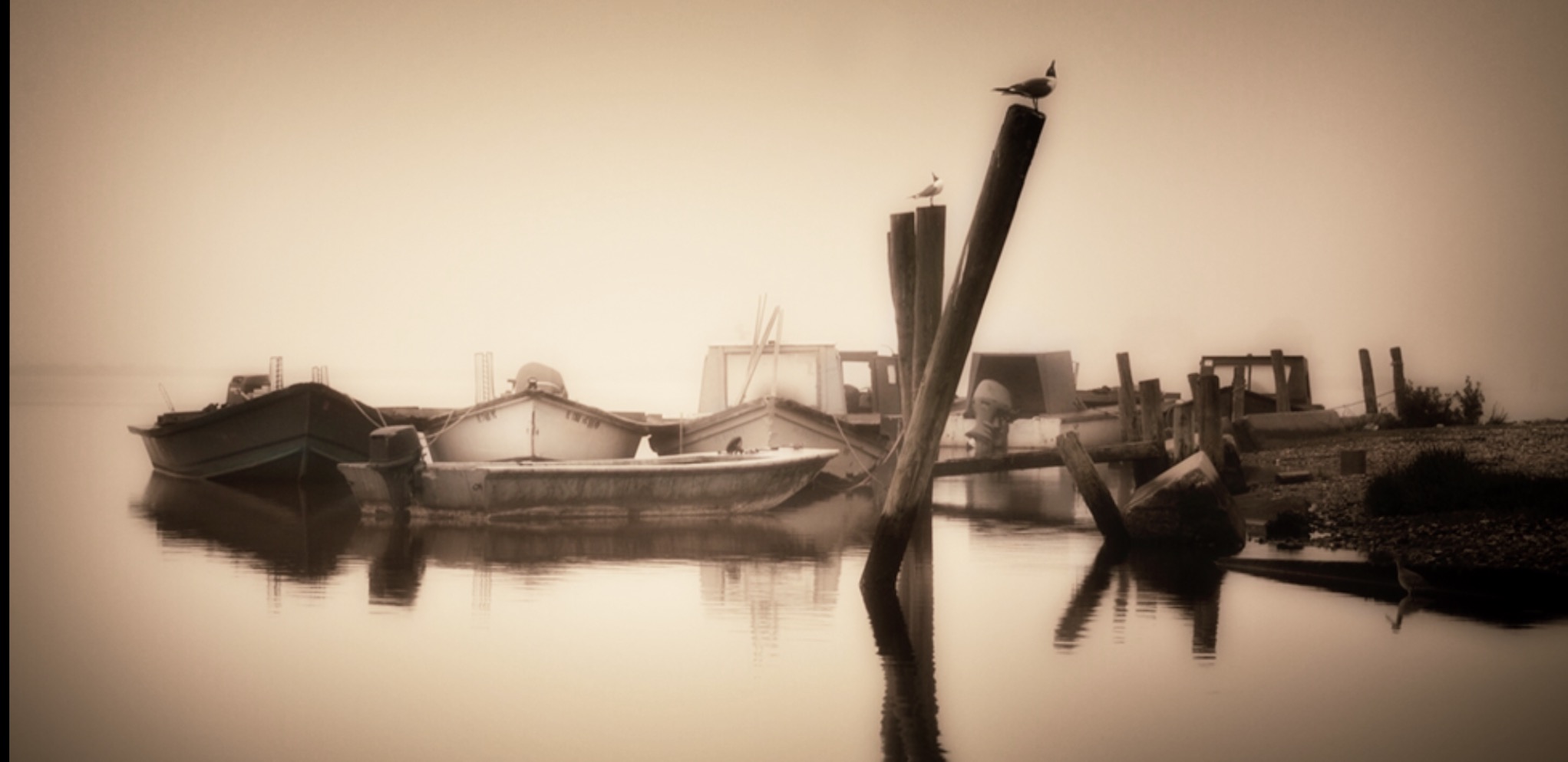
To my eye the image hangs up in the air - I cropped it in so that it pleased my eye more as the focus was on the boats rather than a body of water. I applied a slight vignette to focus the glow. I loved the warmth and softness of your original image so my attempt might have completely missed the mark. I noticed some difference in shading around the pole and the bird and a small mark from a mark on the sensor maybe in the middle top? Its a pretty special thing to have an image of something that is no longer there. On my work computer my image looks really terrible, but it looks ok on my ipad. I'd be interested to hear if you like the crop or prefer your own version. It does have a beautiful stillness to it. Well done. |
Jul 22nd |
 |
| 62 |
Jul 19 |
Comment |
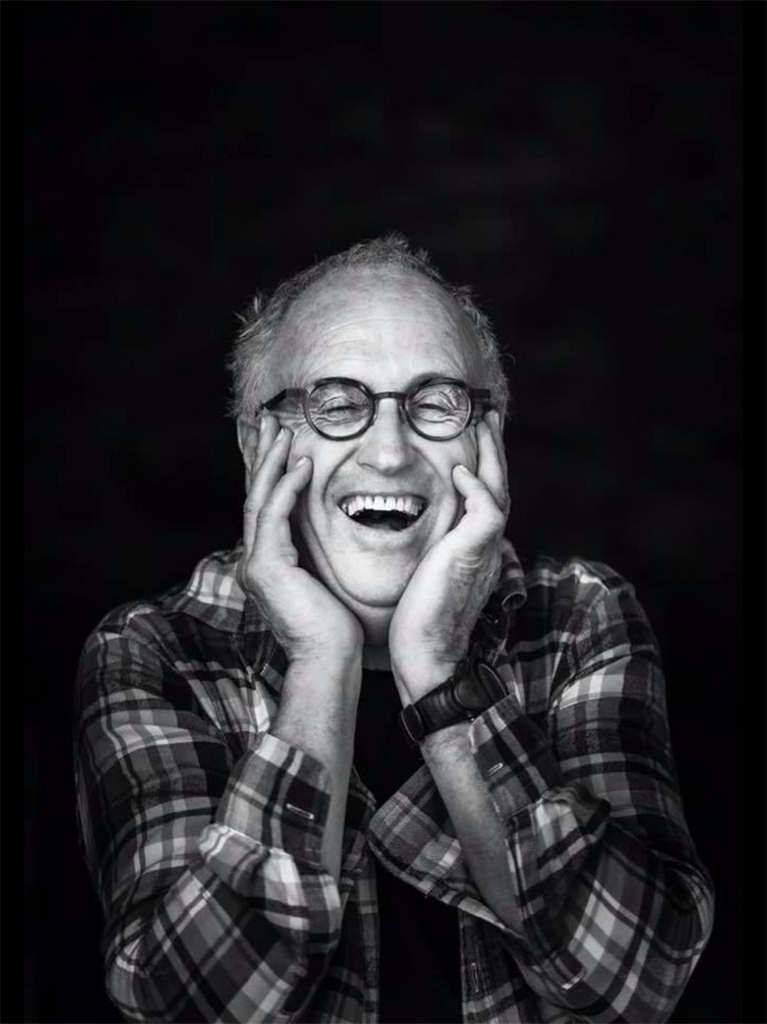
Well Hattie I really like the way you did it and the cropping. In the darker version his face looks quite strange to me. It draws me in because I want to see what he is doing so it tells a great story and I like that his hand is blurred as he is obviously moving and working the material. Also I like the reflected lights as it makes me think it is night and he is working but bakers normally work early - I think its great.
I wonder in the darker version if things look a little sharper and less reflection is obvious? Anyway I prefer the way he looks in your version. |
Jul 22nd |
| 62 |
Jul 19 |
Comment |
Yeah this is a really interesting photo - I prefer Gary and Hattie's crops as I also think the white spots of the water attract the eye. Its got some unusual shapes that are very different to what I've ever seen - its uniqueness makes me curious to look twice. Good job seeing it. |
Jul 22nd |
| 62 |
Jul 19 |
Comment |
ooooh - they are both stunning and captivating. I am especially impressed with the veins in the petals - very delicate and beautifully captured. The whites look a bit different in the two images - maybe that is an optical illusion - I am drawn to the white of the colour image somehow. Its a very breathtaking image LuAnn, I can't think of any comments on how to improve it. Personally I like the frame, but that might be because without it, the image would blend into the whole page. Beautiful work which projects simplicity, stillness and beauty. |
Jul 3rd |
5 comments - 1 reply for Group 62
|
5 comments - 1 reply Total
|