|
| Group |
Round |
C/R |
Comment |
Date |
Image |
| 39 |
Sep 22 |
Comment |
This is an interesting image that draws the viewer right into the interior of the chapel. If you had stood a little further to the right you might have been able to show the interior wall on the left. I think the white door distracts from seeing the interior and I would darken it.
|
Sep 7th |
| 39 |
Sep 22 |
Comment |
This is a very nice, well-composed, and interesting image. The crop helped focus the viewer's attention. Is the person on the far left part of the show? I keep looking at him/her and wondering. The only suggestion I have is to darken the 2 people on the right. As for the open window on the far right, you could crop it out or fill it with bricks and see if you like the change - it didn't bother me until I read the comments above. |
Sep 7th |
| 39 |
Sep 22 |
Comment |
Your color version looks like a painting, but most pictures I have taken with my iPhone look over-sharpened and very 'un-painted.' Your b&w version is good but I agree with the others about the square format. Amazing what you can do with a phone! |
Sep 6th |
| 39 |
Sep 22 |
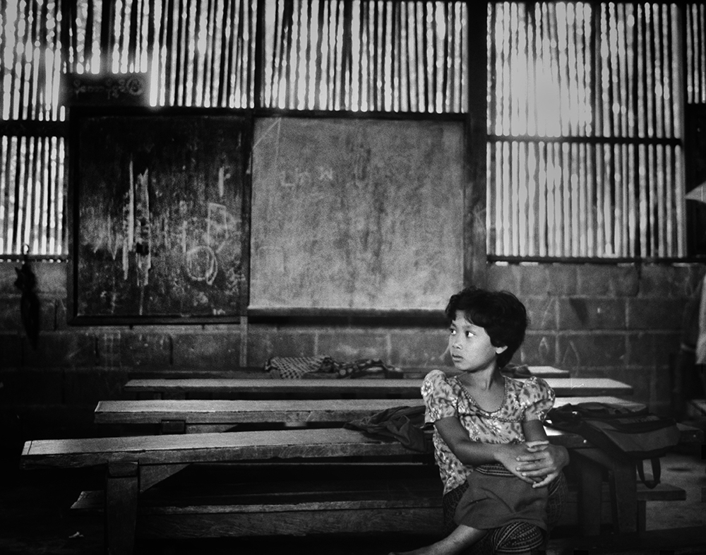
Comment |
Your b&w version really grabs the viewer's attention. One wonders who this girl is and why is she so sad. I prefer the black background as it simplifies and strengthens the emotional impact. The white border works well. My only suggestion is that next time shoot from a lower position so that you are not looking down at the child.
|
Sep 6th |
| 39 |
Sep 22 |
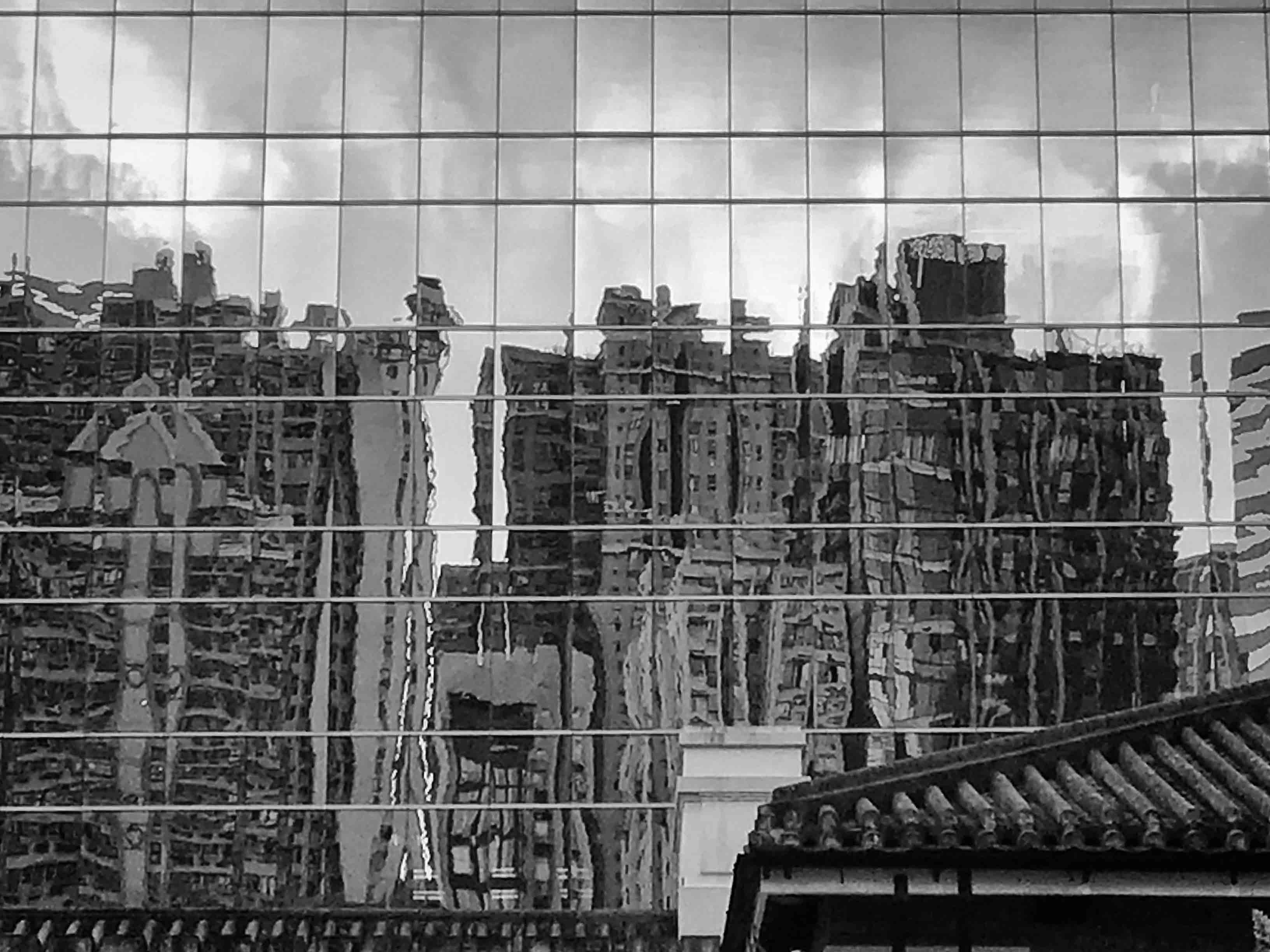
Comment |
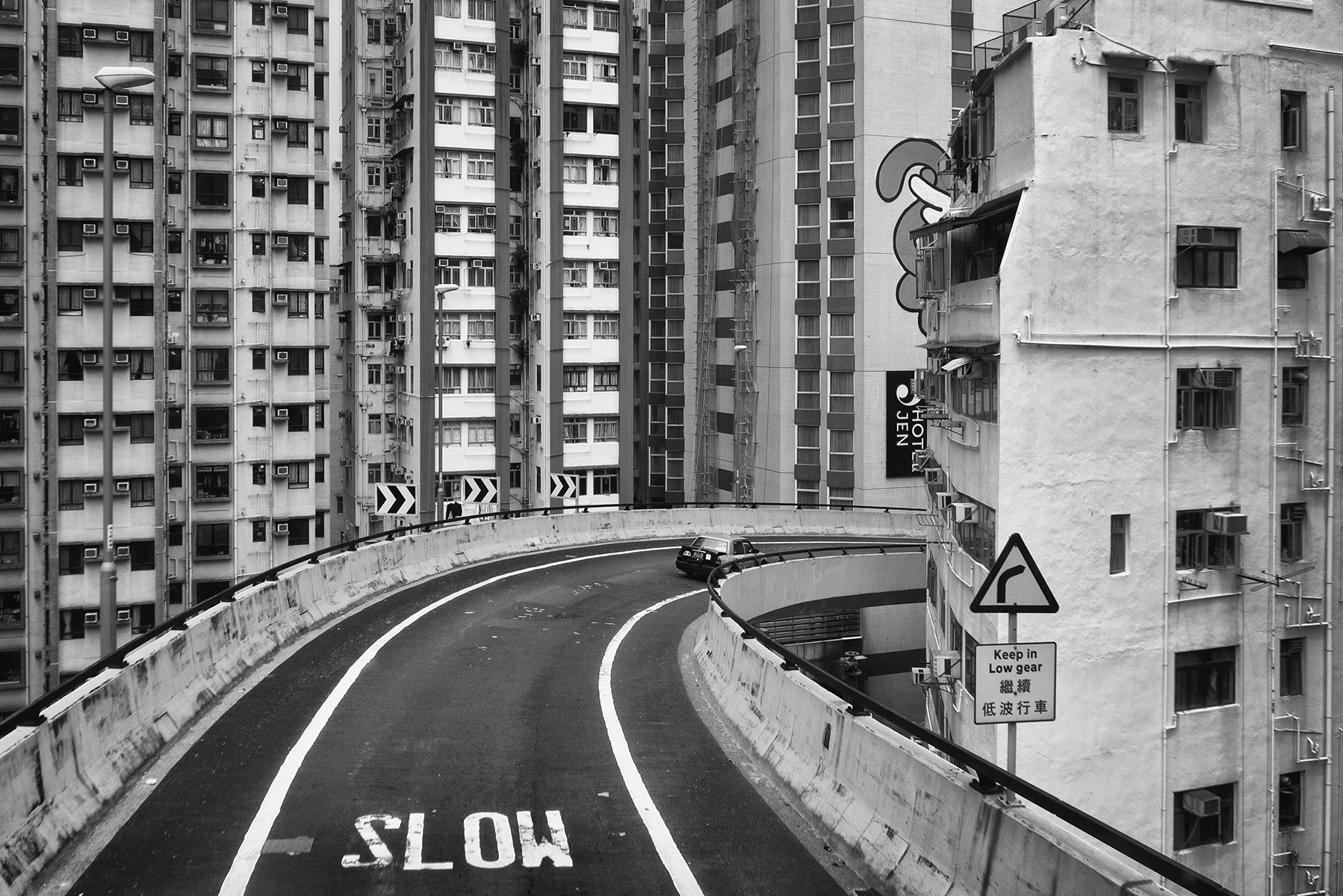
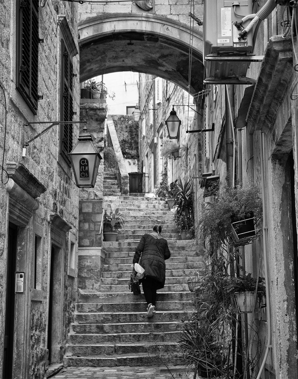
Your b&w version is very strong and better than any of the originals. The light and texture of the buildings is beautiful. I would like to see the powerline on the right removed. Since the tracks are not an important part of the image you could crop them off or clone them out. |
Sep 6th |
| 39 |
Sep 22 |
Comment |
I definitely prefer the black and white image - it is a very strong image. On my computer display, the buildings seem a little fuzzy, and slightly out of focus, especially the tile roof on the middle building. Perhaps you could run it through a sharpener such as Topaz AI and see if that helps. The buildings are exciting but the sky isn't. Maybe you could add a cloud or two in Photoshop.
Overall this is strong work!
|
Sep 4th |
| 39 |
Sep 22 |
Reply |
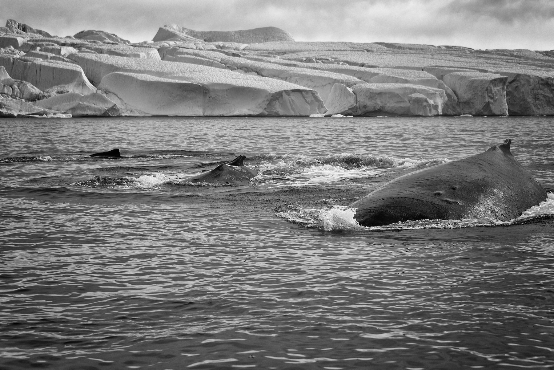
Thanks, Jerry. This trip was a trip out to the fjord to see icebergs, not whales. We were fortunate to see this group, and they turned and swam right to our small boat, out of curiosity I guess. It was a wonderful experience just to see and hear them, and I was very lucky to get a few good images of the whales.
And no, I have never used Camera Raw for editing except for a few corrections (optics, geometry). |
Sep 4th |
6 comments - 1 reply for Group 39
|
6 comments - 1 reply Total
|