|
| Group |
Round |
C/R |
Comment |
Date |
Image |
| 39 |
Apr 21 |
Comment |
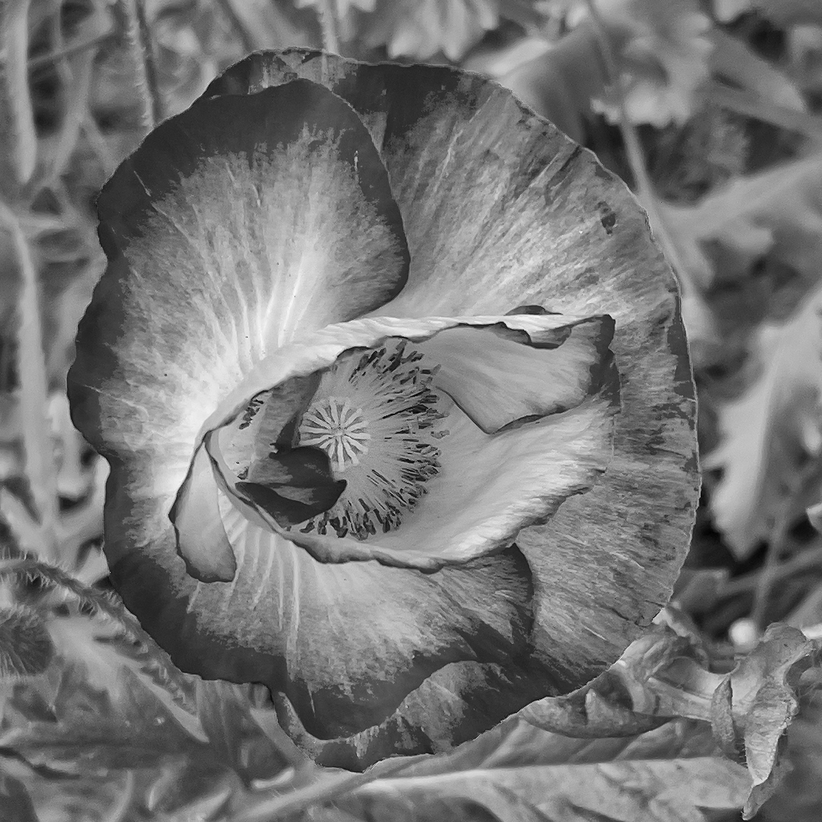
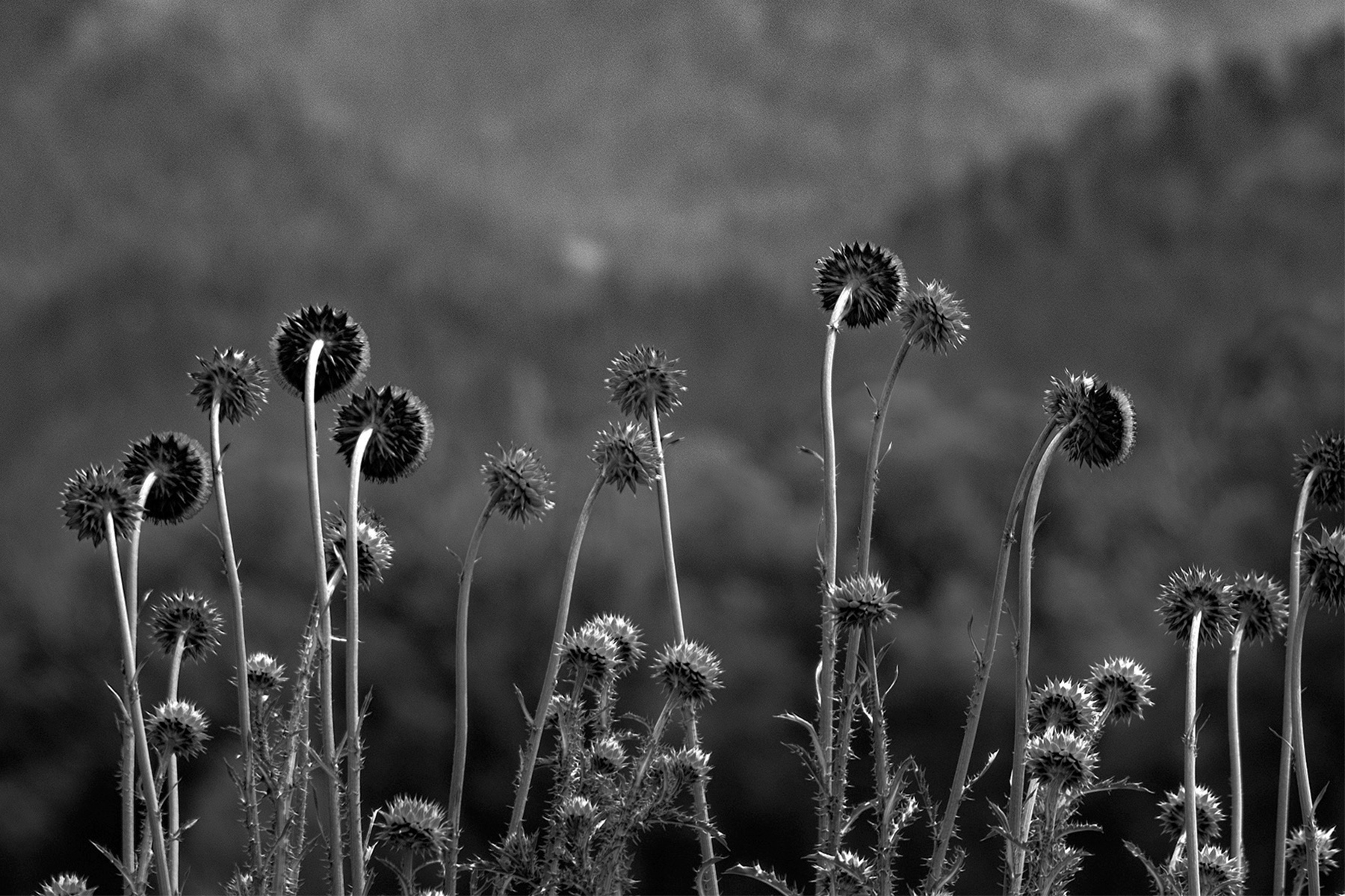
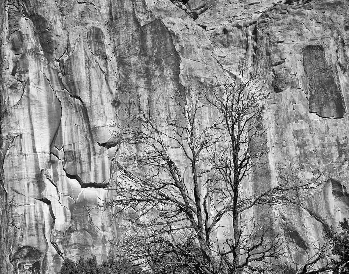
The monochrome version is much better and is a beautiful image. The light is wonderful, and the softening you did really helps to make the monochrome version more pleasing. I'm glad you removed the veins in the background, I find them almost threatening. |
Apr 19th |
| 39 |
Apr 21 |
Comment |
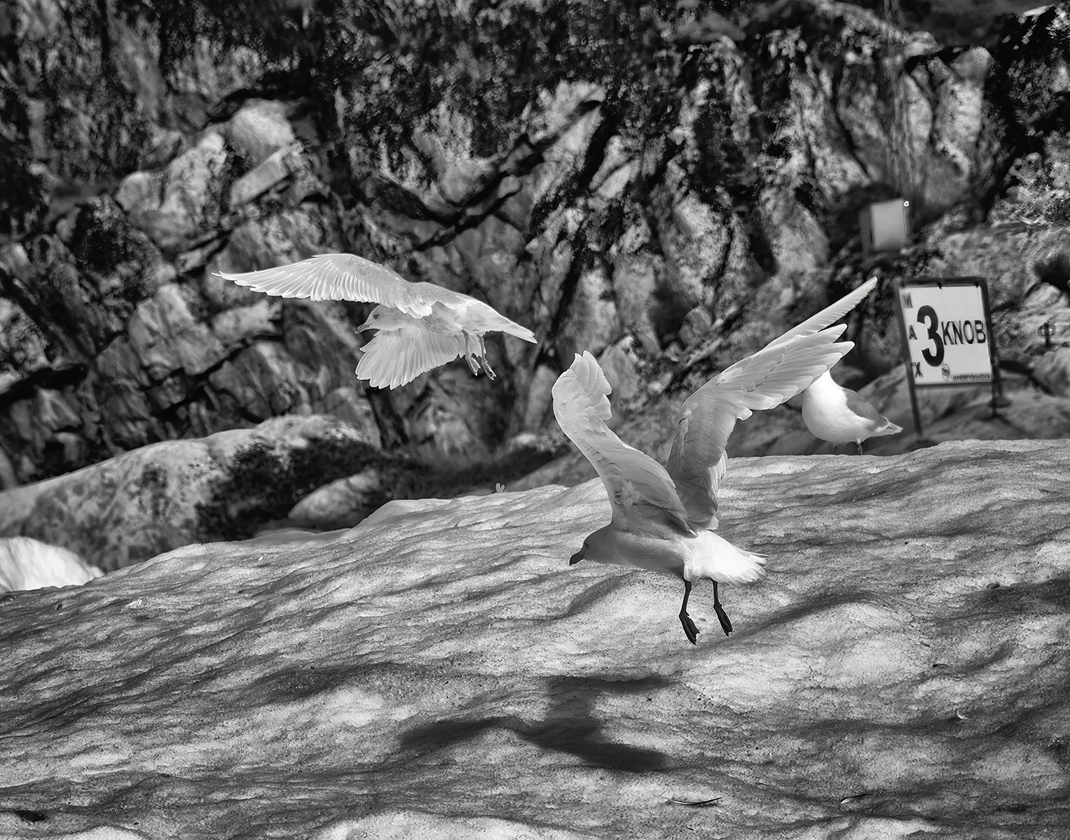
This is a great image - it really grabs my attention. The sensation of motion is well done, and I find Paul's comments really interesting. "You see what you look for," and the only thing I saw was that to my eye it look as if the tires and not moving - (no blur). |
Apr 19th |
| 39 |
Apr 21 |
Comment |
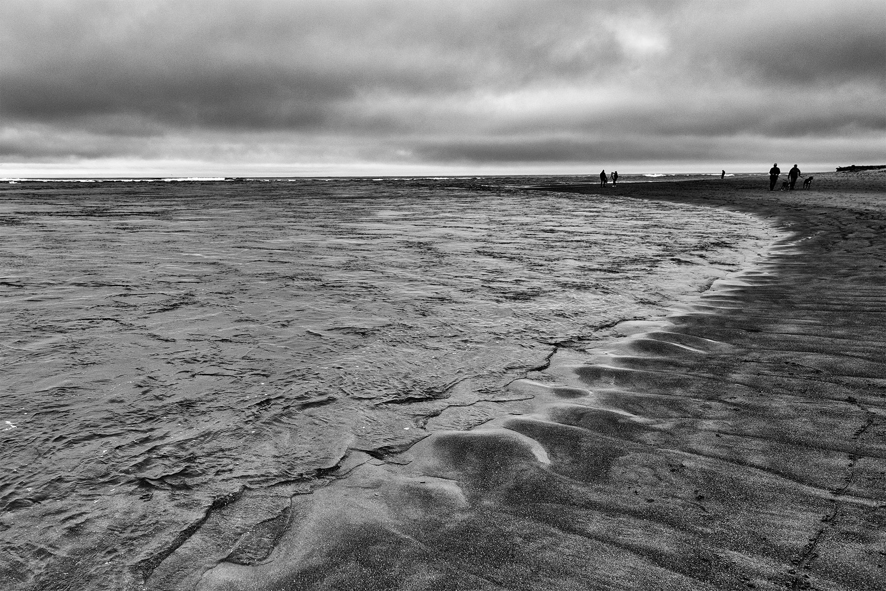
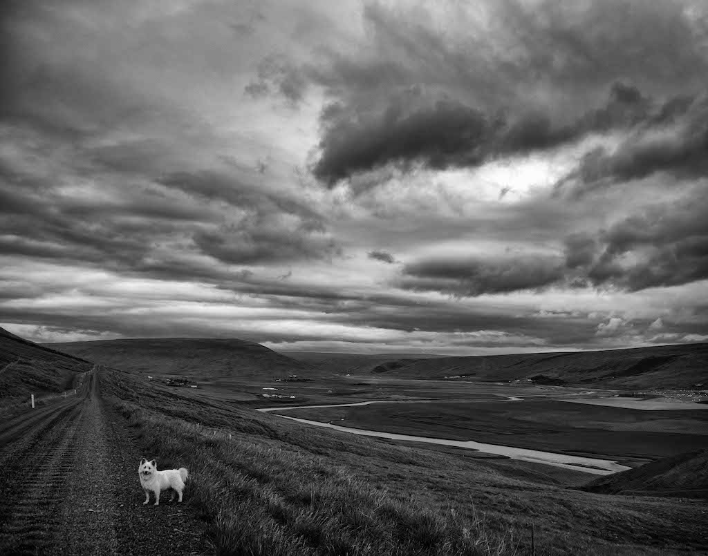
I've spent a lot of time in Scotland and I think you captured the feeling of a dreich day, except you have a little bit of light. Well done! |
Apr 19th |
| 39 |
Apr 21 |
Comment |
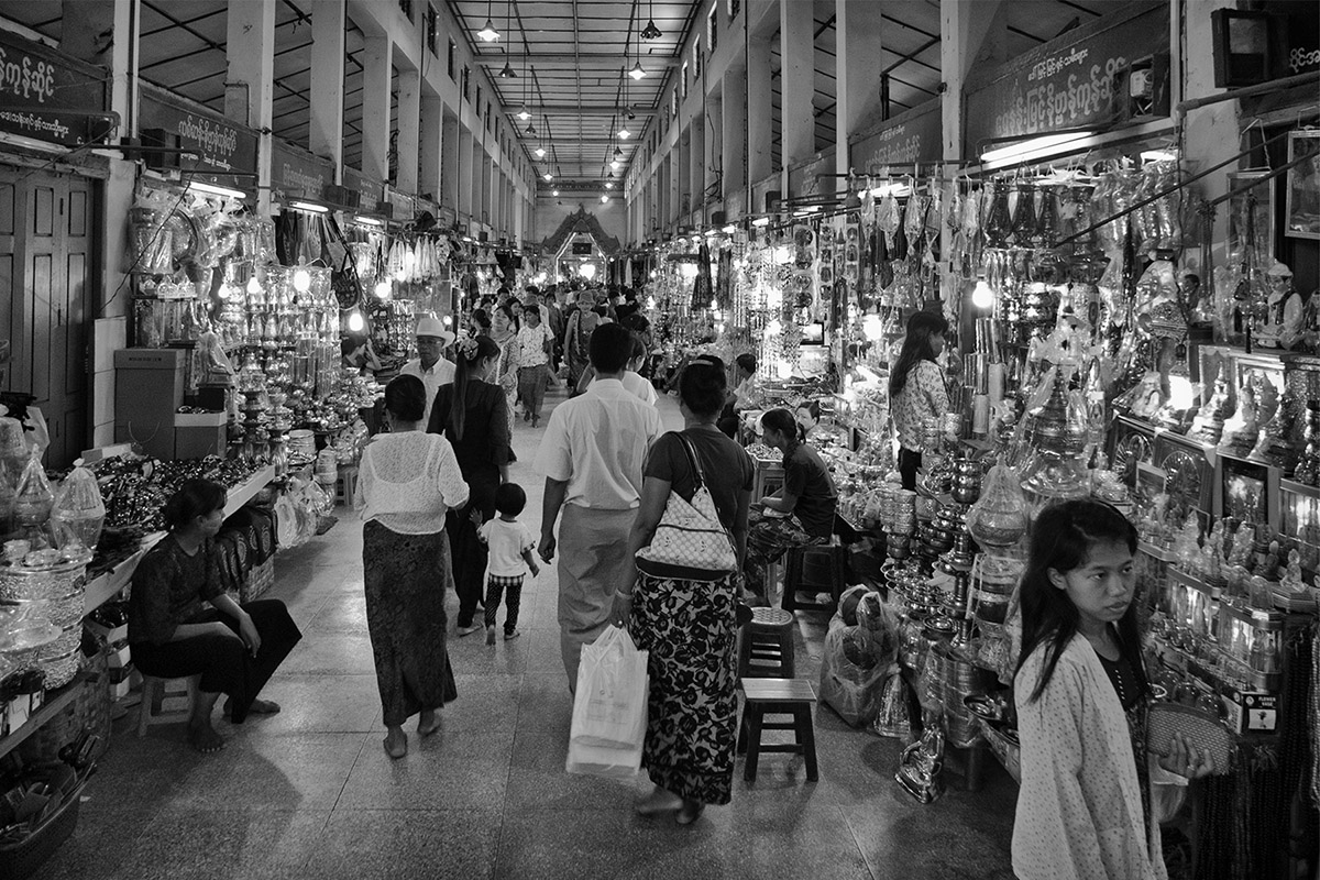
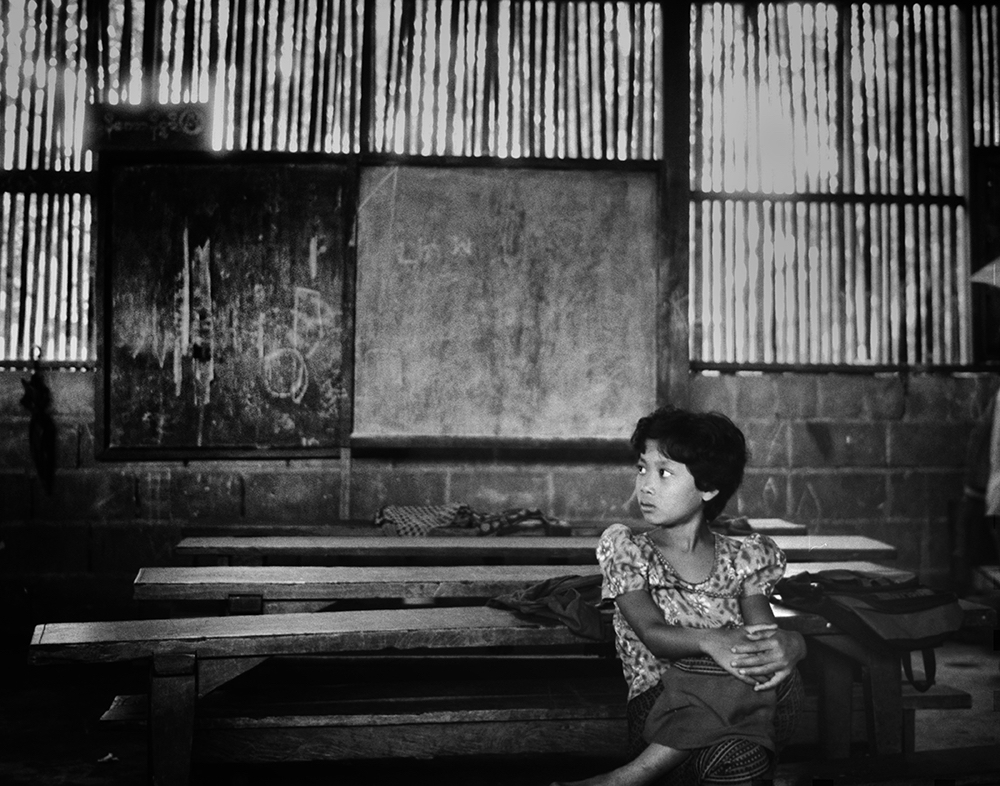
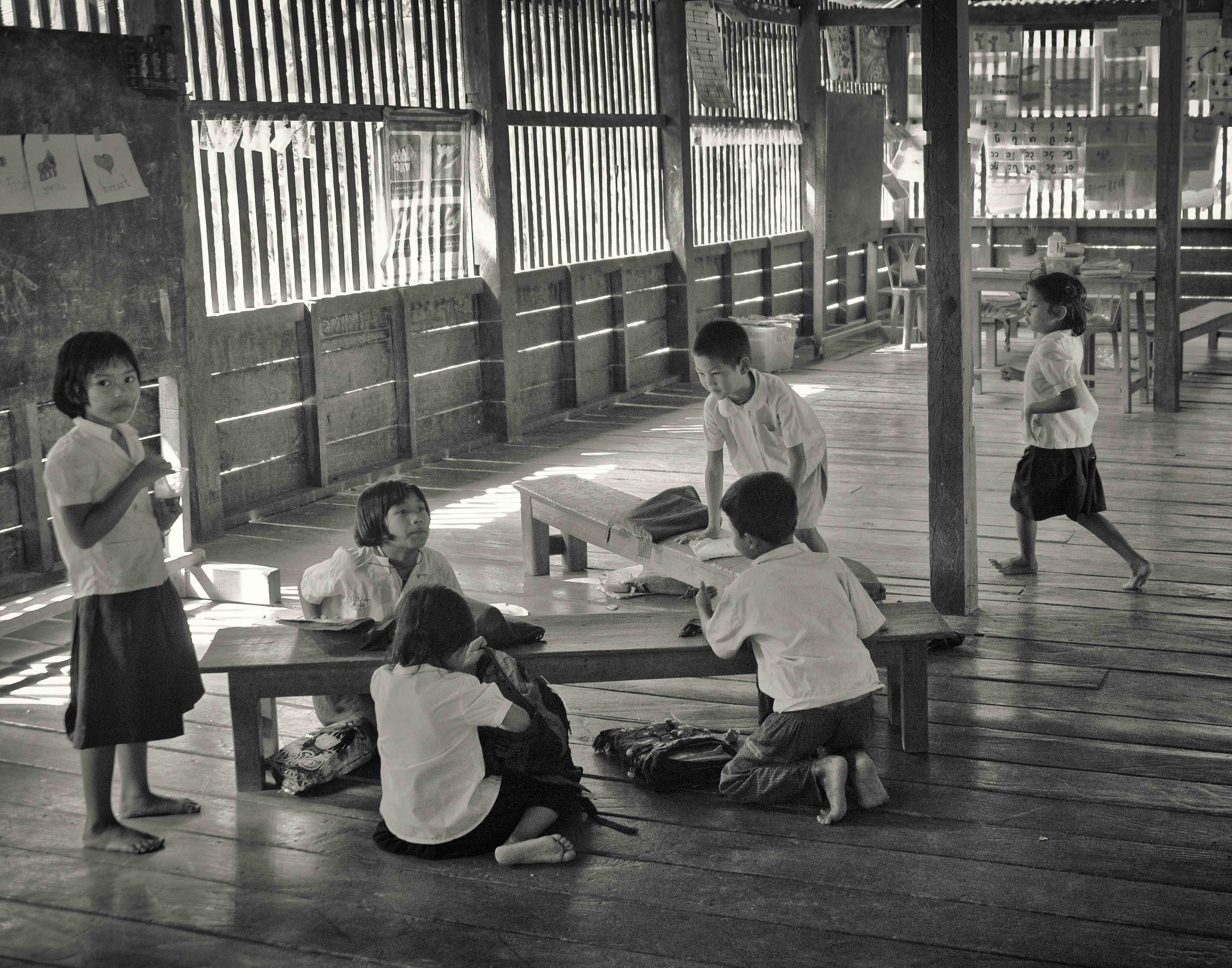
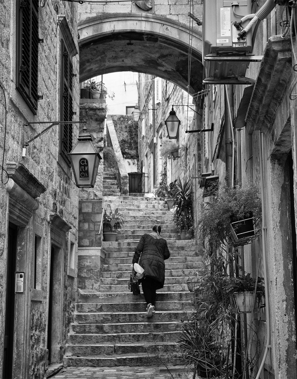
I prefer the B&W because I find the color distracting and the B&W allows me to concentrate on the people, the place, the mood. Thanks for asking. |
Apr 19th |
| 39 |
Apr 21 |
Comment |
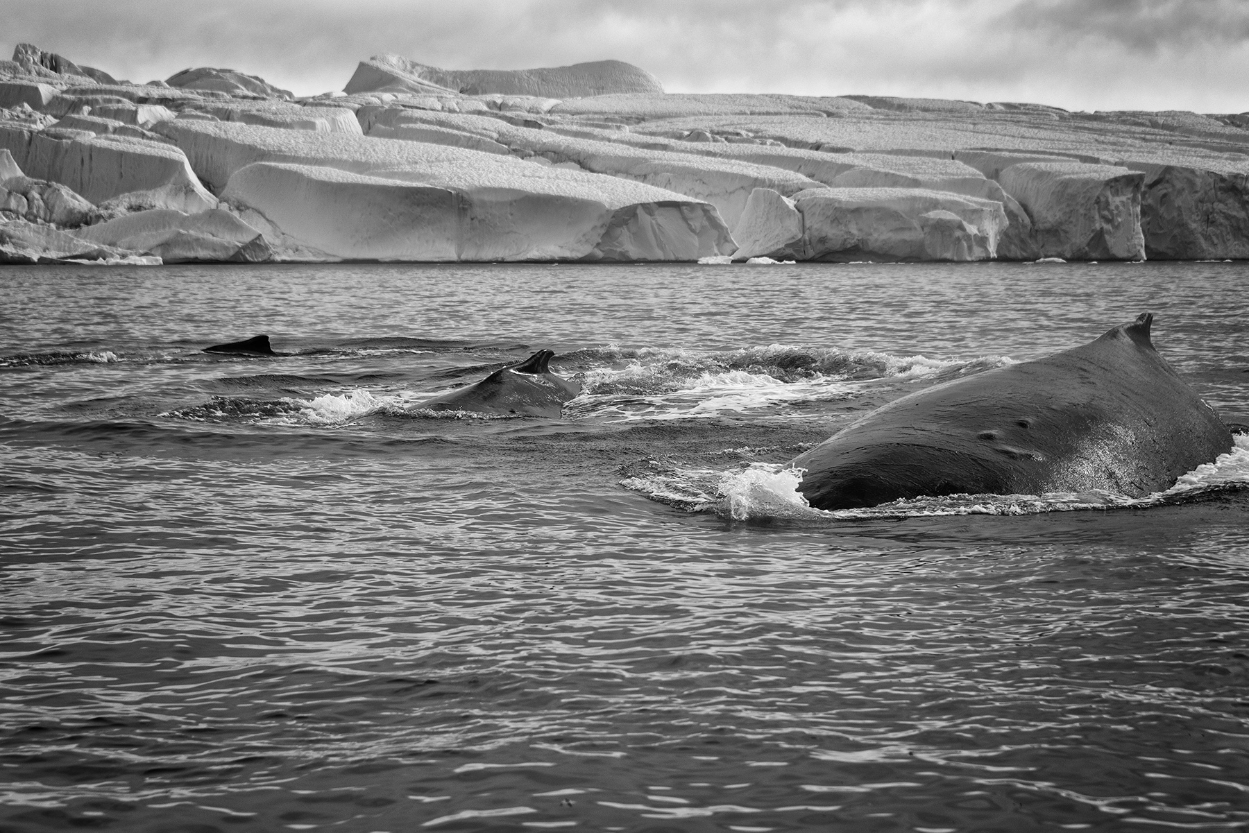
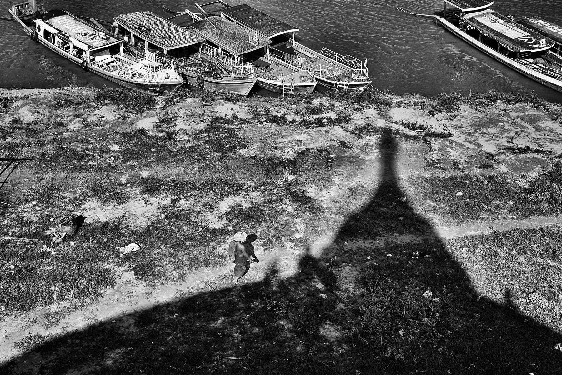
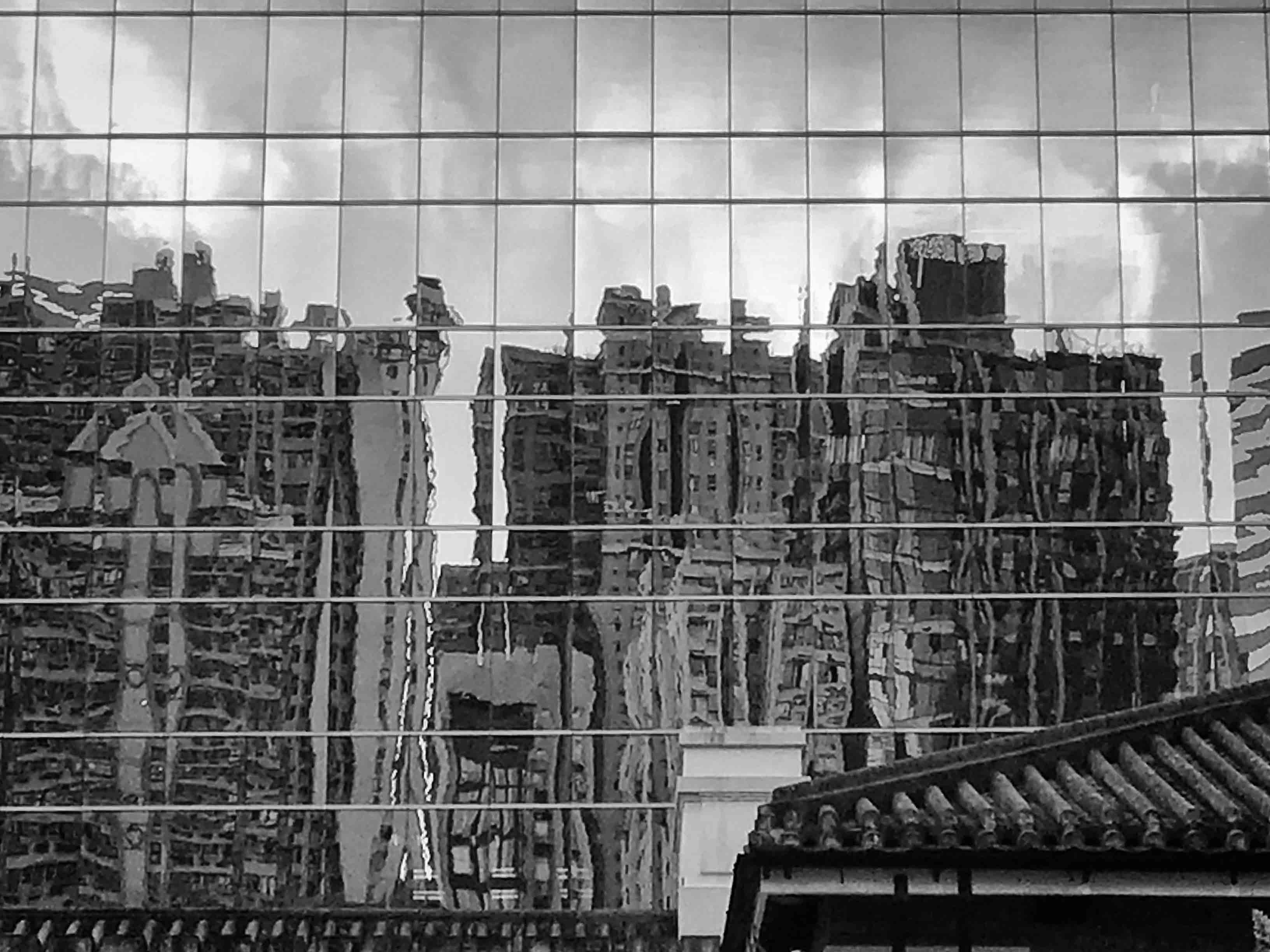
A great image. The light seems especially good, as is the shadow. I enjoy seeing what you can do with a phone (other than talk.) |
Apr 10th |
| 39 |
Apr 21 |
Comment |
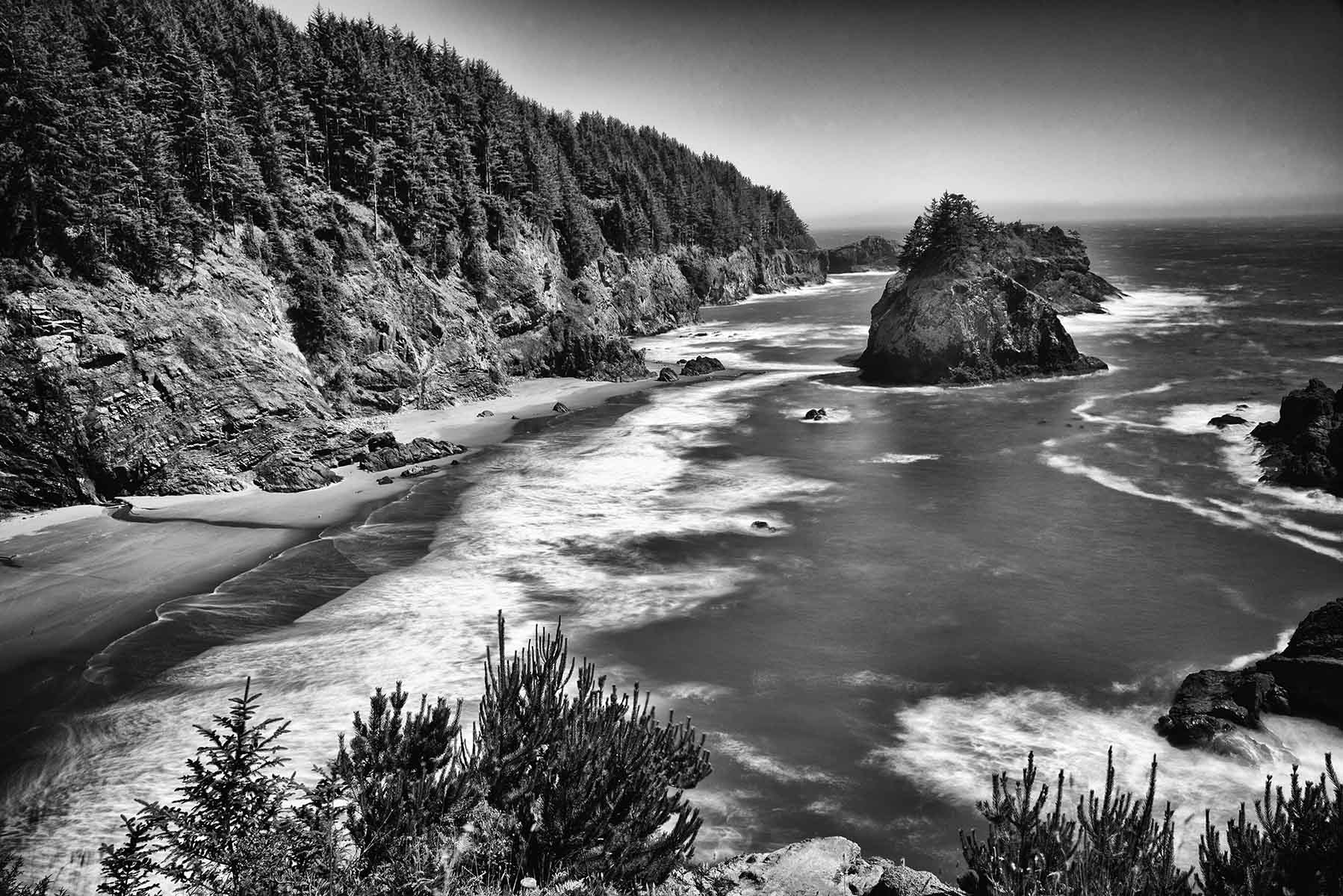
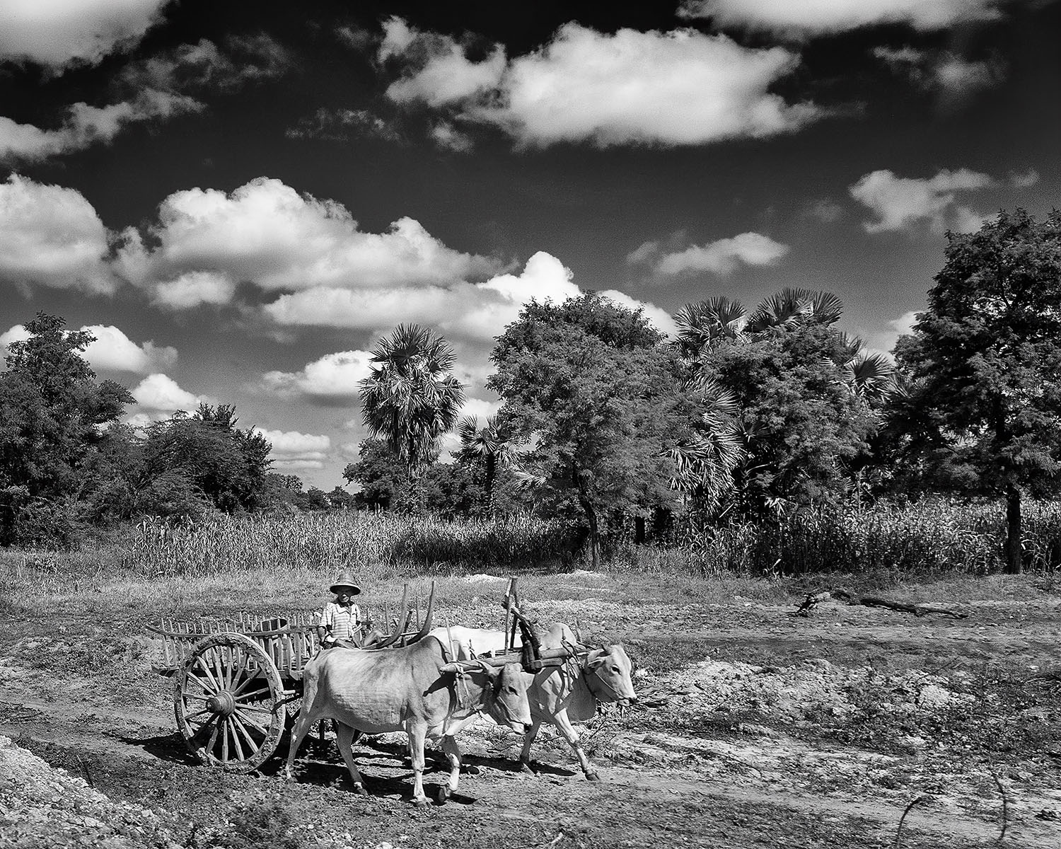
Excellent! Your black and white version is a great improvement over the original in many ways. And the composition is first rate. Well done! |
Apr 10th |
| 39 |
Apr 21 |
Comment |
Great image! The square format and the border work well, and the tones and texture are wonderful. My only minor concern is for the area at the bottom of the black sand where it meets the lighter sand - it seems a little 'muddy' or 'light' to me. |
Apr 10th |
7 comments - 0 replies for Group 39
|
7 comments - 0 replies Total
|