|
| Group |
Round |
C/R |
Comment |
Date |
Image |
| 39 |
Sep 20 |
Comment |
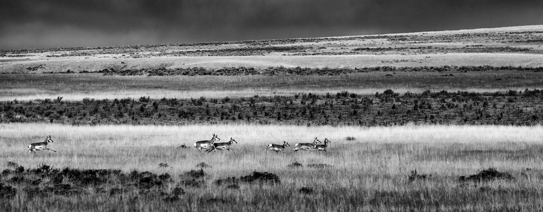
Great shot! I love the tones, the contrast, and the dark sky. The compositon is excellent. It's amazing how good images from a phone can be. It's strictly a matter of taste, but I dislike white foliage. |
Sep 5th |
| 39 |
Sep 20 |
Comment |
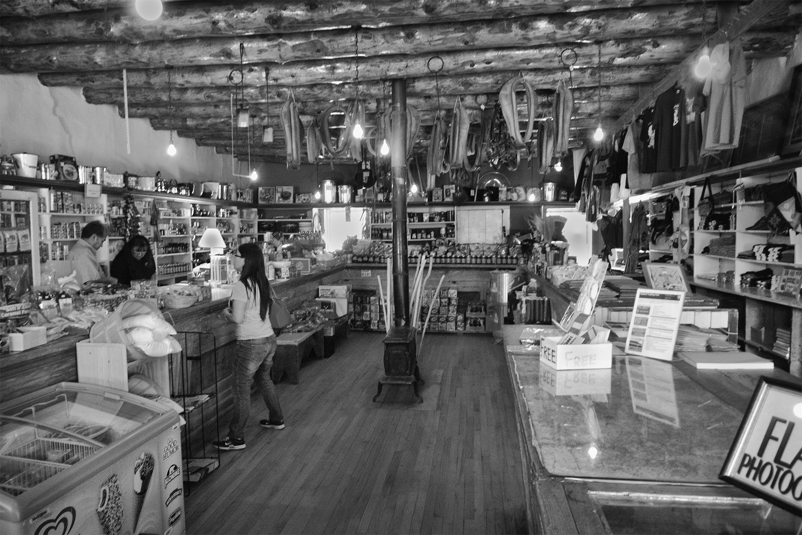
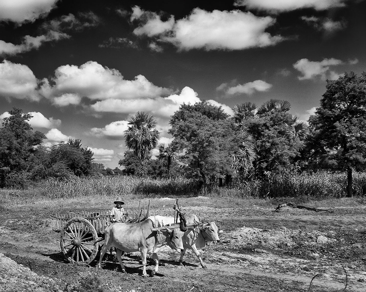
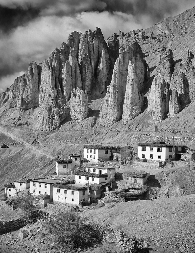
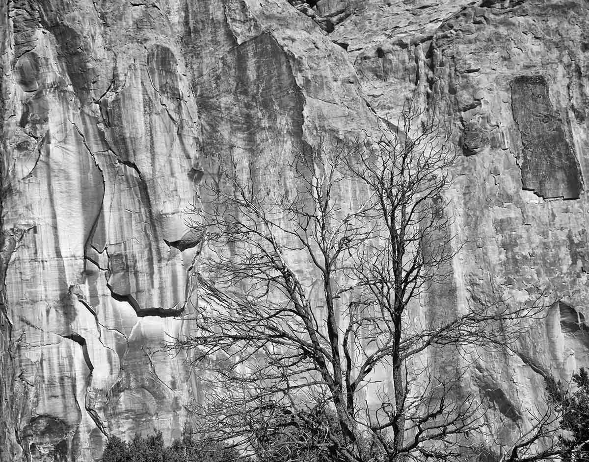
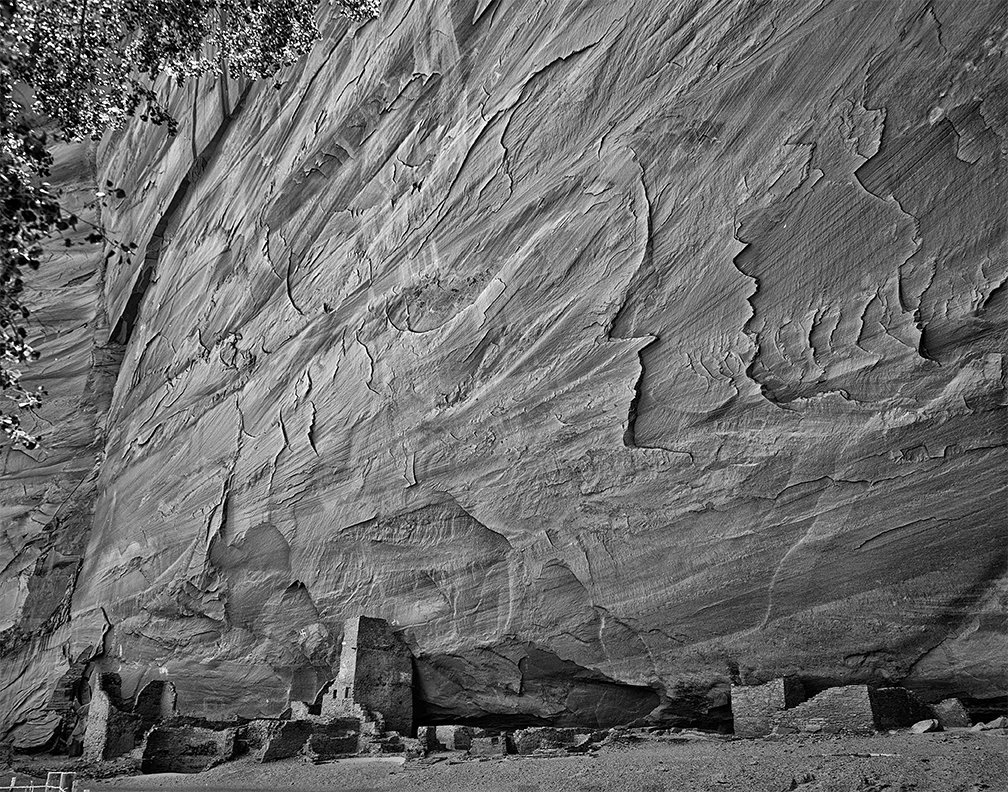
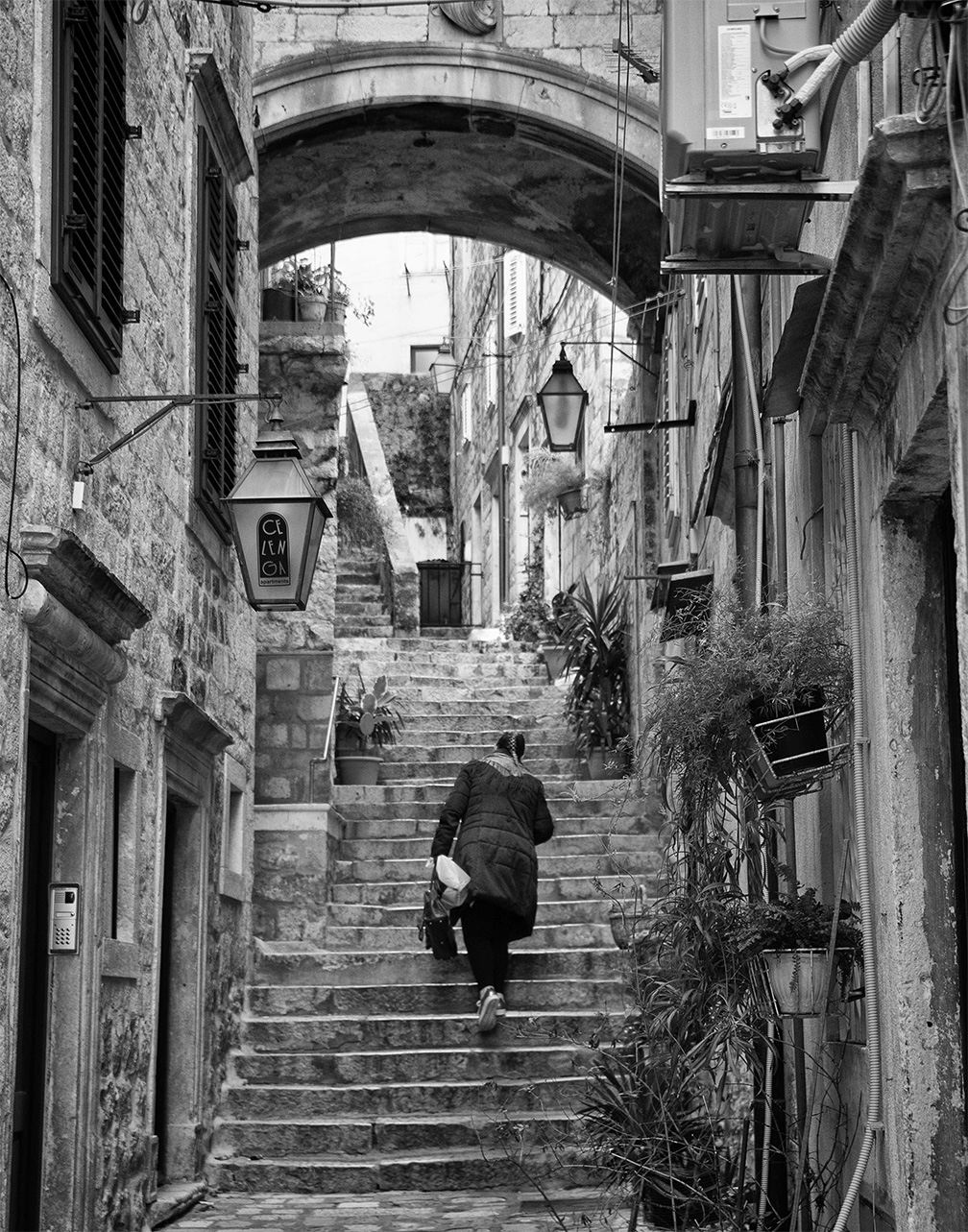
This is an interesting image of a great subject. Your point of view is not the usual one and this makes me wonder why you didn't include more of the wall on the left and some of the church. Your crop and removal of the rug? in front of the door help to simplify the image,
I wondered how the image would look with the sky darkened. In SEP2 I added about 15 control points to darken or lighten different areas, as none of the global adjustments worked for this . My version leaves a lot to be desired, but I wanted to show a different interpretation of the image. |
Sep 5th |
 |
| 39 |
Sep 20 |
Comment |
A beautiful image of a beautiful subject! Technically it looks great. If I were paying for a portrait I think I would want more of her personality to show in her expression. I think you probably wouldn't mind trying again. |
Sep 5th |
| 39 |
Sep 20 |
Comment |
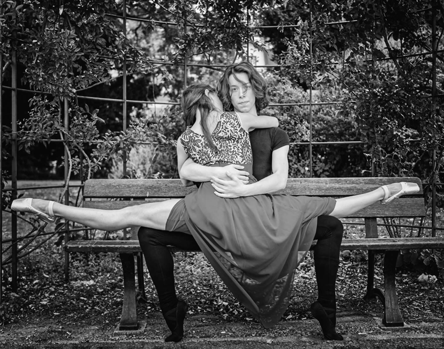
I really like the composition of your image although I agree that the asymmetry is a bit of a problem. I prefer the muscular leg. What first bothered me looking at your image is the way the subject fails to stand out from the background.
My version: after cropping your orginal file, I used SEP2 preset 15 , then I used the green slider to darken the foilage, and added vignette (lens falllloff 3). Last,I added a spot correction to their heads (decreased brightness, increased contrast, no structure). To me this version better seperates the subject from the back ground. |
Sep 5th |
 |
4 comments - 0 replies for Group 39
|
4 comments - 0 replies Total
|