|
| Group |
Round |
C/R |
Comment |
Date |
Image |
| 39 |
May 19 |
Comment |
Thanks for the suggestions. I agree that cropping the right side makes the picture less busy. Cropping the arch at the top hurts the 'sense of place' that I was trying to show. I usually try to maintain a standard size for my pictures - 8x10 or 11x14 - which is sometimes not the best. |
May 27th |
| 39 |
May 19 |
Comment |
It definitely grabs my attention. I prefer the black and white version - just a matter of taste. Good work! |
May 27th |
| 39 |
May 19 |
Comment |
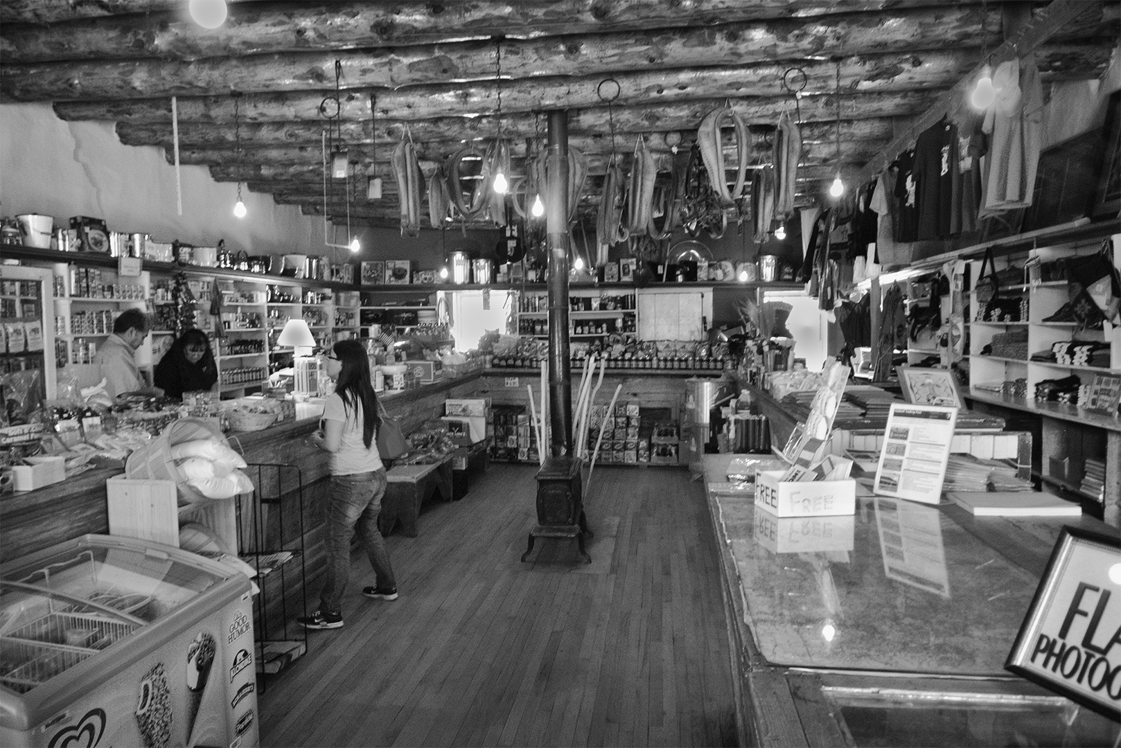
This picture seems like one of the old classic photos of buildings made with film. It seems timeless. When I looked at a histogram of the picture it was flat in the upper zones. You could try increasing the contrast and brightness. If you included a person or an animal in the picture it might seem more alive. |
May 27th |
| 39 |
May 19 |
Comment |
The composition is very good with great lines. You might improve the sharpness by increasing the contrast or using a
sharpness filter. |
May 27th |
| 39 |
May 19 |
Comment |
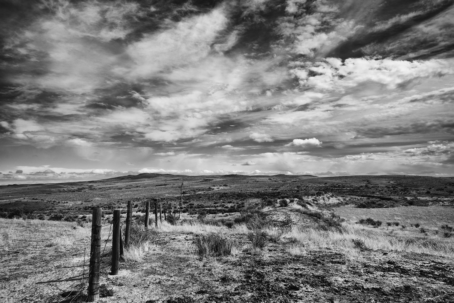
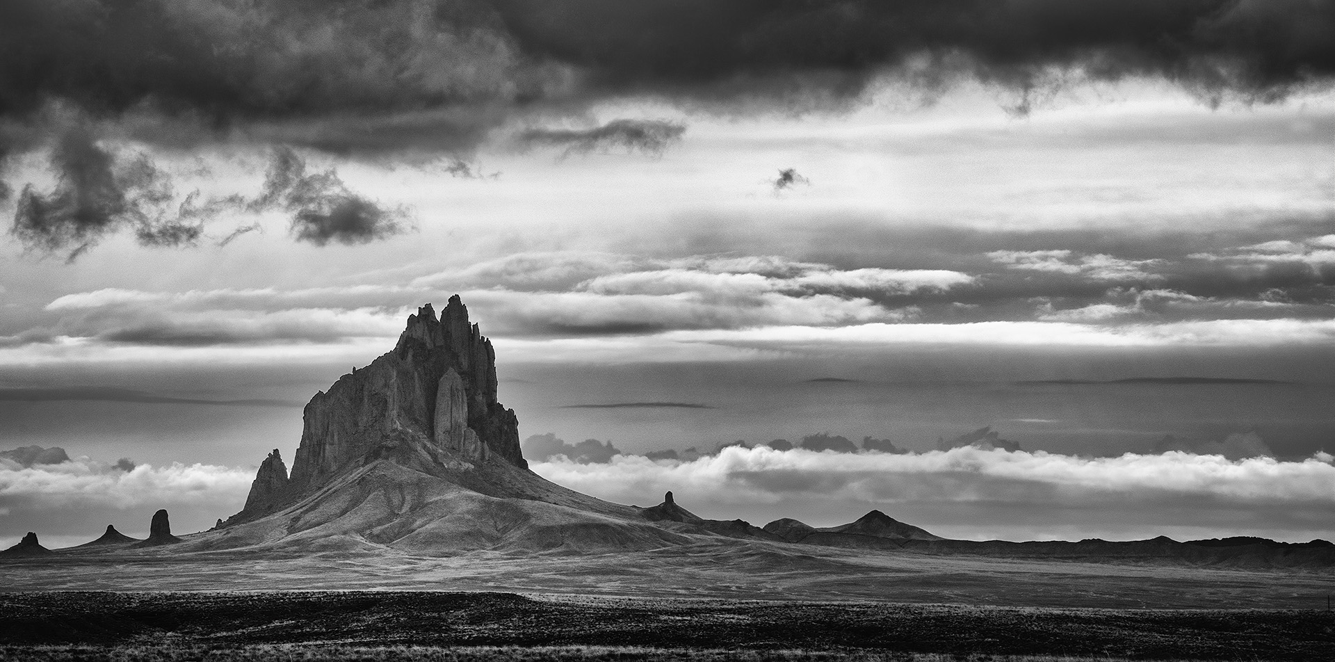
This is a very nice picture. The composition is good and the clouds are very interesting. If you could decrease the contrast and increase the midtones I think you could bring out more texture, making the rocks and sky stand out. |
May 27th |
| 39 |
May 19 |
Comment |
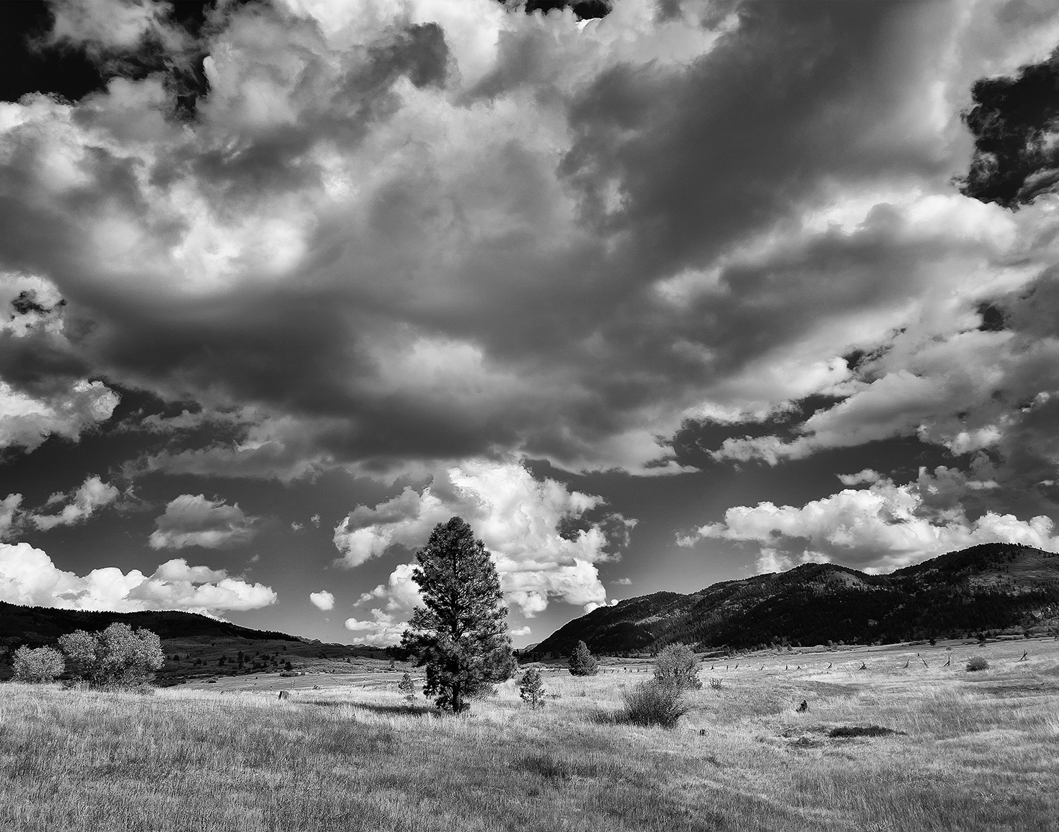
This picture definitely causes an emotional response (cold, lonely) - the light in the trees is wonderful, and the sharpness really helps. I agree that it would be even better simplified e.g. without the barn.
It's a very nice picture. |
May 20th |
| 39 |
May 19 |
Reply |
Thanks. The Lightroom 'auto' is easier for me to use! |
May 20th |
6 comments - 1 reply for Group 39
|
6 comments - 1 reply Total
|