|
| Group |
Round |
C/R |
Comment |
Date |
Image |
| 78 |
Mar 23 |
Reply |
Thank you, I understand now.
|
Mar 8th |
| 78 |
Mar 23 |
Reply |
Thanks Sunil, can you explain what you mean by 'controlling background colors separately', I tend to just convert to B&W then use filters to get the best look.
|
Mar 8th |
| 78 |
Mar 23 |
Reply |
I took a group of club members to Berlin in 2018 for a week to just walk around and take photos, and for me it made another travel book. The East Side gallery is on the longest remaining section of the wall, but this was across the road and around the corner from the main section. On the reverse of this part of the wall is graffiti, but also another section of the wall so the gap between them can be understood.
|
Mar 8th |
| 78 |
Mar 23 |
Comment |
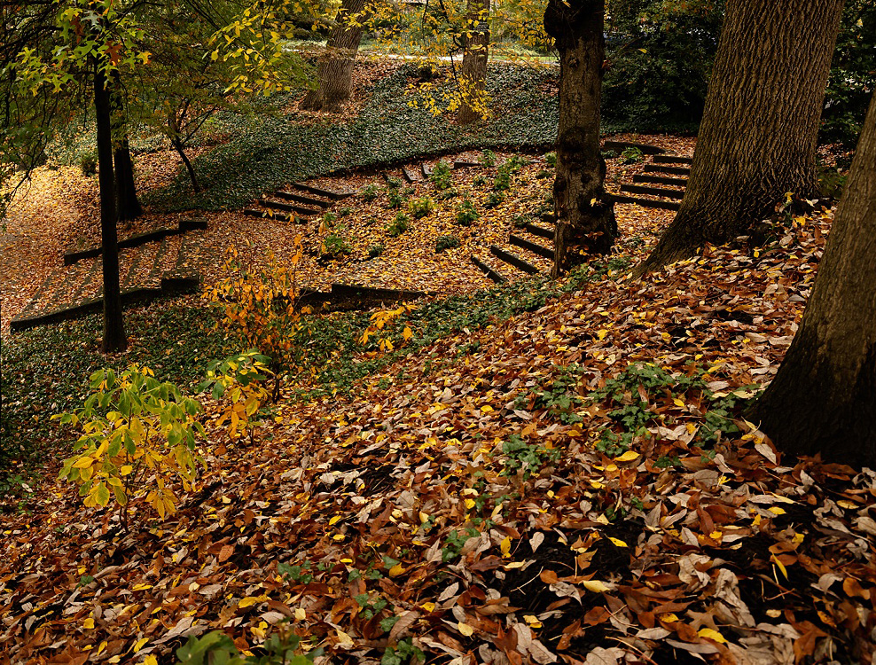
Hi Robert, great image well seen and processed, but I agree with Sunil about the richness of the colours in the original.
My crop would be just right of the left hand tree, and include the road behind for scale. The road area itself would need darkening down to stop the eye from wandering up.
I don't see this as a park but as a giant footprint, so maybe you could use that in the title or how you choose to finally present this?
|
Mar 8th |
 |
| 78 |
Mar 23 |
Comment |
Hi James, great image and well processed, and I think Brenda has pointed out all the lighting issues that I saw.
I prefer Jim's version as it brings out more detail and really makes the flower pop, but I would also include the stem to stop it from 'floating'.
|
Mar 8th |
| 78 |
Mar 23 |
Comment |
Great image Sunil, and the later versions get better each time, I do prefer the contrastier (is that a word?) version, and don't agree with Jim's crop, preferring yours.
If you go back with more time I doubt it will improve much, but may I suggest waiting for the figure to be a bit more to the right rather than on the line of the dominant light centre piece.
|
Mar 8th |
| 78 |
Mar 23 |
Comment |
Great capture Jim. I don't have any issue with the window slant as this is supposed to be an old period building, nor with the weeds in the background as they are natural, but would consider toning down the greens as per Sunil's version or even a tad more.
Do you have more versions as I find the space on the right a little tight and would prefer a bit more room to look into.
|
Mar 8th |
| 78 |
Mar 23 |
Comment |
Hi Brenda, I agree with Jim that the faces need to be brighter, and ideally some differential in colour/contrast with the nest would help to make them stand out. Maybe in nature they want to blend in, but for competition you need to point the judge at what you want him/her to see.
I also prefer the lighter sky in Robert's version, the dark sky feels depressing and will emphasise any halo's (if they come from brightening the faces).
As for title, I suggest "The eyes have it".
|
Mar 8th |
| 78 |
Mar 23 |
Reply |
Thanks James, Brenda has uploaded the original OOC now.
|
Mar 2nd |
5 comments - 4 replies for Group 78
|
5 comments - 4 replies Total
|


