|
| Group |
Round |
C/R |
Comment |
Date |
Image |
| 78 |
Feb 23 |
Comment |
Updated image taking all comments into consideration, just forgot to post it and comp entry is Thursday... lol
|
Feb 18th |
 |
| 78 |
Feb 23 |
Comment |
Hi Mitch
Great pattern picture, and Sunil has nailed the comments if that's what you are wanting to present.
If you consider your wider audience, how do they know this is 'above the books', or from the LoC unless they've seen it person as there is nothing in the image or title to say where or what it is.
|
Feb 5th |
| 78 |
Feb 23 |
Comment |
Super sharp image Robert which is well processed and what you have done to the background really works. It reminds me of a ballet dancer jumping.
If this is to be a competition image you may find the judge saying it looks to be floating as there is no visible stem to support it, so can you bring back some of the stem?
|
Feb 5th |
| 78 |
Feb 23 |
Comment |
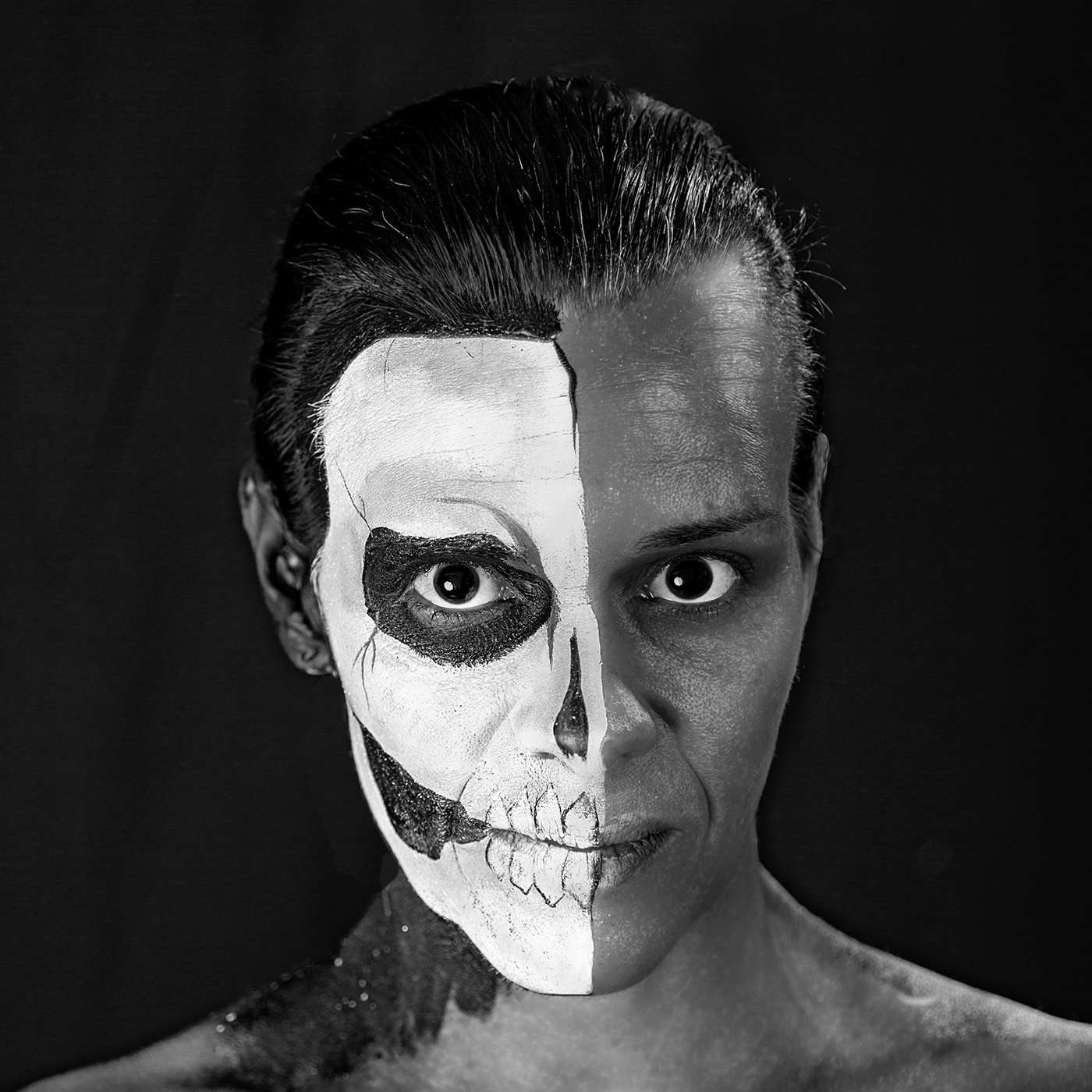
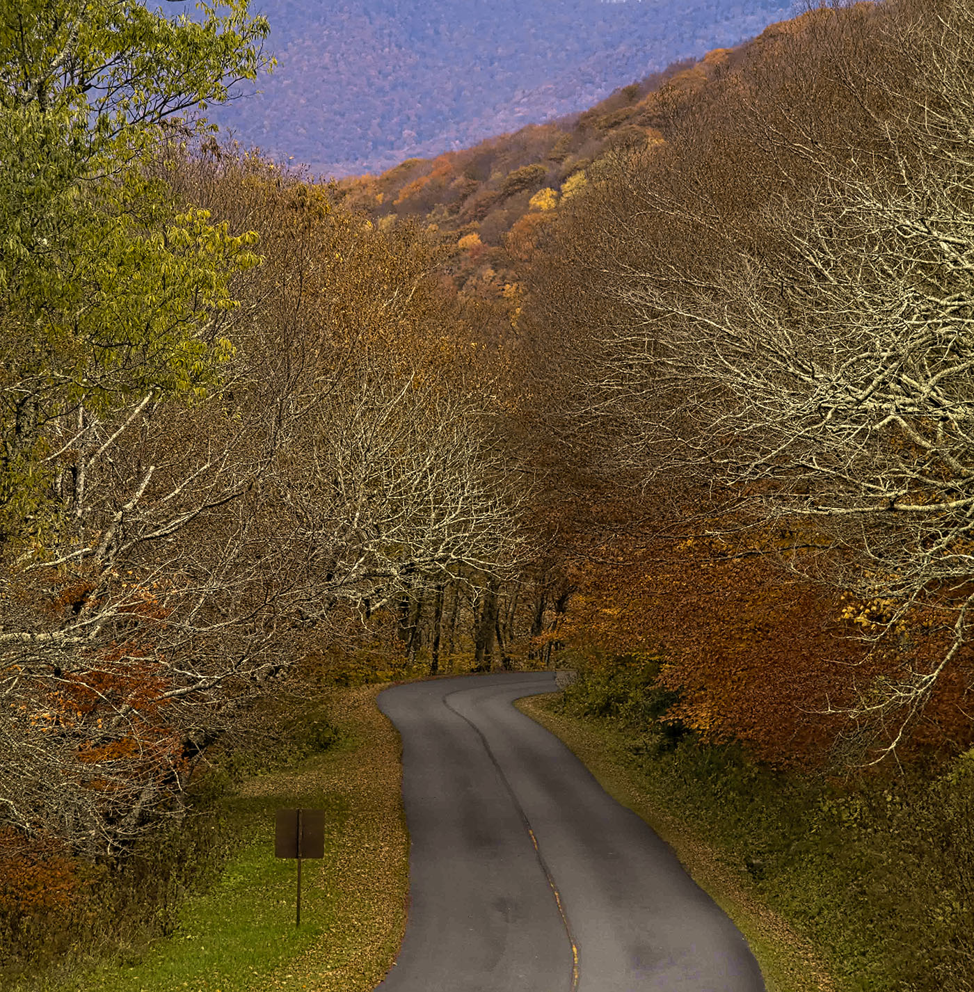
Hi James
I have to agree with Mitch, the sky does not look right as the trees go softer through the image and then the sky doesn't, and his solution to crop out the sky keeps you within the main subject which is the road and trees.
Sunil is right about the road too, it now looks too smooth whereas the gritty-ness (not sure that's a real word) would contrast nicely against the trees.
I'm happy to keep the sign as it is facing the other way and there's nothing to read on it
And to start a separate discussion I have to question why you keep a cheap plastic UV filter on the front of a decent glass lens, it only reduces quality. Ask yourself how many times has this 'saved' your lens so is it worth it, I find a lens hood protects better against occasional bumping and the occasional fingerprint cleans off easier than cleaning plastic. Personal choice of course.
|
Feb 5th |
 |
| 78 |
Feb 23 |
Comment |
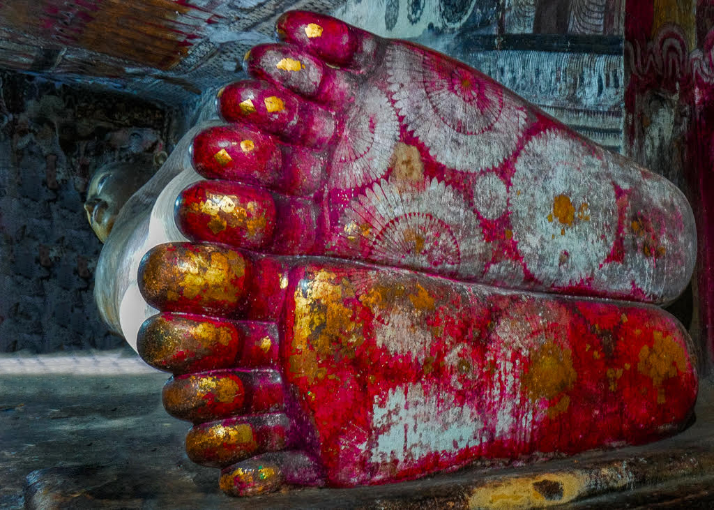
Hi Sunil
Looks like I'm the odd one out again as I love this and don't want to crop or lose any of the Buddha or the walls behind, they all give a great location context to the image.
I do think the flowers and 'bin' are a distraction so I removed them, hopefully not changing the overall feel to the image, I wish I had taken this one.
|
Feb 5th |
 |
| 78 |
Feb 23 |
Comment |
Hi Jim
Following all suggestions I put this in B&W but couldn't get happy with the results, having said that the Infra Red option was a possibility but the left Cactus just looked off, so for me it stays in colour.
I think Brenda might be right to add a little bit more foreground which might help the bottom right rubbish pile (as it is in context with the image), either that or remove this rubbish too.
I'm also with James on the contrast and saturation issue, currently if feels a tad overexposed.
|
Feb 5th |
| 78 |
Feb 23 |
Comment |
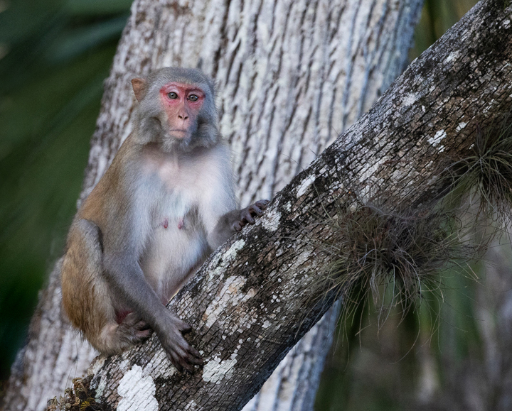
Hi Brenda
Another super monkey image, and I agree with Sunil that the image isn't balanced, but I would take a bit more off the left of his version where it is bright. I have to disagree with James though (sorry James) as the tight crop makes this a portrait that could be anywhere whereas Sunil's crop keeps the location context and I don't feel the branch distracts at all.
I do find the tree trunk a bit too bright and James seems to have improved that, but I don't agree with Robert about blurring the front branch, it would then look wrong if the monkey was sharp and there was no depth between them, however I do agree that the monkey could be sharper.
As for title, how about "Is there no privacy" or "What have I sat on".
|
Feb 5th |
 |
| 78 |
Feb 23 |
Reply |
Thanks Stephen, I think you also set the record for first comments :)
|
Feb 1st |
7 comments - 1 reply for Group 78
|
7 comments - 1 reply Total
|


