|
| Group |
Round |
C/R |
Comment |
Date |
Image |
| 78 |
Dec 22 |
Reply |
Definitely prefer the monochrome version, the table looks far too rich in the colour version.
The few words being typed work well, and good choice of old font too, they add to the story. I still feel there is too much in this image so tried removing the flower for you to consider.
Now the image is darker overall, the left front edge of the table has a highlight that distracts the eye.
|
Dec 29th |
 |
| 78 |
Dec 22 |
Comment |
Thanks for all the comments, all incorporated and I've also darkened the shed down a bit so looks much better to me.
|
Dec 15th |
 |
| 78 |
Dec 22 |
Comment |
Super image Ross, and yes the colour version tells a story in its own way. I agree with Jason about the flip, but also would consider a panorama so as to keep the shadow.
|
Dec 15th |
 |
| 78 |
Dec 22 |
Comment |
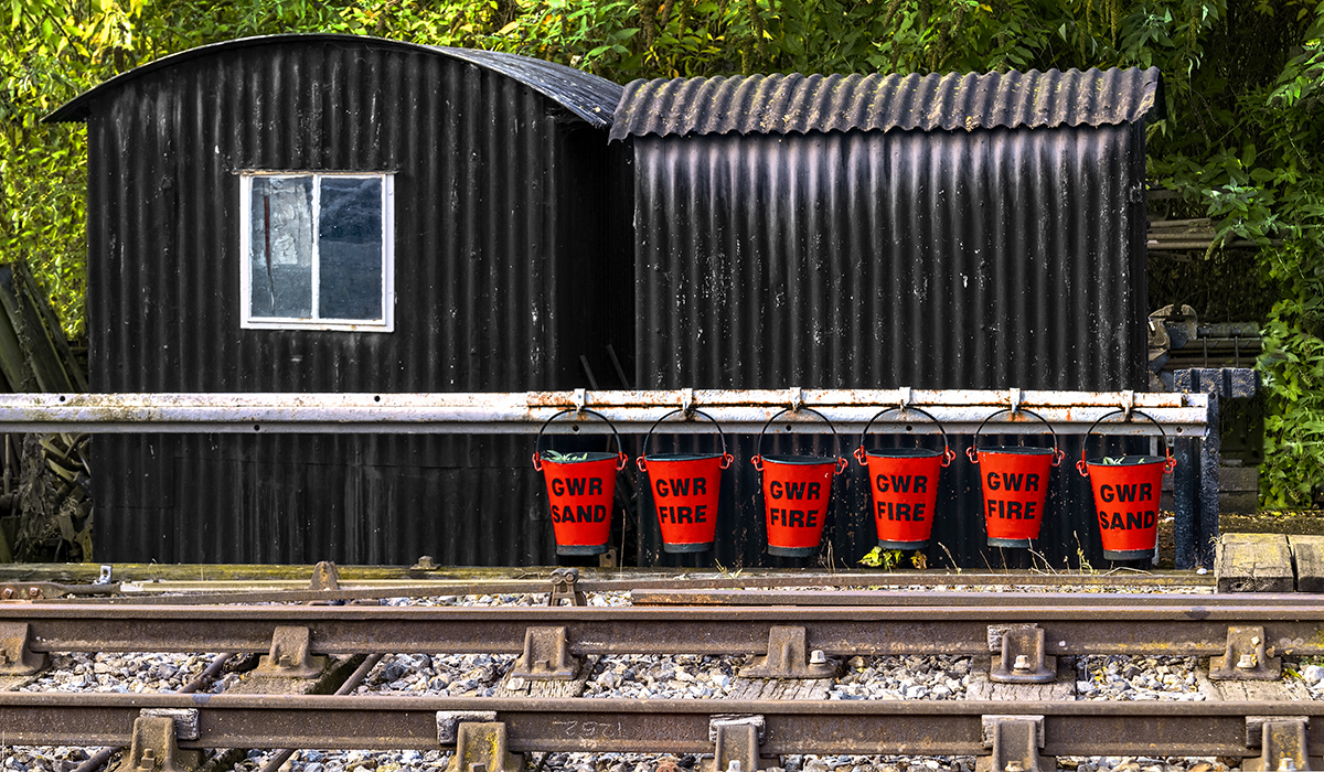
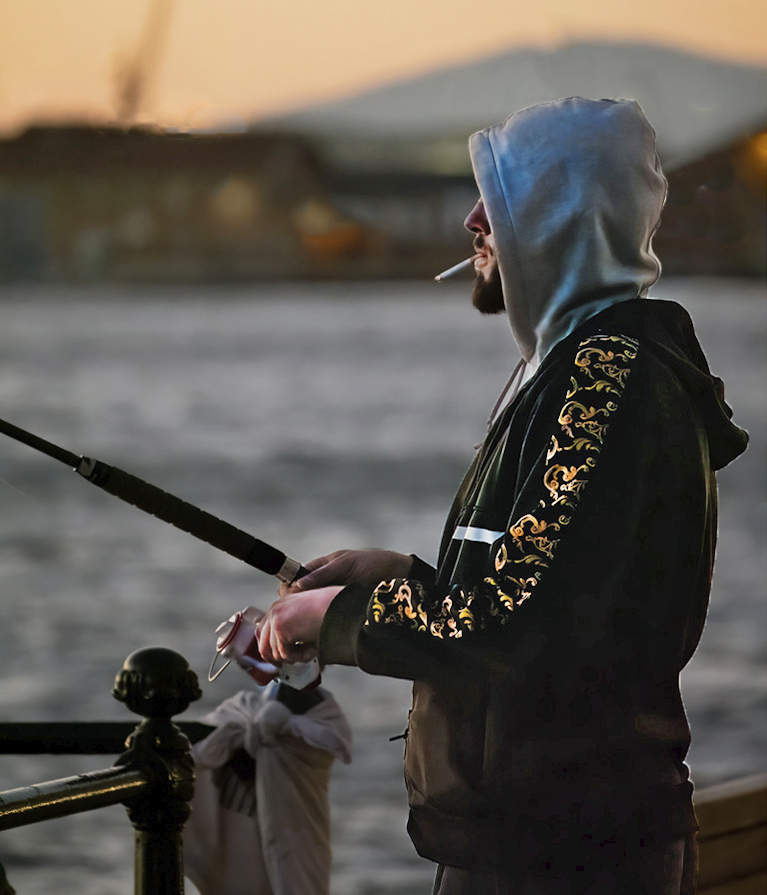
Good street image Jason, but I'm with Jim and the removal/darkening of the white spots which draw me away from the subject.
I also took some contrast away from the buildings so as to emphasise the head a tad.
|
Dec 15th |
 |
| 78 |
Dec 22 |
Comment |
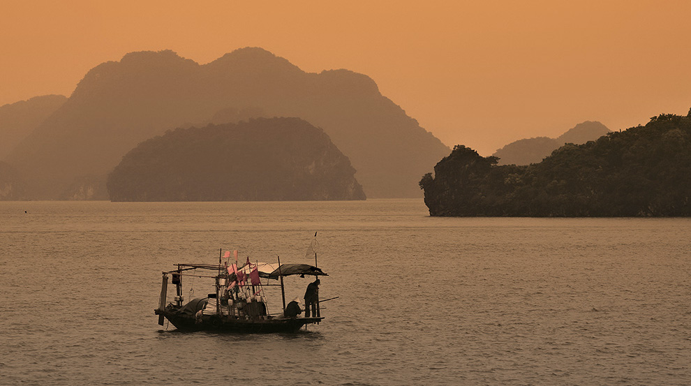
Super image Helen, and I like Jason's crop to move the boat lower in the image but would offer an alternative as a panorama.
The Orange sky works for me, but feel it would be reducing as it got closer to the camera as opposed to an overall saturation, so I tried reducing the saturation in the foreground by adding a gradient to a mask on the 'pepped up' part.
|
Dec 15th |
 |
| 78 |
Dec 22 |
Comment |
I prefer the colour version still, as you say in monochrome the old building gets a bit lost. I do like Jason's crop as the old building becomes more prominent but the contrast between old and new is retained.
|
Dec 15th |
| 78 |
Dec 22 |
Comment |
I tried this in B&W but couldn't find a version to get happy with, so colour is the way to go for me.
I have no issue with the barn on the left, but the tarmac road jars for me, maybe you could find a mud track to replace it?
|
Dec 15th |
| 78 |
Dec 22 |
Comment |
Hi Brenda, sorry but late again to the party.
First, Sepia IS usually allowed in mono competitions if "it gives the impression of being a greyscale image that has been toned in one color across the entire image. (For example, by sepia, red, gold, etc.)" - Taken from Division Definitions here https://psa-photo.org/page/division-definitions?&hhsearchterms=%22monochrome%22
As for the story its wonderful, and needs to come across more in the image, so I would simplify things and just keep the typewriter, photo and letter to make them more dominant.
I agree with the other comments, and only if you are going to reshoot this suggest a square table (you said it yourself earlier) to look more appropriate. There is an alternative too, use this table but add a blotter, a letter part handwritten and a nice pen to go with the existing photo and letter. I can feel a series of images coming from this idea so good luck.
|
Dec 15th |
7 comments - 1 reply for Group 78
|
7 comments - 1 reply Total
|


