|
| Group |
Round |
C/R |
Comment |
Date |
Image |
| 78 |
Sep 22 |
Reply |
I much prefer this one, good luck in the competition
|
Sep 28th |
| 78 |
Sep 22 |
Reply |
Thanks Brenda, this was an actual pilot from the restoration charity just dressed up to look the part, and yes he was young.
I've looked at the gauges again and fixed the Knots but I must be missing something 'cos I can't see the oil pressure gauge?
|
Sep 6th |
| 78 |
Sep 22 |
Reply |
Thanks Jason, I agree the area under the chin is too bright so I have darkened it. This is destined to be a print so I've printed in all formats, even on matt paper, but the Sepia version definitely looks the best.
|
Sep 6th |
| 78 |
Sep 22 |
Comment |
Lovely image Mitch, what a fabulous trip you must of had and it makes no difference if it was taken on a phone, its the camera in your hand that captures something that counts.
I liked the top left of the mountains in the original and I guess you cropped them to bring the waterline off centre, but for this image I don't think it mattered. For me the colours just pop out and still look real, superb.
On my screen there is a slight ghost line around the mountains, maybe that was in phone processing of a jpg, or added by denoise, but I would soften this edge slightly to remove it.
The horizon also looks crooked, but that is probably correct as the waterline is receding in the centre, so just an observation and no suggestions to change it.
|
Sep 6th |
| 78 |
Sep 22 |
Comment |
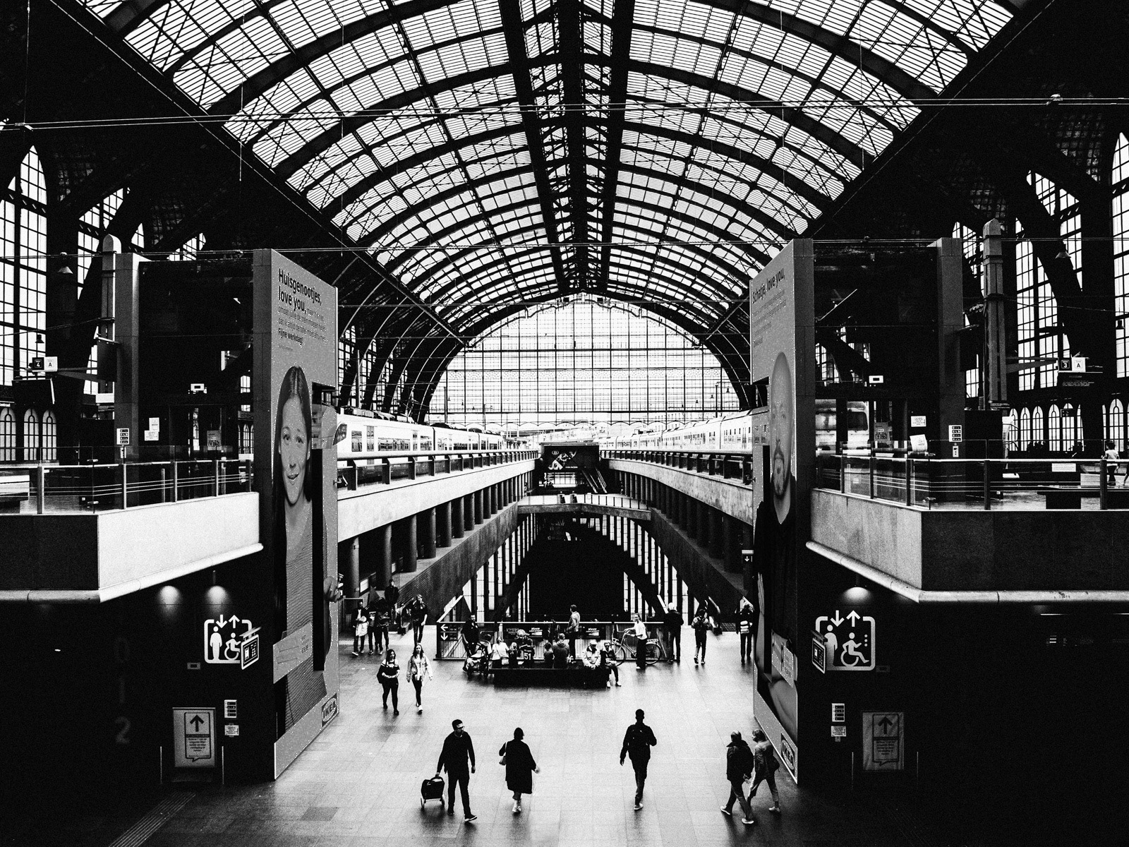
Hi Jason, definitely the right decision to go black and white to focus on the infrastructure rather than the scene, and I agree with the others that the huge posters are a distraction so I darkened them down so they are still there but the eye doesn't go to them as easily.
As for crop I disagree with the others, I think the figures in the foreground are very important as they give both presence and scale to the image. What do you think about losing the child to make 3 distinct figures?
|
Sep 6th |
 |
| 78 |
Sep 22 |
Comment |
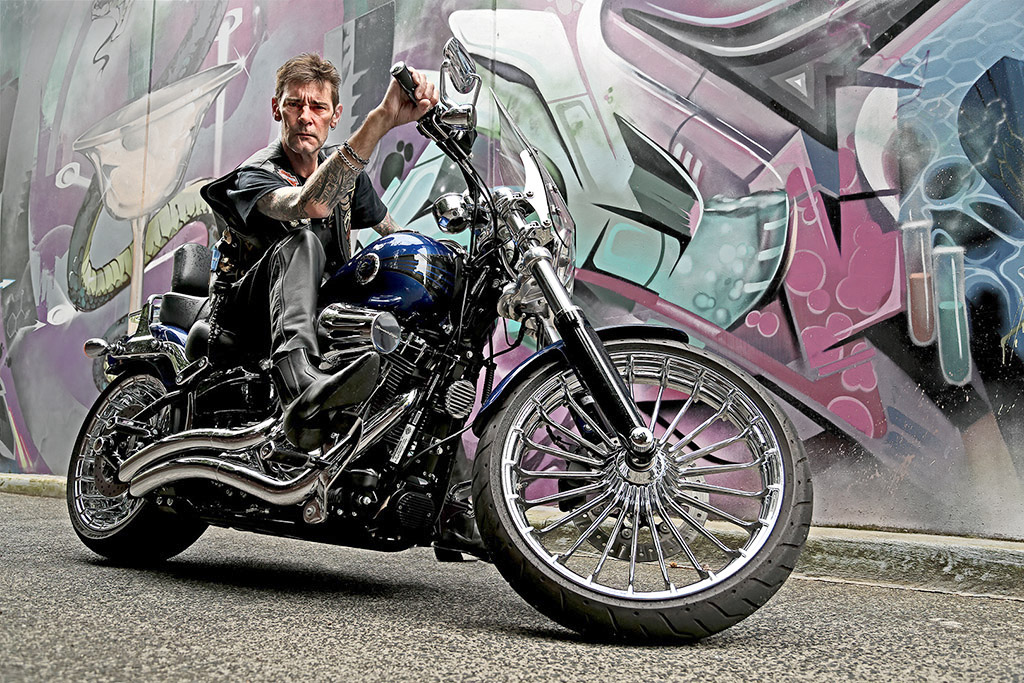
Hi Helen, fabulous bike and an amazing character that suits the bike too.
I tried Levels to bring up the bike and rider. Following Brenda's comments I make a cutout which was quite hard for this one, so many small sections, but I then used negative Vibrance to take down the background which is very busy and 'argues' with the bike.
Once you have the Mask you can invert it and use it to sharpen up the bike only, I tried the High Pass method.
Finally I added some Brightness into the eye area to lose some of the deep shadows.
|
Sep 6th |
 |
| 78 |
Sep 22 |
Comment |
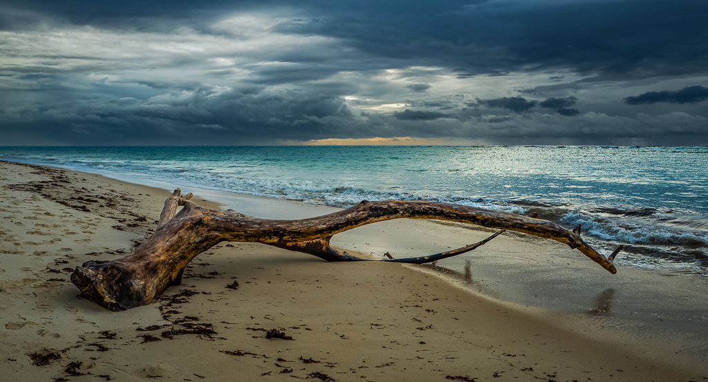
Hi Sunil, great image and processing, straightening the horizon and cropping the bottom make it more letterbox, and maybe a slice off the top would make it more so.
I love the colour version as the wood has real interest which is lost in monochrome.
I used some Negative Dehaze on the sky (mask) to bring it back a bit, and then some Saturation and Vibrance on the rest (inverse Mask) to make it pop, thoughts?
|
Sep 6th |
 |
| 78 |
Sep 22 |
Comment |
Very relaxing image Jim, and I like the implied triangle of the mules, building and barge.
Another classic UK comment, if you had moved a bit to the right the 'S' in the path would have been fully visible, never mind that you would possibly been in the River!
I also added a little Dehaze to richen the colours, but its very subtle so no point in posting the result.
|
Sep 6th |
| 78 |
Sep 22 |
Comment |
Hi Brenda
The sky replacement works well, much better than the flat Blue.
Two suggestions, the smaller distant balloon looks a bit sharper than the foreground one, maybe add a hint of blur just to this one to give it some depth, the sky doesn't need anything.
The second point is a common one that says 'some separation between objects would help' but it's a personal choice about what you want to present, and separation doesn't always work, so this comment doesn't really help except to prompt the question.
|
Sep 6th |
6 comments - 3 replies for Group 78
|
6 comments - 3 replies Total
|


