|
| Group |
Round |
C/R |
Comment |
Date |
Image |
| 78 |
Aug 22 |
Reply |
Agree with Jason, that touch more contrast really helps.
|
Aug 21st |
| 78 |
Aug 22 |
Reply |
looks a lot better to me, but you might now want to look at the bright edges of the water.
|
Aug 9th |
| 78 |
Aug 22 |
Reply |
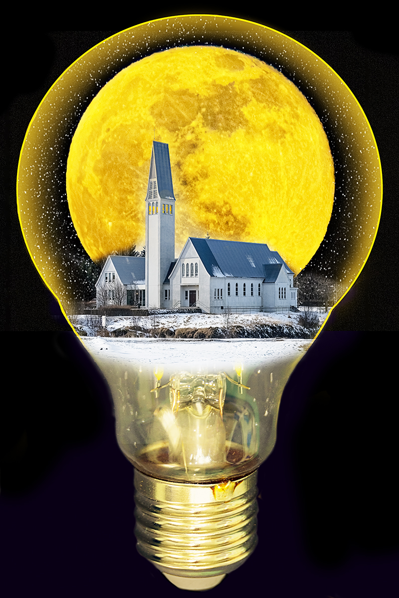
thanks Brenda, the lightbulb is just a standard domestic fitting so this was in the shed :) |
Aug 7th |
| 78 |
Aug 22 |
Reply |
Good point Jason, fortunately I used a mask to hide the edge so a simple fix, and just softened the end of the line. A black line didn't work as it got lost with the black background.
|
Aug 7th |
 |
| 78 |
Aug 22 |
Comment |
Hi Mitch, great capture and agree with Jason that the crop is well selected. For me the vertical branch is an intrusion, especially as its out of focus and everything else has been totally dissolved.
|
Aug 5th |
| 78 |
Aug 22 |
Comment |
Definitely atmospheric Jason, I love the hazy background which gives it plenty of depth, and any crop needs to be aware of not losing that.
Mitch is right to lose the wire and pipe as it feels more restful now, and I think I'd try losing a bit off the top (maybe to the yellow tree top) to help the hut become more prominent in the frame.
|
Aug 5th |
| 78 |
Aug 22 |
Comment |
Hi Helen, lovely capture especially as a 'lucky' find and not what you were waiting for. I like Brenda's tilt as it gives it a bit more dynamism, but would prefer a bit more room around the bird to show it's environment.
On my screen the leaves look a bit washed out, so have you considered a touch of saturation?
|
Aug 5th |
| 78 |
Aug 22 |
Comment |
Hi Sunil, I have to disagree with Jason this time as I like the processed image more. The spotlight is now more visible and 'explains' why the flag is backlit, and it also emphasises the lovely rimlight on the tail.
There is some rimlight on the front of the horse, could you bring this us too to make the shape really pop?
I agree with Mitch about the words on the hoarding, darkening them means they lose prominence and we no longer want to read them.
|
Aug 5th |
| 78 |
Aug 22 |
Comment |
Hi Jim, nice image but I think you've brightened it a bit too much and lost some of the evening atmosphere. The original sky has a tone to compliment the scene but this has been lost too.
I also like Jason's suggestion of a gradient on the water to darken the foreground even more (as per the original) as this is some distance from the quayside.
|
Aug 5th |
| 78 |
Aug 22 |
Comment |
Great capture Brenda, and I think Jason has said it all so I'm looking for something else productive to say. Have you tried Dehaze to bring some of the sky back? |
Aug 5th |
6 comments - 4 replies for Group 78
|
6 comments - 4 replies Total
|


