|
| Group |
Round |
C/R |
Comment |
Date |
Image |
| 78 |
Aug 21 |
Comment |
Thanks for all your comments, I've decided not to use this version of the set so have applied your suggestions to a similar image.
|
Aug 25th |
 |
| 78 |
Aug 21 |
Reply |
Although the flower is bright, my eyes went to the in focus grasshopper, so better in my opinion. |
Aug 13th |
| 78 |
Aug 21 |
Comment |
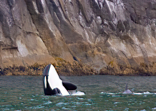
Good catch Mitch. As the Whale is leaping backwards then Jason's flip works for me too.
Helen's comment about more wall also works for me, otherwise the shoreline just cuts the image in half.
Can you do anything with the other Whale? For me its not adding anything as its almost lost in the tonal range, so needs to be either made more important, or removed completely.
Secondly the image seems to lack punch, try using some Vibrance and Saturation.
|
Aug 10th |
 |
| 78 |
Aug 21 |
Comment |
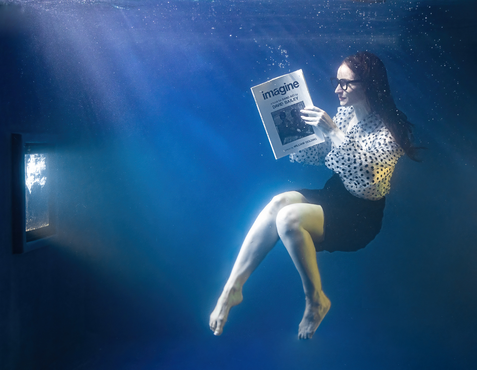
Hi Jason, first question is what do you mean by Nature Photography? If this is intended for competition then it does not qualify as a composite, but if its just a image about nature then you can do what you want. I personally have no issues with composite images however created. I did something similar for an open competition back in 2009 and had to use tweezers to position the legs!
I prefer Helen's to Mitch's suggestion as it keeps the full Lily pad, and your rework kept the points of the flower, tight but all there.
The big question is what do you want the viewer to look at, the flower or the grasshopper as both are strong focus points on either side of the image? Have you considered adding a third item, maybe a smaller version of the flower, or part of it, in the top middle to create a triangle?
|
Aug 10th |
| 78 |
Aug 21 |
Comment |
Interesting image Helen, and I'd go with Jason's colour version because the gardener detail is lost in monochrome and not strong enough for a silhouette.
I also read left to right so the flip works for me, but if its a simple pattern picture you want then I would not include the grass, and crop to put the gardener squarely on the third.
|
Aug 10th |
| 78 |
Aug 21 |
Comment |
Fabulous image Sunil, Jason and Mitch have said it all, nothing more to add. |
Aug 10th |
| 78 |
Aug 21 |
Comment |
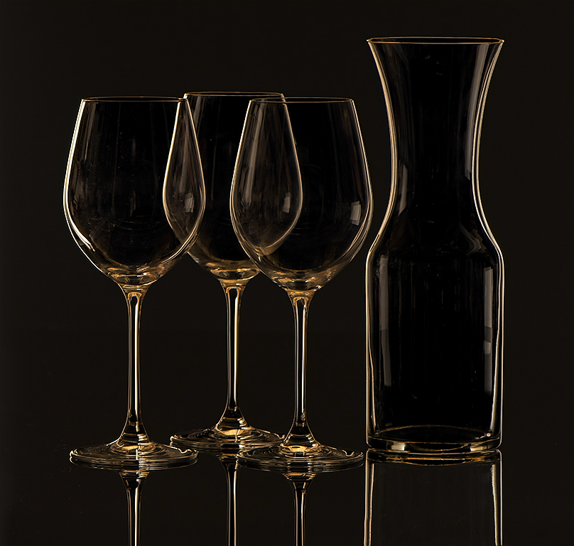
Great project Jim, and I prefer the colour version except for the background which looks a bit like a colour cast now. I added a levels adjustment layer and used the black dropper to select the background, darkening it (I'm sure you can do this better with the original).
You can see the light source reflecting in the glass, and I like that but did you use a softbox (or cloth sheet) to soften it?
|
Aug 9th |
 |
| 78 |
Aug 21 |
Comment |
Such a simple image but I really like it, the colours go together well and a bit more saturation of the gold would really make it jump.
Jason is right about the focus, plus a faster shutter speed will help. I like the composition but maybe a bit more (not to much) foreground would be nice. You said about the weeds, can you take the tripod into the pond beyond the weeds?
|
Aug 9th |
7 comments - 1 reply for Group 78
|
7 comments - 1 reply Total
|


