|
| Group |
Round |
C/R |
Comment |
Date |
Image |
| 78 |
Apr 21 |
Reply |
Thanks Sunil, looking better already.
|
Apr 7th |
| 78 |
Apr 21 |
Reply |
Thanks Mitch, I agree that it's too bright so will look to adjust it later. The area in front of the left bus lights is the exhaust from the right bus. |
Apr 7th |
| 78 |
Apr 21 |
Comment |
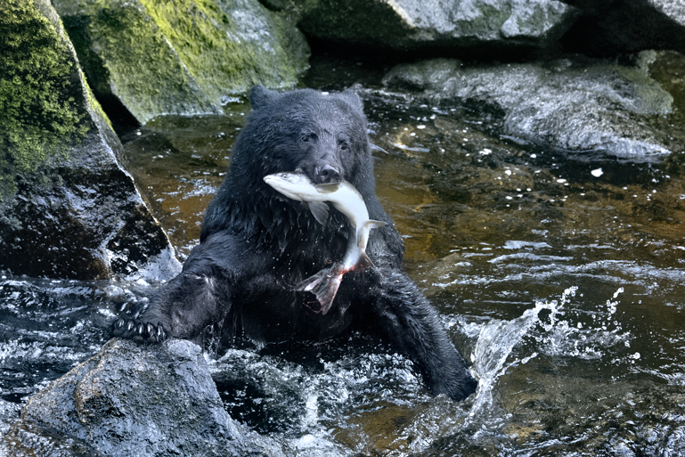
Hi Mitch, superb capture timed to perfection.
I agree with Helen that the splash is integral to the story, and Sunil's 3:2 crop would achieve that, plus give a bit more of the location for the story. I tried dropping the image as taken into Topaz Adjust, and then brought down the brightness on the fish, what do you think?
|
Apr 7th |
 |
| 78 |
Apr 21 |
Comment |
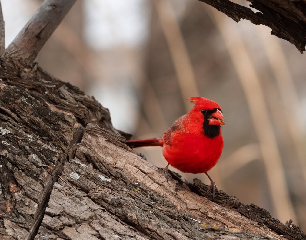
Hi Jason
I'm with Mitch on keeping the top branch, and maybe even the left one too as it does make a natural frame, or of course 'move' them as Mitch hinted at.
I tried a different crop, darkening down just the background, and brightening up just the bird. I have no idea what the true colour of the bird should be so this look more like your original. There's still more to do with the brighter white area to remove this distraction.
|
Apr 7th |
 |
| 78 |
Apr 21 |
Comment |
Hi Helen, more contrast has helped the image but have you thought about putting a gradient mask on the contrast layer so as to leave the distance so lovely and soft?
To be different I also preferred the original Blue version as it screams cold morning to me. Good luck in the competition.
|
Apr 7th |
| 78 |
Apr 21 |
Comment |
Great shot Sunil, and changing to monochrome stops the eye wandering around and keeps it focussed on the figure.
Others have already commented on the light so I'll suggest a tighter crop to make the subject less central.
|
Apr 7th |
 |
| 78 |
Apr 21 |
Comment |
Hi Jim, an excellent image and caught just at the right moment. I agree with your crop and removing the unwanted modern features, but may have been tempted to leave a bit more of the field corner.
On my screen there is a halo along the rooftops possibly from sharpening?
Have you also considered flipping the horizontal so the story reads left to right?
|
Apr 7th |
 |
| 78 |
Apr 21 |
Comment |
Hi Brenda, lots of comments already so a few more building on those made earlier.
The crop is much better now, losing the space on the left, and including the riders shadow make the whole image more balanced and captures the action more realistically.
I prefer the monochrome version as all the colours in the crowd take me away from the action, and I don't think you need the blur either, just use levels and move the central slider right to darken down the crowd and mask off the field, rider and horse.
The last point, and one you can do nothing about unless you have more horses to make a composite, is this is not a flattering shot of the horse's rear, if the horse was facing you when it reared it would be much stronger.
|
Apr 7th |
6 comments - 2 replies for Group 78
|
6 comments - 2 replies Total
|


