|
| Group |
Round |
C/R |
Comment |
Date |
Image |
| 78 |
Jan 21 |
Reply |
Thank you for the kind words, the original hasn't made it in 3 salons so I'm hoping the group's comments and the new version will fare better.
|
Jan 29th |
| 78 |
Jan 21 |
Comment |
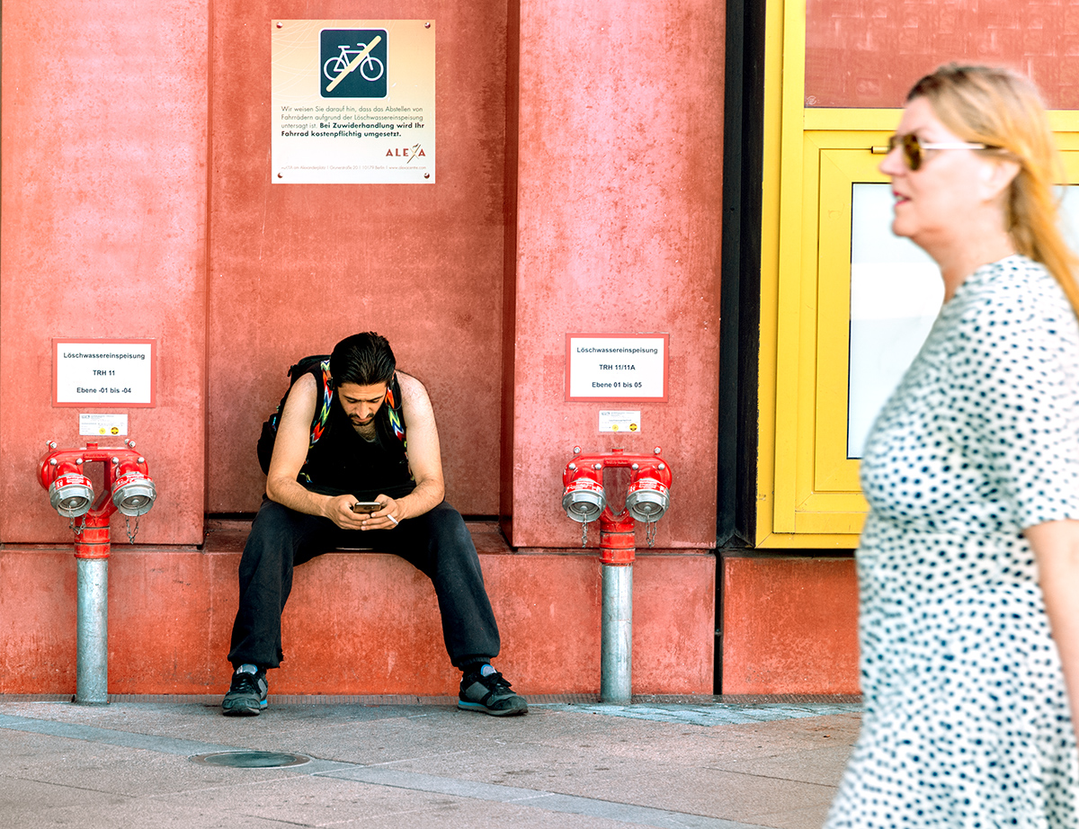
Taking Sunil's suggestion I revisited this, the crop is the same but I've done some more tidying up, the sign for 'no bikes' has been completed and moved away from the edge, the red window above the girl has been cloned and desaturated to match the wall, I've removed the red earing and stripe on the glass, plus the bits on the floor have been tidied.
Now I'm not sure if the Yellow frame is too strong or if that too needs toning down?
|
Jan 25th |
 |
| 78 |
Jan 21 |
Comment |
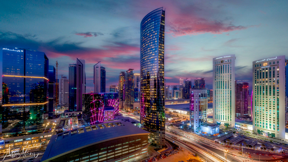
Superb image taken at some risk to yourself, but well done. You have done an excellent job of stitching this together, I would not know if you had not said so.
I tried adding a Levels layer and moving the middle slider left to 1.4 and the left (dark) slider to 16, which has brought out a bit more detail in the shadows.
I also cloned out the bright light on the round right tower as once I had seen it I kept going back to it.
|
Jan 9th |
 |
| 78 |
Jan 21 |
Comment |
I like Sunil's crop, and just added a curve layer and hit auto, then brought down the highlight on the nose, to get a bit more punch.
|
Jan 9th |
 |
| 78 |
Jan 21 |
Comment |
This all works very well as a card, and Brenda has said all that I think can be said. Keep safe and have a better year than the last one.
|
Jan 9th |
| 78 |
Jan 21 |
Comment |
It definitely needed that brightening up to get such rich colours, and the texture now just pops off the wall. The emphasising of the Green vs Red also works well, and the shadows give it depth.
I don't agree with keeping the dead vine, its not dead enough to be interesting unless you can darken it down more to make it more prominent. Removing it completely by crop and cloning focusses the eye on the Green leaves.
|
Jan 8th |
 |
| 78 |
Jan 21 |
Comment |
I love the soft feel of this image, the colours in the sky, the way you've adjusted the other colours, plus you've lightened it just about enough.
There are some distraction such as the hazard boards below the Vatican, the White van next to them (no issue with the cars), and the phone light from the person sitting below the van. I also feel the verticals are leaning out a bit.
|
Jan 8th |
 |
| 78 |
Jan 21 |
Reply |
Good idea, I dismissed this initially as I don't like blur, but now starting to accept it for movement. Definitely will have to revisit this.
|
Jan 5th |
6 comments - 2 replies for Group 78
|
6 comments - 2 replies Total
|


