|
| Group |
Round |
C/R |
Comment |
Date |
Image |
| 78 |
Dec 20 |
Comment |
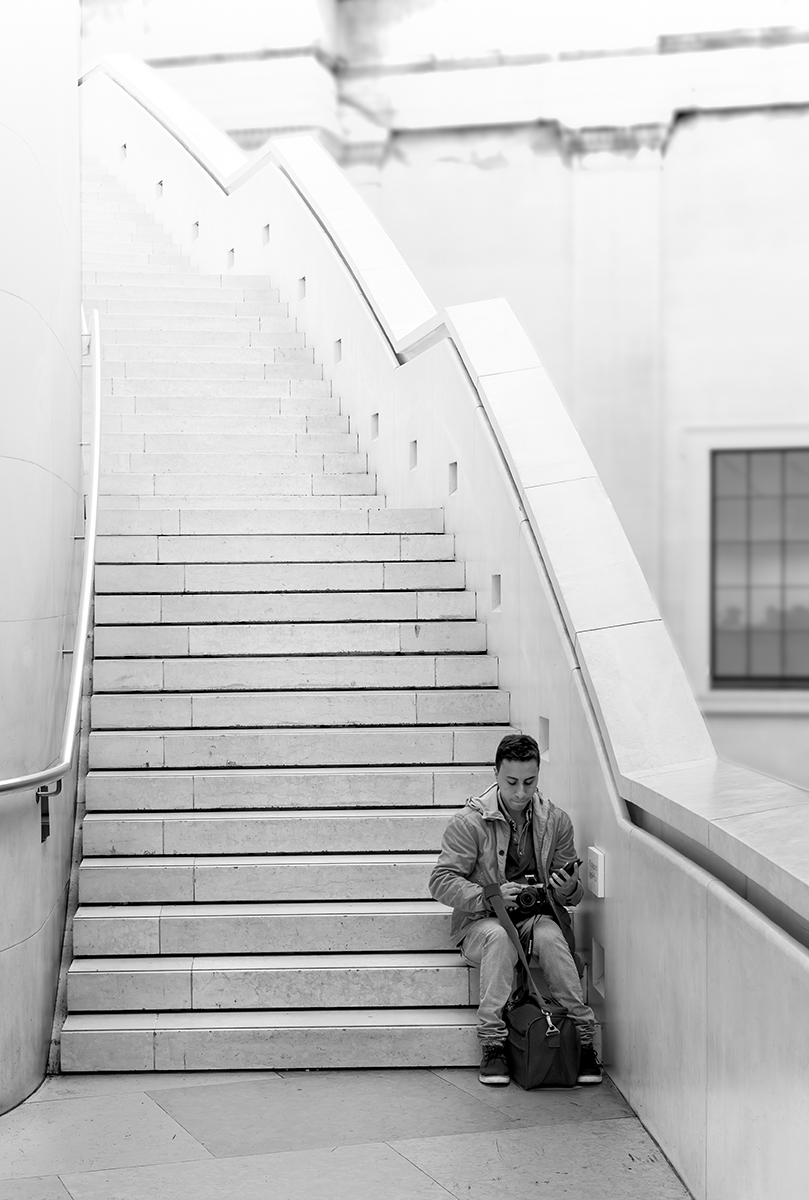
Thanks for all the comments, so I've had another play.
I've taken Jim's suggestion to blur the background, but want to keep all the stairs as they are as important as the figure. I've also added a layers layer with a gradient mask to make the stairs disappear into the light.
New title (suggestions welcome): Technology To Lift Our Dreams.
|
Dec 25th |
 |
| 78 |
Dec 20 |
Comment |
Thanks for all the comments, so I've had another play.
I've taken Jim's suggestion to blur the background, but want to keep all the stairs as they are as important as the figure. I've also added a layers layer with a gradient mask to make the stairs disappear into the light.
New title (suggestions welcome): Technology To Lift Our Dreams.
|
Dec 25th |
 |
| 78 |
Dec 20 |
Reply |
I like the smoke change, and the title, plus find Sunil's Sepia suggestion interesting.
What is the Photoshop error, is it too big now to be a PSD and needs to be a PSB? |
Dec 25th |
| 78 |
Dec 20 |
Reply |
Thumbs up from me.
|
Dec 23rd |
| 78 |
Dec 20 |
Reply |
This is in the British Museum, a public venue where one can't take models, so its a street/grab shot. I was just surprised at the lack of people on this staircase for a packed museum.
|
Dec 20th |
| 78 |
Dec 20 |
Reply |
Thanks Jim, the blur and darkening definitely help, but I want the figure darker to make him stand (or sit) out.
|
Dec 20th |
| 78 |
Dec 20 |
Comment |
Superb image and super detail for handheld, and I especially like the head being in the darker area which makes it stand out even more.
I disagree about cropping tighter, maybe take a bit off the left and add a bit more of the tree on the right giving more room to look into but keeping the surroundings, but other than that I have no other improvements to offer, just wish I had this image :)
|
Dec 19th |
| 78 |
Dec 20 |
Reply |
I fully understand your feelings, I do 90% of my portrait work "in camera" and hate it when the comments imply I've added the model to a location. There is a special place for 'authentic' photography which is growing in interest again, so well done for sticking to your principles.
|
Dec 9th |
| 78 |
Dec 20 |
Comment |
Brenda has pretty much nailed the comments on this one, its a super image that just works.
|
Dec 5th |
| 78 |
Dec 20 |
Comment |
Moody and atmospheric, a very relaxing image. Consider using negative Clarity to make the mist even mistier, and a bit of Dehaze to bring up the contrast in the mid-tones.
There looks to be a box or something in the field between the fence horizontals which now I've seen it I can't forget it and keep going back there, a simple job to remove it.
I'm not sure about the title, as there is no obvious path through this image?
|
Dec 5th |
| 78 |
Dec 20 |
Comment |
A very pleasant venue, almost timeless and well photographed. As already said, the figure needs to be further into the frame, and the cap doesn't work for me either. Stephen's title works for me, so have you considered removing him and adding a monk or similar peaceful figure?
The green at the end of the passage feels a bit bright and possibly too sharp, have you considered a bit of gaussian blur and reduce the brightness just on the green part?
|
Dec 5th |
| 78 |
Dec 20 |
Comment |
A lot of work has been done to this and it was worthwhile as its an excellent image with lots of detail, and of course topical with Trump in the headlines.
I agree with Brenda the flag doesn't trouble me, and removing it would be a major task, but the light below (white bit) and the street light below/left do draw the eye away.
The pillar on the left looks a bit strange, is there a shadow falling on it?
|
Dec 5th |
| 78 |
Dec 20 |
Comment |
I like the concept with the play on Havana, presumably that's the type of cigar too (I wouldn't know), so maybe use that in the title.
The filters have certainly given it more depth, but there is some strange light around the base of the ashtray, especially on the right where it should be darker, like the glass.
I think there is just enough of the bottle, but you could have a bit more to give it more height, and I would have liked the whole cigar in view, which would allow the height and width to be kept to proportion. The ashtray could also go a bit left to give it a bit more room, the overall feel is a bit tight.
I like that you've added some red to show the cigar is alight, and not too much as it would have been easy to overdo this part and cigars don't glow much when resting like this. As for the smoke it could be a bit more dense and this doesn't look real, too many hard edges for the whispery effect
|
Dec 5th |
| 78 |
Dec 20 |
Reply |
"Billy No Mates" is an expression common in the United Kingdom, and I was unaware it wasn't universal so I'll have to change it before entering salons. It means someone without anyone else to talk to, ie 'no mates', and is used when a figure is seen doing something but isolated from everyone else.
|
Dec 5th |
8 comments - 6 replies for Group 78
|
8 comments - 6 replies Total
|


