|
| Group |
Round |
C/R |
Comment |
Date |
Image |
| 78 |
Oct 20 |
Comment |
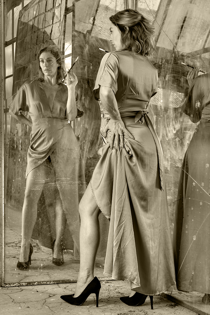
I tidied the verticals up as per Helen's suggestion, and distorted the shape to fit better, then added some tint. I submitted it to the ACB circuit in India, and I'm pleased to say it was accepted in the mono class.
|
Oct 30th |
 |
| 78 |
Oct 20 |
Reply |
I still like this, but now the man on the bottom left seems to draw me across, have you considered a tighter crop?
|
Oct 25th |
 |
| 78 |
Oct 20 |
Reply |
Looks good to me, not usable as a Travel photo 'cos of the changes, but a strong Monochrome comp entry, good luck. |
Oct 25th |
| 78 |
Oct 20 |
Comment |
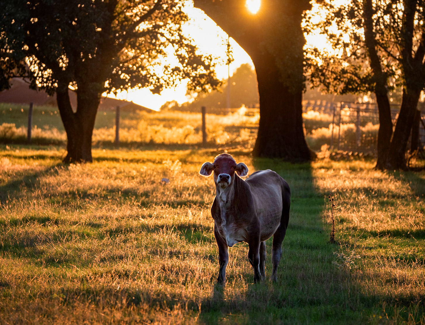
I want to keep the rich colours so put it into the Raw Converter and upped the dehaze and clarity. I then added a levels layer on the cow and lightened via the midpoint, plus added a bit more exposure to the head. Finally I added more saturation to warm it up even more.
If I have more time I'd play with getting more detail in the sky, not too much but enough not to look so bleached.
|
Oct 15th |
 |
| 78 |
Oct 20 |
Comment |
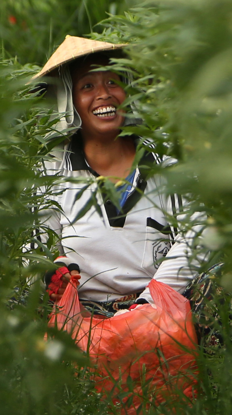
Hi Helen, A super image but I have to disagree with Jason for once, for me there is too much greenery, probably 60%+ and this is supposed to support the image, not be the primary feature.
|
Oct 15th |
 |
| 78 |
Oct 20 |
Comment |
A simple image that just works, especially in B&W. |
Oct 15th |
| 78 |
Oct 20 |
Comment |
Super image Jim, I'm jealous of such amazing locations :)
I'm surprised at how much background detail you caught at F1.8 as I'd expect it to be thrown considerably more out of focus. Having said that the buildings are important to set the scene, and the crop is well chosen.
I would like a bit more separation between the roof of the truck and the horizon, and this might be achieved with Jason's suggestion about overall brightness levels.
I'd also like a small cloud in the left of the sky to break up the solid colour, and balance against the truck.
|
Oct 15th |
| 78 |
Oct 20 |
Comment |
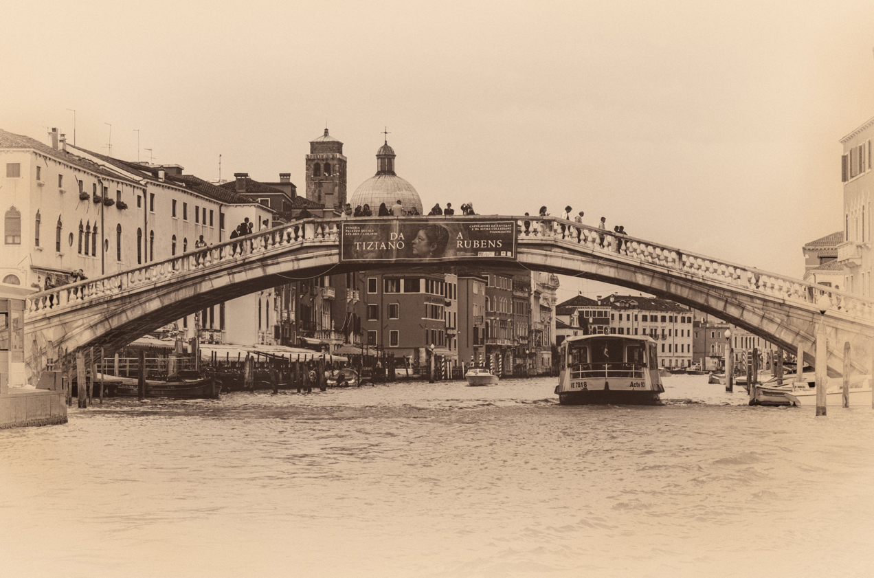
Hi Brenda, a bit late to the party this month but there are some good comments here already so not much to add. Going B&W was definitely the right choice, and the boat ahead is perfectly positioned.
There is still one shirt very bright in the centre of the bridge that I would darken down.
I'm not a fan of the strong vignette and Stephen has already covered that. I'm also not a fan of grain and the sky looks noisy on my screen so maybe a small gaussian blur to soften it?
The postcard look works well in its own right, but I agree with you about the loss of detail, so what if you just tinted the B&W version?
|
Oct 15th |
6 comments - 2 replies for Group 78
|
6 comments - 2 replies Total
|


