|
| Group |
Round |
C/R |
Comment |
Date |
Image |
| 78 |
Jun 20 |
Reply |
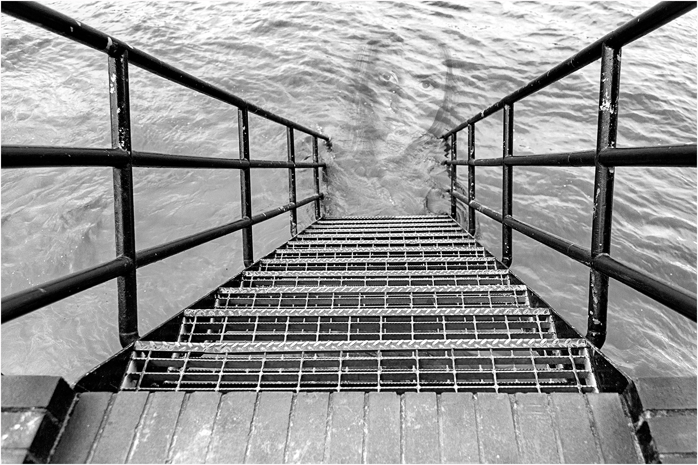
The tower looks a lot straighter now, more lightening makes it feel more in tune with the other buildings, and more sky definitely helps. You could try cropping the bottom to make the building diagonals come out of the corners.
For the windows I just cloned a bit of sky, and in my opinion it adds a bit of depth.
I don't think you can enter a 'travel' image that has any anything added or any other adjustments to the picture content (like adding sky to the windows), but you can straighten, dodge, burn, hdr merge etc. You can of course use it in the 'open section'.
|
Jun 21st |
| 78 |
Jun 20 |
Comment |
Thanks for your comments, @Jim I wanted the symmetry so haven't cropped anything.
The face was the most distraught one I could find, but bow to your comments and have replaced it with one looking more into the camera, plus I've made it bigger so as not to feel like a real person in the water.
I've also made the steps less sharp as there were some disturbing artifacts in the full image.
|
Jun 20th |
 |
| 78 |
Jun 20 |
Reply |
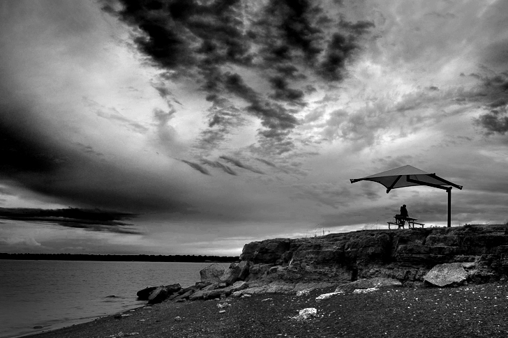
Sunil, that makes sense if you want the focus on the couple and not the sky, but they are very small in the frame to be the main focus. Have you considered a serious crop off the left and top to make them more prominent?
|
Jun 14th |
| 78 |
Jun 20 |
Comment |
Excellent still life, nicely lit and the sprinkling of sugar makes it come alive, so much so that I want one! I love the fact you improvised with books and envelopes to set up the shot, plus honest enough to admit it.
I feel it could be a bit sharper, and maybe a bit more light just on the dates, but not on the bottle which it subtle in the background.
|
Jun 7th |
| 78 |
Jun 20 |
Comment |
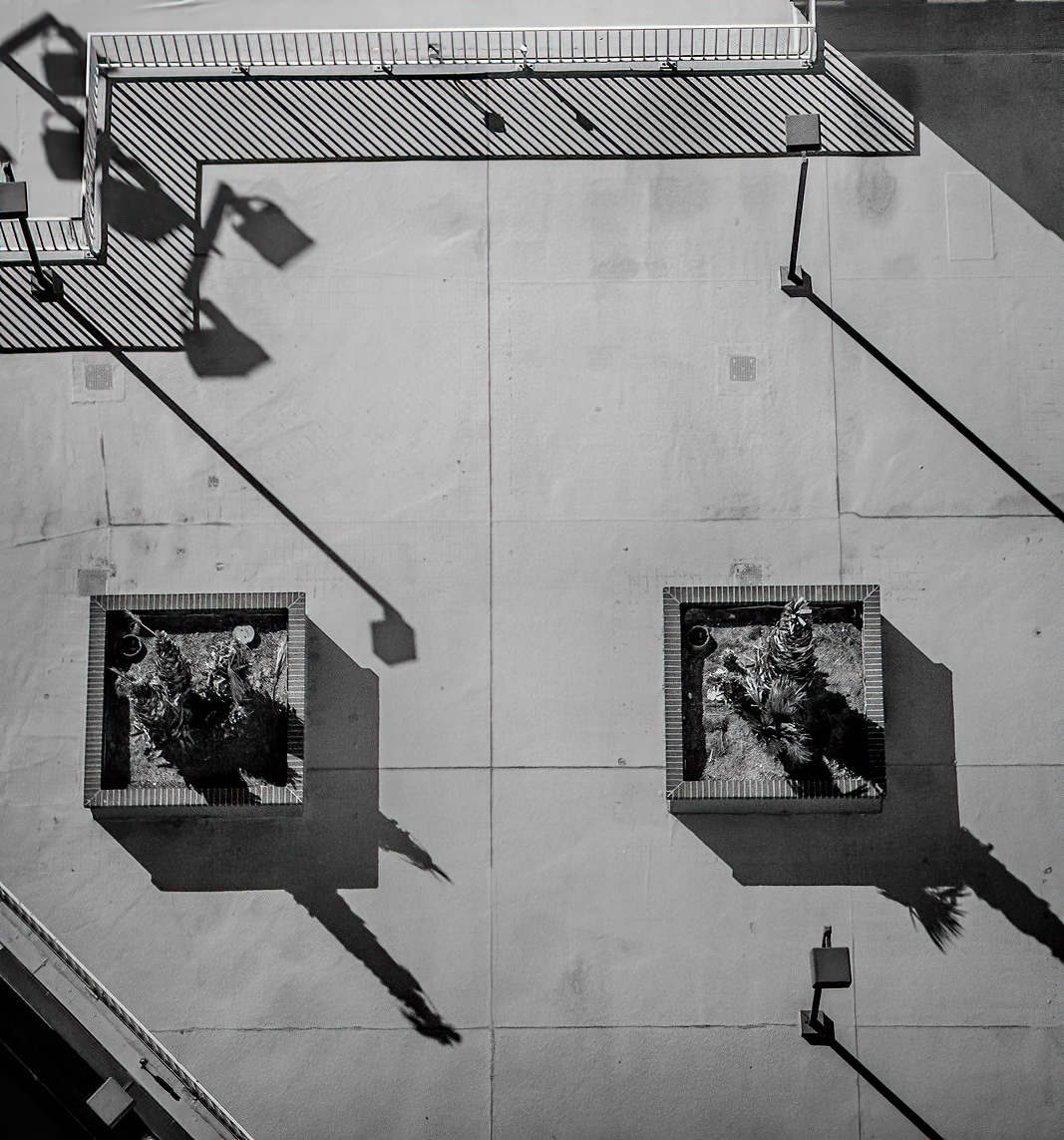
Interesting concept just to use graphic shapes, and repeating patterns. My thoughts were to tidy up the top right shadow and then to enhance the contrast and sharpen to really make the lines punchy.
I note you said you wanted a vertical image, but there's a large chunk at the top that doesn't add anything, and cropping it out just about keeps a vertical shape.
|
Jun 7th |
 |
| 78 |
Jun 20 |
Comment |
An interesting image where the green background gives a feel of radiation, and I think Brenda's idea of keeping the eyes sharp will completely change the feel of this image.
Good luck with your new adventures.
|
Jun 7th |
| 78 |
Jun 20 |
Comment |
Nicely cropped to focus on the important elements, removing the bin and turning it to b&w works well too. I did feel the sky had lost a lot of potential detail by saturating so tried using topaz adjust hdr, then b&w with red filter, plus I left a bit more on the right.
I also love the colour version, it really catches the eye and makes a dramatic statement. |
Jun 7th |
 |
| 78 |
Jun 20 |
Comment |
First the canyon, I love the muted tones and the slight blur, they add to the overall feel of size and distance, especially with the foreground rocks being sharp (no pun intended) but feel the sky is a bit bright.
Second the model providing the foreground interest, lovely colours and detail in the dress, good pose as if meditating, but have to agree with Brenda that the boots let her down, moccasins would have suited better. Also is that a phone in her left hand?
Overall though I think the two parts of the image are competing for attention and one or the other has to become the dominant factor by toning down the other.
|
Jun 7th |
| 78 |
Jun 20 |
Comment |
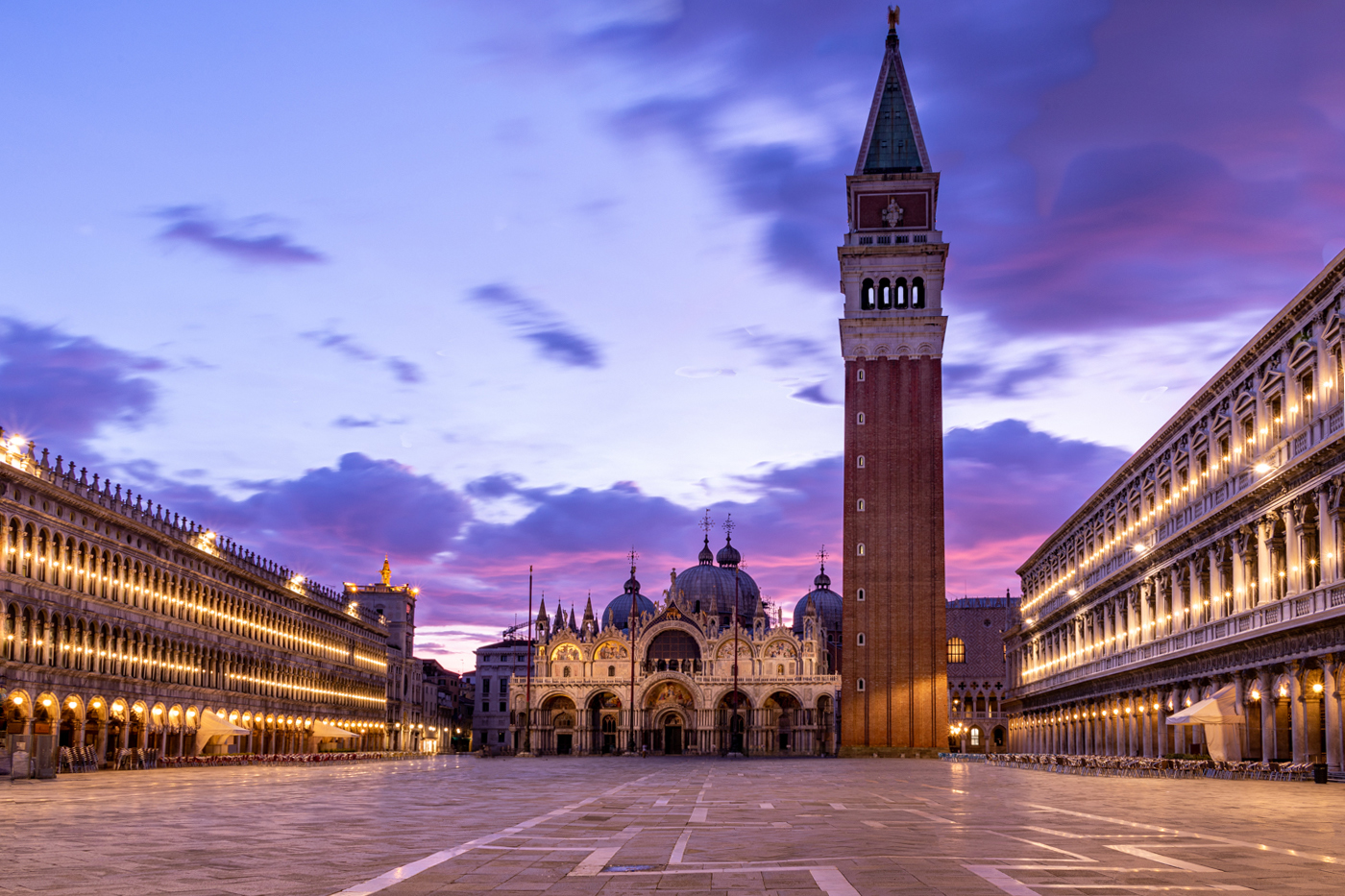
As a record of the square this does the job well, and probably how you remember it. Lightening the tower works too, not too much as to lose the darkness, and not too little so as to not show the detail.
I think you're right about needing a bit space more at the top, and with an already blurred sky this should be easy.
Nitpicking, I get the feeling of tilting to the right slightly, plus played with adding light to 8 of the windows.
|
Jun 7th |
 |
| 78 |
Jun 20 |
Comment |
I am attempting to make the figure a 'lost soul' rather than a real figure drowning, hence the blending of layers and reduced opacity to keep the texture of the water.
|
Jun 7th |
8 comments - 2 replies for Group 78
|
8 comments - 2 replies Total
|


