|
| Group |
Round |
C/R |
Comment |
Date |
Image |
| 78 |
Apr 20 |
Comment |
Updated after comments; the chair is back and the face lightened, plus the catch light in the eyes enhanced.
|
Apr 14th |
 |
| 78 |
Apr 20 |
Reply |
I prefer the tighter crop too. |
Apr 14th |
| 78 |
Apr 20 |
Reply |
LOL, the most important part is you are happy with what you produce, the rest is just opinion. |
Apr 7th |
| 78 |
Apr 20 |
Reply |
Thanks Jason, I like "but still something a little odd in a subtle way", just can't put a finger on it :). What do you think about the smaller window reflections, keep both,lose one or both? |
Apr 4th |
| 78 |
Apr 20 |
Comment |
I love portraiture and shoot it as my main genre, and this is a good portrait. The lighting is excellent with just enough to separate the model from her background, and well done not to have the jewelry blown out, always a challenge.
I agree with Brenda about the eye, such a key part of any portrait. I would also like to see the top of her head as the crop is so slight, and some attention to her right shoulder (clone a bit more hair?).
|
Apr 2nd |
| 78 |
Apr 20 |
Reply |
Fully understand, good luck in the competition. |
Apr 2nd |
| 78 |
Apr 20 |
Comment |
Well seen Jason, most of us would just walk past this without giving it a thought.
I love the effect of the dandelion, we wouldn't know it if you hadn't told us, it looks like a soft light source to explain the rim light.
Would you consider a square crop to remove the right hand bud, and maybe removing the left out of focus flower completely? I also put a levels on the flower head to bring a little detail back.
|
Apr 2nd |
 |
| 78 |
Apr 20 |
Comment |
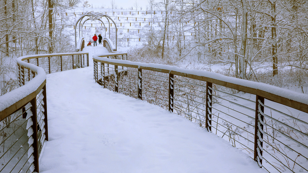
Definitely worth the wait to get this couple and dog coming into the picture. Composition wise I wouldn't change anything, the 'S' curves lead us well into the image, and they don't cross so good positioning while you waited. I wasn't so happy with all the footprints so a quick and dirty job to remove them.
If you feel this has a Blue cast its easy to remove, copy the layer and 'Blur,Average', add a Levels adjustment and use the Grey dropper to select the blur colour, hide the blurred layer and then play with the Levels midpoint slider to suit.
If you like the Blue then ignore this paragraph :)
|
Apr 2nd |
 |
| 78 |
Apr 20 |
Comment |
An interesting story but it doesn't come across in the image, but I love the feeling of isolation or solitude that it projects, which makes the man so important.
B&W certainly suits this image and you have brought out the sky well.
I feel the right hand rock is dominant so would take the brightness up a little to compensate, and then crop tighter to make the figure more prominent. Taking Brenda's suggestion I've sharpened the man and put a Levels on the whole image to increase the tonal range.
|
Apr 2nd |
 |
| 78 |
Apr 20 |
Comment |
I agree with Brenda, great street photography image but possibly over sharpened, but I love the positioning of the couple.
I also find the background poster is too dominant and not relevant to the maps they are reading so have you considered replacing it with some sort of tourism picture? |
Apr 2nd |
 |
| 78 |
Apr 20 |
Comment |
I love the colours that you have brought out, it feels like what I imagine jungle to be like under a blazing sun. My first thoughts were the greens were too green/bright but apart from the one fern on the left front I now think they work well, especially the far end of the path where the sun is coming through. Darkening the bottom of the image works too in adding depth.
The path just about has an 'S' which draws us comfortably through the picture, but is that what you want? For me a comfortable lead line should take me to something (a Panther?) whereas a strong 'S' makes its own statement, so do you have any that accentuate the 'S' at all?
|
Apr 2nd |
7 comments - 4 replies for Group 78
|
7 comments - 4 replies Total
|


