|
| Group |
Round |
C/R |
Comment |
Date |
Image |
| 78 |
Feb 20 |
Comment |
Thanks for all the comments, updated version. |
Feb 13th |
 |
| 78 |
Feb 20 |
Reply |
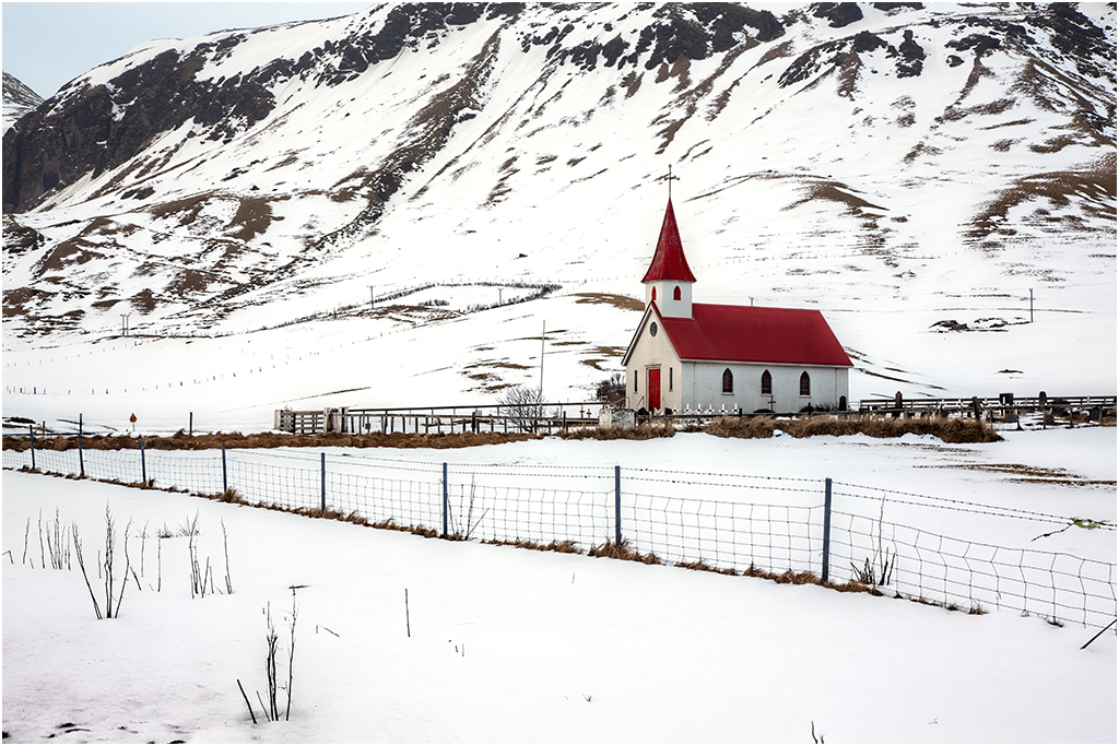
I can't take out the fence as its a travel picture and no amendments are allowed. If I did remove it I would also have to crop the bottom to stop the other fence splitting the picture in two. |
Feb 13th |
| 78 |
Feb 20 |
Reply |
I've redone the adjustment taking your point, but still don't like the blue tint (I know its cold but looks wrong to me). |
Feb 13th |
| 78 |
Feb 20 |
Reply |
Jason you nailed it by saying 'illustrated book', a comment I've been trying to verbalise as my images are too 2D. I've put a gradient on the mask for the filter so the mountain tops are not altered hopefully making them feel further away.
I've also redone the adjustment so there's less detail in the bottom left plants and I'm happier that they don't stand out as much.
|
Feb 13th |
| 78 |
Feb 20 |
Comment |
Very nice image, simple sky, a bit tight on the left but definitely suits your choice of B&W processing. I agree with Gary that a little more light in the shadows would be nice, but as he also says not too much.
I felt the top window looked like an eye watching what you were doing!
|
Feb 9th |
| 78 |
Feb 20 |
Comment |
Good capture of this goat's first moments, and against all the 'rules' I like the eye closed, it gives a feeling of peace in the sunlight after its journey.
Strange DOF where the ear is in focus, the face behind is in focus, but the bit below and behind the ear (leg?) isn't. Did you blur the foreground and include this by mistake?
Jim's blur and reduced brightness of the background works for me too. |
Feb 9th |
| 78 |
Feb 20 |
Comment |
Super image, and well worth the wait for the solitary figure that makes it work.
I agree with Jason re the contrast, but maybe not so much white as he suggests, the original to me works well. I also see the arches as fountains, but the more I look the less I like them, so myabe darken them down so they aren't quite so powerful. |
Feb 9th |
| 78 |
Feb 20 |
Comment |
A fabulous house and tree, and a super sky to go with it, well seen and post processed.
A real dilemma here, the building to the right definitely lets it down, but the tree is superb and needs to stay. To the left is just clutter so you're right to ignore it, maybe tidy up the white van.
Have you considered altering the right hand building to make it more appealing, a quick edit of an idea to reduce its impact. I've also removed the signs from the front of the house.
|
Feb 9th |
 |
| 78 |
Feb 20 |
Comment |
Welcome aboard Jim.
I agree with Jason, a great job isolating the subject but I would have preferred the wall to be as shot, its not too bright and the new colour for me is too close to the pot. I think you've also lost the texture in the plaster which brings character to the scene. |
Feb 9th |
| 78 |
Feb 20 |
Comment |
Good job of cloning and removing all the other distractions. I don't have any issue with the bit of green and may have left a bit more of it in. You have added blur to the rock back left, and I would be tempted to mask the blur layer and keep the original.
As the others have said, the rock is too bright and draws ones attention, and is strangely a different colour from the rest of the rock. One danger is to bring the rock back to match the other browner rock, but then the fabulous bird (which may be common to you but I've never heard or seen one before) would not necessarily stand out.
I also would have liked a bit more space around the bird, giving it a location.
|
Feb 9th |
 |
7 comments - 3 replies for Group 78
|
7 comments - 3 replies Total
|


