|
| Group |
Round |
C/R |
Comment |
Date |
Image |
| 78 |
Jan 20 |
Reply |
Thank you Brenda, Lenah is a female professional model and uses some of my images to promote herself. Normally when we shoot she has long dreadlocks but this time she removed the wig to do something different, and the hat just happened to be in my prop bag and had no other significance. It's interesting that you saw a connection between the hat and her colour. The jacket was chosen to simply make her look tougher. |
Jan 6th |
| 78 |
Jan 20 |
Comment |
A beautiful horse, well photographed with room to run into, and good use of back-lighting. Taking on board your earlier comments are you allowed to use Photoshop? I find the fence poles lessen the image, so either edit them out or try to get a cleaner background when taking the image, either way a cleaner pleasing background will enhance the subject. |
Jan 6th |
| 78 |
Jan 20 |
Comment |
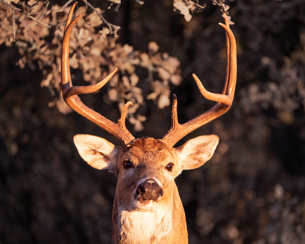
I think you've captured an excellent portrait of this fella, and the central positioning adds to his strength. A bit more space at the top would have helped, and maybe bring down the background a bit to make him stand out. |
Jan 6th |
 |
| 78 |
Jan 20 |
Comment |
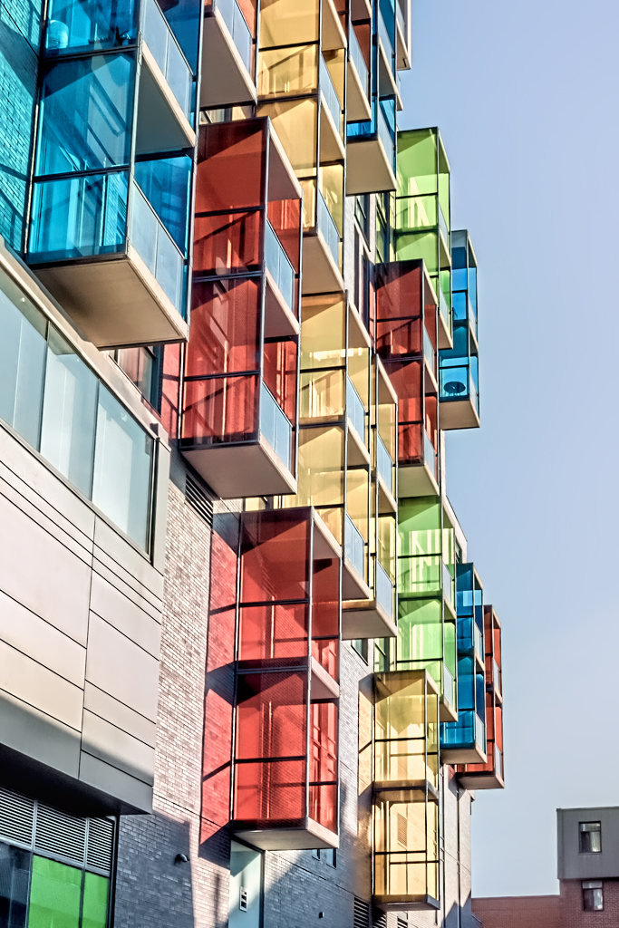
I like this and you were right to lighten the bottom buildings to bring them into the image. I would just add a bit more punch to make it more of a statement image. |
Jan 6th |
 |
| 78 |
Jan 20 |
Comment |
A superb holiday image and I love the treatment given, especially how you have brought up the tree. Have you considered using the same adjustment layer (edit the mask) on the decoration immediately to the left of the tree? The lamp itself is dark for a central feature so maybe lighten this a bit too.
I agree about the car on the left, shouldn't be too hard to clone it out as cropping would spoil the tree detail, but what looks like Santa behind the post doesn't trouble me. |
Jan 6th |
| 78 |
Jan 20 |
Comment |
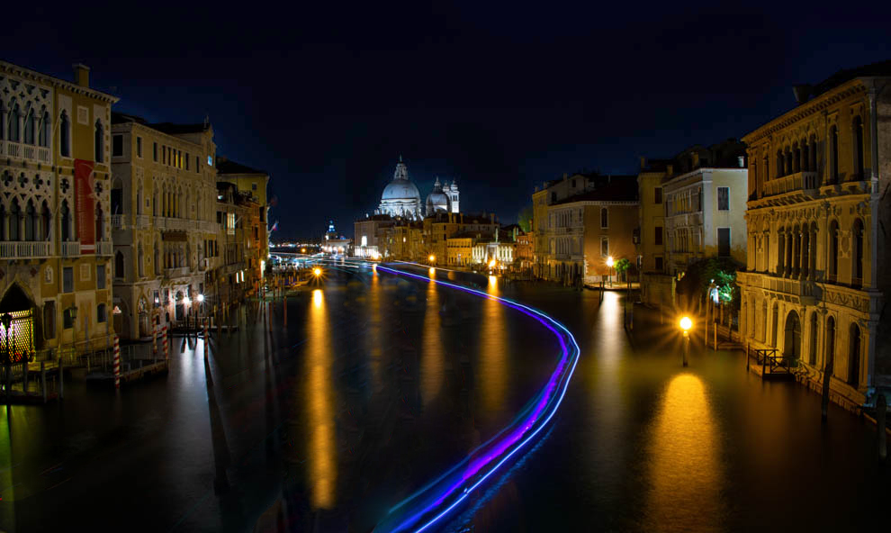
Raising the light levels on the buildings certainly works well, just enough to see them but keep the mood, plus the starburst on the lamps adds to the overall feel. The bright gate on the bottom left could do with toning down a tad as it draws the eye.
I find the gaps in the trails, especially the left red one, off-putting, and this is probably where you've added trails so I would try to close these gaps. Also the central red and white lines start in about the same place but then cross over implying 2 boats in the same place at the same time. I like the purple trail best as it moves through the whole image and may even be strong enough to be the only trail, sometimes less is more.
The sky is very dark presumably from the time it was taken, a slightly earlier shot with a bit of detail or a few stars would help.
|
Jan 6th |
 |
5 comments - 1 reply for Group 78
|
5 comments - 1 reply Total
|


