|
| Group |
Round |
C/R |
Comment |
Date |
Image |
| 78 |
Nov 19 |
Reply |
yes, the distraction of the lamp is so much more evident now its gone. |
Nov 30th |
| 78 |
Nov 19 |
Comment |
Sunil is right about the big leaf, it competes for attention, but a simple crop would sort this out. Excellent focusing on the face but I would prefer a bit more dof, and maybe mute the greens a bit? |
Nov 3rd |
 |
| 78 |
Nov 19 |
Comment |
Sunil has nailed the sky in this one, and B&W suits it well. I would bring up the levels in the horses a bit so they are a bit more prominent. |
Nov 3rd |
| 78 |
Nov 19 |
Comment |
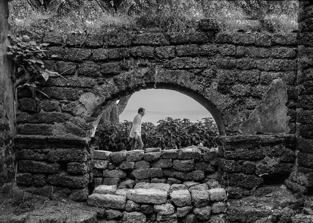
B&W certainly brings out the texture in this one, and suits the overall image. I'm not sure about the top corners being so dark they look like they are missing so my eye keeps going there to look for something. Also can you bring out the detail behind the man a bit more? |
Nov 3rd |
 |
| 78 |
Nov 19 |
Comment |
Well processed, was this a simple crop or did you use a transform tool? She looks a bit thin in the face so I would stretch the width a bit to see if it feels better. |
Nov 3rd |
| 78 |
Nov 19 |
Comment |
Super image and what Sunil said, either remove the light or make it a moon. I'm happy with the amount of floor showing, but if you do crop then leave the complete diamonds. |
Nov 3rd |
5 comments - 1 reply for Group 78
|
5 comments - 1 reply Total
|