|
| Group |
Round |
C/R |
Comment |
Date |
Image |
| 78 |
Oct 19 |
Reply |
Definitely better but at the risk of being kicked, I think maybe the lightening is a bit too much now :) |
Oct 27th |
| 78 |
Oct 19 |
Comment |
Sorry to put up a different image but August is closed, and wanted to thank everyone for their comments that prompted a change to that image. Please delete if not allowed. |
Oct 22nd |
 |
| 78 |
Oct 19 |
Comment |
Sorry to put up a different image but August is closed, and wanted to thank everyone for their comments that prompted a change to that image. Please delete if not allowed. |
Oct 22nd |
 |
| 78 |
Oct 19 |
Reply |
I much prefer this to the original, and take Brenda's point about darkening the left hand building so as not to draw the eye that way. |
Oct 13th |
| 78 |
Oct 19 |
Reply |
Definitely agree to bring up the main building, but would go a bit further with the sides and water. |
Oct 7th |
 |
| 78 |
Oct 19 |
Comment |
As above, timing is everything so well caught. As a Nature picture you can't do much tidying up, but if its not for competition there is some cloning that would improve it. |
Oct 6th |
| 78 |
Oct 19 |
Comment |
I tried cropping off the top of the sky (3:2 format) as it's the mountain that is the feature in the sky, then using dehaze to add the contrast in the sky. It also feels cold (blue) which is presumably the intent, but take a look at upping the temperature to see how it looks. I couldn't save any changes I made, sorry. |
Oct 6th |
| 78 |
Oct 19 |
Comment |
Great motion shot but I would like the rider and horses head sharper, leaving the motion to the rest of the image. Stephen is right about a slightly faster shutter, plus I would suggest panning with the rider. Also a bit more space on the left to ride into would help. |
Oct 6th |
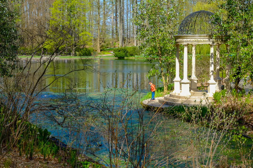
| 78 |
Oct 19 |
Comment |
I love the addition of the little boy, he makes the image work. As well as Richard's comments I would crop it a bit tighter to bring him towards the third, and try to remove the people on the left as they are a distraction. Here is a quick and dirty edit to show. |
Oct 6th |
 |
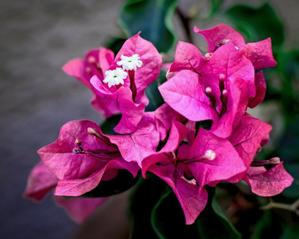
| 78 |
Oct 19 |
Comment |
I agree with Richard as to making the flower itself pop out a bit more, and would add a little selective sharpening to the flower too. |
Oct 6th |
 |
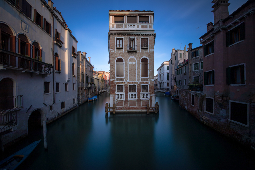
| 78 |
Oct 19 |
Comment |
Love the silky water and the symmetry of the picture with the main building plumb in the middles, but the edges are a tad too dark for me, whereas the sky is perfect. |
Oct 6th |
8 comments - 3 replies for Group 78
|
8 comments - 3 replies Total
|


