|
| Group |
Round |
C/R |
Comment |
Date |
Image |
| 78 |
Aug 19 |
Reply |
As you can't re-do this shot in camera I would certainly try, but the challenge will be the car edge and how much to apply, good luck.
|
Aug 5th |
| 78 |
Aug 19 |
Comment |
Way too much time was spent on this, the initial image was put through Topaz Denoise, then Topaz Adjust (Exposure), then sharpened. The adjustment to B+W was with a green filter, then finally Levels.
The paper was photographed on the kitchen table, and parts cropped out and others cloned to nothing and blended to remove all trace. The text I added was then given a Gaussian blur to make it look more line the actual paper text.
The figure is a character from the Walking Dead series, hence Zombie Killer in the headline.
Thanks for all your comments, especially the idea to add a cup of coffee and/or some glasses. I've recycled that newspaper now so have a new one from the weekend (only get 1 per week for the big crossword) to try again before the competition in October.
|
Aug 4th |
| 78 |
Aug 19 |
Comment |
Jason has said it all again, I agree about the bottom left corner and if its for a nature competition it needs a bit more space too. Overall a superb image, well done. |
Aug 4th |
| 78 |
Aug 19 |
Comment |
Good story on how you spotted the image before it appeared, and then nailed it. The fact that the couple are pin sharp but the car is moving really adds drama.
I like the b+w as it removes some of the distractions in a very busy scene, but would consider a different dof and removing the right hand edge, thereby excluding the man on the crossing as he doesn't add to the story. |
Aug 4th |
| 78 |
Aug 19 |
Comment |
Excellent choice of shutter speed for the water, just how I like it, not static or too silky and the detail on the foreground rocks works for me too.
I think you need to decide what this image is about, the lower two thirds is nature in all its glory and works on its own, but if you want to include the top third (and I would) then I think it needs some more work to make the buildings more of a feature. |
Aug 4th |
| 78 |
Aug 19 |
Comment |
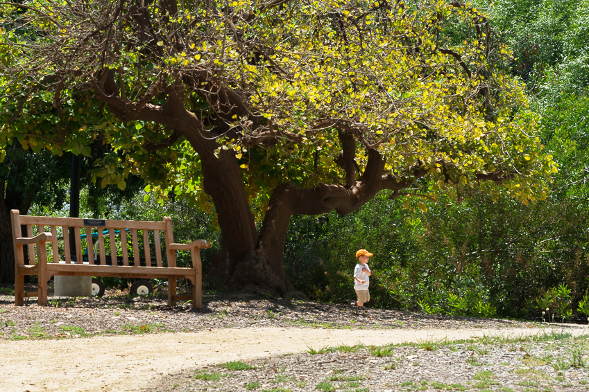
I like the bench as it make the boy look so small, but agree that there's too much space and the boy needs to be more on the third. I tried flipping the horizontal which also made the path come out of the left corner and lead across the image to where the boy's heading. If you do this be careful about words on the seat!
I also added a small curve to give it some more punch. |
Aug 4th |
 |
| 78 |
Aug 19 |
Comment |
Jason seems to have pretty much nailed the comments on this one so all I can say is maybe the main shadow is too dark.
Brenda is also right about choosing the settings and your timings to avoid the harsh light in the middle of the day, but I'm terrible at getting up so probably would have got the same result. |
Aug 4th |
| 78 |
Aug 19 |
Comment |
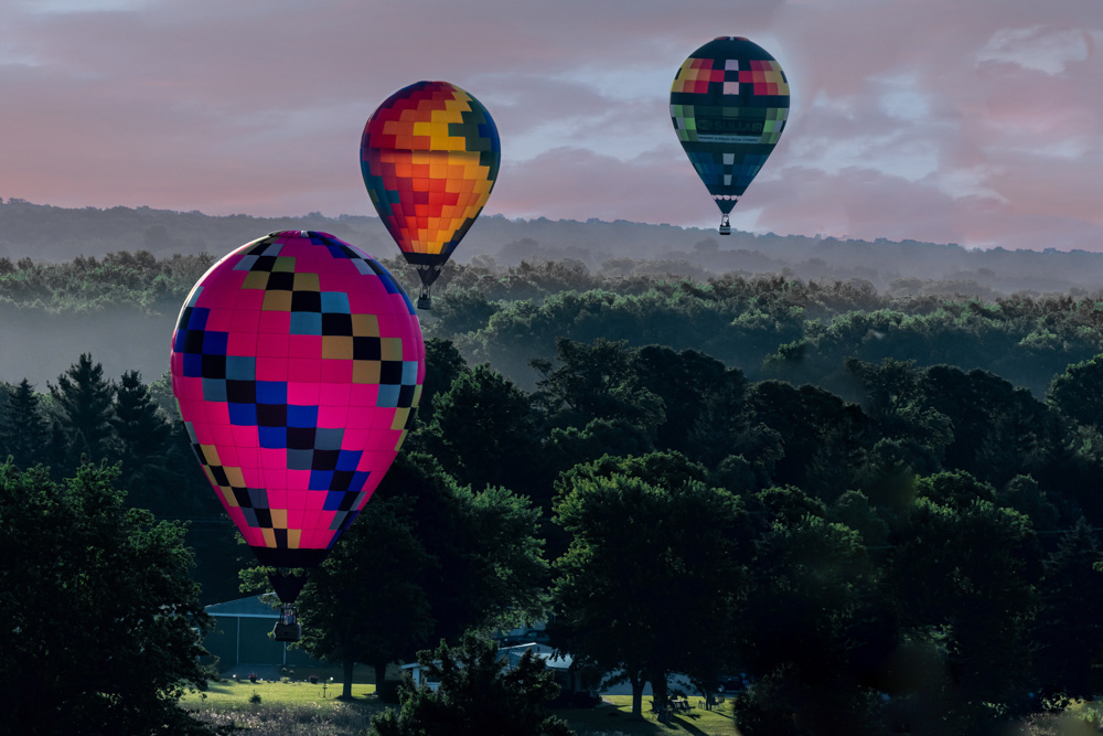
I'm with Jason on the sky, didn't think it had been replaced so well done avoiding the easy error of leaving a line between the trees and sky. Composition wise I also agree with losing a chunk from the left, but only if you can add some more to the right as it needs the space. If you have more images then consider using one with the left balloon a bit higher and maybe with a bit more space between it and number 2. |
Aug 4th |
 |
7 comments - 1 reply for Group 78
|
7 comments - 1 reply Total
|


