|
| Group |
Round |
C/R |
Comment |
Date |
Image |
| 78 |
May 19 |
Reply |
Yes this works better for me, and the warm tones add to the overall feel |
May 22nd |
| 78 |
May 19 |
Comment |
Here is the OOC image, not a lot different. |
May 21st |
 |
| 78 |
May 19 |
Comment |
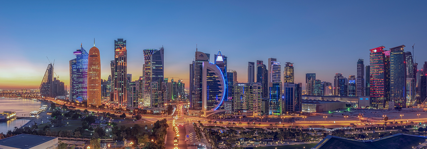
A super city shot, and its already been said that the lead in road and the curved ring road add to the overall feel of this image.
For me I think you could crop off the tennis courts completely, I find them distracting, to emphasise the width of the image. |
May 13th |
 |
| 78 |
May 19 |
Comment |
Good to see you got down low for this image, and there may have been scope to get even lower, isolating the main flower. The out of focus other flowers add to the overall feel but do pull the eye off the main subject.
At first I thought the Green was too bright, but now think it suits the image.
|
May 13th |
| 78 |
May 19 |
Comment |
Super image, love the pastel feel to the whole thing. I'm with Brenda in losing some of the left hand side, and maybe some of the sky too, but not too much, making a letterbox shape to emphasise the width of the image.
I like my images to be sharp and this is a little soft for my taste. |
May 13th |
| 78 |
May 19 |
Comment |
For a grab shot you have caught all the important features. The darkening of the surroundings really brings the eye to the centre of the image, and the natural light is superb.
I feel the conversion to B&W has been a bit harsh on the floor and centre piece, and as the plant is the so significant I prefer the colour version.
Well done for removing the little name plates, a small detail but so much better without them. |
May 13th |
| 78 |
May 19 |
Comment |
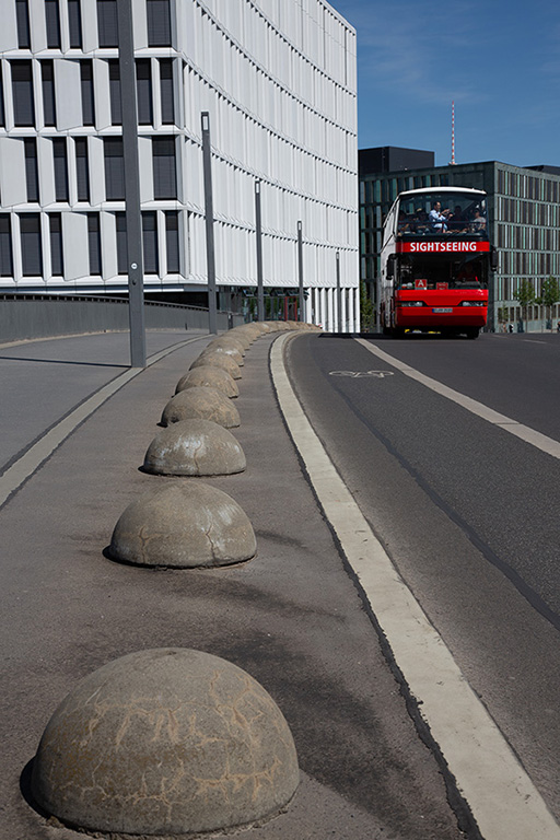
Most has already been said, the top fence is too dominant so shooting from further left, and lightening the fence would most likely improve things.
Apart from the fence I don't think this is too sharp, the subject is hard and rugged and a soft look wouldn't suit. I might even push the stones in the building a bit further to make them a feature.
If you are just starting on B&W then this is a good attempt, you will soon be looking at overall tonal range and the difference a small change can make to the feel of an image. |
May 13th |
| 78 |
May 19 |
Comment |
I'm not a fan of light painting but this one really does work, the smoothness of colour in the yellow makes it stand out from the usual streaks that I get to see. I think the silhouette is maybe a bit dark, there is a hint of detail which I would like to see a bit more of, but not too much to distract from the overall effect. |
May 13th |
| 78 |
May 19 |
Comment |
Thanks all, good constructive comments which is what I signed up for. The white halo is caused by oversharpening and an error I don't usually make, at least I didn't think so until it was pointed out here. It is a crop of the original but not by much, I focused on the line of stones rather than the bus so thanks again for the comments. |
May 13th |
8 comments - 1 reply for Group 78
|
8 comments - 1 reply Total
|


