|
| Group |
Round |
C/R |
Comment |
Date |
Image |
| 83 |
Apr 23 |
Reply |
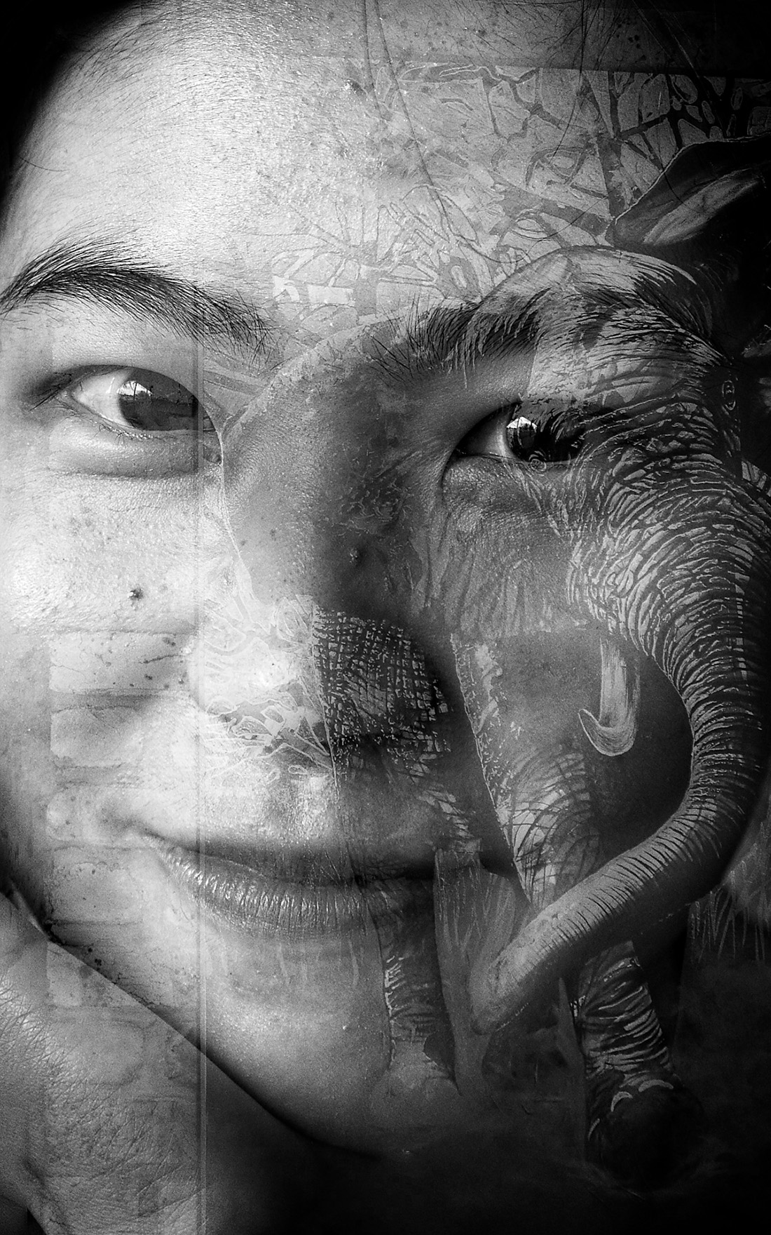
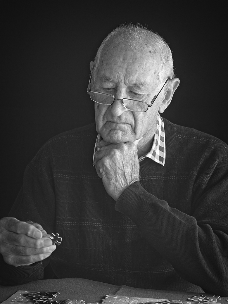
Definitely better but if it was my photo, I would want to take it even further. The background face is the problem for me because it makes some connection (sort of) with the eyes of your subject. Without the distraction, there is some mystery. What is this guy thinking about? He's not really looking at anything - he's in some other space. He looks like a really interesting character. |
Apr 21st |
| 83 |
Apr 23 |
Reply |
Thanks for the reminder about variances in styles Lance. I think I am still trying to discover what my own style is so I get over enthusiastic about new things I read about. |
Apr 21st |
| 83 |
Apr 23 |
Comment |
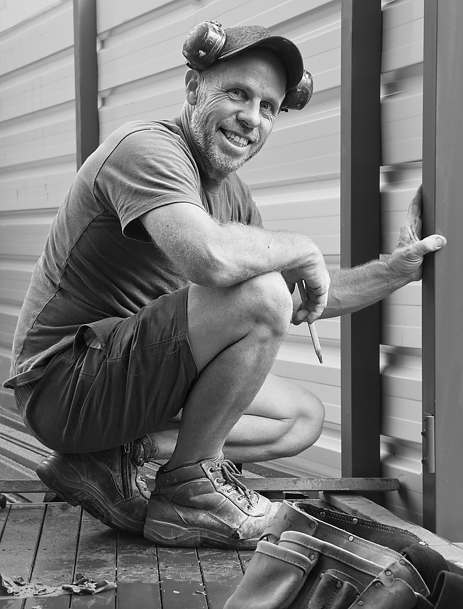
Your friend is very photogenic Mark! He has deep, soulful eyes and a determined looking jaw. A great portrait subject. The lighting on his face is quite good. Darkening the background as Debasish has done to remove the distractions brings the focus back to his face. |
Apr 20th |
| 83 |
Apr 23 |
Reply |
Thanks Adi. |
Apr 20th |
| 83 |
Apr 23 |
Reply |
That's for sure Debasish. It's quite ugly down at street level! |
Apr 20th |
| 83 |
Apr 23 |
Reply |
Thanks Mark - glad you like it. |
Apr 20th |
| 83 |
Apr 23 |
Reply |
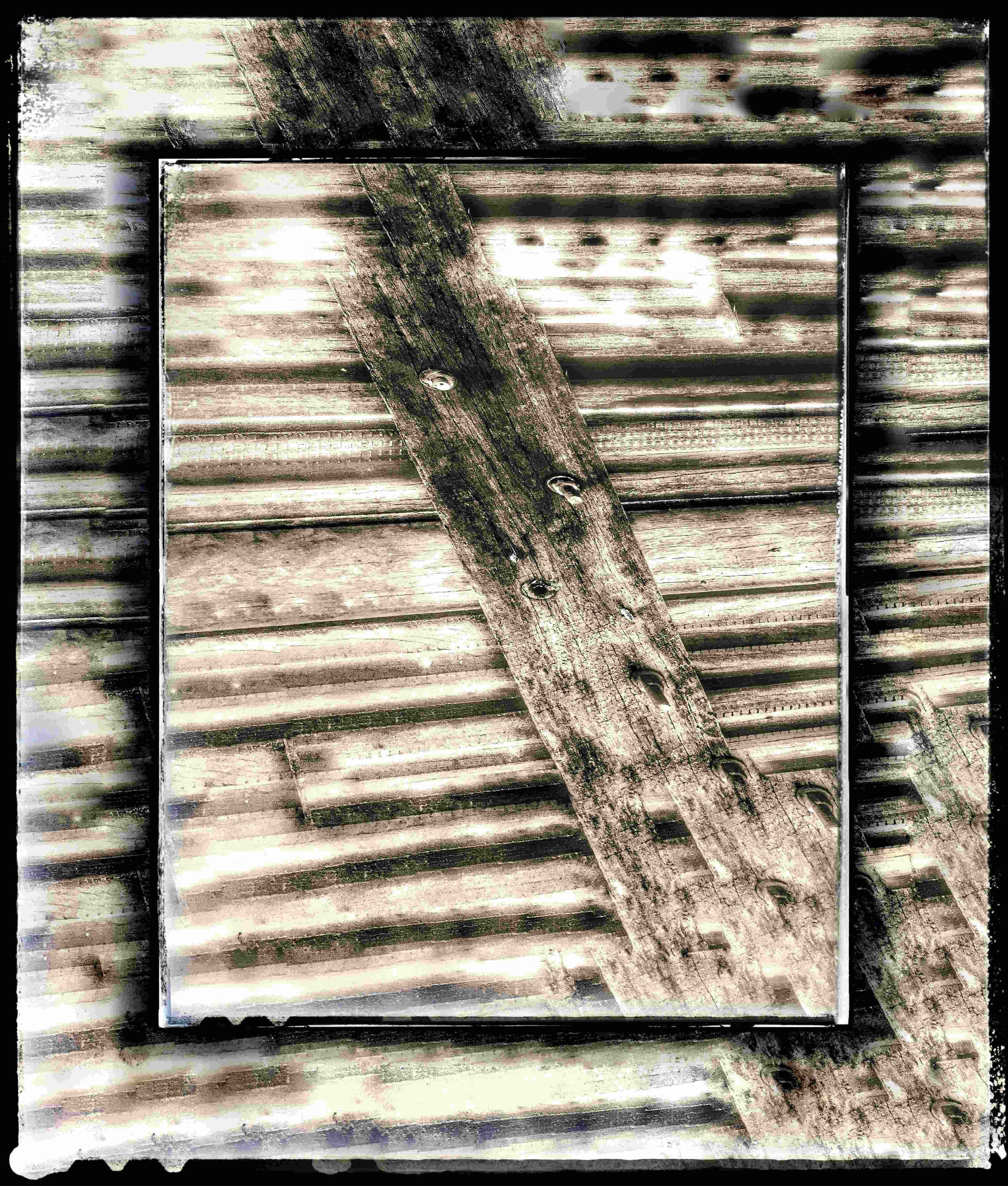
Thanks Lance, I like your comment about the manmade design being "poetic". There is some beauty in the complexity of the pattern and the image really lends itself to black and white. |
Apr 20th |
| 83 |
Apr 23 |
Reply |
Oh yes. I see that now. Thanks |
Apr 17th |
| 83 |
Apr 23 |
Reply |
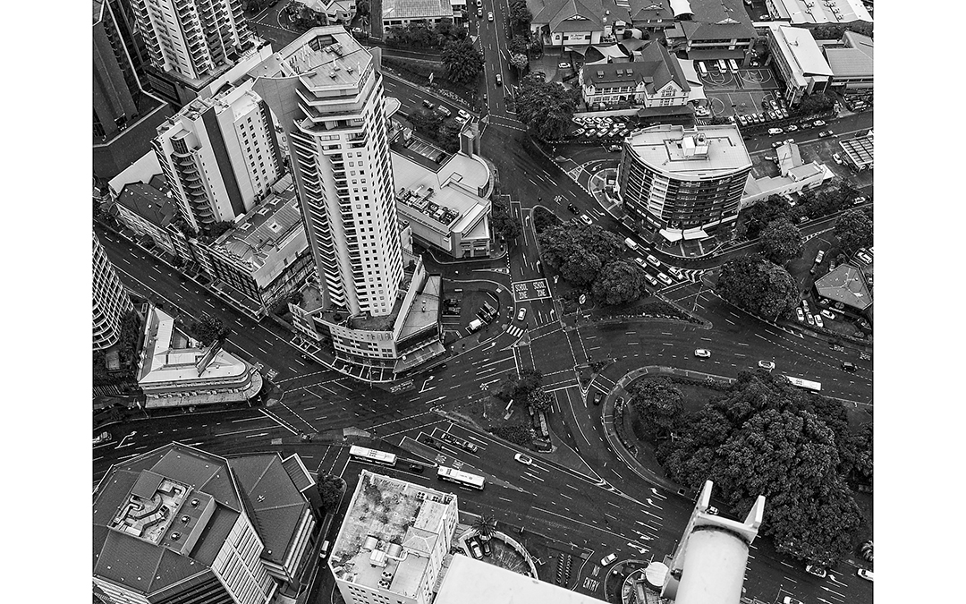
Thanks Jon. Yes it was a through the hotel window and for once it was relatively clean. The roads do look complicated but it's much easier when you are down there driving than looking from above. Even I am surprised now that you have made me look at it more closely. There is hardly any traffic which is unusual for a city intersection. But it was 2.25 on a Sunday afternoon and we were already beginning to worry about COVID so that might explain it. |
Apr 16th |
| 83 |
Apr 23 |
Comment |
Hi Lance
I've been in and out on a number of occasions looking at this image and it ended up in the "too hard" basket. You've talked a bit about Japanese aesthetics and as usual, my knowledge is scant. Trying to get a better feel for Japanese photography I looked up "Japanese black and white nature photography" and came across a photo very similar in nature to yours but focusing on a single tree. Without the extra branches it is easier to appreciate the beautiful contrasts in the foliage. I can see why you go back there often It looks like a beautiful place to be spending time - taking photos or not. Following is the address if you would like to look. It may be helpful in your endeavour to rework. We might all be interested to see what you come up with.
https://pamphotography.blog/2013/06/08/photographing-the-japanese-garden-in-portland-or/ |
Apr 16th |
| 83 |
Apr 23 |
Comment |
Hi Jon
This is a really nice composition with the lighthouse situated on the swampy looking land. I agree with the previous comments on the tonal range looking at the image as presented (and on my computer). However, based on your description of the impending storm I might have expected to see the sky a bit more dramatic. Darker clouds would contrast with the lighthouse making it stand out more as the focal point of the image. I think the bird looks great, and it provides a good point of interest in the image. I've taken the liberty of asking Lance to explain why he thinks it is a bit too close to the lighthouse in the frame. |
Apr 16th |
| 83 |
Apr 23 |
Reply |
Hi Lance
I am just about to comment on Jon's photo but just wanted to ask why you think the bird position is too close to the lighthouse. It looks fine to me without knowing any details about the bird type or size. It seems to have a very big wingspan. |
Apr 16th |
| 83 |
Apr 23 |
Comment |
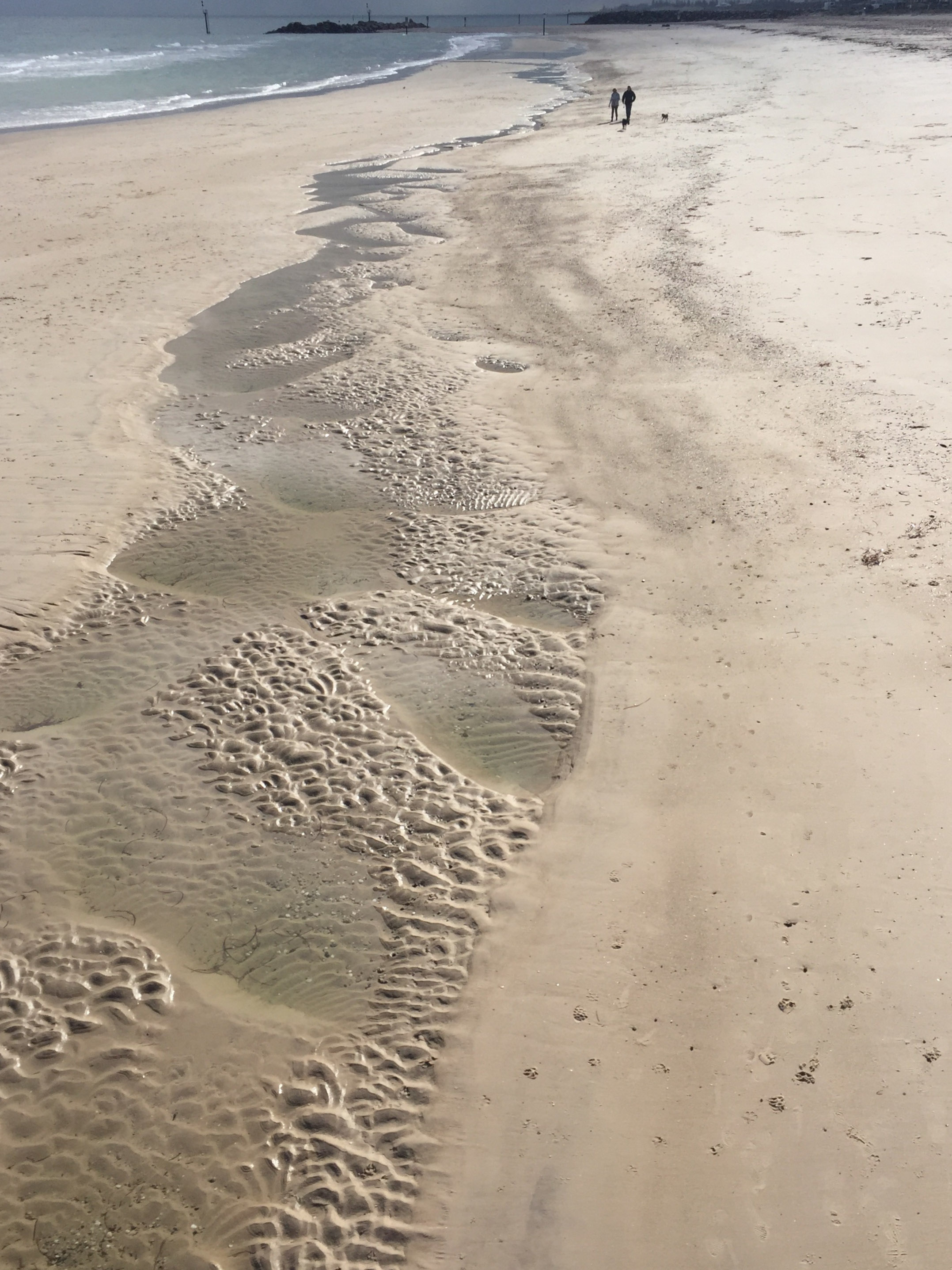
Striking long exposure night seascape. It exudes loneliness. Love the effect of the fast moving clouds (glad you explained that). The pier is interesting as well because it looks really rickety - the railing undulates and the uprights seem to be struggling to hold up. Is that just an illusion? I too, like the bit of driftwood which is sitting nicely in the watermarks in the sand. It adds interest. |
Apr 10th |
| 83 |
Apr 23 |
Comment |
I like the story here Debasish, and I can understand why you wanted to grab the moment. I agree that the 16:9 crop is better because the subject fills the frame and it gets rid of the tower in the distance bottom left. As an alternative, you could do something creative to fill the background in Photoshop (or whatever you use) such as a sky replacement using a few clouds - especially if you have a collection of your own sky photos, in which case it would still be all your own photography. I'm thinking the tower and the painters might pop out a bit more. Just a thought. |
Apr 10th |
5 comments - 9 replies for Group 83
|
5 comments - 9 replies Total
|