|
| Group |
Round |
C/R |
Comment |
Date |
Image |
| 20 |
Apr 20 |
Reply |
Aluminium too, yes, I agree |
Apr 26th |
| 20 |
Apr 20 |
Reply |
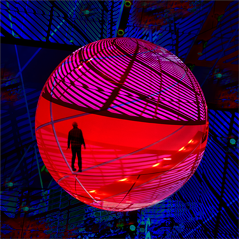
I would do glossy as it has a glassy/prism/crystal feel |
Apr 26th |
| 20 |
Apr 20 |
Comment |
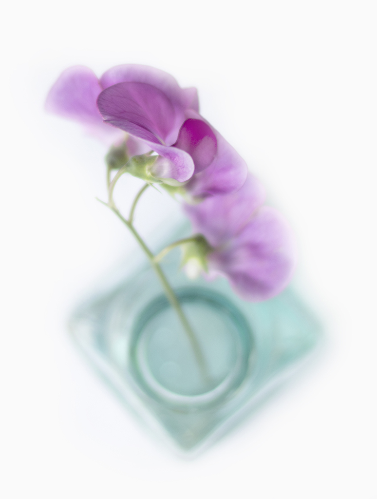
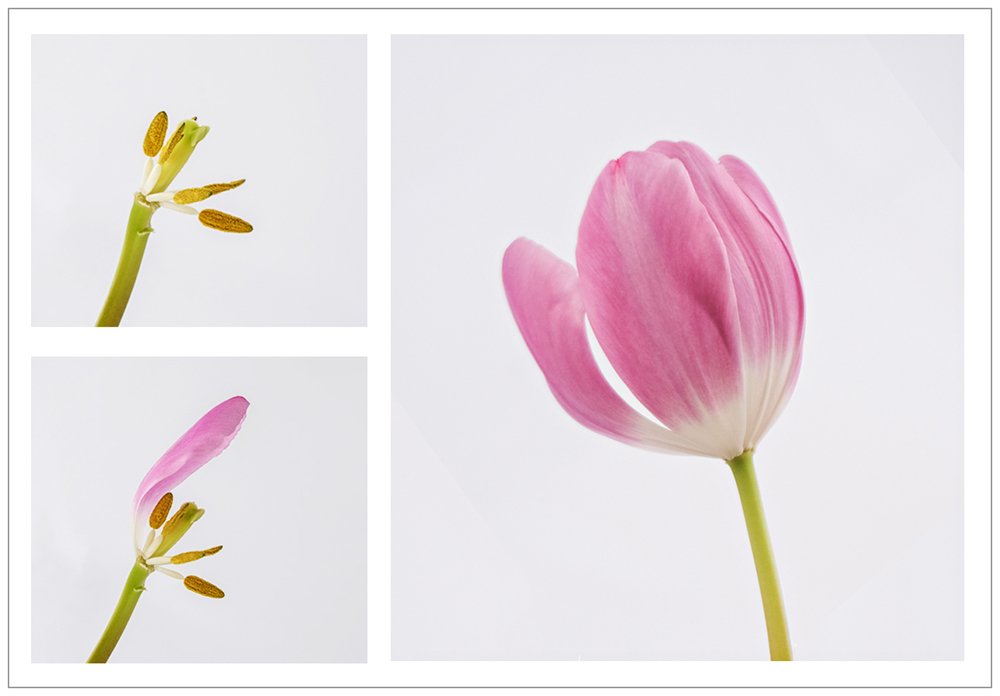
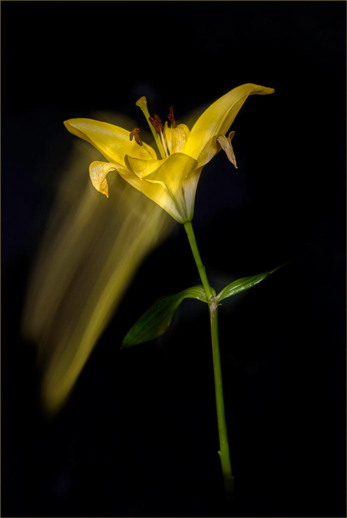
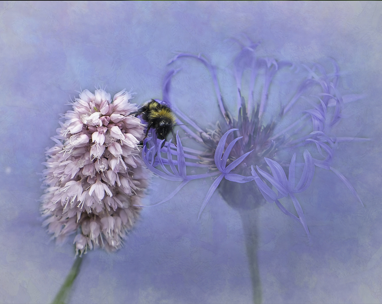
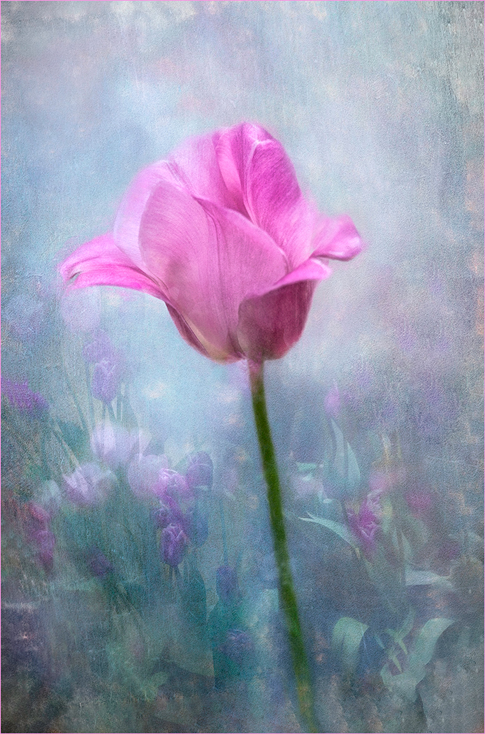
Whilst I like what youve done with the frame I do feel it dominates being sharp, striking and dull of detail whereas the flower within is so soft with nothing in focus |
Apr 26th |
| 20 |
Apr 20 |
Comment |
Love the idea of changing the title to Panhandler!! Fun, different but in my opinion, Id like to see the pans/man sharper and more of a relationship between the toy and the pans. |
Apr 26th |
| 20 |
Apr 20 |
Comment |
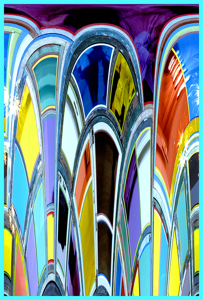
Very interesting piece of artwork youve made from this. The doubling up of the tree branch, in white, slightly offset works well. The blocks of colour added make it very modern but do agree with Betty about the yellow. Id like to see the white more white. Again, appreciate the description in how you did it! |
Apr 26th |
| 20 |
Apr 20 |
Comment |
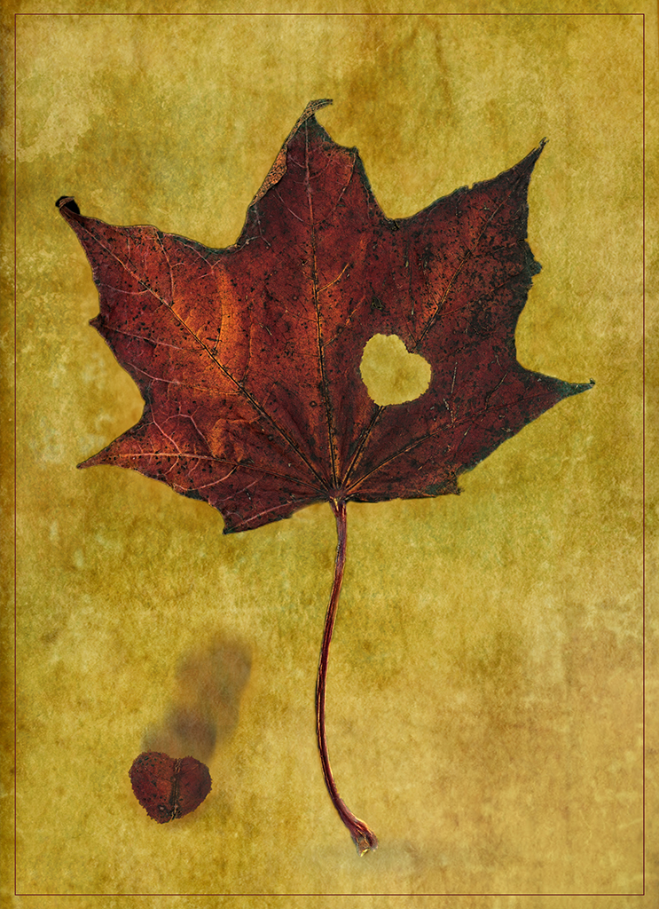
A great improvement, really like the texture applied and the lighthouse stands out lovely. I'm not keen on the lighter yellow patch on the right hand side, I'd tone that down a bit |
Apr 26th |
| 20 |
Apr 20 |
Comment |
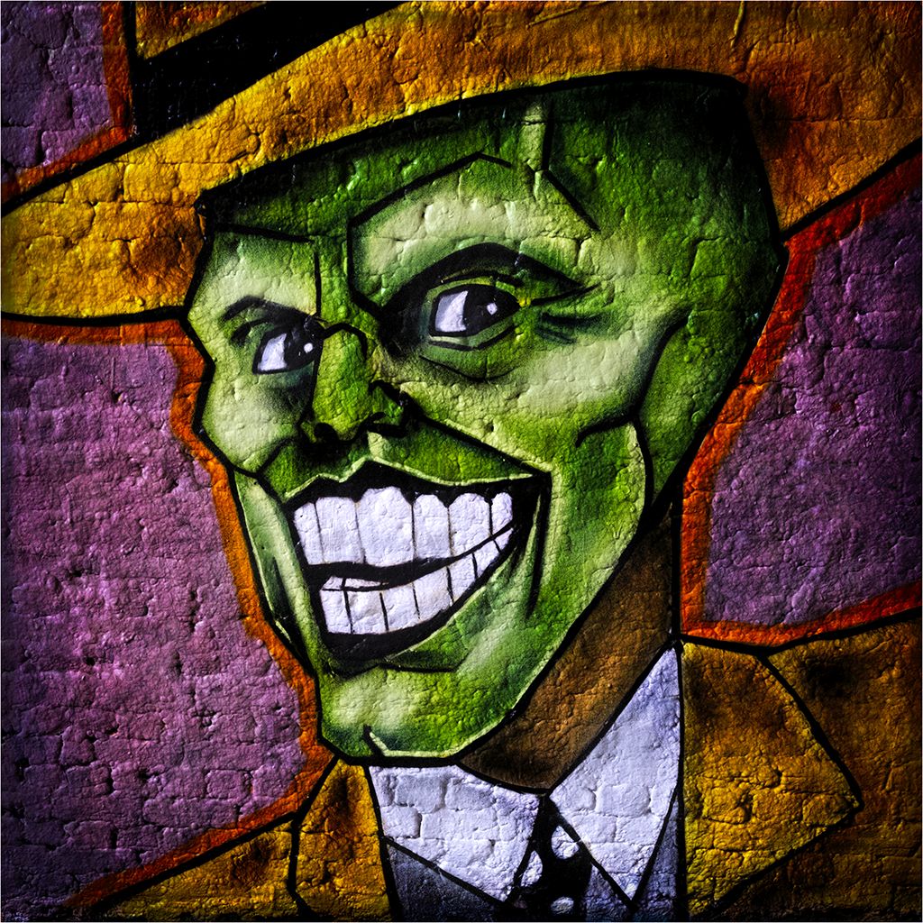
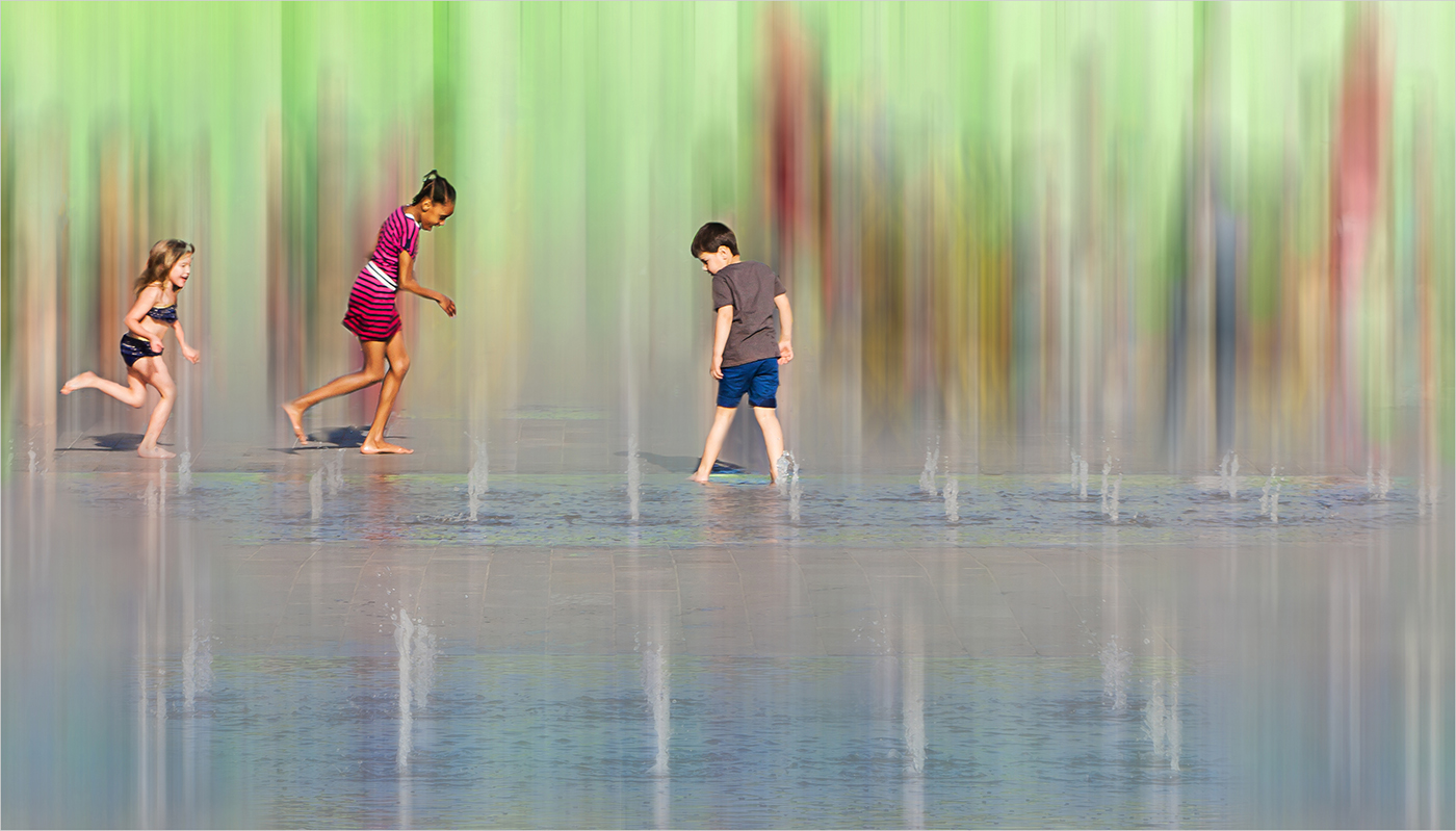
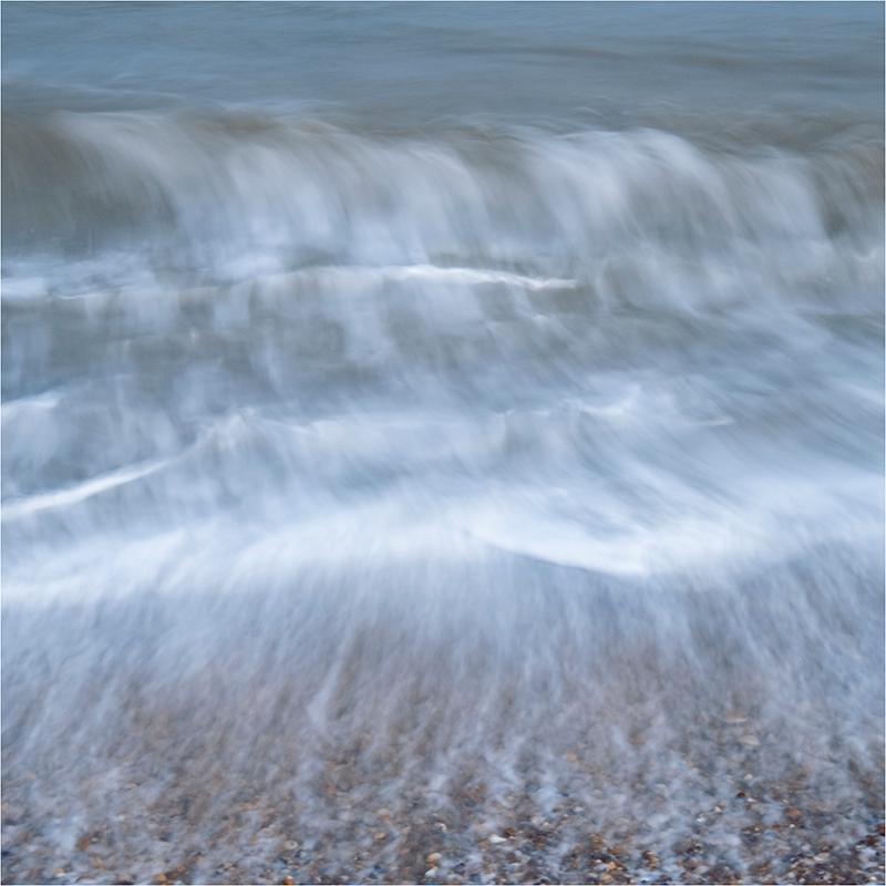
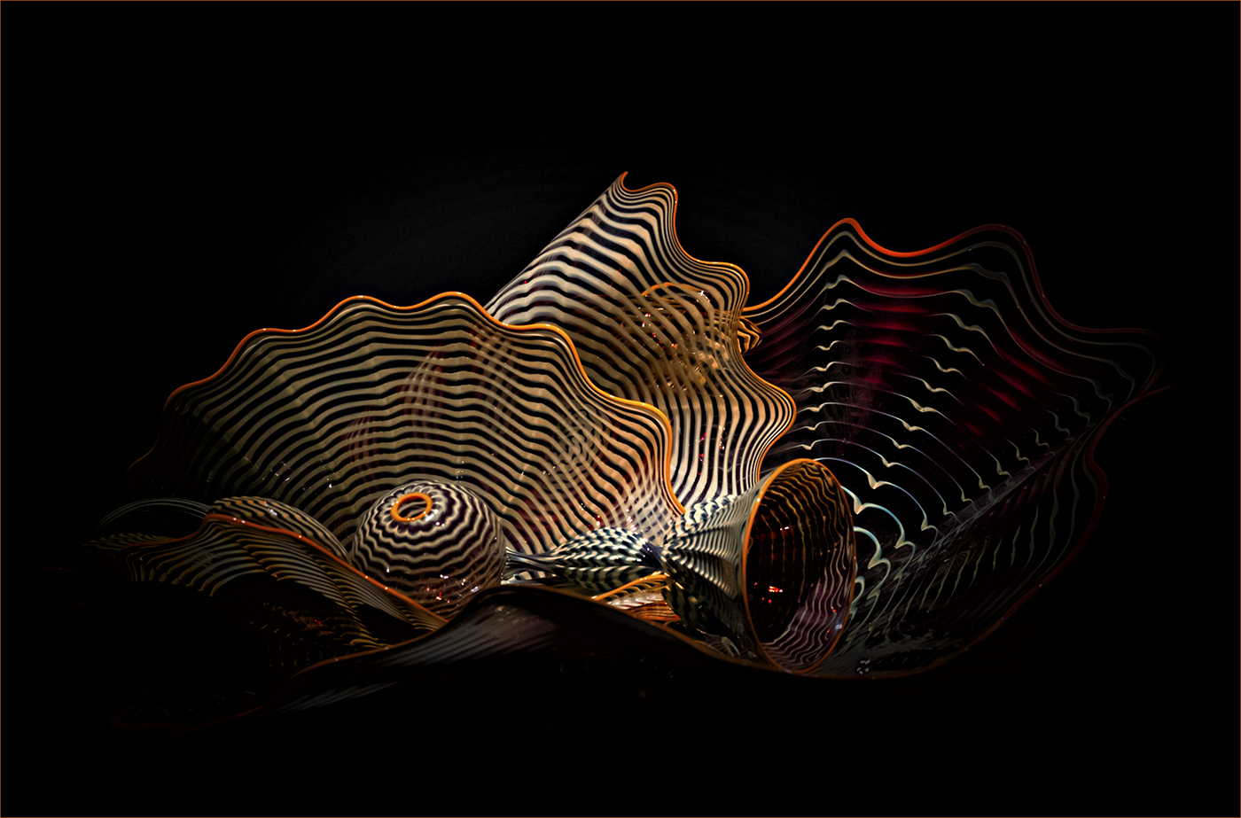
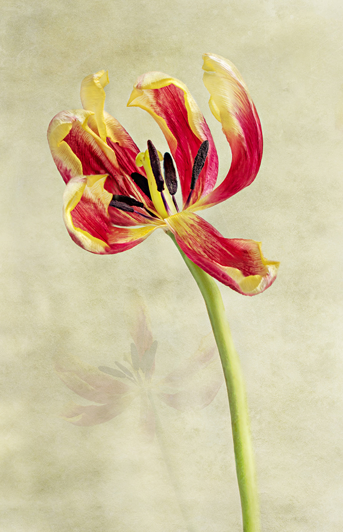
Lovely colours, very vibrant and certainly one for wall art. |
Apr 26th |
| 20 |
Apr 20 |
Reply |
Thank you Mark for your kind comments. I enjoyed the process in copying and layering the original photo. Keep an eye out for another month as I have another one similar! |
Apr 3rd |
5 comments - 3 replies for Group 20
|
5 comments - 3 replies Total
|