|
| Group |
Round |
C/R |
Comment |
Date |
Image |
| 20 |
May 19 |
Reply |
I think your right Cindy. I will increase the shadow under her feet. Thank you |
May 4th |
| 20 |
May 19 |
Reply |
Thank you Shirley. |
May 4th |
| 20 |
May 19 |
Reply |
Thanks for your comments Nellie on my image. Im from Bromley, South London but grew up in hertfordshire |
May 4th |
| 20 |
May 19 |
Reply |
Thanks Cindy. It will be a learning curve! |
May 4th |
| 20 |
May 19 |
Reply |
Thank you Barbara. Perhaps I'll put the fire out! Its tricky knowing how small/large to make things when youre adding into a scene. I'm new to this aspect of image making. |
May 3rd |
| 20 |
May 19 |
Comment |
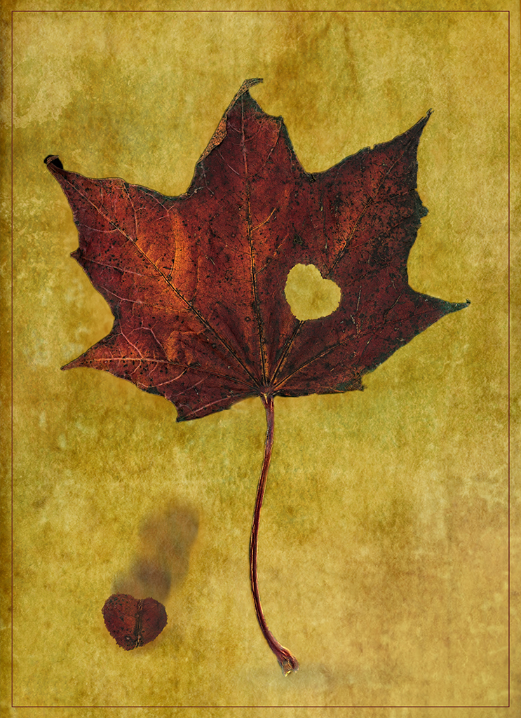
Wow..that is a huge difference to the original image. The final result is certainly improved and more pictorial with the treatment applied.Looks like a drawing! |
May 3rd |
| 20 |
May 19 |
Comment |
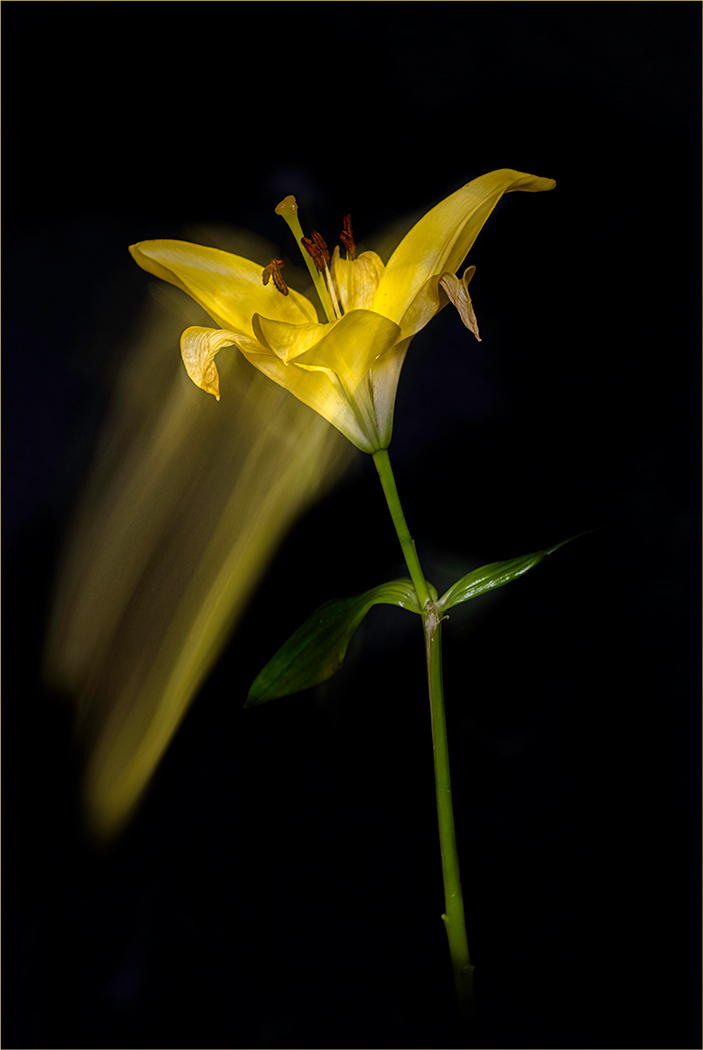
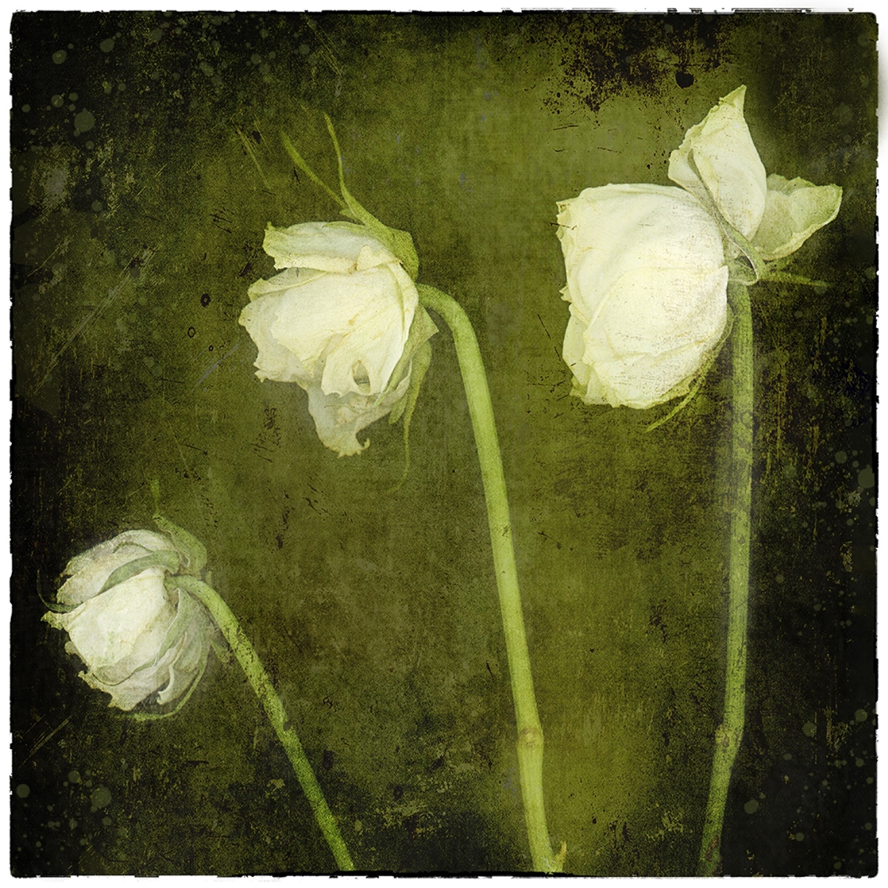
Dandelions are so tricky to take good shots of. The slightest breeze and they disintegrate! The software has certainly improved the image. Sharper, plus the background is softer and less distracting so you focus more on the subject. |
May 3rd |
| 20 |
May 19 |
Comment |
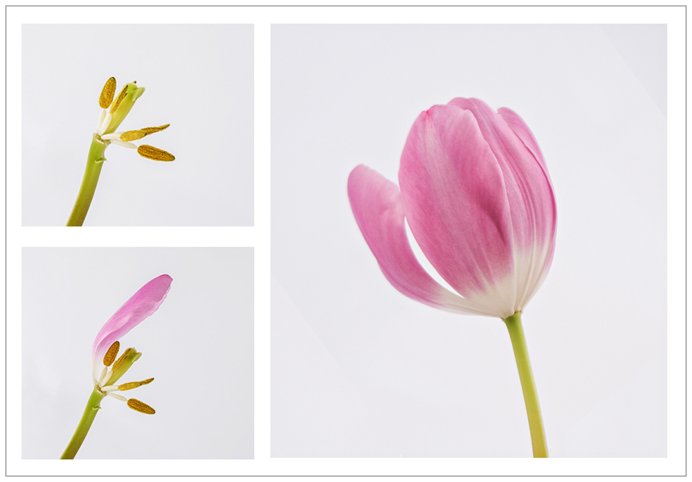
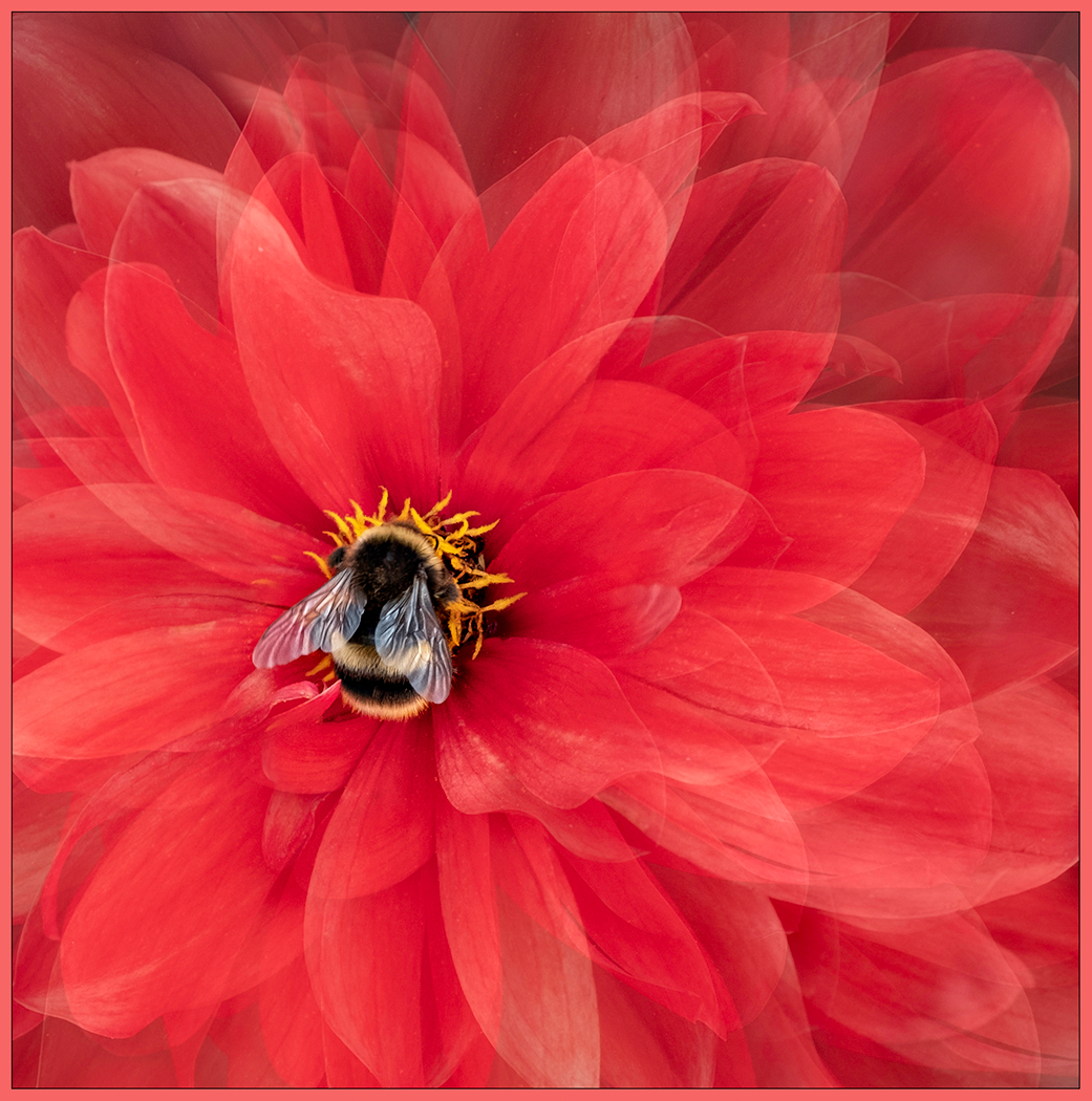
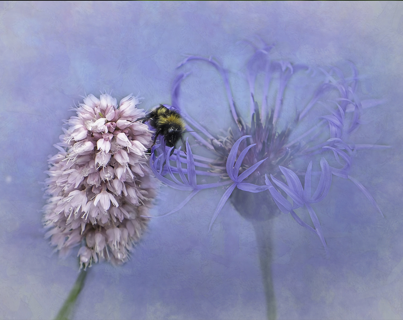
Wow..they are killer heals. Wish I could wear those! Perfect placement with the pink flowers giving you a triangular shape to all the elements. Personal taste but I prefer the background in the original image! I think the new BG is a bit overpowering? |
May 3rd |
| 20 |
May 19 |
Comment |
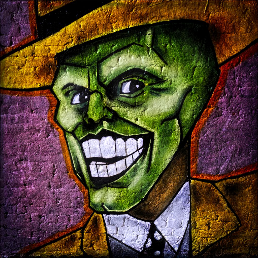
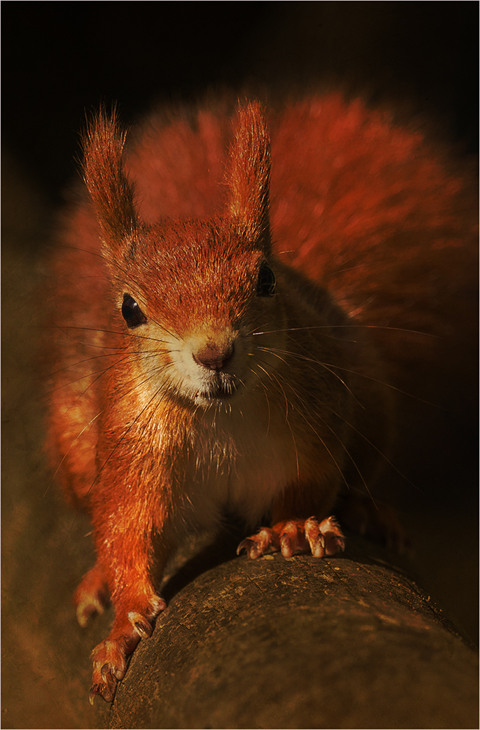
When you say youve been painting images do you mean going over the original image using various photoshop brushes? Tell me more! I love the treatment and the fact you've also changed the position of his eyes too so that hes looking straight at you with his mouth open ready to pounce. Simple uncluttered background makes him really stand out and those whiskers are so sharp. |
May 3rd |
| 20 |
May 19 |
Comment |
I like the fact that the horse is looking directly at you and you can see all four legs plus the tail swishing out out to the side too. Youve done well with your selection. The Glade image youve used frames the horse nicely although in my opinion, I would blur out the "cracked" look in the centre to soften it a bit and make the horse stand out even more. |
May 3rd |
| 20 |
May 19 |
Comment |
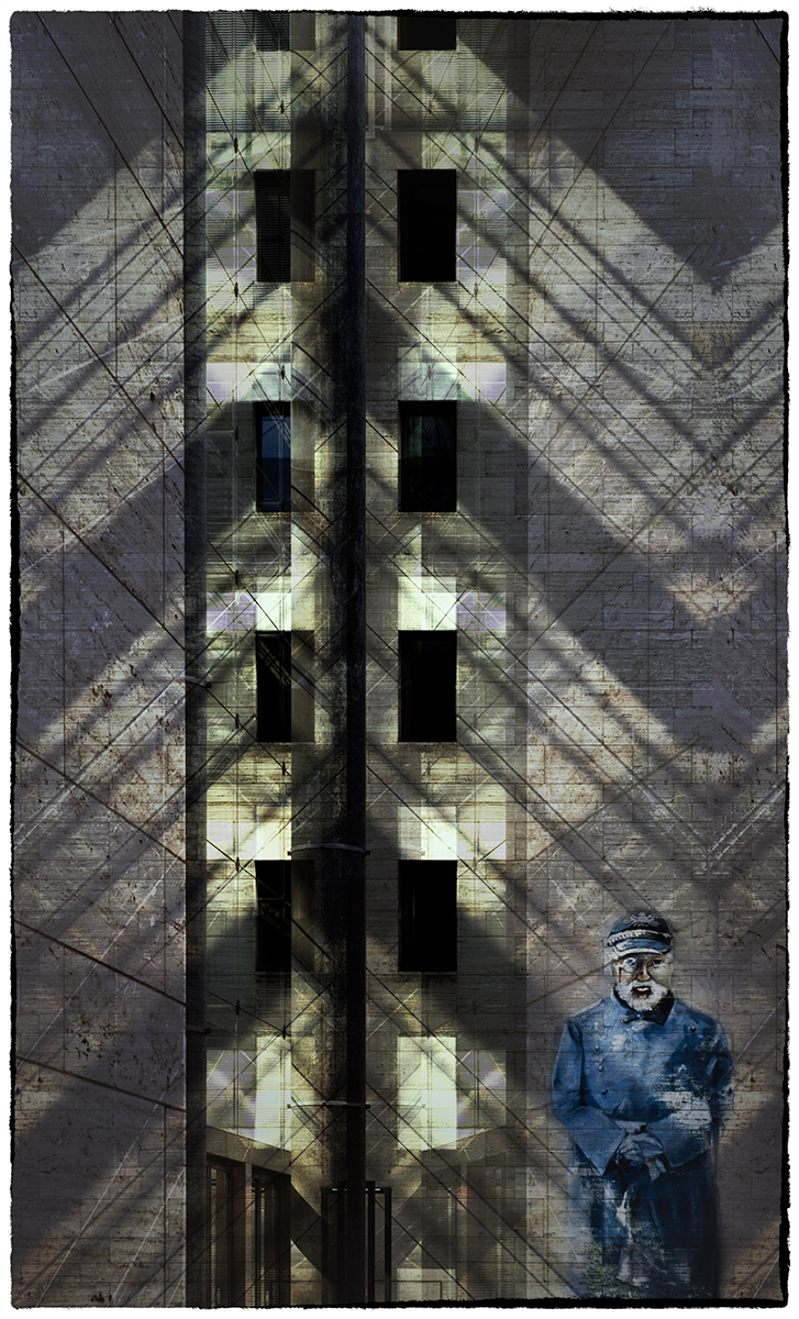
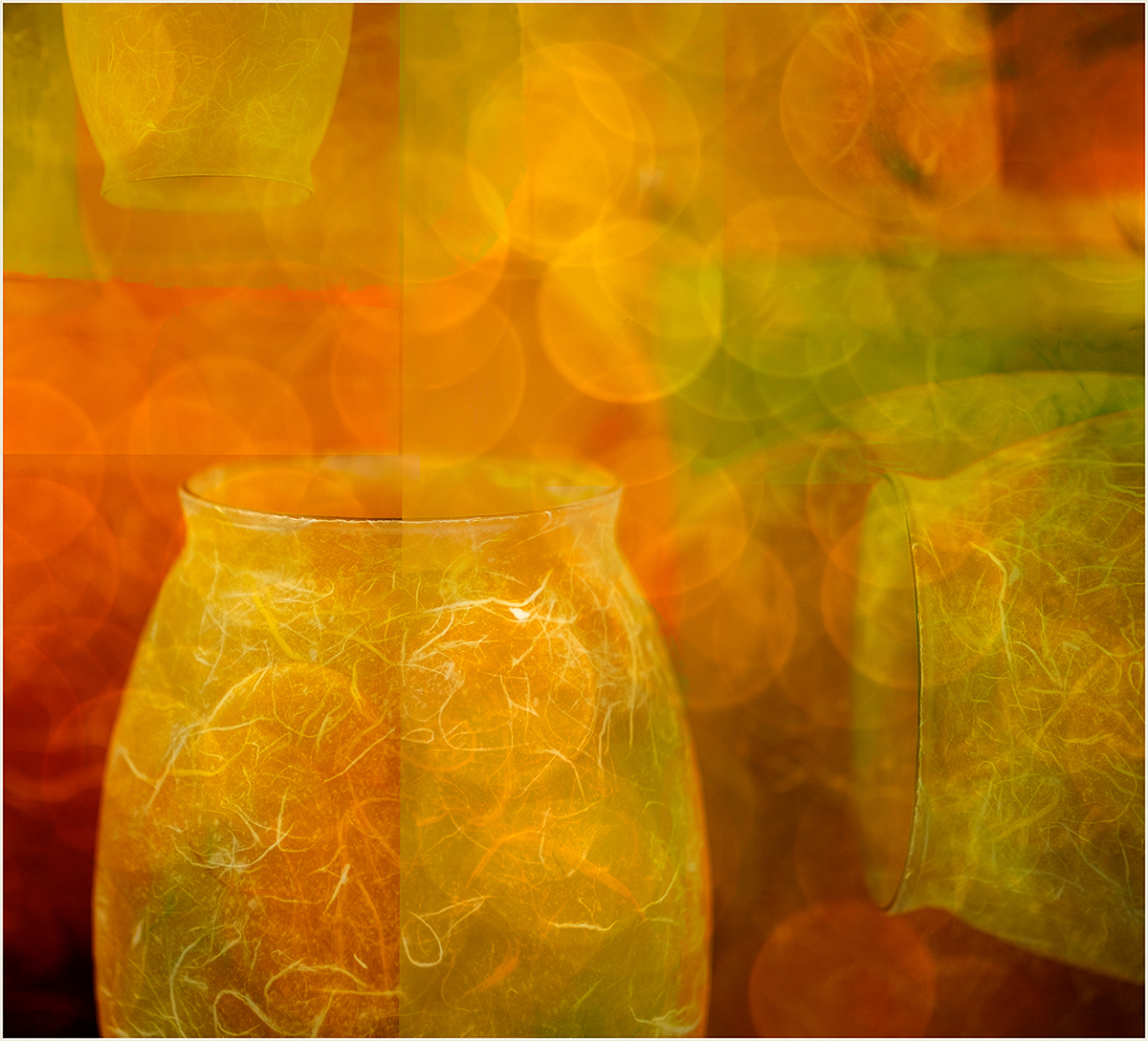
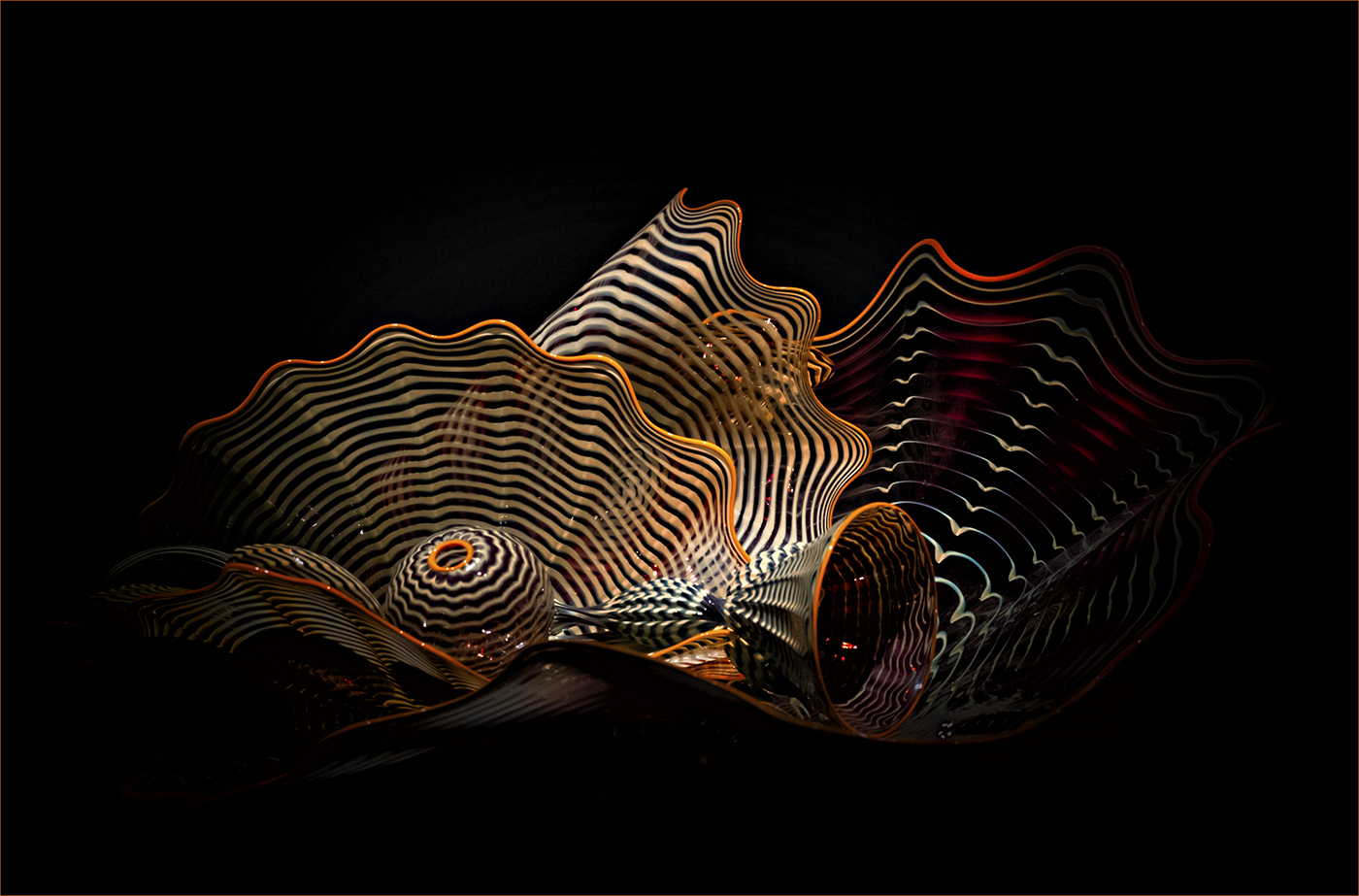
I would never have known this was images of glass. Well taken considering the lighting conditions. You have definitely improved the image bringing on the fiery red and orange colours, bringing a "molten" look to the glass. Perhaps I would add a fine keyline around the edge of the image as its bleeding into the background. |
May 3rd |
| 20 |
May 19 |
Comment |
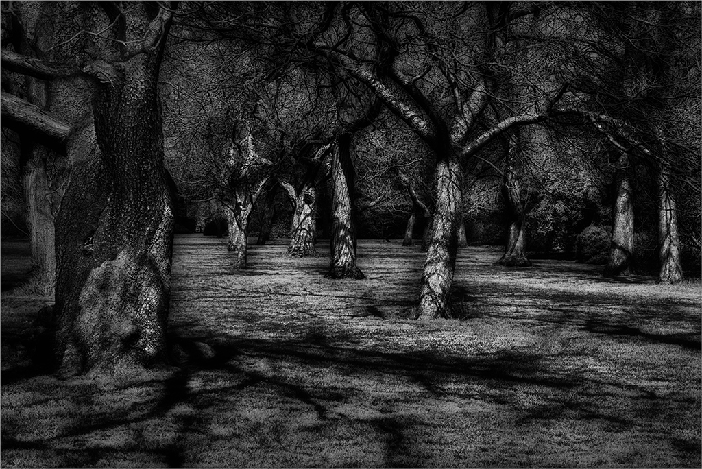
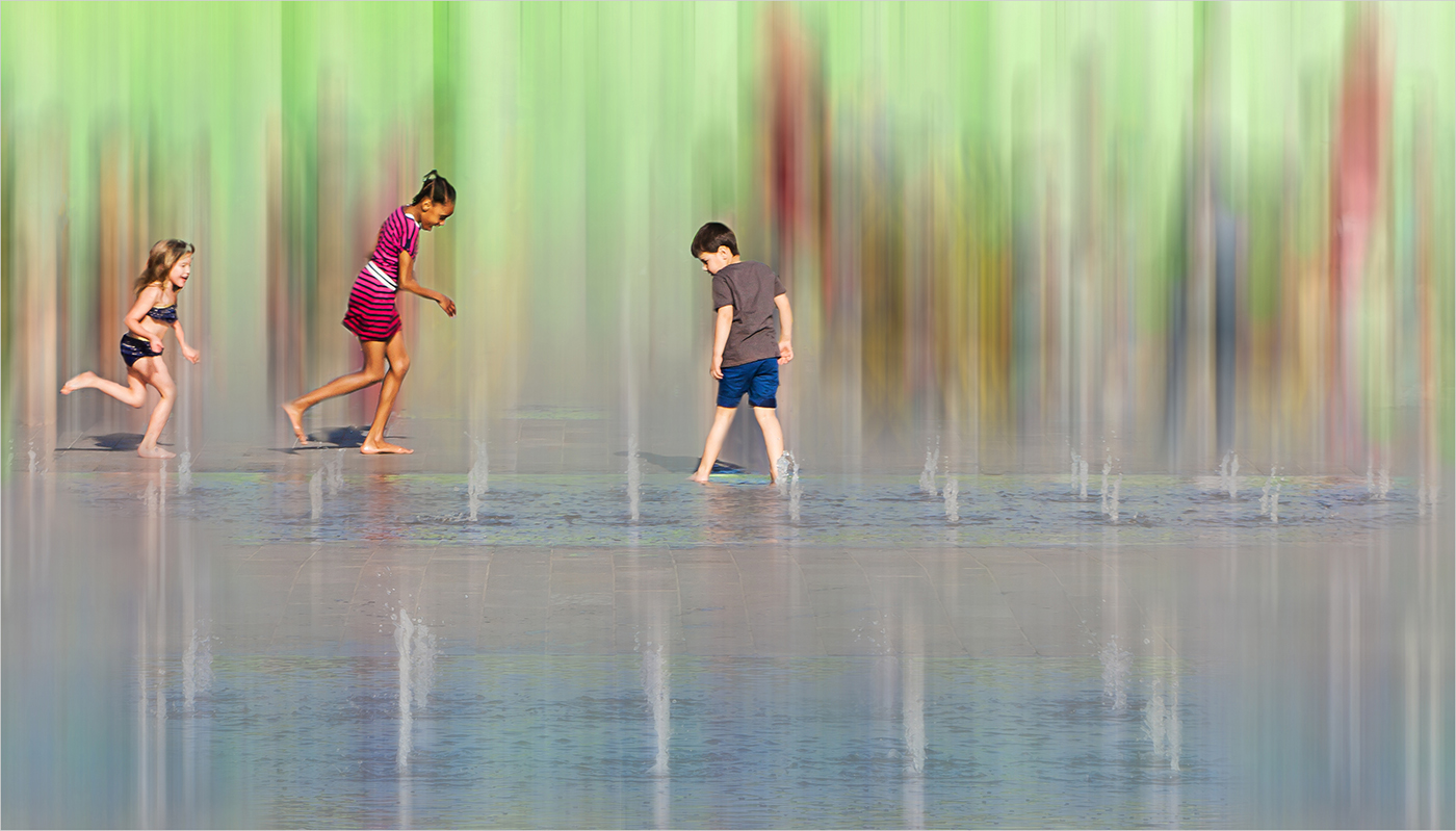
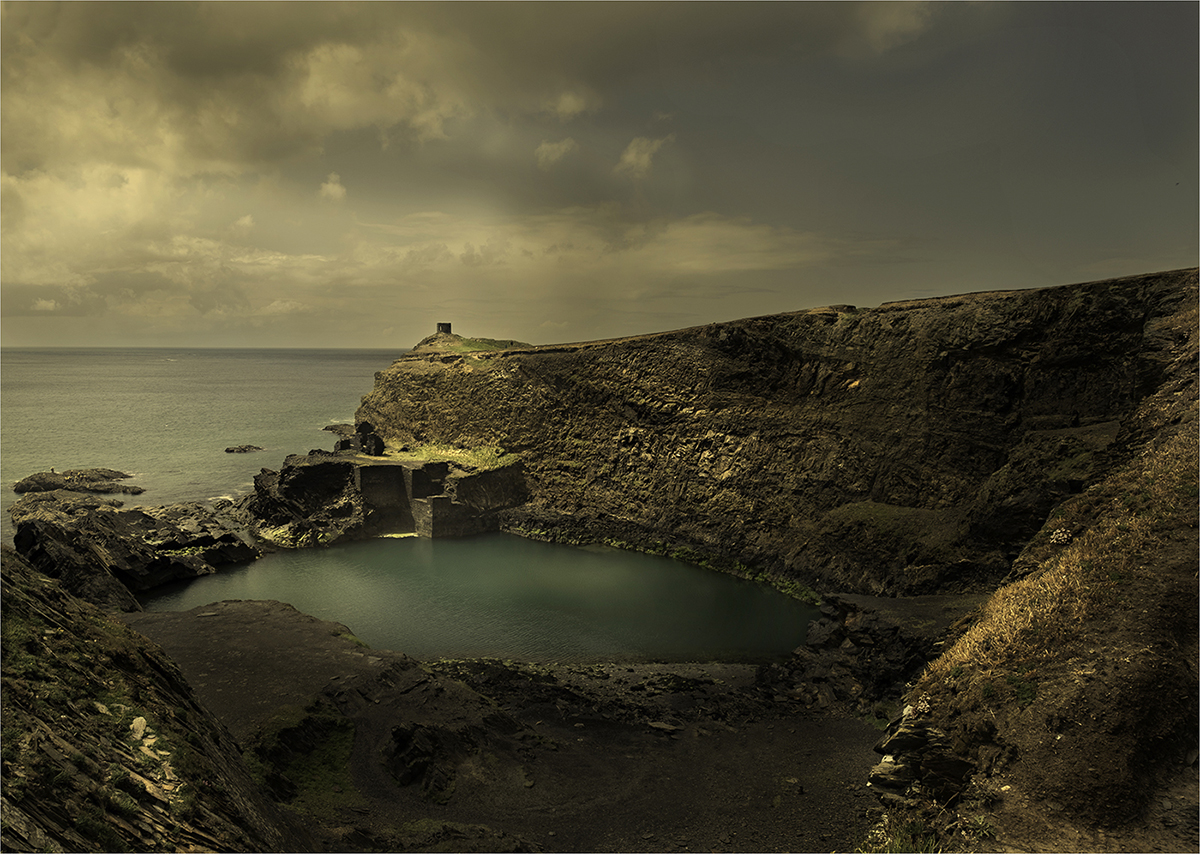
Im wondering if I should crop in from the right and get rid of the tree? I keep looking at it! What do you think? |
May 3rd |
| 20 |
May 19 |
Reply |
Thank you Peter, I'm sure I will |
May 3rd |
7 comments - 6 replies for Group 20
|
7 comments - 6 replies Total
|