|
| Group |
Round |
C/R |
Comment |
Date |
Image |
| 80 |
Jul 20 |
Reply |
Thank you Victor. I like your suggestions about cropping off the bright areas at the top and the empty space off the bottom. Thanks for that suggestion. |
Jul 9th |
| 80 |
Jul 20 |
Reply |
Thank you Karen. And I agree with you about masks. I wish everybody would wear them. And not on their chins. |
Jul 8th |
| 80 |
Jul 20 |
Comment |
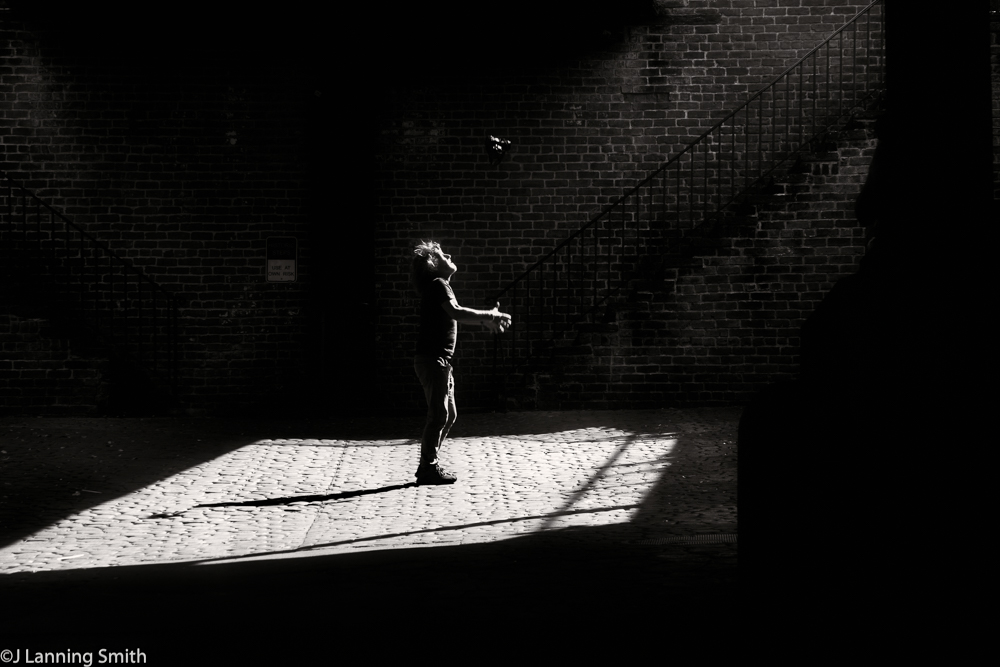
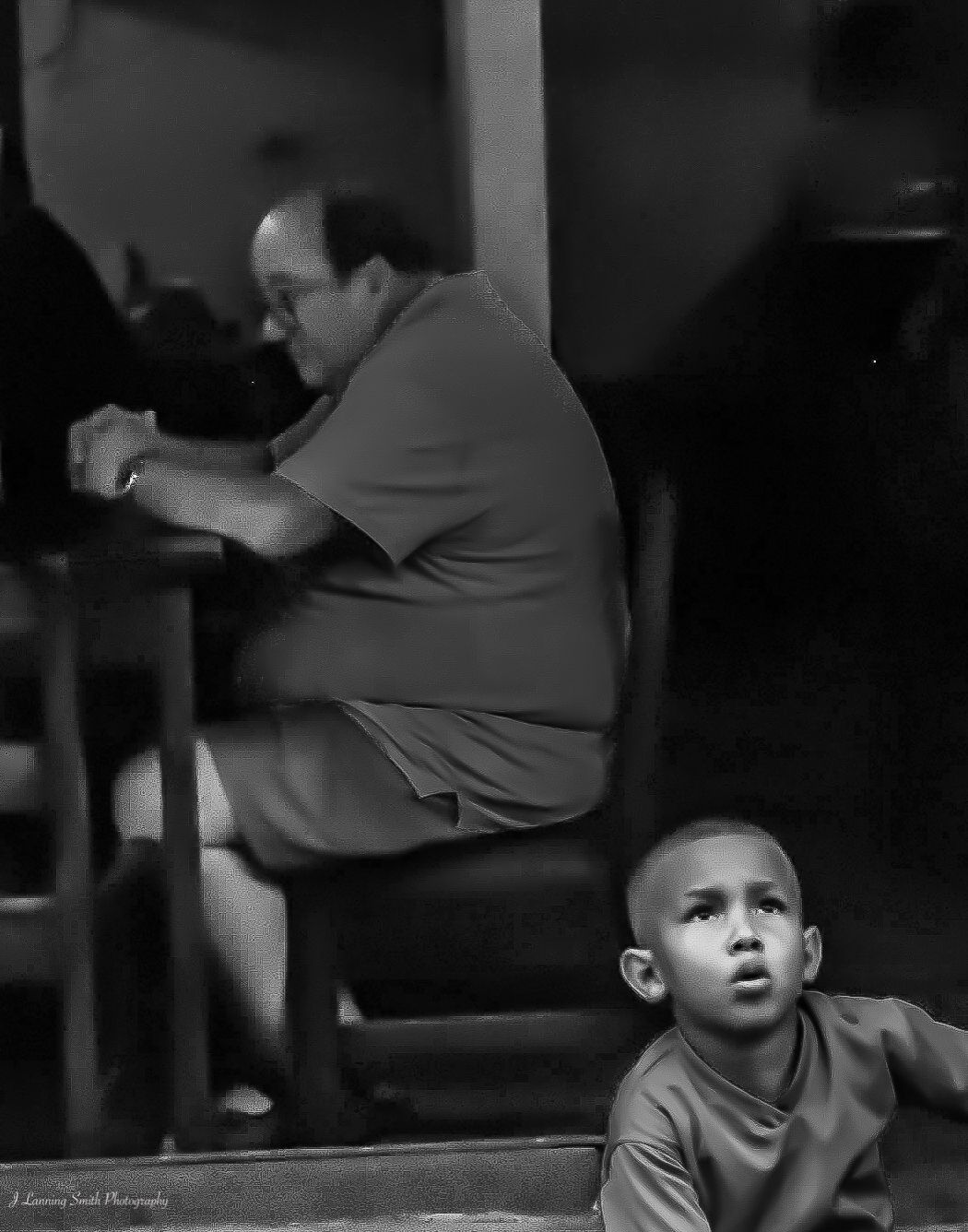
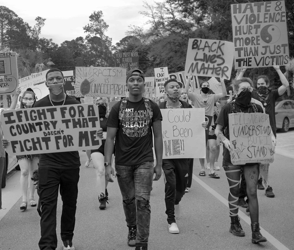
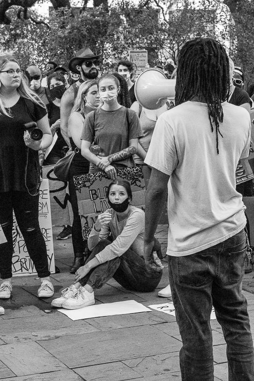
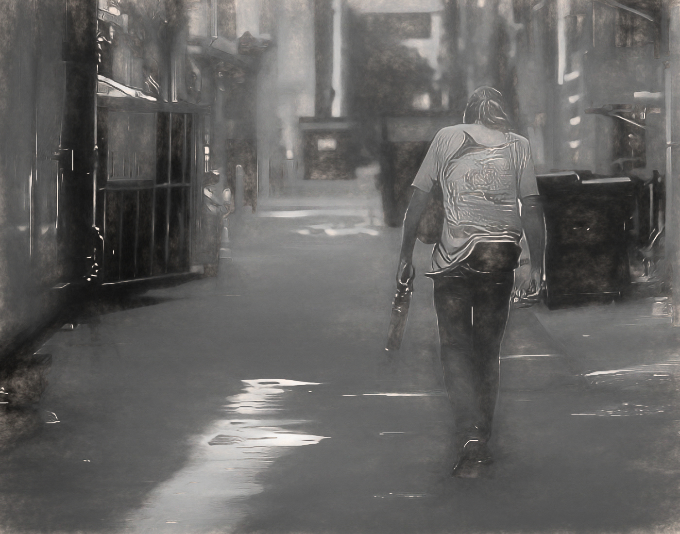
Very sharp, nice black & white image. I do find the merging of the girl's forehead with the backpack somewhat bothersome (depending on what you plan to do with this image). I think because of that lack of separation, it's not an image that you want to enter into an exhibition or a competition, but as part of a book of street photographs or a collection of images about the protests to show your friends, then it could work. It's too bad because I think it's otherwise a perfect photograph. |
Jul 8th |
| 80 |
Jul 20 |
Comment |
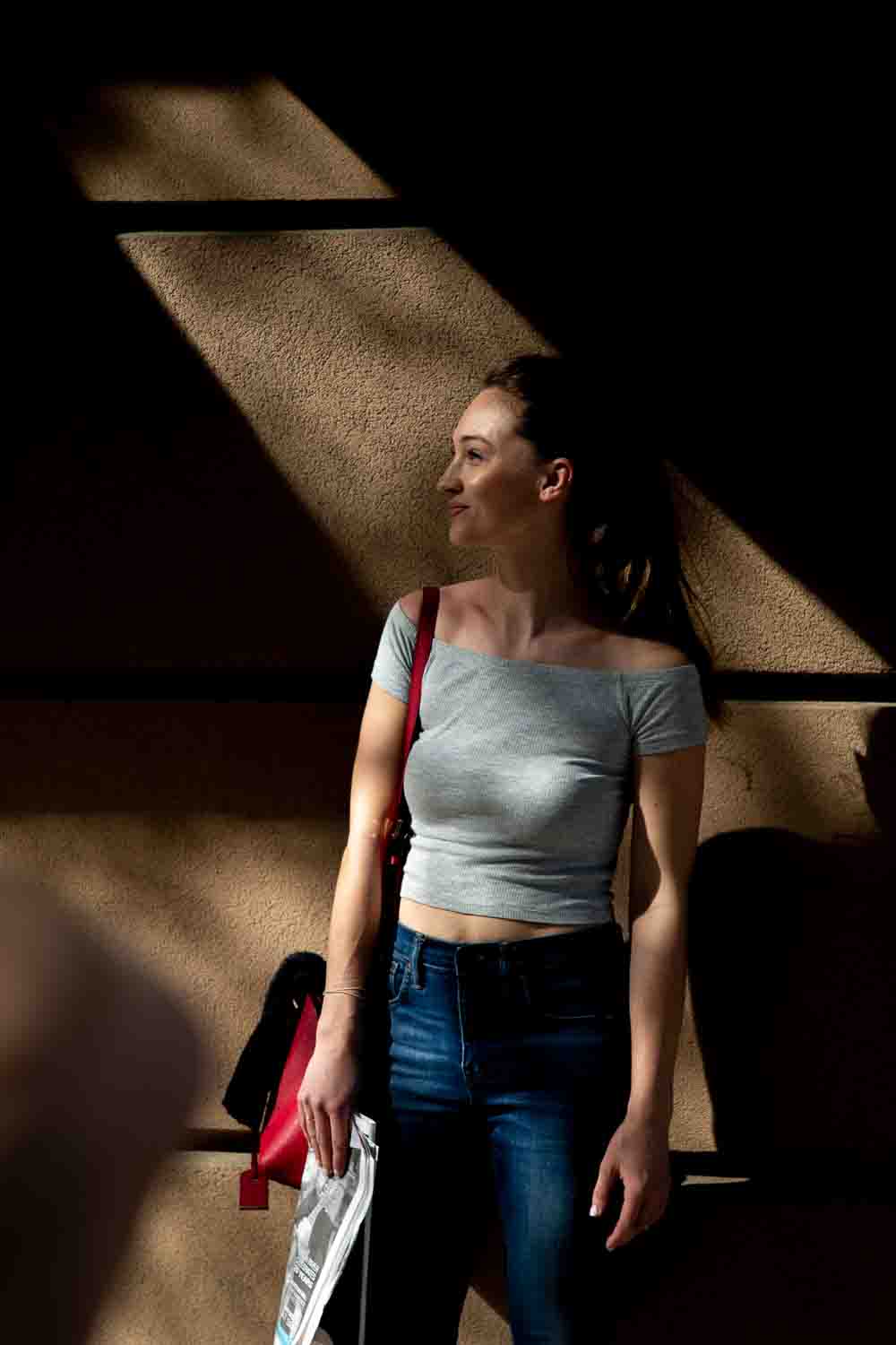
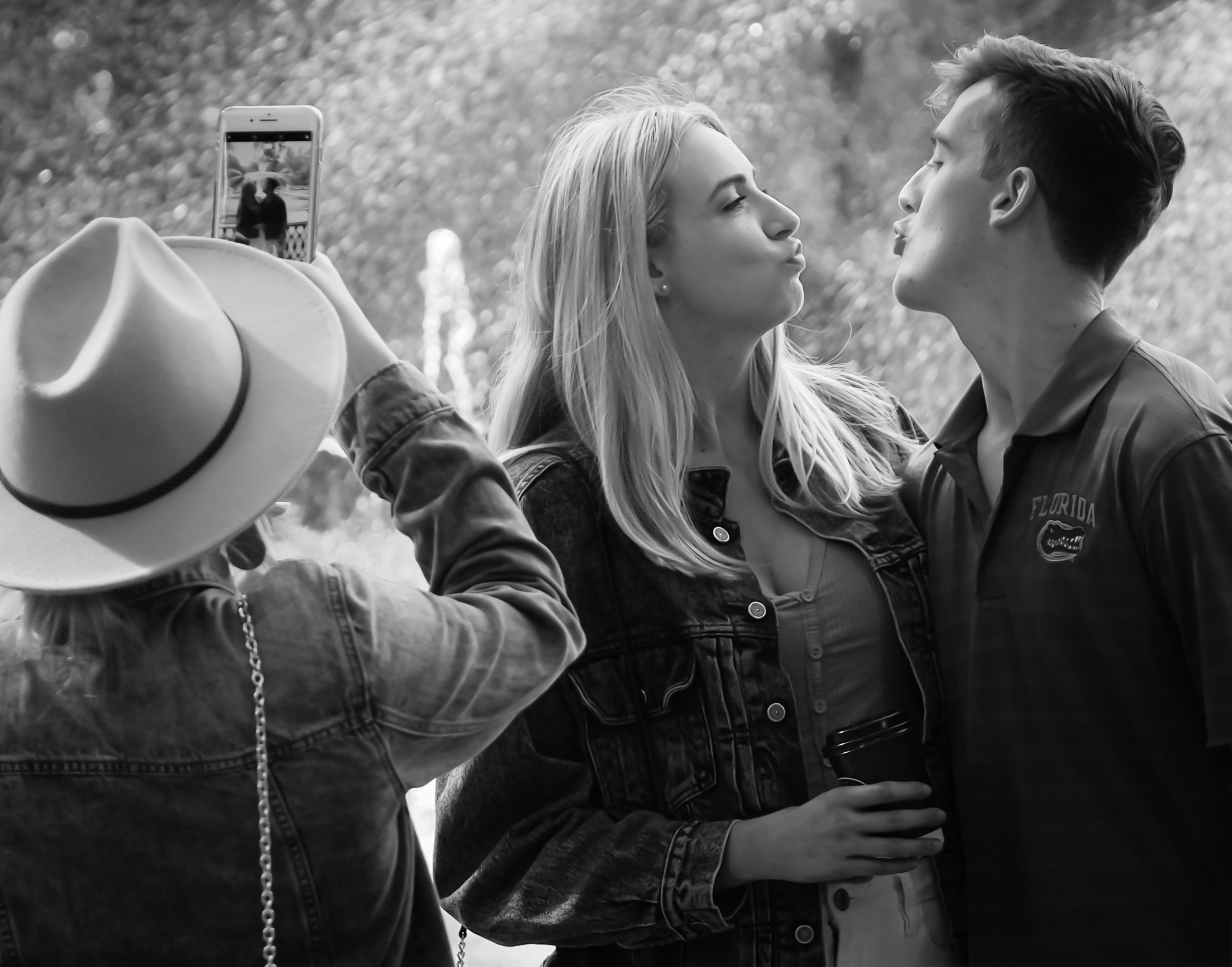
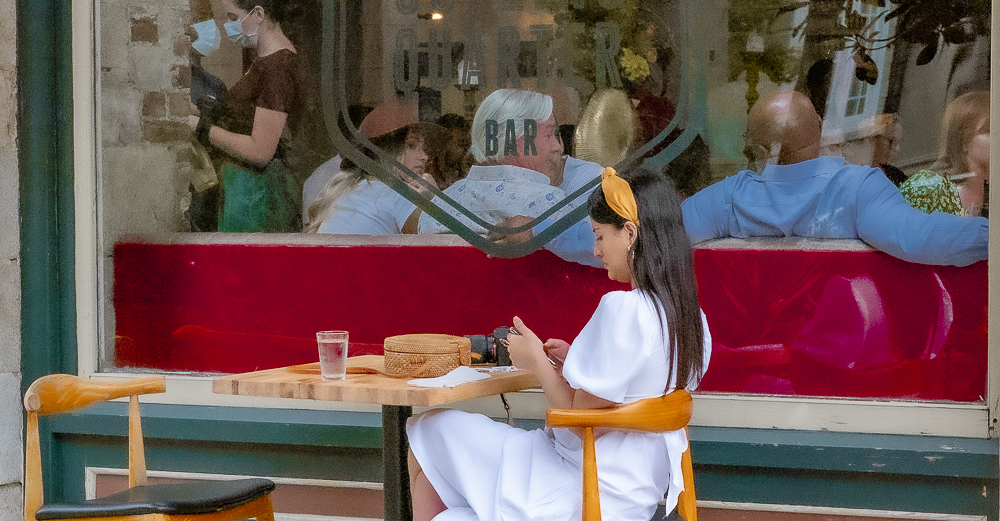
This is a nice image all the way around. I like the subdued colors and the feel that they give me. The composition is well done. I think you did a nice job with the exposure. And the swirling scarf in the sunlight really draws the eye in.
Very well done! |
Jul 8th |
| 80 |
Jul 20 |
Comment |
I like the original image, before you added the texture, the best. It's sharper, brighter and more interesting to me. Plus I'm a bit of a purist when it comes to street photography --- I want to see the entire scene. In fact, I'm betting this would be an even better image if we saw the entire band and the setting they were playing in. But for me, I don't care for putting the texture in. |
Jul 8th |
| 80 |
Jul 20 |
Comment |
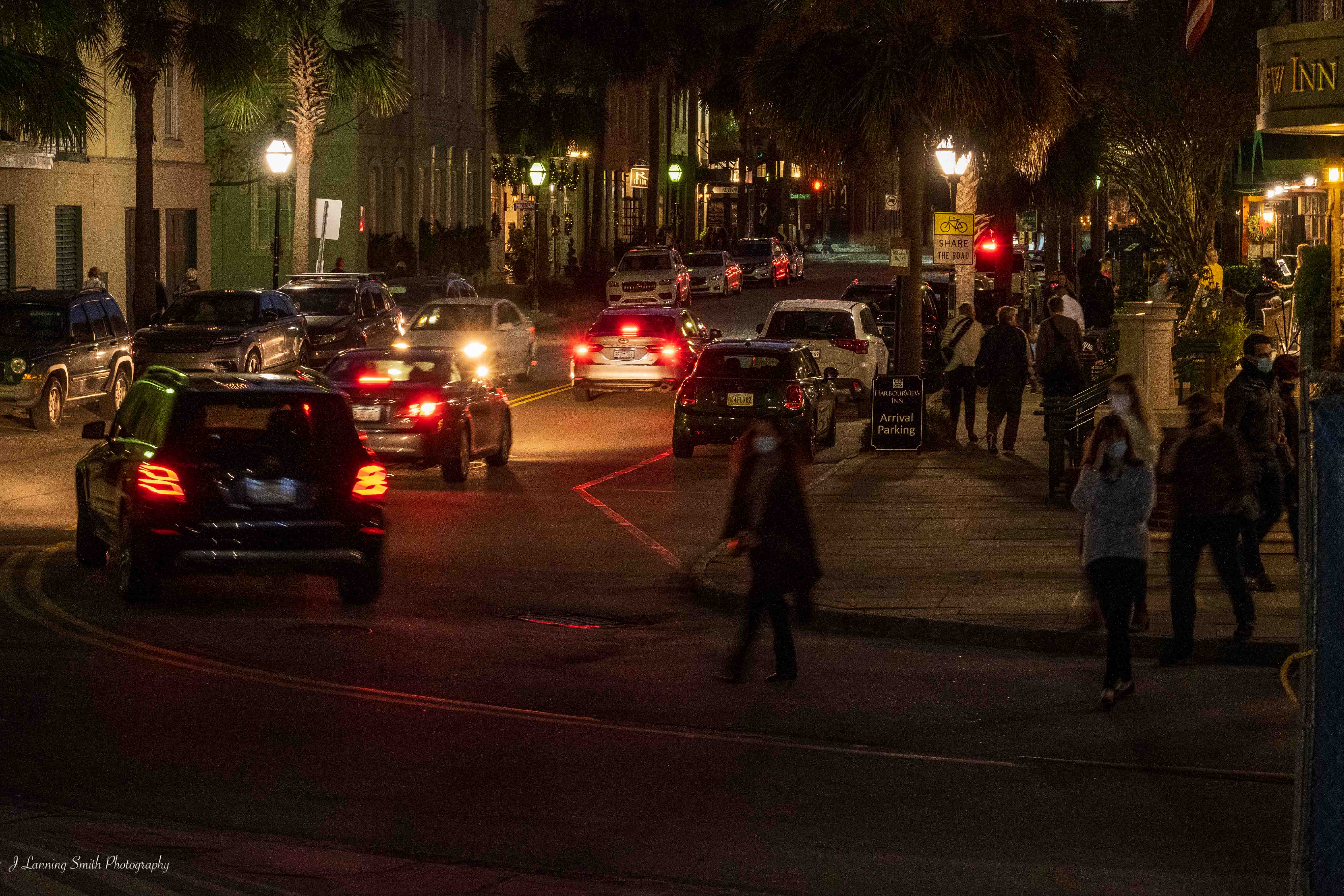
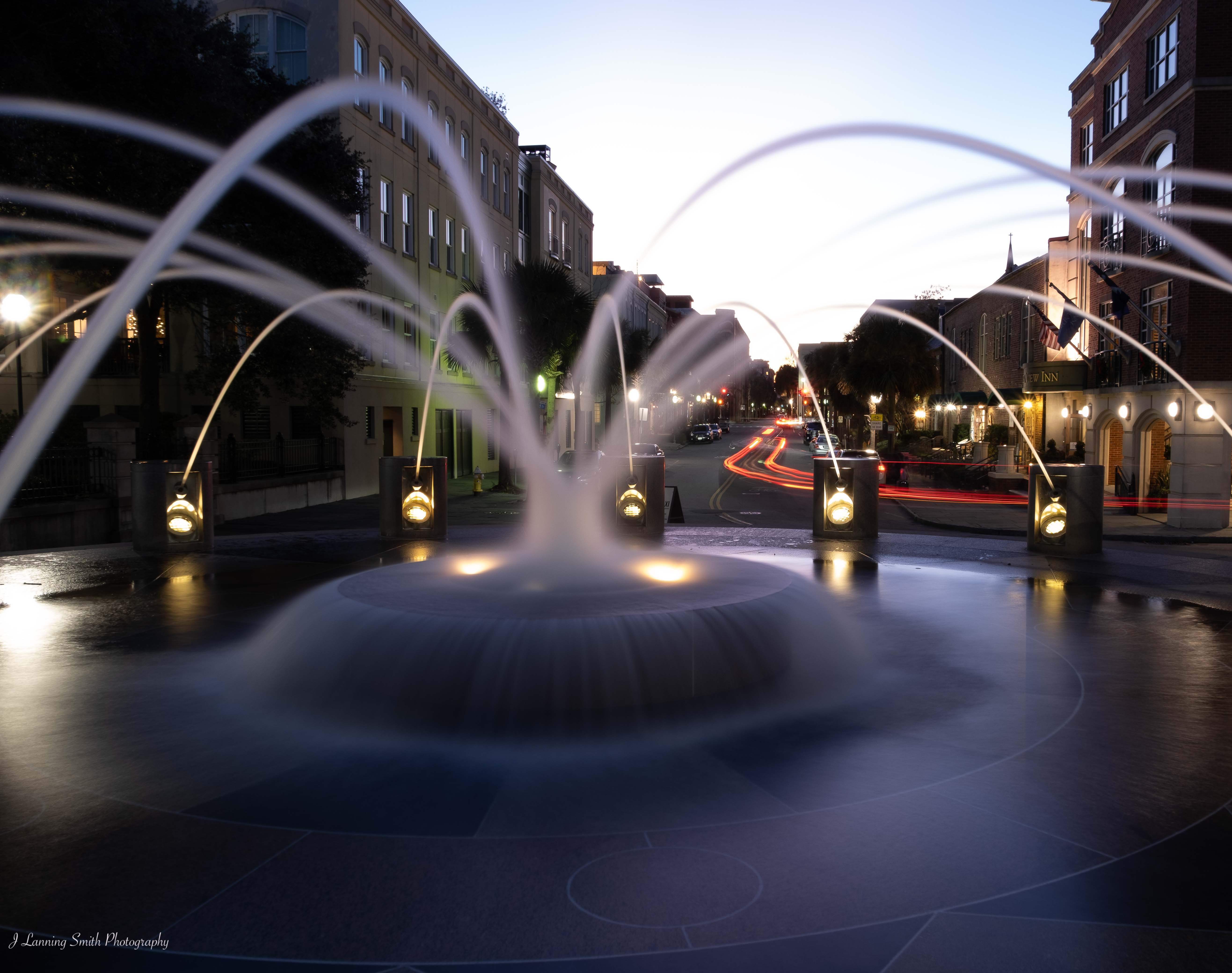
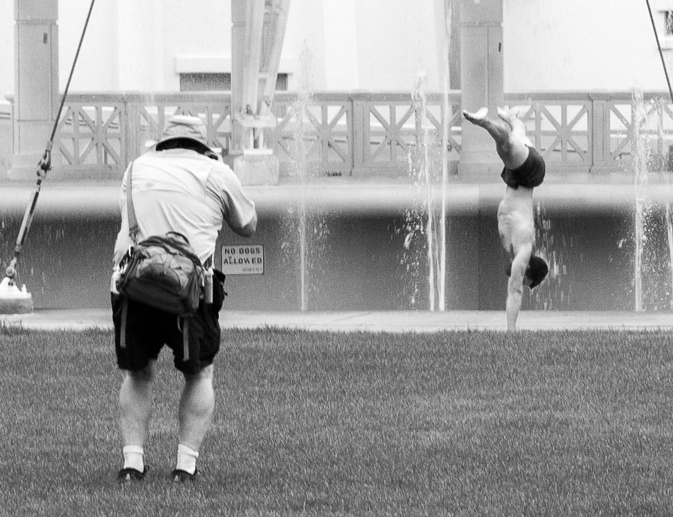
I agree with both Bill and Beverly that the scene overpowers the subject in this image, but I'm not totally sure that cropping is the right answer here. For example, I think the bench and the road provide the opportunity of leading lines up to the subject, which I think might be what you were going for. But I have two thoughts there. One, I think it would work better as leading lines if you got lower. This was shot from eye level, and I think this is one for getting down closer to the ground to take the shot. And my second thought is that the leading lines shoot right past the subject and go on up the hill. That kind of distracts from centering the viewer's eyes on the subject.
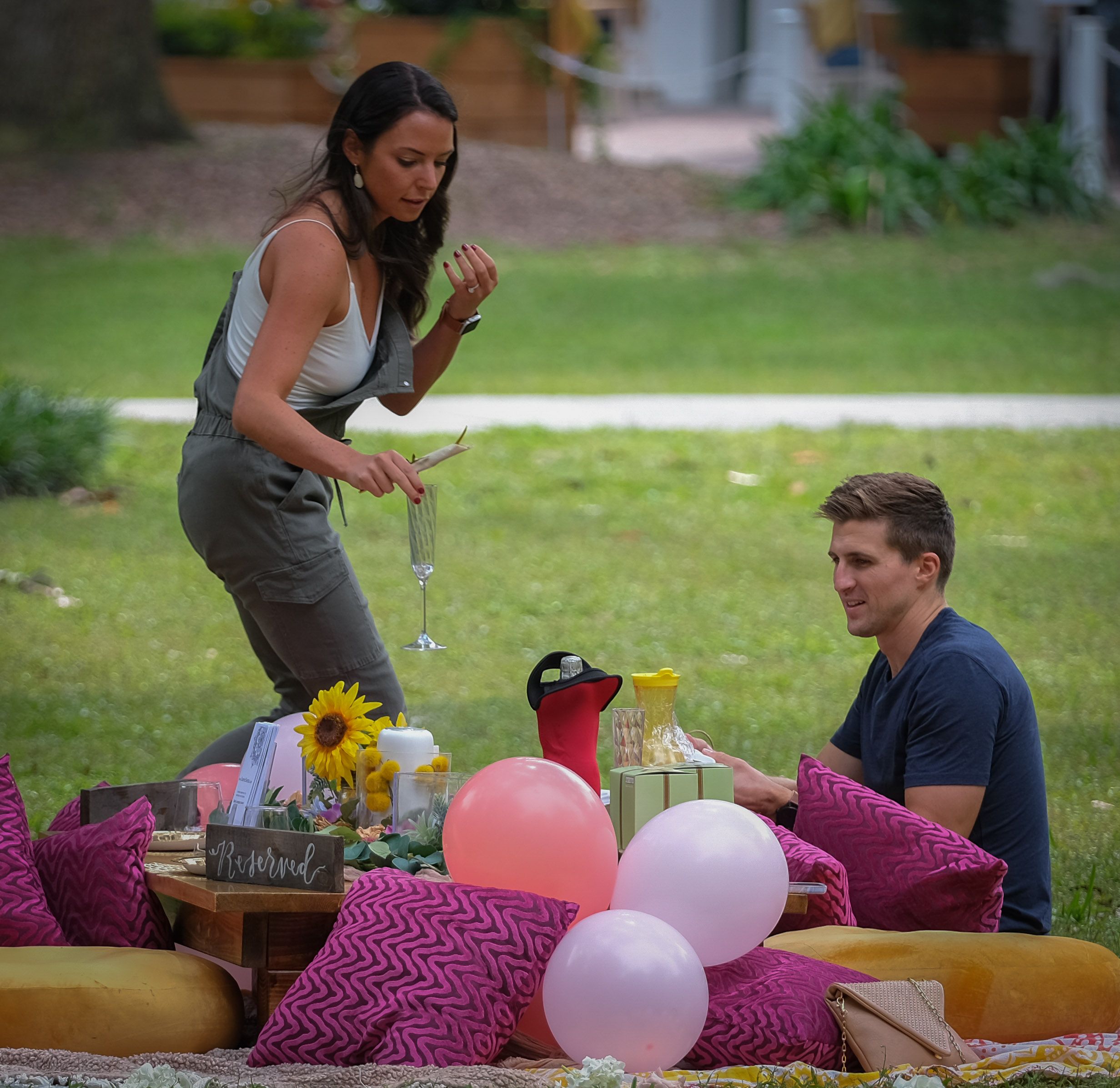
The other problem I see is the woman's back is turned to the camera. I know you would lose the leading lines in doing so, but I think the image would be more interesting if shot from more directly in front of them, so that you saw both of their faces. You could shoot from that angle and allow your subjects to fill more of the frame, but not so much of the frame that you lose some of the wall and the bench too. You want to keep a sense of place as that is part of what tells the story. And I think that's all you need to give it that sense of place. The road and everything past the sign of the inn are not necessary to keep that sense of place. |
Jul 8th |
| 80 |
Jul 20 |
Comment |
I like Stephen's crop when I open it up on my computer; however, for some reason when I opened it first on my iPad, the composition of that crop was all wrong. So, this is a revised comment to reflect that. I agree that there's no need to crop out the partial gondola. It's part of the story.
I think you've done a nice job Bill in processing this image and in composing it. I like the contrasts of the various colors. I like how you've brightened it up. Good job. |
Jul 8th |
| 80 |
Jul 20 |
Reply |
Thank you Beverly |
Jul 8th |
| 80 |
Jul 20 |
Reply |
Thanks Bill. I was lucky to be able to get into that position. |
Jul 6th |
| 80 |
Jul 20 |
Reply |
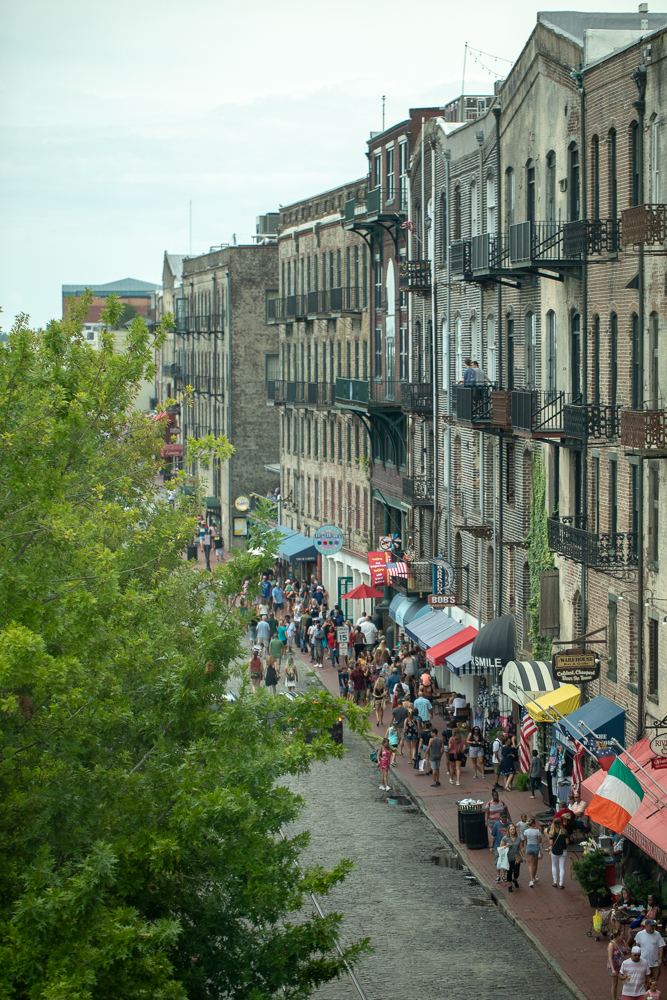
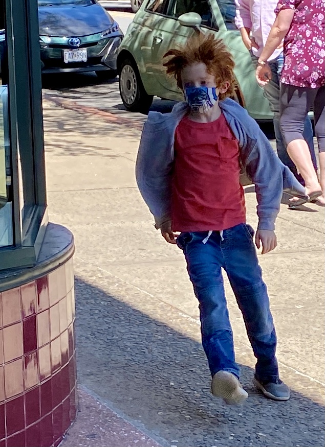
Thank you Carol. Our local photography club's competition in September is street photography, and I'm planning to enter this one. So, I'm really happy to hear that this is one that works for you and hopefully others as well. |
Jul 4th |
5 comments - 5 replies for Group 80
|
5 comments - 5 replies Total
|