|
| Group |
Round |
C/R |
Comment |
Date |
Image |
| 80 |
May 20 |
Comment |
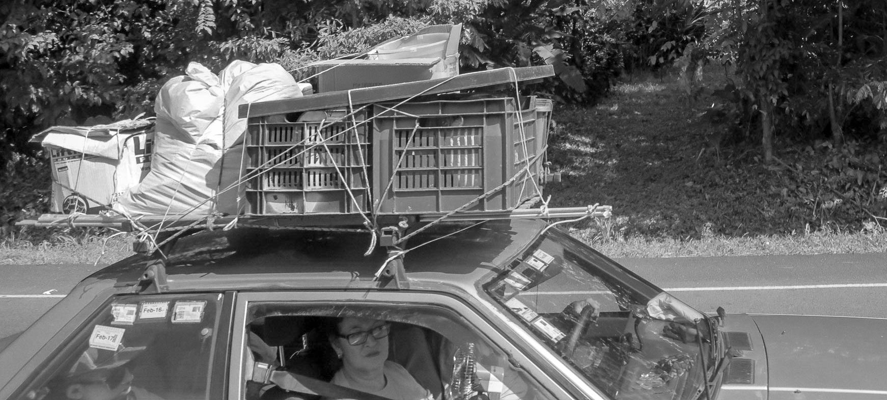
To me, the scene is what is interesting. If you take out the scene, the picture of the man himself is not interesting. So I'm not in agreement with cropping tighter or removing items from the scene. I think this image has good composition as it is. |
May 16th |
| 80 |
May 20 |
Reply |
I like this a lot Stuart. This has a bright, open mid-century modern feel to it. Since my house interior is all done in mid century modern furnishings and artwork, this would be an image I would hang on my wall. Very nice! |
May 16th |
| 80 |
May 20 |
Comment |
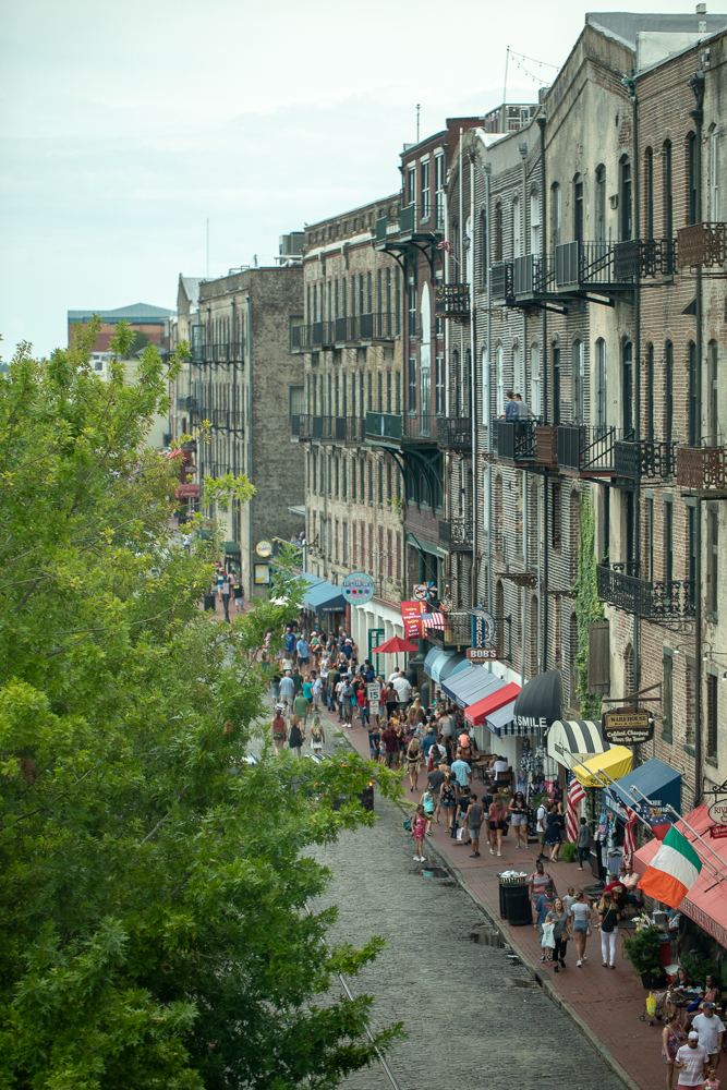
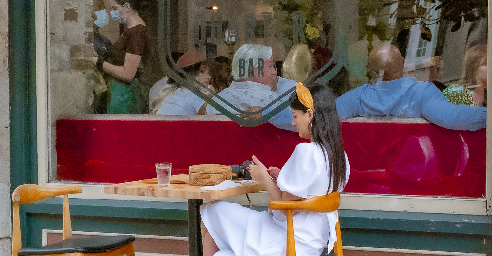
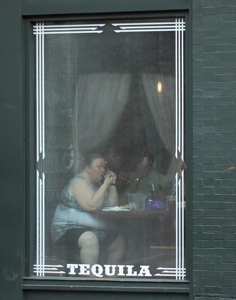
Personally, I would not cut out the sign or the Coke bottle. This is street photography after all and neither is out of place or distracting. The sign gives the scene a sense of place too. I suppose a competition judge for something other than a street photography competition might take points off for half a sign, so if you're entering the image in a competition like that then you might remove the sign. Otherwise I would keep it.
But definitely don't crop to take out the sign. That would throw the whole composition out of balance. If you do remove the sign, do it in post processing. But of course then it wouldn't be a true street photograph since the sign is a permanent part of what is there. |
May 16th |
| 80 |
May 20 |
Reply |
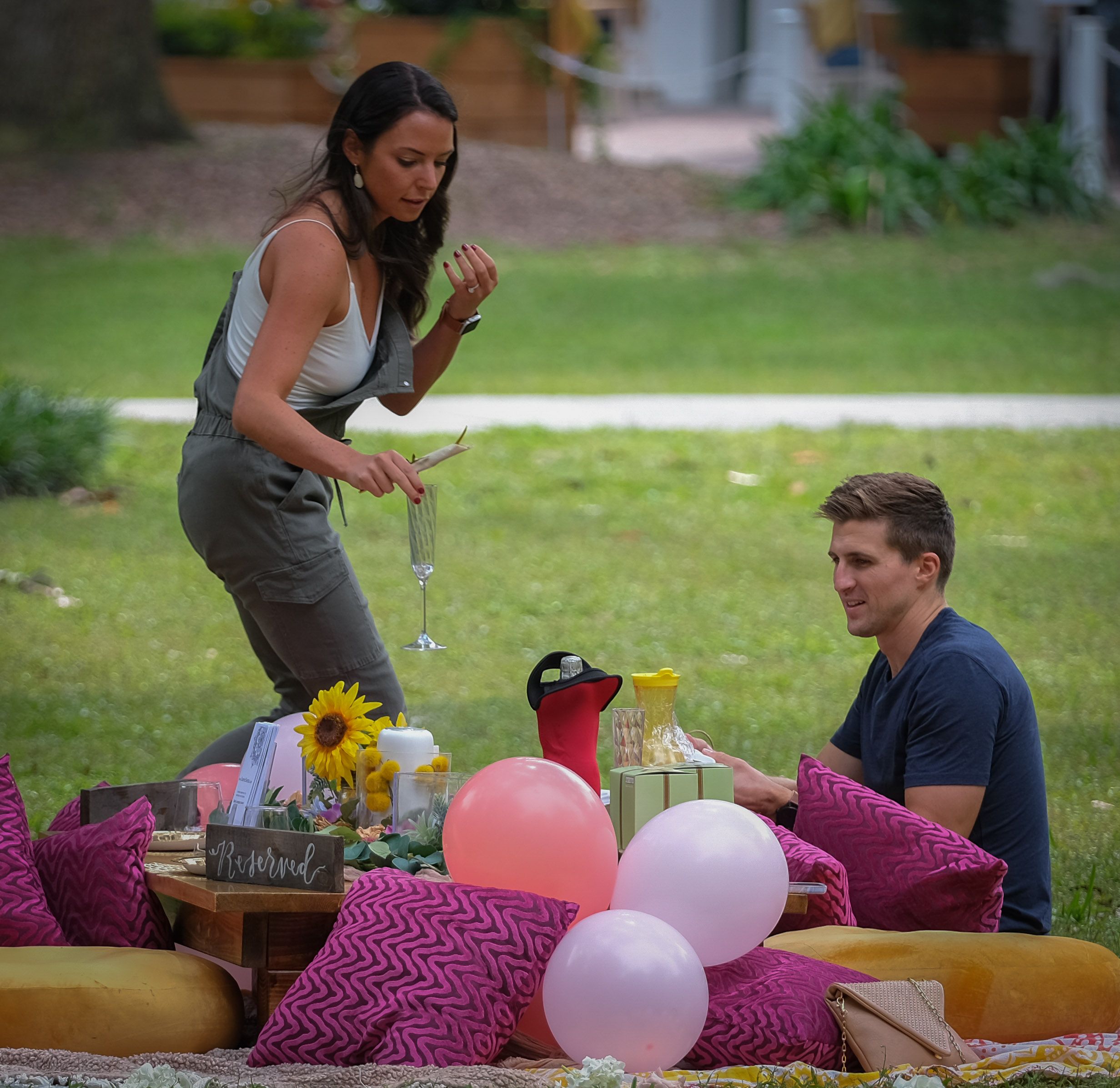
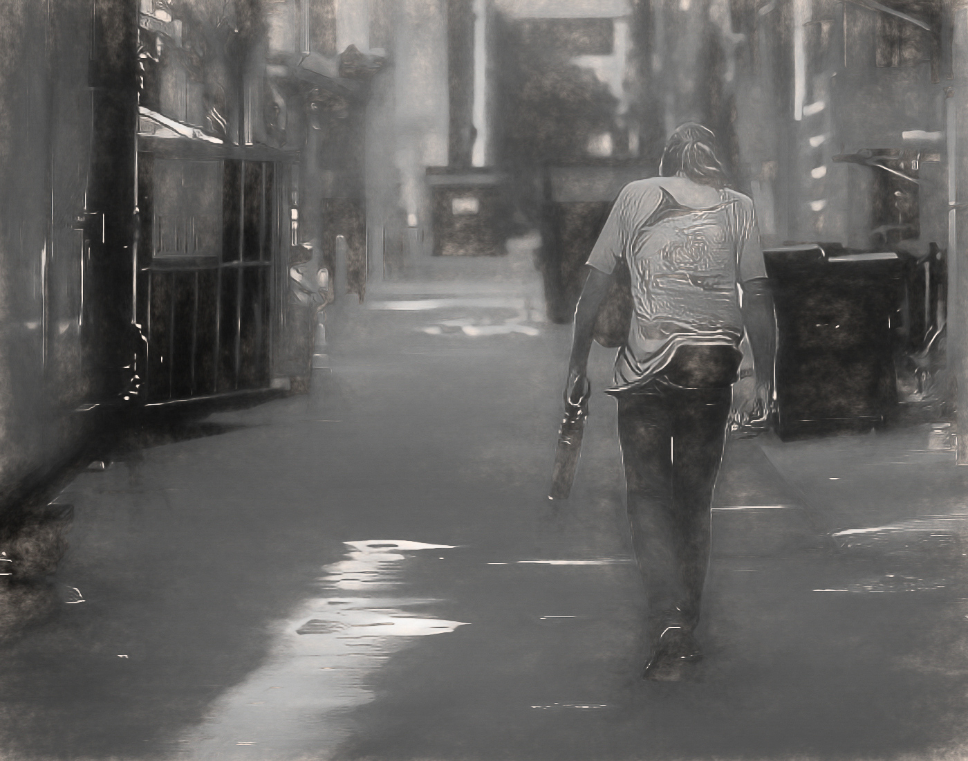
Thank you Carol. I did not intend to make a value statement about her, but you're not the first person to suggest that. I agree with you that this image doesn't convey loneliness, but I never said it did. I said it reminded me of myself and the fact that I generally eat alone. But I'm not lonely and I therefore never intended to imply or convey that she was either. I think loneliness and being alone are two entirely different things. I know people who feel lonely even though they are surrounded by lots of other people. And then there are others, such as myself, who while being alone actually have very satisfying and fulfilling lives. I don't think we know the situation with this woman. Having said all that, I'm finding that most viewers, like you, prefer the original version and don't like the hazy look of the window without the context of the rest of the scene, so I'm planning to go back to that. Thanks for your comments. They have been helpful in helping me to make that decision. |
May 16th |
| 80 |
May 20 |
Reply |
Thank you Karen. I agree with you. |
May 11th |
| 80 |
May 20 |
Reply |
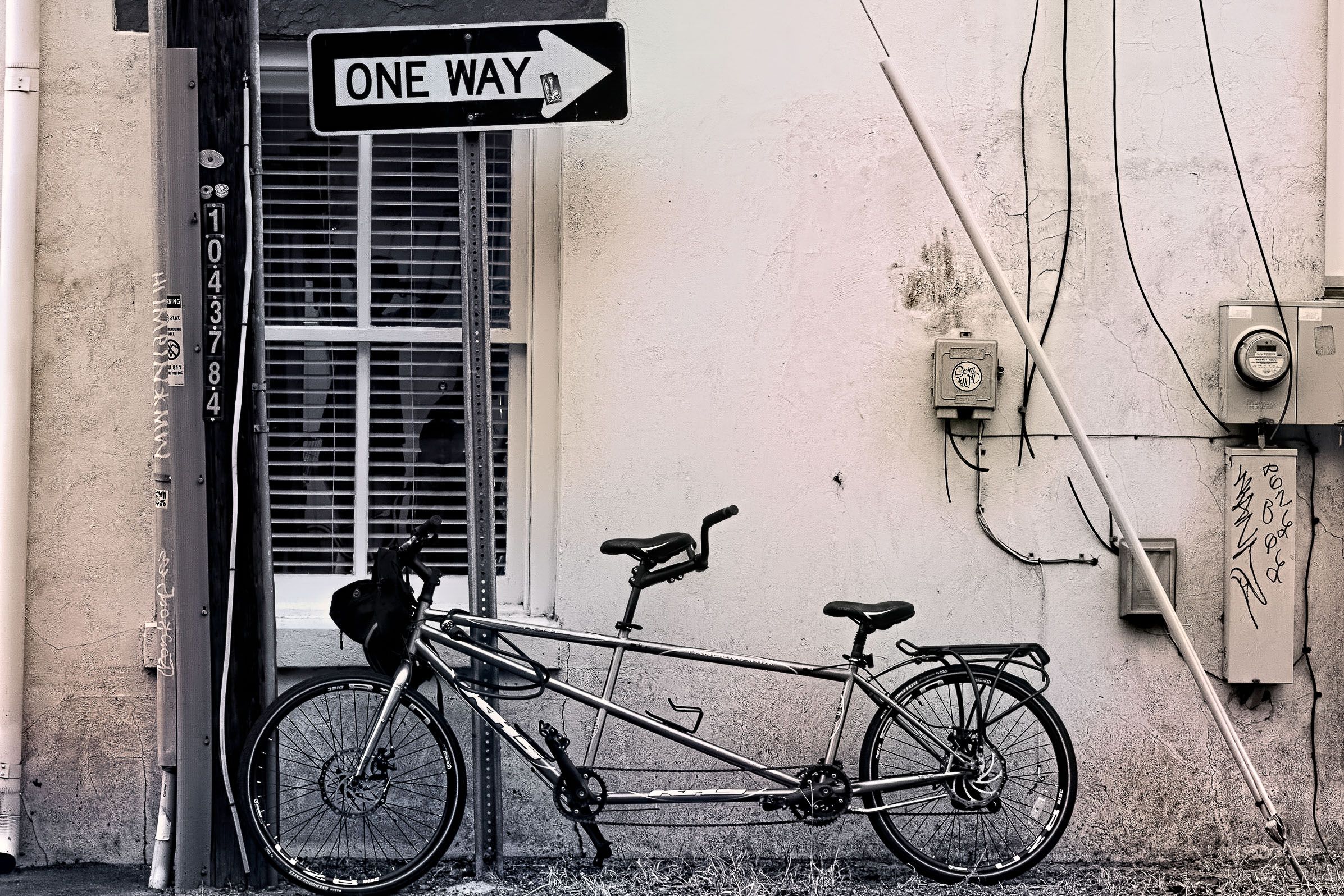
Thanks Ed. I keep trying different crops. I think that's been my biggest struggle - finding the right crop. |
May 11th |
| 80 |
May 20 |
Reply |
Thank you Victor. I have actually been thinking along the lines of what you suggested. So it's good to know that others think along those lines too. I like what you did with the image. |
May 11th |
| 80 |
May 20 |
Comment |
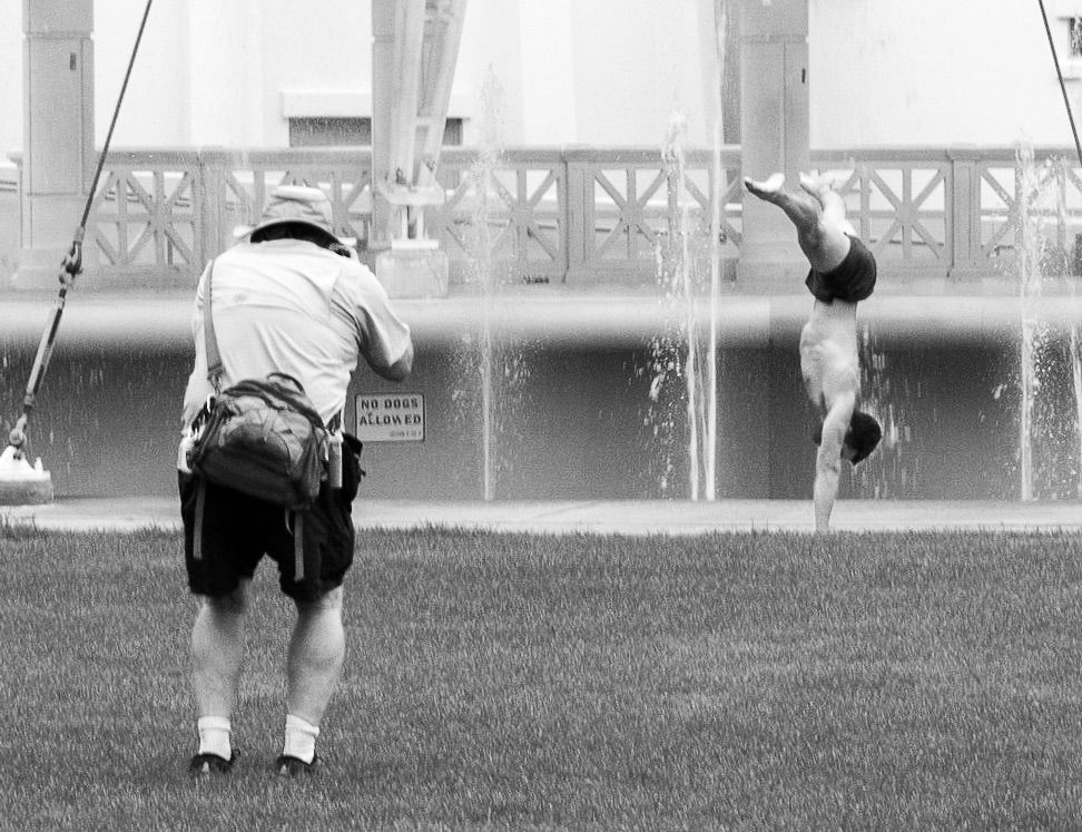
I agree with Ed about the story this image tells, and shooting from behind an artist to see the scene being painted is one of my favorite things to do too. I have several images where I've done just that. I also agree with Ed about the placement of the artist. I think the subject is the scene being painted and not the artist, so, I think your placement is right on this.
Personally, I prefer your choice of doing it in black and white; I don't think color adds anything to the image. But I agree with Ed that more contrast is needed. The people don't stand out enough, and I think they should in an image like this. I think an increase in their contrasts would make a big difference.
Also, I thought the sky was kind of bland. I'm wondering if there might be some detail in the sky that you could bring out in this image?
Overall, I like the image.
|
May 9th |
| 80 |
May 20 |
Comment |
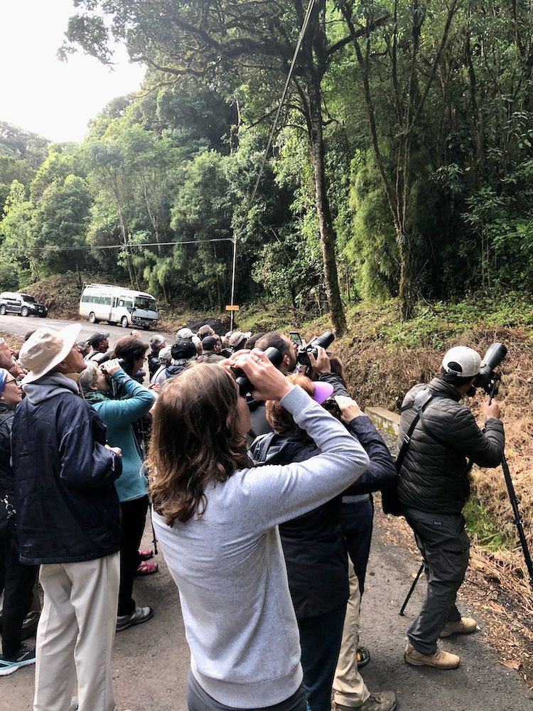
This image gives me the feel of being there, and that's a good thing. It has a story to it and the composition is good.
I thought the lower right hand corner might be a little soft compared to the focus in the rest of the image. |
May 9th |
| 80 |
May 20 |
Comment |
This is a bright, vibrant image and I really like the colors and the contrasts that you've achieved with it. The composition is very well done. The subject matter is interesting.
I agree with Beverly that the netting is distracting as are the shadows. I think this would be a truly stronger image without the netting and the shadows. I also think it needs to be slightly straightened as well. |
May 9th |
| 80 |
May 20 |
Comment |
This is a beautiful scene. It has the look of a watercolor painting. And I think you've done an excellent job with the composition. You've placed the subject in the lower right hand quandrant, which is the strongest point in a photograph. Very well done on that. And then your capture of the overall setting is exquisite. The whole scene spells romantic. It's just lovely overall.
I'm wondering if that is the leg of a person lying on the bench on the left side. It looks like it is, but then again, I can't decide if I find that distracting or not. In some ways, because it points to the young couple, I kind of think that it isn't. And I think taking it out would leave too much of an empty bench, and you need the bench that long to get in the full measure of the scene. So, I think I would leave it in.
Very nicely done! |
May 8th |
| 80 |
May 20 |
Comment |
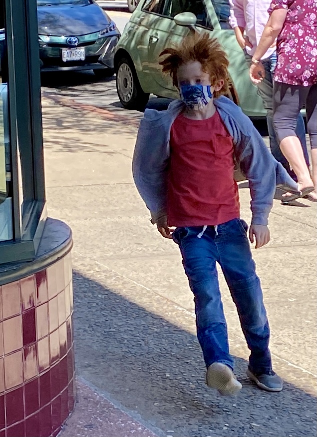
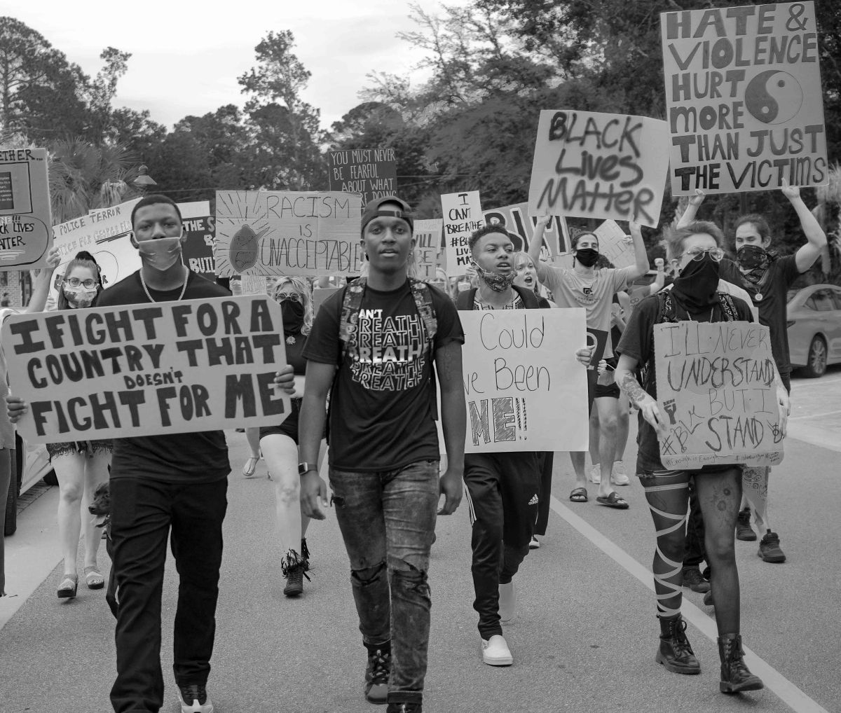
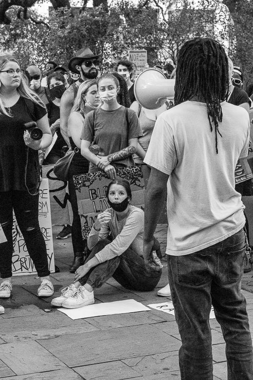
I think this image is well done. I like the richness of your black and white points and the tonal contrasts within the image. The subject matter is interesting and certainly applicable to our times. Photographs like this will be there to remind us after this panic is finally over. And this certainly tells the story. While the colors in the original image are interesting and make a good image in itself, I think you made the right choice to go with black & white. I think the b&w sets the mood of the image better.
I don't have any suggestions for improving on this image. |
May 4th |
| 80 |
May 20 |
Comment |
The colors are what draw me into this image and of course the leading line of the road and its lane marker bringing my eye into the heart of the image. I think the composition is good. This image has kind of a modern artsy feel to it, and I think that's cool.
I want to see more detail in the image however. Did you shoot it in Raw? If so, then you can probably lighten up on the shadows a fair amount and bring out some of the detail in the trees and the homes. I think that might make it pop a little more. |
May 4th |
| 80 |
May 20 |
Comment |
Thanks Beverly. I don't know if you remember, but I've shown this image here before with a different crop that showed some of the building too. But in this view of the image, I'm wanting to focus specifically on the people in the photograph. That's the reason for this crop, but it sounds like you prefer the wider view with some of the building too. And that's good to know. This is an image that keeps drawing me back to it, but I don't feel like I've perfected it yet. So, I'm open to all ideas for it. |
May 4th |
9 comments - 5 replies for Group 80
|
9 comments - 5 replies Total
|