|
| Group |
Round |
C/R |
Comment |
Date |
Image |
| 80 |
Mar 20 |
Reply |
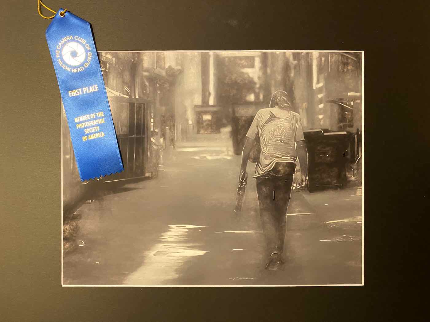
Thanks Bill. That's exactly the effect I was going for. And I've been meaning to post this, but I did enter it into the competition and I did win a First Place ribbon in the Advanced category for it. So, a big thank you to everybody who has commented on it so far. |
Mar 17th |
 |
| 80 |
Mar 20 |
Comment |
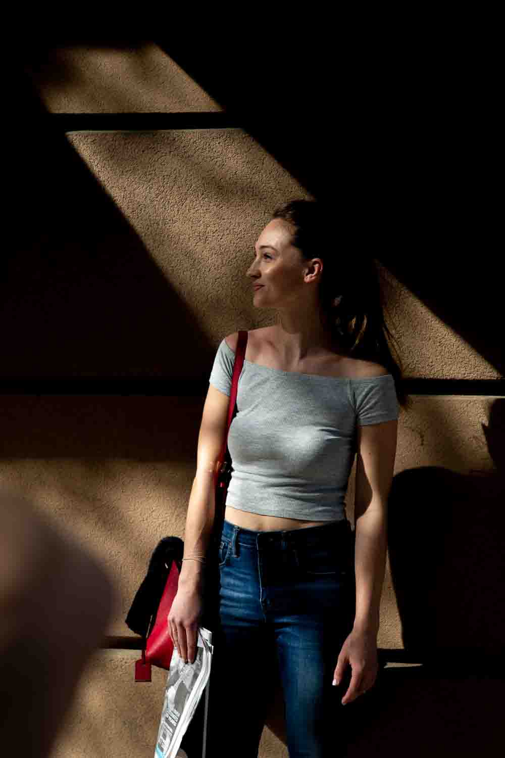
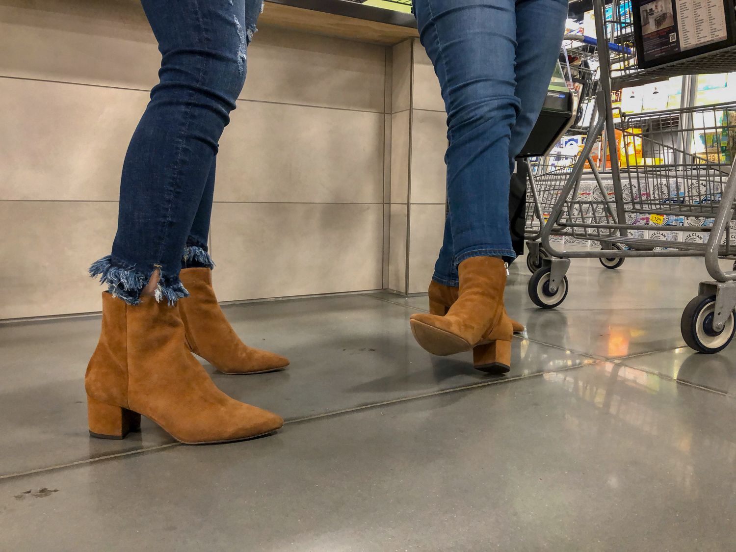
This is an interesting image, and I would have definitely stopped to try and capture it as well. I think there is a story being told by this image. I think the image is very sharp, and I like the angle from which this is taken. There seem to be several kind of subtle leading lines here thanks to the angle that you've shot from (the angle of the street and the cars bringing my eye to the couple and then the pointing of the camera and the wreath toward one of my favorite stores, from which much of my house is furnished).
I have to admit that I didn't figure this image out though until I read your description. The first thing my eyes hit upon when seeing this image was the wreath, but I didn't see that the young lady was holding it. As a result, I was confused as to why there was a wreath hanging in the middle of this image. It's actually more obvious what is going on in the original color version of this image.
I actually like the uncropped, color version better. But that's probably just me and my quirky tastes. |
Mar 6th |
| 80 |
Mar 20 |
Reply |
My comments are still the same. |
Mar 6th |
| 80 |
Mar 20 |
Reply |
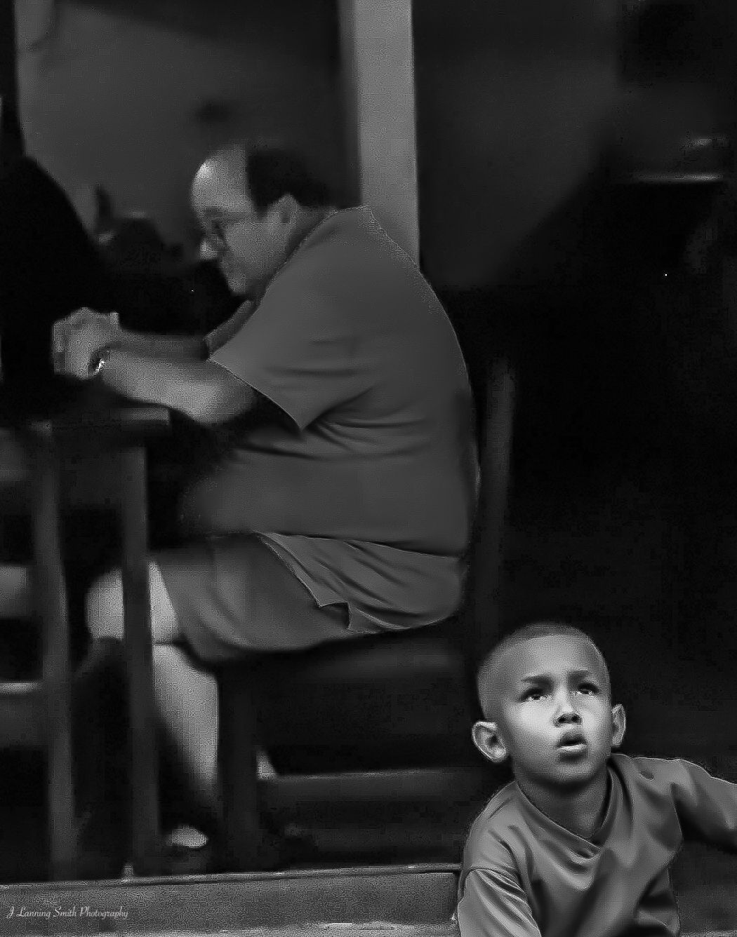
Thanks Ed. I am actually going for a kind of hazy, unreal look. I do recognize that that is a risk with the judges. In the end, I've decided to take that risk because I like the feeling this image conveys when processed this way. But I agree, the judges may not like it. But I still will. |
Mar 6th |
| 80 |
Mar 20 |
Comment |
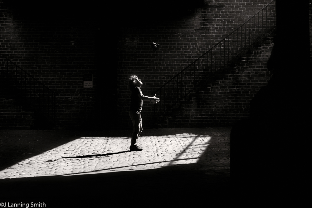
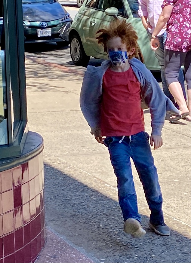
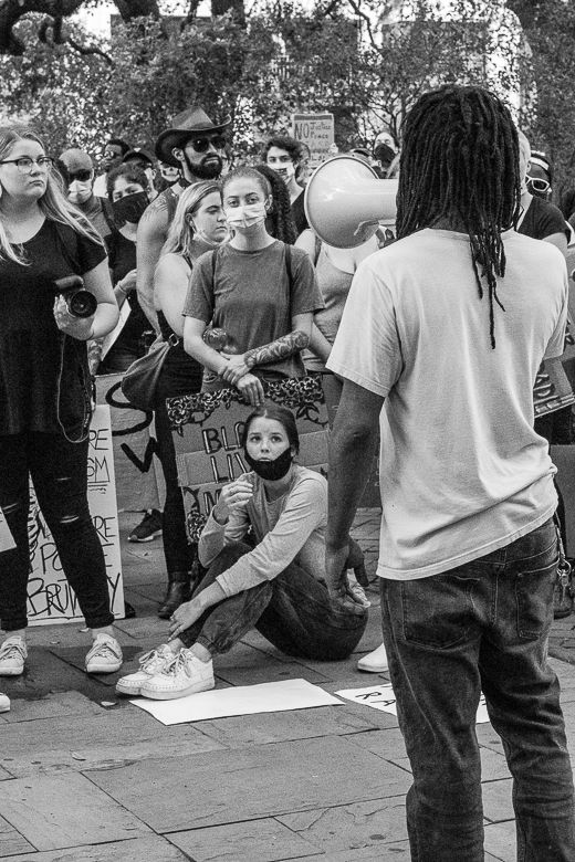
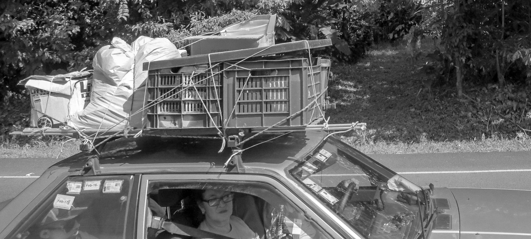
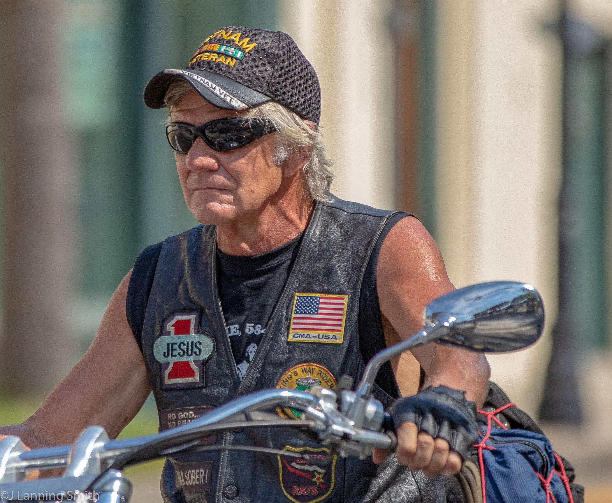
I think this is definitely an interesting character to shoot. And I like the way you captured him head on like that. I also like the crispness of the black and white image. And I like the softness of the shadows. I think you captured the depth of field right on this.
For me, I found the darkness of the one leg (his right leg) to be somewhat distracting and would like to see it more of the same white as the rest of his clothing. I was also distracted by what that is that is sticking out of his coat on his right side. I guess when I look at it closely, it might be the handle of a compact umbrella, but nevertheless I found it distracting. |
Mar 5th |
| 80 |
Mar 20 |
Comment |
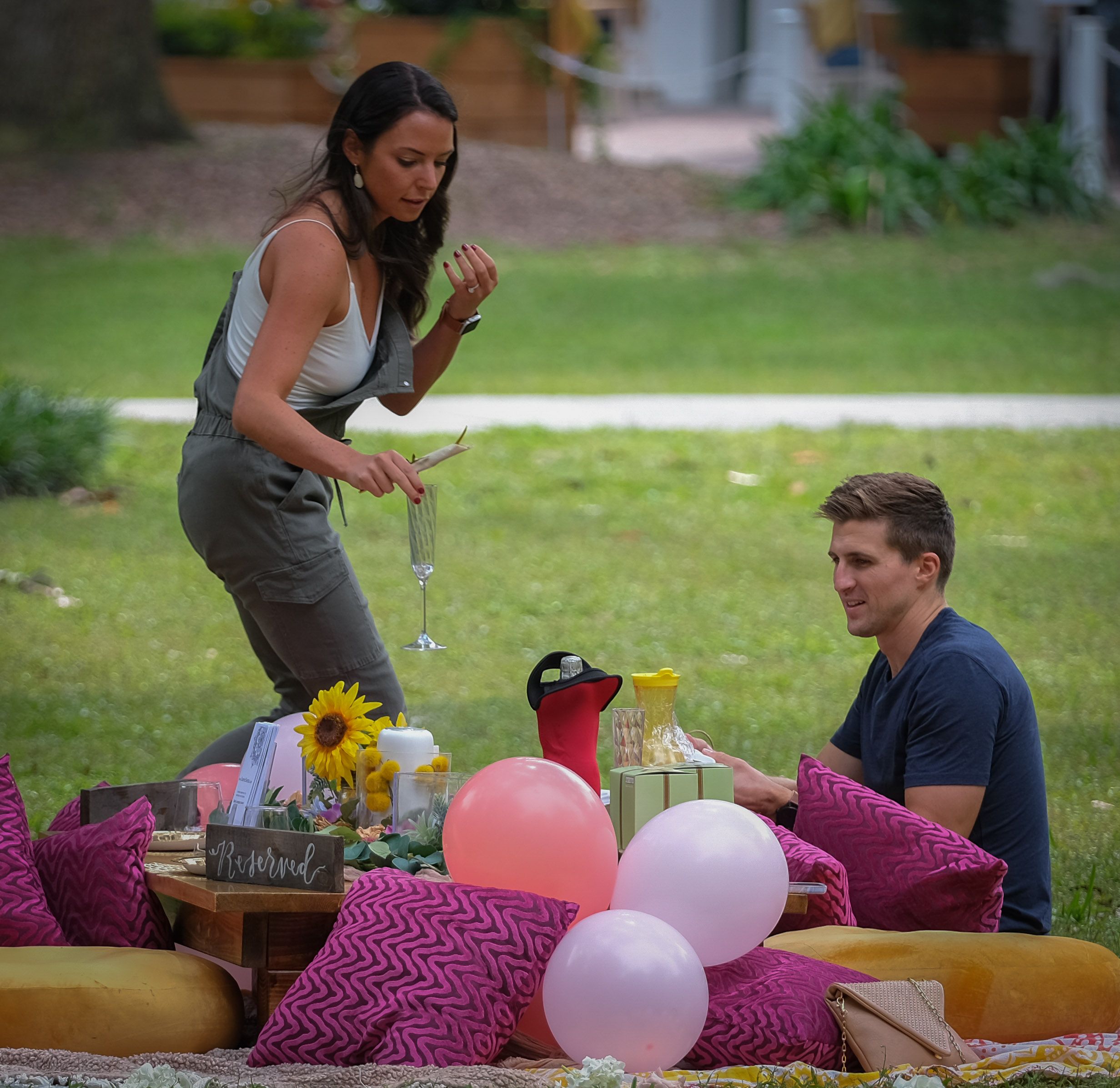
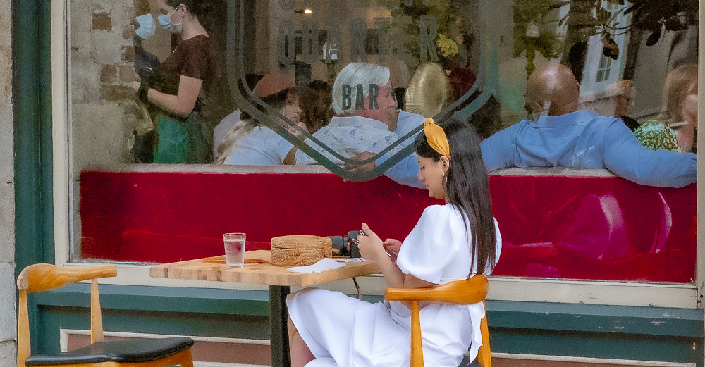
I can see why you were attracted to this scene; I would have been too. I like the contrast of the orange gloves and the slick green apron. The composition is very well done on this image. And I like the smiles on both of their faces. The depth of field is nicely done too. I like the way the scene is sharp back to the second person and then there is bocah with the mountains in the background. This image was very nicely done.
I don't have any suggestions for improvement. You nailed it. |
Mar 5th |
| 80 |
Mar 20 |
Reply |
Thank you Victor. Your comments on that are much appreciated. |
Mar 5th |
| 80 |
Mar 20 |
Reply |
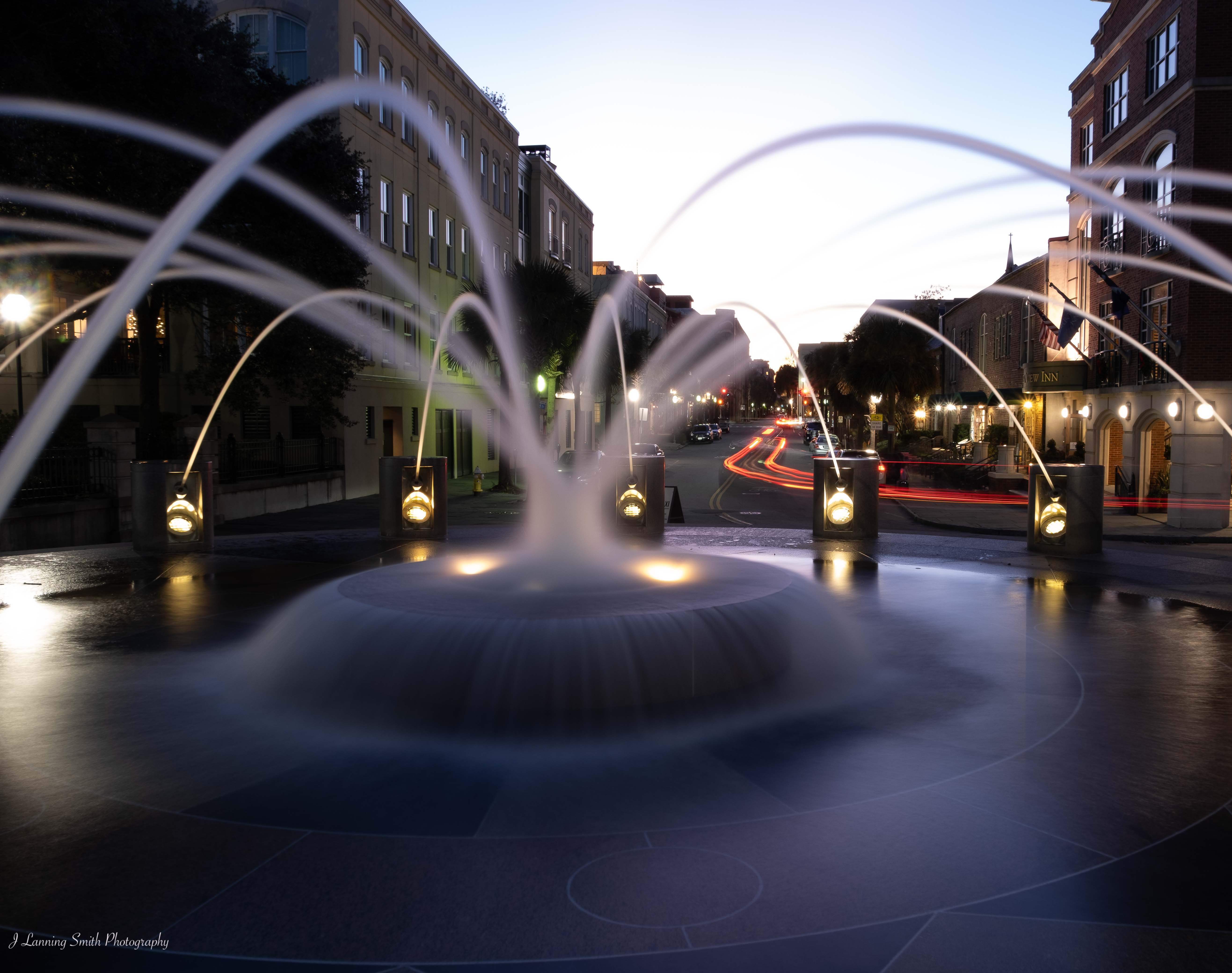
I think it's a nice image as it is. But if you're planning to enter it in a competition, then you might want to consider doing that. Let's see what others think. |
Mar 2nd |
| 80 |
Mar 20 |
Reply |
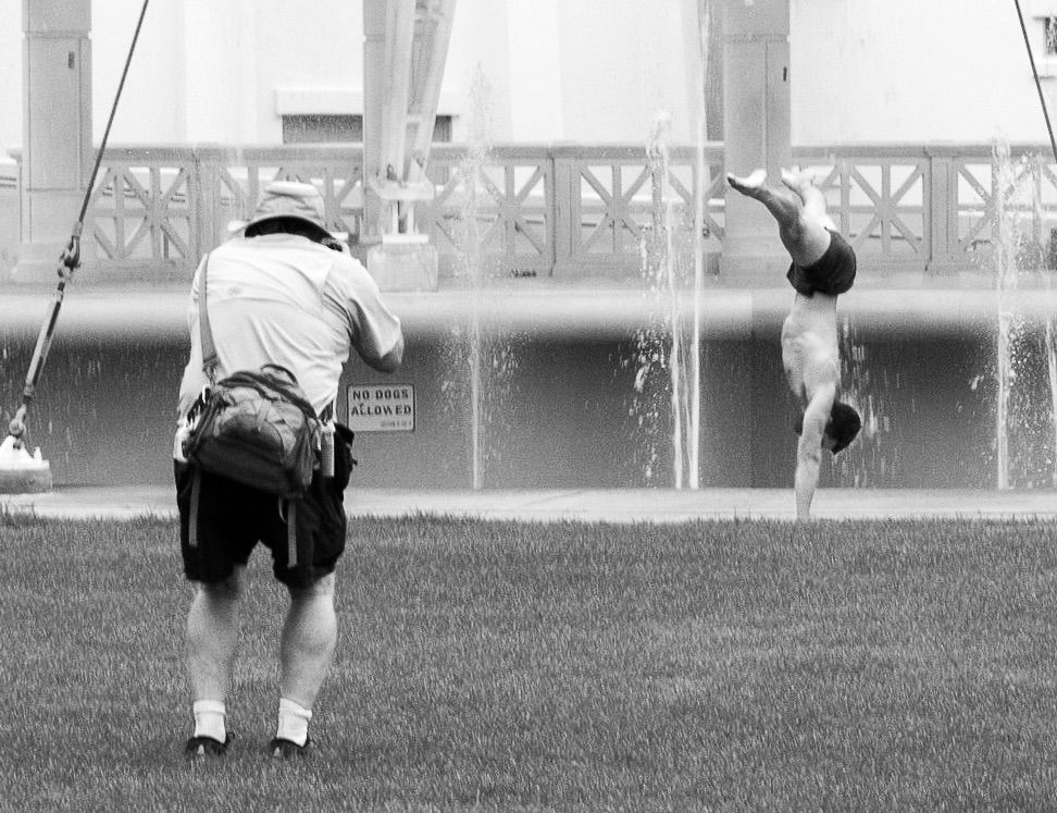
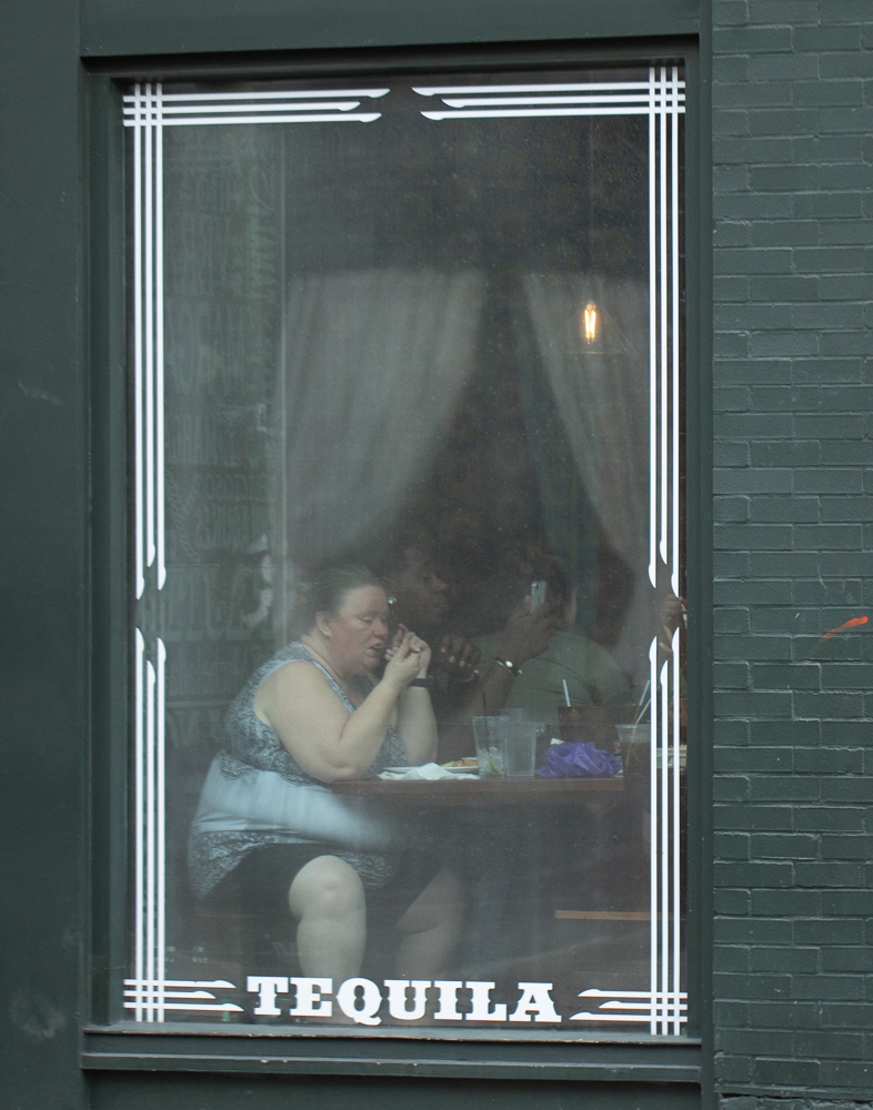
Thank you Carol. What he was carrying was the one part of the image that I've been kind of wondering about because without looking at the original it does appear to be a sawed off shotgun. And if that's what the viewer sees, does that add to or subtract from the impact of the image? |
Mar 2nd |
| 80 |
Mar 20 |
Comment |
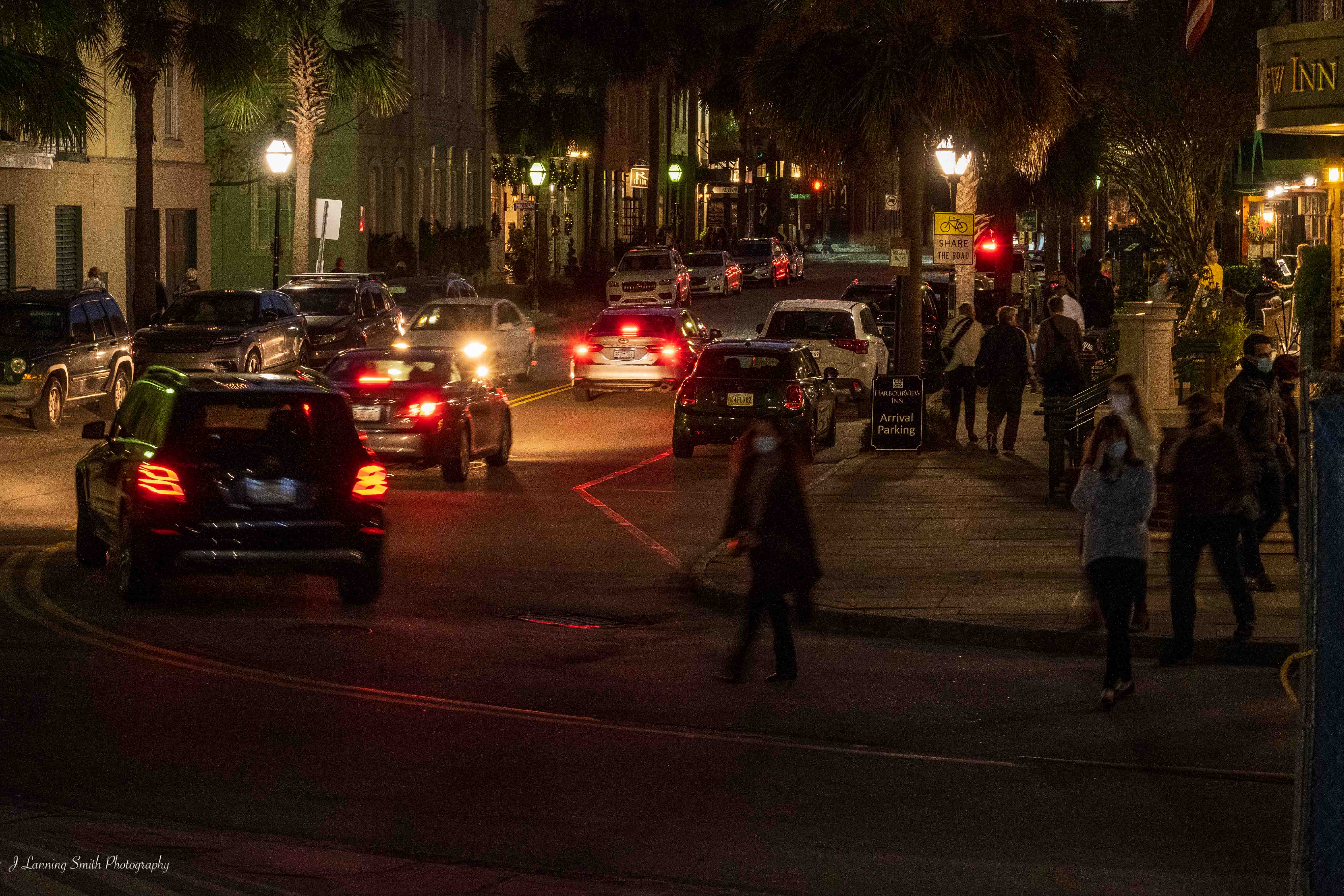
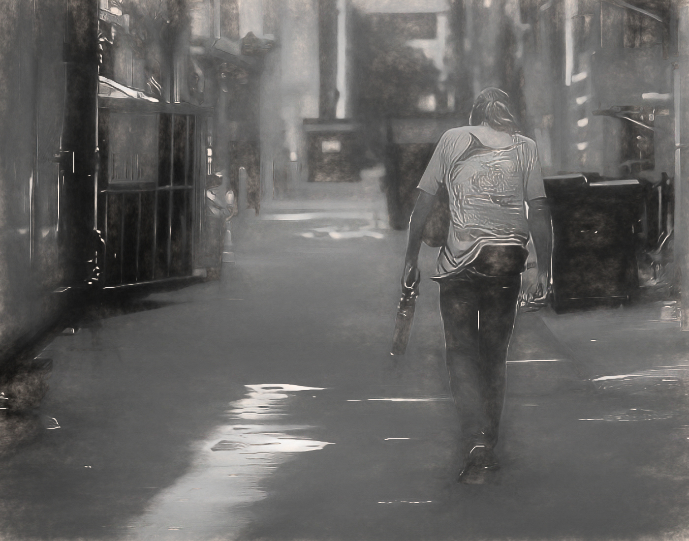
Since you asked for help as to why this may have received a low score in your camera club's competition, I'm going to stick with offering my thoughts on that.
Regarding the leading lines, my understanding of what is important about them is that they bring your eyes into the image. Sometimes, they can be quite subtle. Leading lines don't have to be immediately recognizable as leading lines. I say that because I often think the best images are ones where the leading lines aren't real distinct.
But in this composition, you have two distinct leading lines, one coming in from the left frame and one coming in from the right. My eye doesn't know which one to follow into the image, and as a result, my eye is moving between the two as opposed to going up into the image.
I also generally find that leading lines work best when coming in from the proximity of the lower lefthand corner of an image. So perhaps you can try repositioning yourself so that one of the fences is leading in from just above the lower lefthand corner.
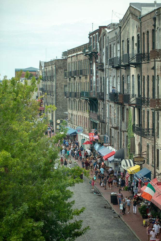
My next thought is: What are your leading lines leading my eye too? I think the people are too far away and indistinguishable for the leading lines to be taking me to them. I'm guessing that perhaps the subject of this image is the walk itself, but it unfortunately doesn't pop for me.
I think the problem there is that it appears you used a "Look" from Topaz Studio or similar processing software. I would suggest using a different "Look." This one looks kind of artificial to me and I don't think it enhances the image or brings out any specific emotion about the image.
Two other thoughts: One -- I think it needs to be leveled. In my club, an unleveled photograph will automatically drop it in points. And two, this is the kind of image that I think is often shot best low to the ground as opposed to at eye level. It adds a different perspective to how the image is being seen.
I hope those comments help. |
Mar 2nd |
| 80 |
Mar 20 |
Comment |
You've done it again, Bill. I love your image. I think you captured the merchant and the lady at just the right moment of exchange with their two expressions and the action of putting the scallop into the plastic bag. I like the composition of this as well where you are showing us the market with its very colorful display of the food items. Everything is very sharp in this image, which I think is appropriate because of the number of different points of interest in the image. I also like the improvement that you've made in the brightness of it over the original image.
I don't see a single thing in this image that I could possibly find to improve. It is very well done in my opinion. |
Mar 2nd |
| 80 |
Mar 20 |
Comment |
I like this image. I think it is well composed, and I think the angle from which it is shot leads my eye right into the picture. I think your decision to do it in color as opposed to black and white was the right decision for this image. I like the pose of the artist too because to me it takes the emphasis off of him and on to the work that he is doing. I think that seeing his accessories as you have portrayed them is pertinent to this as a street scene. For me, it creates a story to this image.
I think the feet of the people on the sidewalk in the upper lefthand corner is a little distracting, but I don't know how I would fix that. Unfortunately, I think cropping them out would bring his head too close to the top of the frame and cropping in from the left would put too much emphasis I think on the plastic bag; whereas I think having the clothes and the rags is pertinent to the story this image tells. So, in the end, I would leave this image just as it is. |
Mar 2nd |
6 comments - 6 replies for Group 80
|
6 comments - 6 replies Total
|