|
| Group |
Round |
C/R |
Comment |
Date |
Image |
| 80 |
Feb 20 |
Reply |
Thank you Isaac. I have started the course and it's funny because so far, in my critiques, I've been told that I am writing well and Jon has had no other comments about how I've worded my critiques in the course. In reading the text for the course, most of the principles stated are principles that I've always tried to follow. And I was actually pleased to see that some of the things I've always believed that were contrary to what we often hear, Jon Fishbein did too. I've re-read a dozen times what I wrote in my critique of Carol's image above, and I honestly don't see that it was worded badly or that I gave it an incorrect critique. I gave what I considered was an honest critique. I've also looked at the other comments here, and none of the comments have changed my mind about this image. But I also said in my critique that I'm only one person and others may not see it the same way. That turned out to be prescient I think. But I think it also showed some humility on my part that even though I didn't find anything in this image that I liked that didn't mean others wouldn't see it differently. |
Feb 26th |
| 80 |
Feb 20 |
Comment |
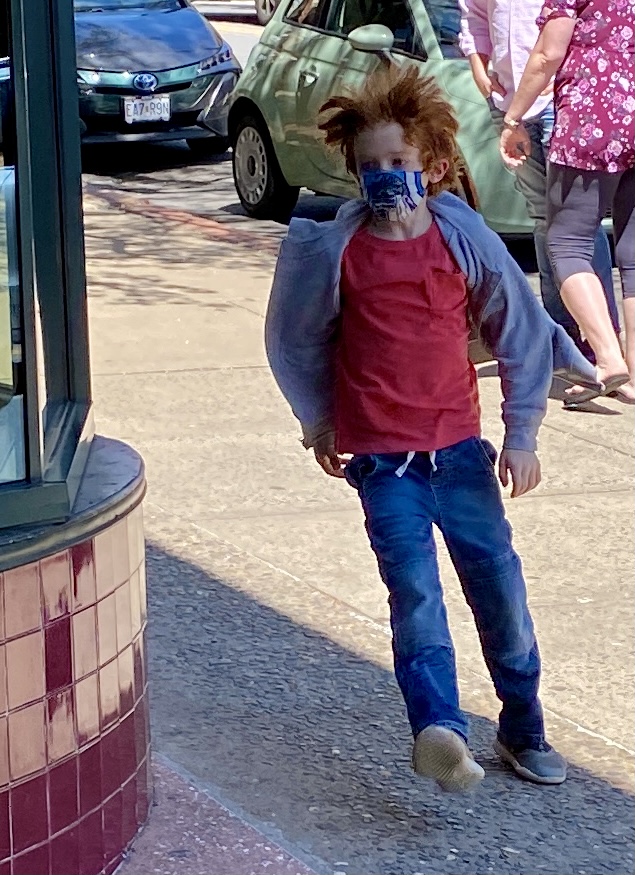
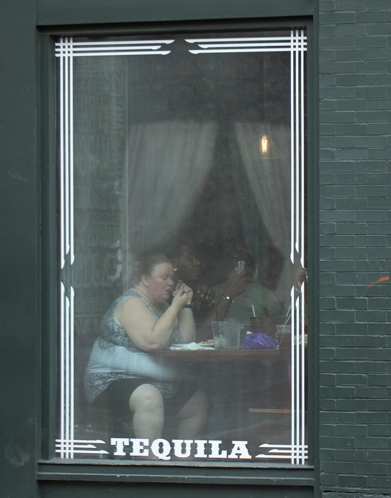
Welcome to the group Victor. This is a cool image. I love the expressions and each of their postures. And capturing how everybody is people watching including the lady watching you really makes for an interesting image.
My only suggestion for improvement would be if you were able to do it again, the tip of the man's foot is cut off. That doesn't look intentional. So if you had been able to back up a little you may have gotten the whole foot in there.
Overall I like the image and the richness of the tones. Very nicely done! |
Feb 13th |
| 80 |
Feb 20 |
Reply |
Thank you Victor. I appreciate your critique on this. You have some very good suggestions for improving the image. |
Feb 13th |
| 80 |
Feb 20 |
Reply |
Thanks Bill. I'll check it out. |
Feb 10th |
| 80 |
Feb 20 |
Comment |
Thank you for the suggestion about Jon Fishbein's Image Analysis course. I'm definitely open to learning from others. I feel badly that you didn't like the way I voiced my critique, but I really thought I was being respectful in the way that I stated my thoughts. I started out with a soft warning to you that the critique was not going to be positive by stating that I was going to be candid. I went on to say how I considered saying nothing at all, which in retrospect is probably what I should have done. But as I stated, I didn't think that would be fair either. And I ended my critique by saying "Sorry." I really thought that was all very respectful and kind, but if you found it otherwise, then I want to apologize for that. It was not my intent to be disrespectful or to upset you.
Generally, I do try to say as many positive things as I can about an image because I think it's important for a photographer to know what it is that I like in their work. But I'm not going to make up positive things to say either. So, in the future, I'll follow my grandmother's advice and when I don't have something nice to say, I won't say anything at all.
On the subject of photographing the homeless, I think this could be a good discussion to have in this group but divorced from this or any other image. Most reading that I have done about street photography ethics has come down on the side of not doing it. I think the principle that is important, in my mind, is to ask myself when I'm photographing a subject is "Would I want somebody to photograph me if I was in that same position?" And truthfully, if I was sleeping under a bridge or on a park bench and obviously homeless, I would not want others taking my picture for their own entertainment or enjoyment. As I said in my original comment, it would be different if it was part of a real project to create awareness of the homeless situation. But it's hard to do that well because there already exists a lot of work in that regard.
Going back to this specific image, I personally didn't see that (and I said that I'm only one person -- trying to emphasize not to listen just to me -- again trying to be kind and empathetic in my critique). Rather than creating empathy for the homeless person, I felt this image was more critical of the city for putting up artwork when there are homeless people in need of resources. But, I don't personally believe it's a binary choice. I believe we can work to address the homeless situation and have good art (including good photographs) too. So, to me, there's a little bit of a false narrative in this particular image because it suggests there's something wrong with having art when there are homeless people living on the street.
At any rate, I'm interested in the Image Analysis course. I would imagine that it could not only help me to better analyze images but it could as well help me to become a better photographer (as I could learn to better analyze my own images). I know that I have a lot to learn. Do you have a link to that course? I tried Googling it, but it didn't come up.
Thanks�. |
Feb 10th |
| 80 |
Feb 20 |
Comment |
Here's an excellent article on photographing the homeless --- written by a person who is or has been both a photographer and a homeless person. He talks about how both to do it and how not to do it, and when it adds value to the conversation about homelessness and when it doesn't. It's well worth a read by all of us who are interested in doing street photography.
https://pdnonline.com/features/photographer-interviews/formerly-homeless-photographer-not-photograph-homeless-people/ |
Feb 10th |
| 80 |
Feb 20 |
Reply |
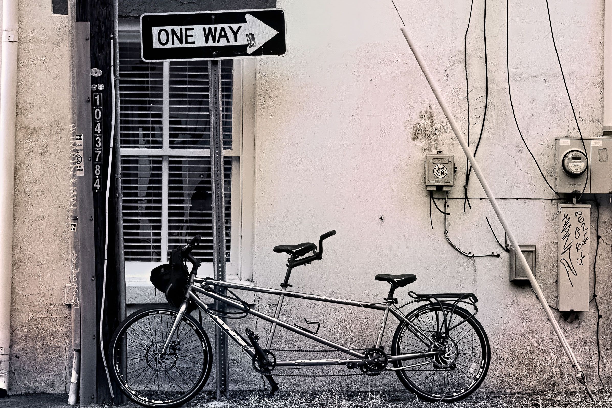
I personally don't care for that crop. For one thing, it still shows a utility box but then the cable is just going out of the frame on the right -- and that leads my eye out of the frame.
I didn't really intend for this image to be a pretty picture or to be a piece of fine art. Its intent is to convey the sense of rebellion that I saw in the bicycle owner's personality when I came across this scene.
I tried to convey in my description all the different ways that Rebellion spoke to me, and the utility boxes and the graffiti and the peeling paint were all part of that. At least to me they were. |
Feb 10th |
| 80 |
Feb 20 |
Reply |
I just noticed that you started out by saying "With only the bicycle as the subject..." But the bicycle is not the subject. The subject is Rebellion, just as the subject in your image was Irony and not really the homeless person or the artwork. I saw that in your image; I just didn't feel that it came through that strongly to me. And perhaps my subject isn't coming through that strongly to you either. That's good to know if that's the case. |
Feb 8th |
| 80 |
Feb 20 |
Reply |
I agree with you about the one way sign being too high and that throws the composition off. As I mentioned in my description, the rule of thirds is definitely violated in this image. But I did it this way to bring out my theme for the image, which is rebellion. As I described in my description, every part of this scene spoke rebellion to me when I first encountered it (including the utility boxes juxtapositioned with the romantic notions of a bicycle built for two). And that's what I wanted to capture.
I'm not sure that I would think we're different in our perspectives. In fact, I saw a lot of similarity in our two images this month. We both tried to capture an emotion that we felt when we encountered the scene we did. Our pictures aren't pretty but they aren't meant to be either. And we both included utilities in our image and we both felt the utilities were an important part of the image.
Last month, I submitted a pretty mediocre image that I probably shouldn't have submitted. And I thought you had a very powerful image with the person at Pike's marketplace. As a portrait shot, I really liked it. And I'm guessing that you and I will see things similarly more than we will differently as we each submit more images in this Group. |
Feb 8th |
| 80 |
Feb 20 |
Reply |
I think what would improve it for me would be a shot more directly showing the artistic piece. I understand the desire to respect his privacy, and I would want to do that too, but at this angle, the art piece doesn't have enough impact in this image to create enough of a contrast between the richness of the art and the poverty of the homeless man. Again IMHO. |
Feb 7th |
| 80 |
Feb 20 |
Reply |
I did take into account the irony you were shooting for, but I didn't feel that this image really brought out the irony for me. But I'm just one person and others may see it differently. Not sure I agree about the leading lines though unless you're suggesting that the Steam Plant sign is the focal point for this image because to me that's where they lead to. But again, that's just my opinion and others may feel entirely different. |
Feb 7th |
| 80 |
Feb 20 |
Comment |
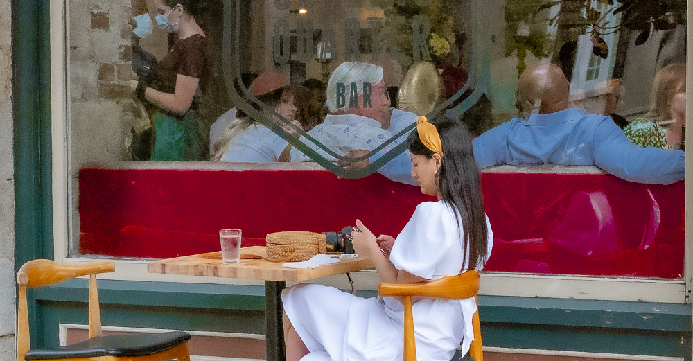
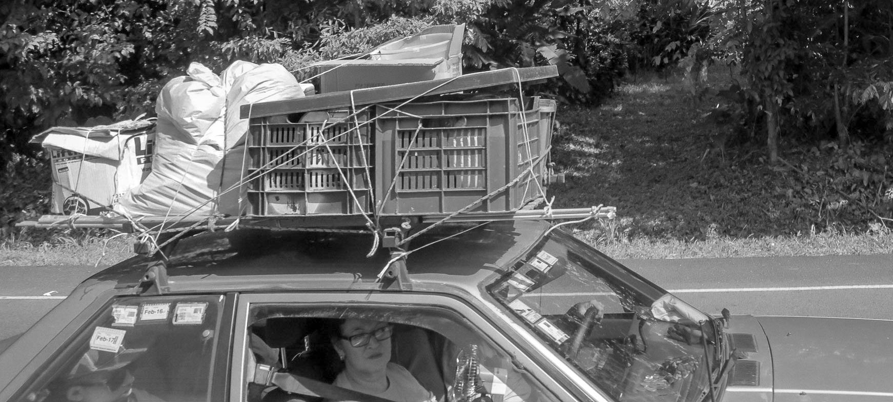
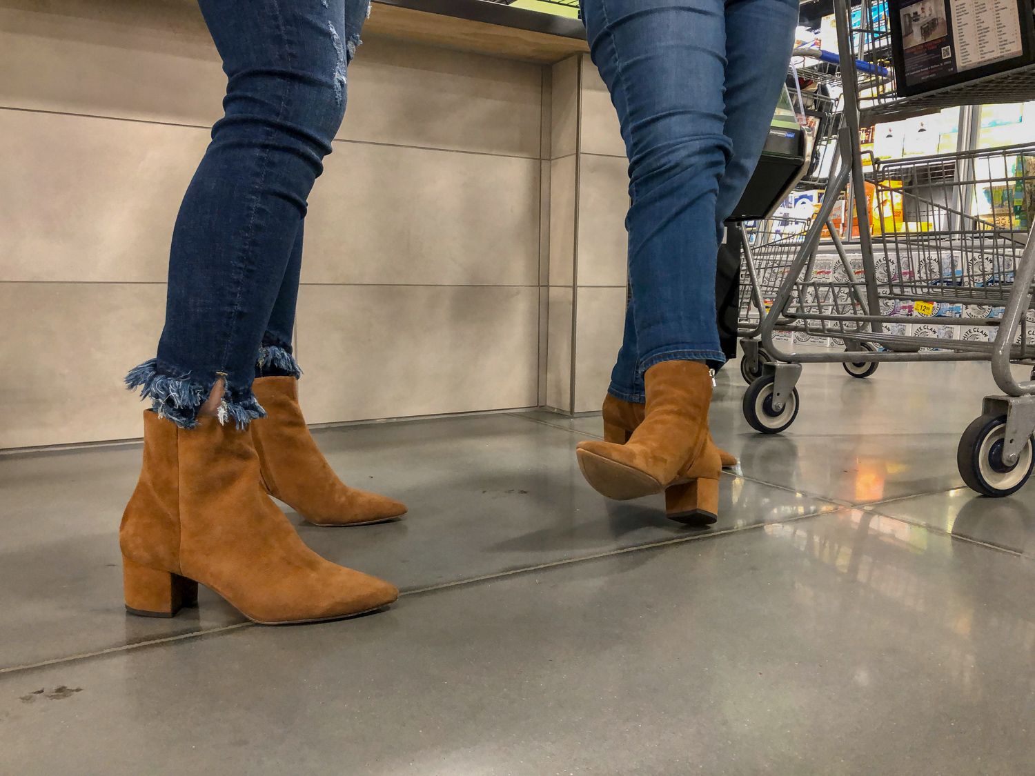
Feet! I love it. I've been planning to do more feet shots myself after I did that boots shot a couple months ago. I think feet and what people wear on their feet makes for an interesting subject. This is a bit of an intriguing image too because the two subjects are really close to each other and they're leaning in toward each other. It makes me wonder just exactly what are they doing? They look too close to be having a conversation. Very interesting shot! |
Feb 7th |
| 80 |
Feb 20 |
Comment |
You beat me to the punch, and you did a nice job of it too. I have a couple shots of body painters on the street that I will probably put up here at some point in the future.
I like this image and how you enhanced the colors. I think you did a really nice job with this. This image has an artistic feel to it, and I like that. |
Feb 7th |
| 80 |
Feb 20 |
Comment |
Cool shot! I agree with Stephen about switching to landscape and including the child. In fact, I think I like the original color version with the wider landscape view more than I like the processed portrait shot in black and white. So, I personally would have stuck with the original (except I agree that it needed straightening). |
Feb 7th |
| 80 |
Feb 20 |
Comment |
Nice work! I like this image and the composition that you chose for it. And I like the nice soft colors you gave it in post processing and the taking out of the museum lighting on the ceiling. Very nicely done! |
Feb 7th |
| 80 |
Feb 20 |
Comment |
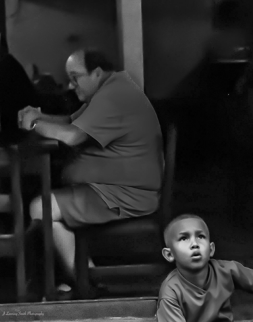
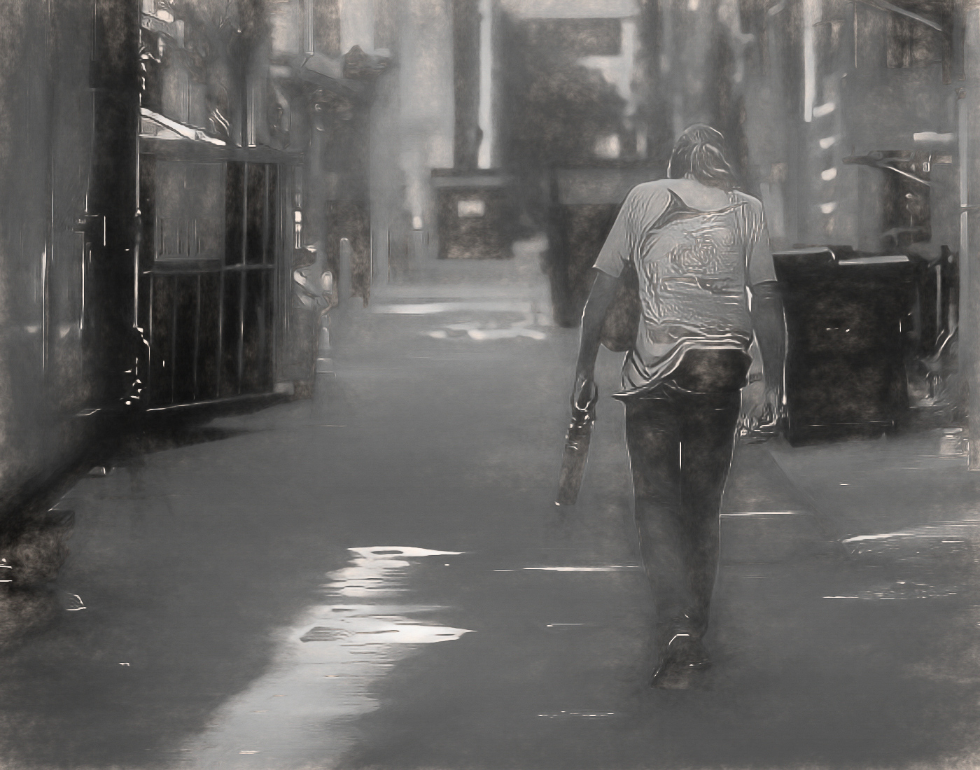
I'm going to be candid and just say outright that this image doesn't really do anything for me. For one thing, I'm not sure what the subject is. Is it the homeless person sleeping against the wall or is it "art work" above the homeless person or is it something else? If it's the "art work" then I think the angle of the shot is all wrong. And if it's the homeless person, I kind of have a negative reaction then to photographing people robbed of their dignity. The only exception might be if the purpose of the photograph is to bring light on the plight of the homeless. But I'm not seeing that in this photograph. I also don't find anything special about the lighting, the colors, the composition, etc. So, I guess I could say nothing at all, but in fairness to you, I felt compelled to give you my honest, candid opinion on this image. Sorry. |
Feb 7th |
8 comments - 8 replies for Group 80
|
8 comments - 8 replies Total
|