|
| Group |
Round |
C/R |
Comment |
Date |
Image |
| 77 |
Nov 19 |
Comment |
This is a nice image. I like the detail in the flower petals. And I like the contrast of the petals with the background.
One thing that I did find distracting was the two branches on the upper left side of the picture. I found their blurriness distracting, and while I understand why they're blurry, they stand out because none of the other branches are that blurry. My eye unfortunately goes right to them.
I would suggest that if you can't sharpen them up, then you might take them out of the image. |
Nov 11th |
| 77 |
Nov 19 |
Comment |
I find this image to be pleasing, but it doesn't do anything for me. There's no wow to it. I do like the changes you made from the original however. I think the colors, while not exciting (to me) are much better than the colors in the original photograph. So, what I'll say is --- I like what you did with it, but it's not an image that I would hang on my wall. But don't let that bother you because I usually find that what I like, others don't like and images I don't like, everybody else does like. I have strange tastes. :-) |
Nov 11th |
| 77 |
Nov 19 |
Comment |
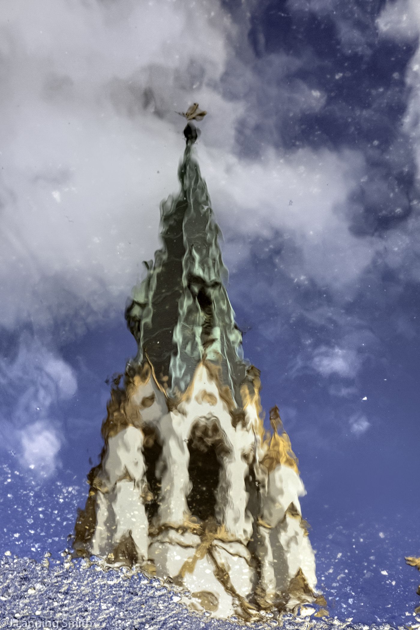
I like the colors in this. I like the way you used a leading line up to the water and the clouds. Very nice, especially for having done it spur of the moment with a cell phone. Well done! |
Nov 6th |
| 77 |
Nov 19 |
Comment |
I always think that the color red makes an image pop, and this one is no exception. I like that. I like the model's pose. And I think you did a great job on the clouds and the sky. There is a certain mystique about this image that I really like. |
Nov 6th |
| 77 |
Nov 19 |
Comment |
I too like this image and the story it tells. As for the type of fine art we might focus on, I agree that no. 1 of the three ideas presented by Georgianne is what I like. And this image is a good representation of that. |
Nov 6th |
| 77 |
Nov 19 |
Reply |
Thanks Georgianne. I actually won a club competition a couple of months ago when I used Topaz Studio 2 to turn a landscape photograph I did into an Impressionist painting. It caused some discontent among some in the club because they didn't feel like it was a real photograph. We've had several conversations about that.
My feeling is, what does it matter as long as I as the artist photographer and you as the viewer like the image? I find that many people want to silo images into art or into photographs and the two shall never meet. But I disagree with that. With the software we have today, the distinction is being blurred. Art is art to me. Whether it starts out as a photograph or as a painting doesn't matter. As photographers, I believe we are artists and we use the tools we have available to create art.
Thanks for doing this and for showing me how you did it. |
Nov 6th |
5 comments - 1 reply for Group 77
|
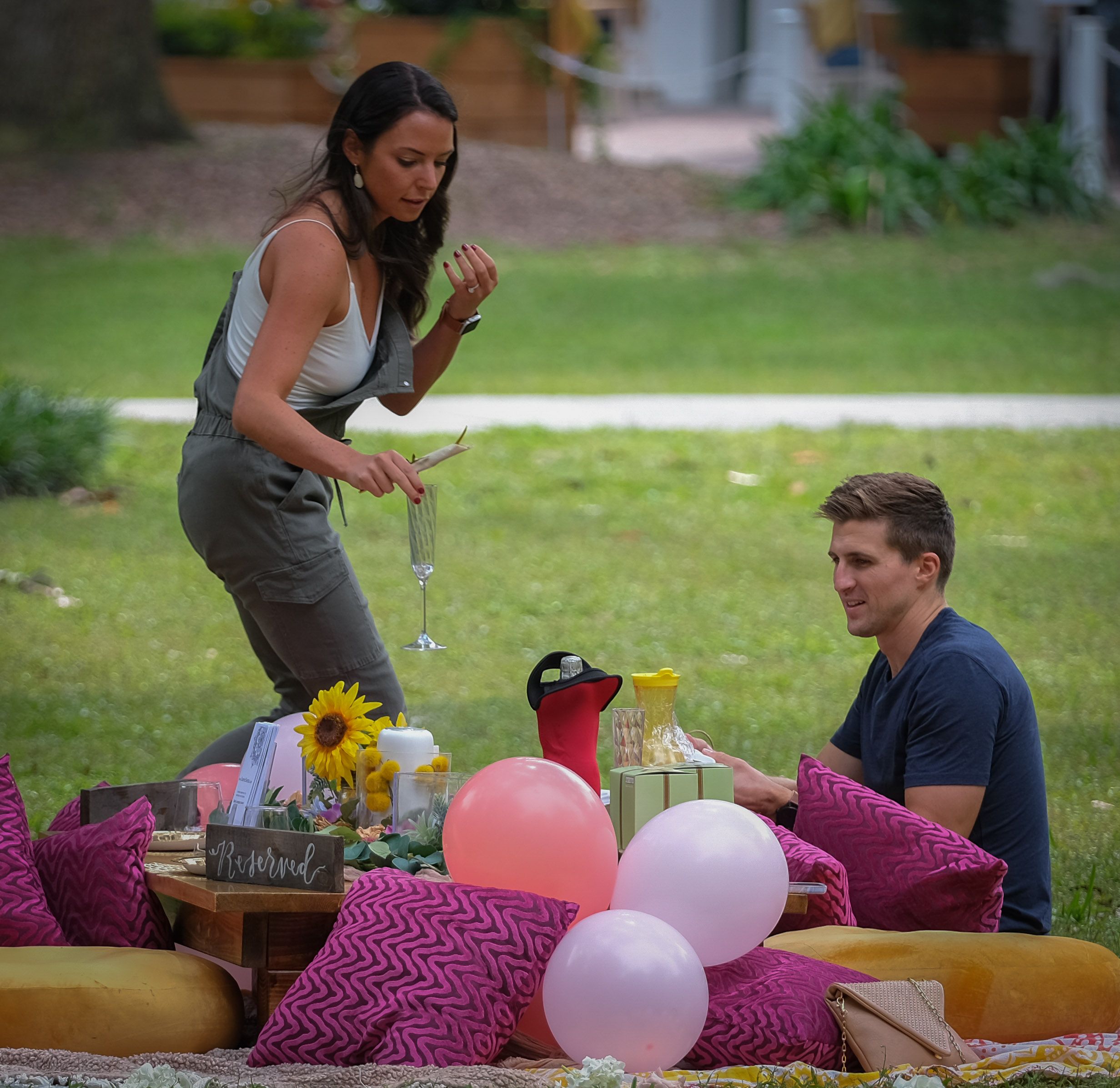
| 80 |
Nov 19 |
Comment |
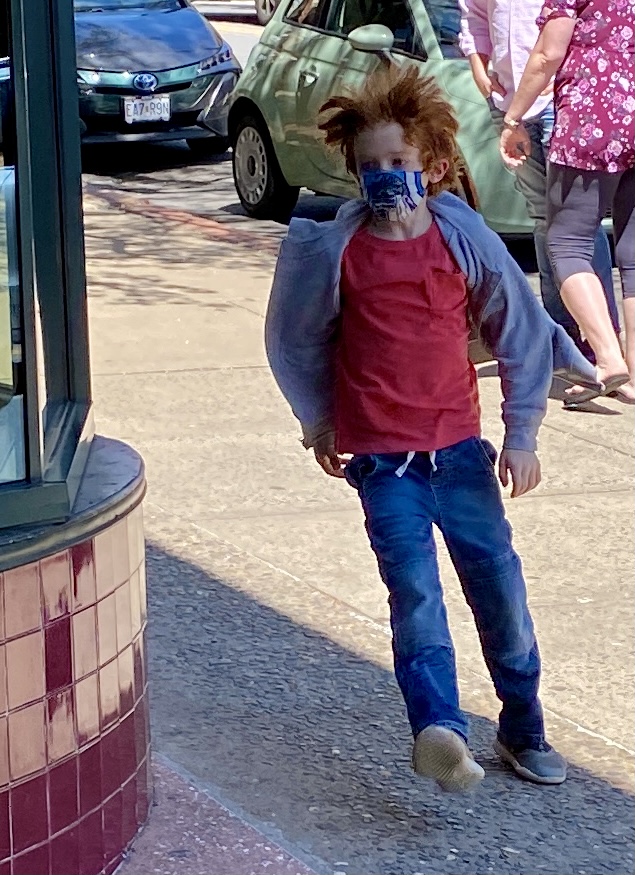
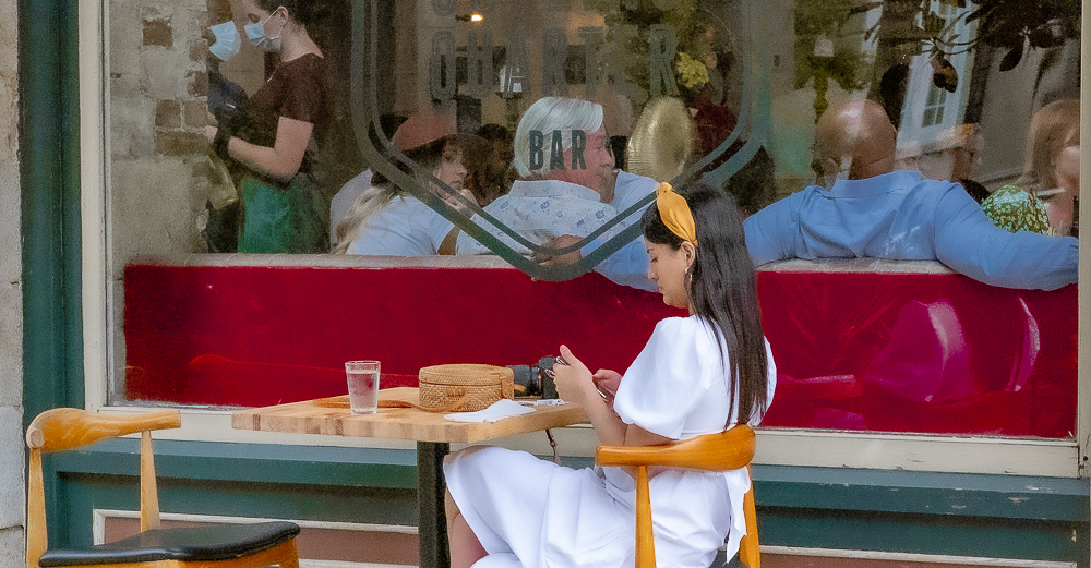
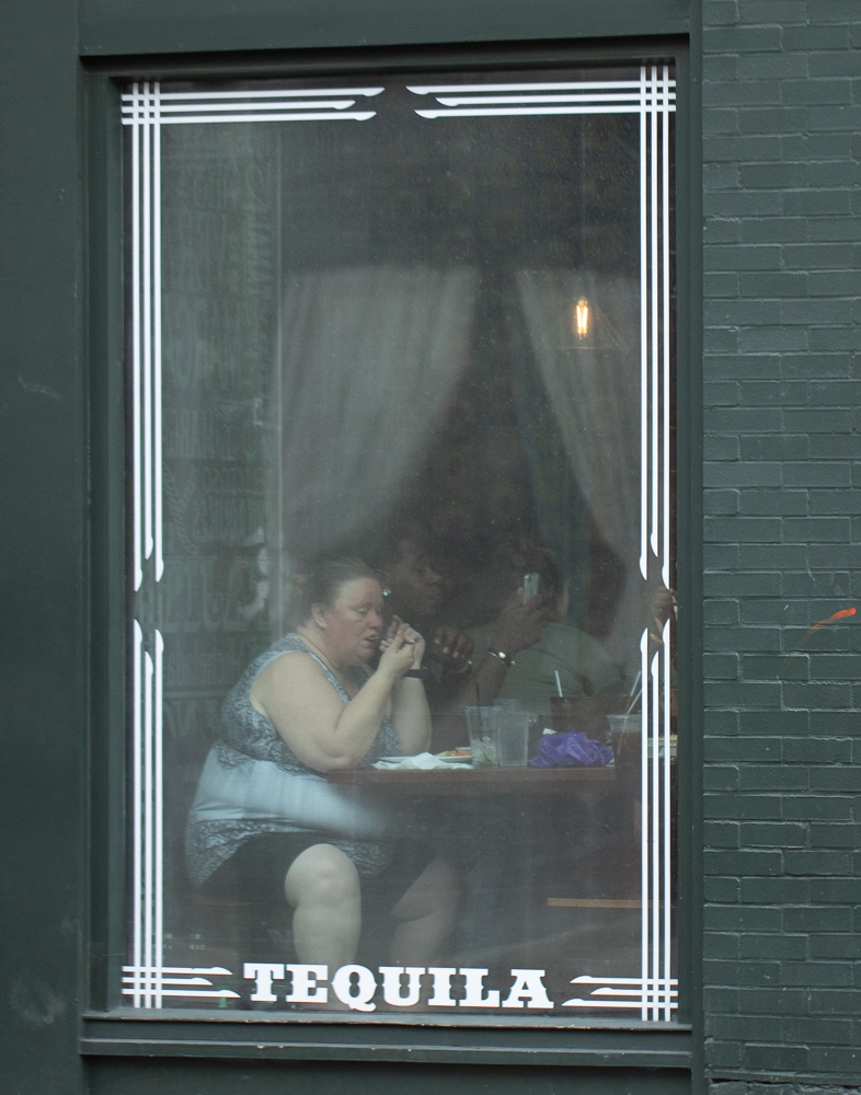
I agree on the way the photographer is cropped and the way that frames the photograph. I agree with Ed that he is a supporting element and so only having him partially in is preferred I think. Good call on that. |
Nov 12th |
| 80 |
Nov 19 |
Reply |
Thanks Bill. I appreciate your comments, but to me, the story is the parents taking the picture of the child, and in my opinion, including more of the child would have confused the story. As for the black and white, I tend to choose it when I think that the colors don't add anything to the photograph. If the scene is about the colors, then I include the colors. Otherwise, I like to go with black and white. Do you think that's wrong? |
Nov 12th |
| 80 |
Nov 19 |
Reply |
I agree with you Ed. The story is not about the child; it's about the parents doing a grab shot of the child. To me, including more of the child would raise the question as to what the subject of the photograph is. Also, I personally like a little mystery in an image. |
Nov 12th |
| 80 |
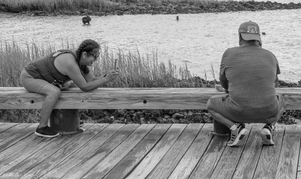
Nov 19 |
Comment |
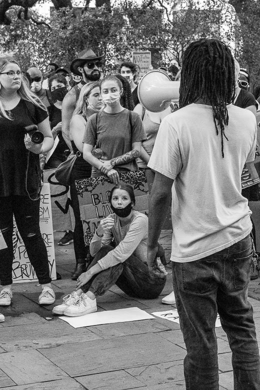
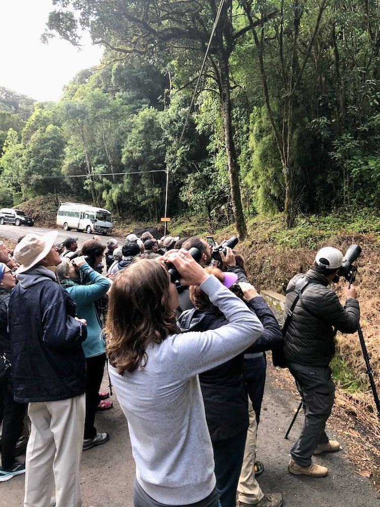
I like this image. It has a definite story to tell. And I like that you got down to their level to take the shot. Very well done! |
Nov 11th |
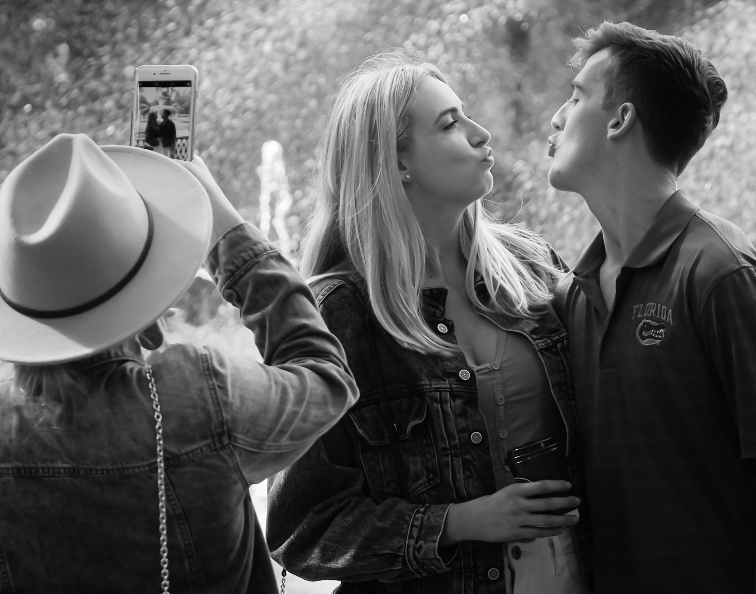
| 80 |
Nov 19 |
Comment |
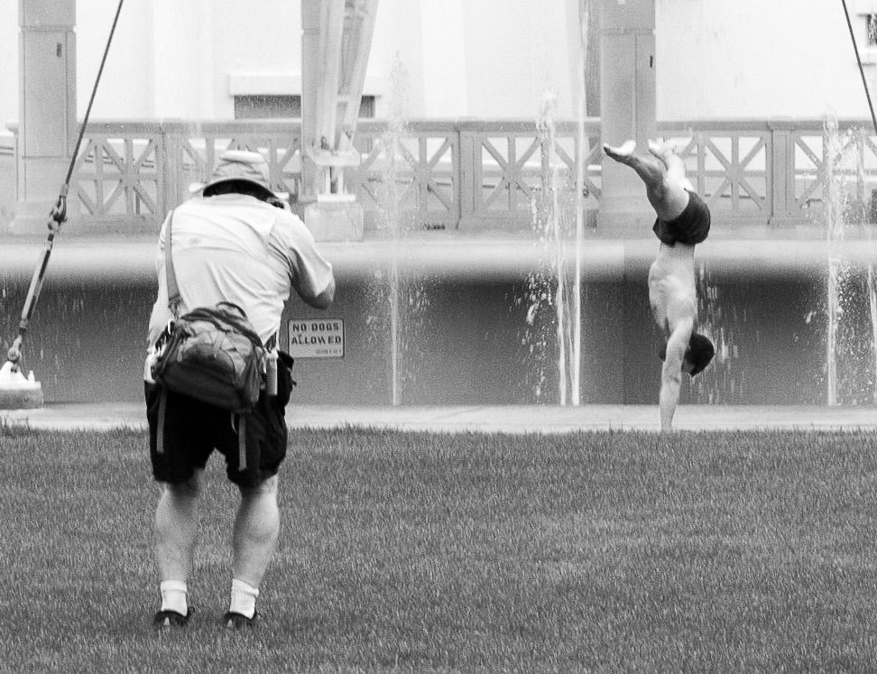
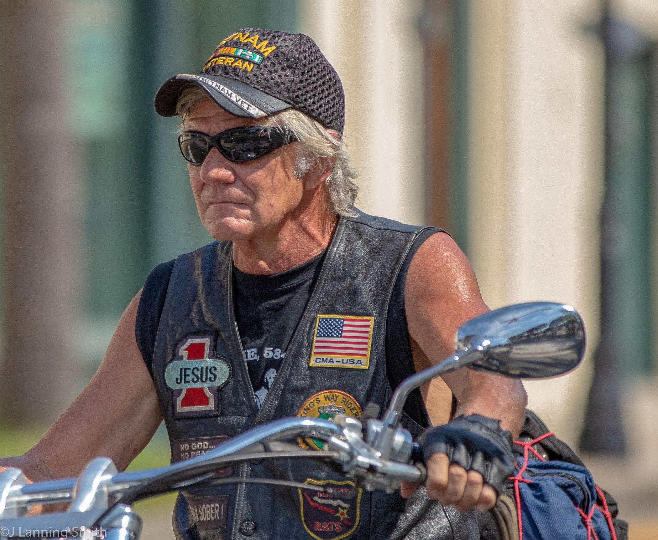
Very nicely done Bill. I can't decide if I like the black and white better though or if I like the color one better. I think the color red adds a bit of a wow factor to the image. Plus in the b&w, it appears like the one column is rising out of the back of his wagon whereas in the color version, you don't have that effect as much. But overall, they're both nicely done. |
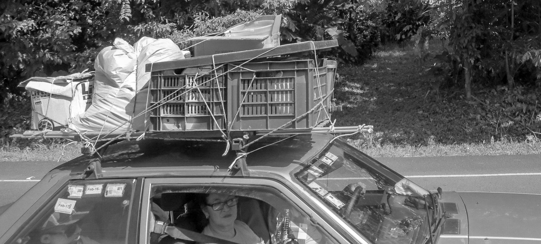
Nov 6th |
| 80 |
Nov 19 |
Comment |
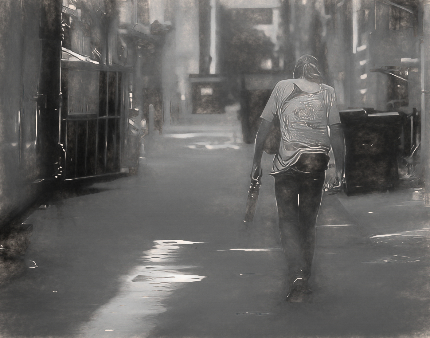
I like this image, maybe less blown out. :-) But it has an interesting story to tell. It's definitely better as a black and white too. |
Nov 6th |
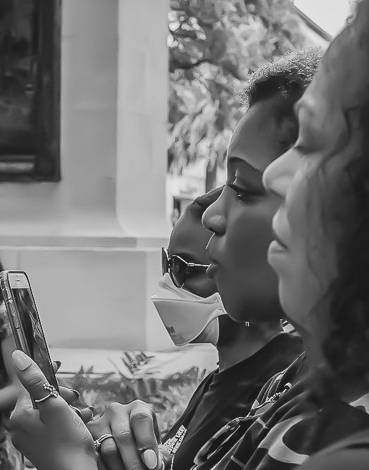
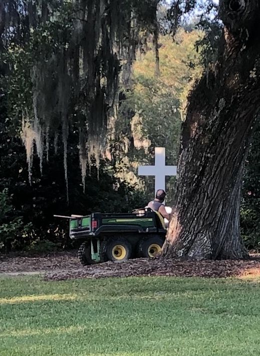
| 80 |
Nov 19 |
Comment |
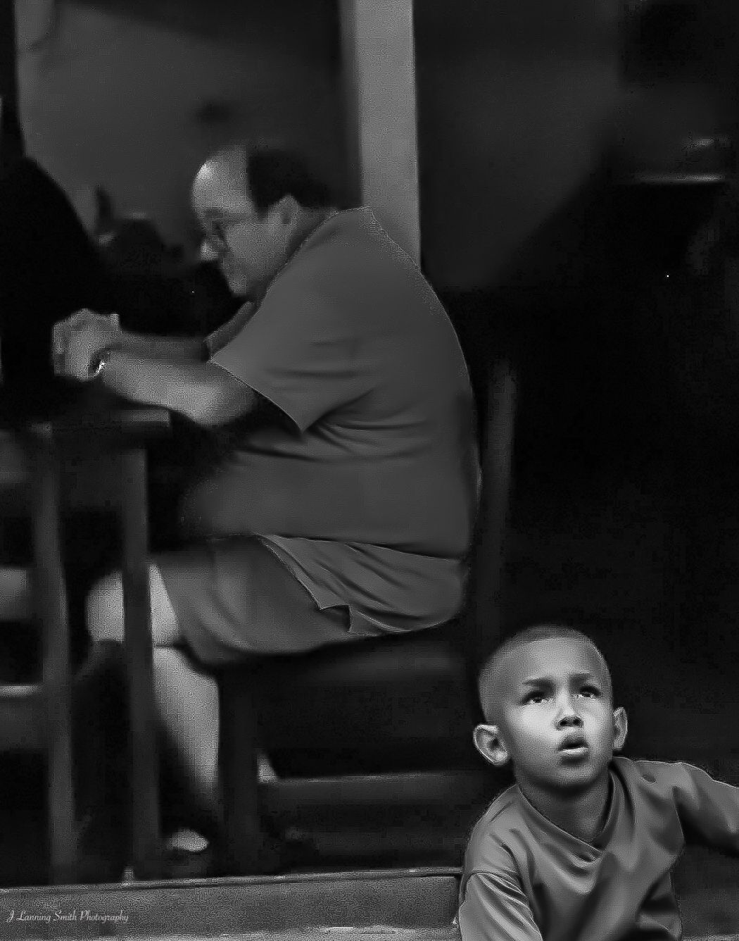
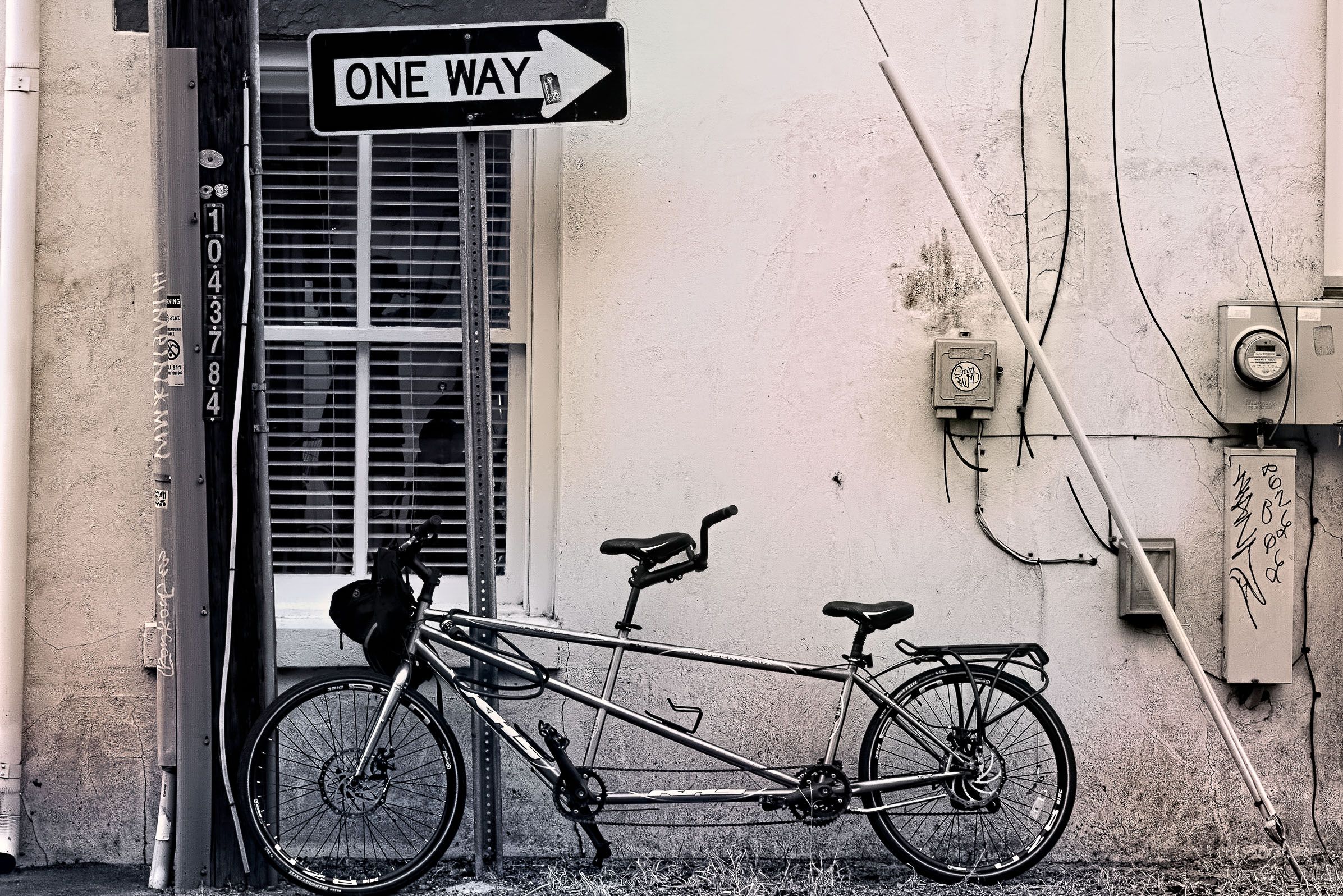
This is a cool image, very interesting. I like what you did with the background too and the way you kind of softened the image into the background. Nice job! |
Nov 6th |
5 comments - 2 replies for Group 80
|
10 comments - 3 replies Total
|