|
| Group |
Round |
C/R |
Comment |
Date |
Image |
| 77 |
Sep 19 |
Reply |
I like this version a lot better. Good job. |
Sep 16th |
| 77 |
Sep 19 |
Comment |
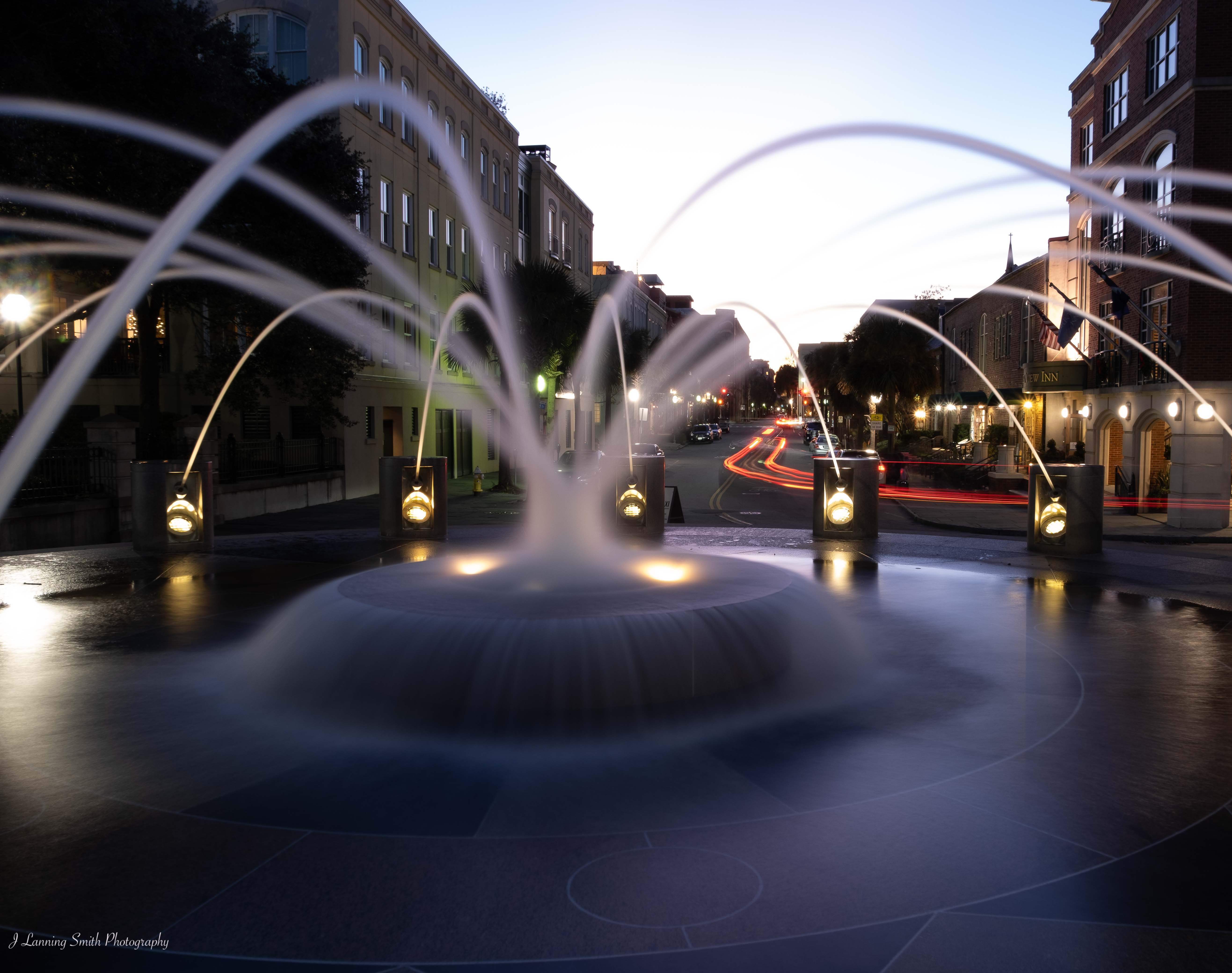
Nice way to save an otherwise mundane photograph. This is a lesson for me that says not to be too hasty in judging some of my original shots. There is more that can be done with them.
I agree with Witta about the lower lefthand corner and the distractions. But other than that, I think you've done a great job. And this is a good example of what I think of as fine art. |
Sep 8th |
| 77 |
Sep 19 |
Comment |
I like this image a lot. Very nice. My only suggestion would be to remove the light on the right, including the starlight. I found that distracting. What I think could be interesting would be if light were streaming in from the right at the same angle as the music, perhaps to highlight the notes. |
Sep 4th |
| 77 |
Sep 19 |
Comment |
This image is very well done in my opinion. I like the colors. I think the colors of the flower are a nice contrast with the background color. Very nice detail. |
Sep 4th |
| 77 |
Sep 19 |
Comment |
I love this image. It's one that I would definitely hang on my wall. I agree with Georgianne about taking the anchors out. But overall, I really like this image. |
Sep 1st |
| 77 |
Sep 19 |
Comment |
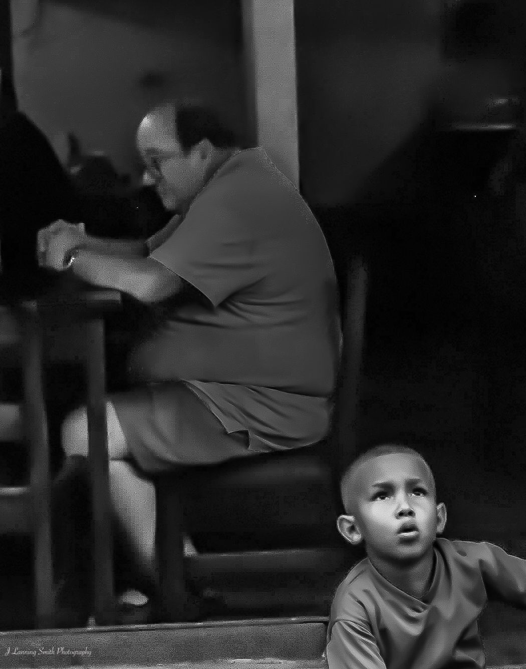
I like both the final version of this image and the monochrome image. They say, whoever "they" are, that shots of people in color are about their clothes whereas black and white is about their faces. I think that's so true here too. Each of these has a different feel.
The colors in the color version are so appealing and they each work well together. So, that's what I see when I look at the final version. I'm looking at the colors and seeing something artistic. In the black and white, it's clearly about the children though, and I think cropping it the way you did is the right effect.
Good job on this. I like both images. |
Sep 1st |
5 comments - 1 reply for Group 77
|
| 80 |
Sep 19 |
Reply |
I'm not, but maybe we'll have an opportunity to meet sometime in the future. |
Sep 8th |
| 80 |
Sep 19 |
Comment |
To be quite honest about it, I don't find this image interesting. And I don't really have any suggestions for making it interesting. As Ed said, it's a ubuiquitous story. But unlike Ed, it doesn't really work for me. Sorry! |
Sep 4th |
| 80 |
Sep 19 |
Comment |
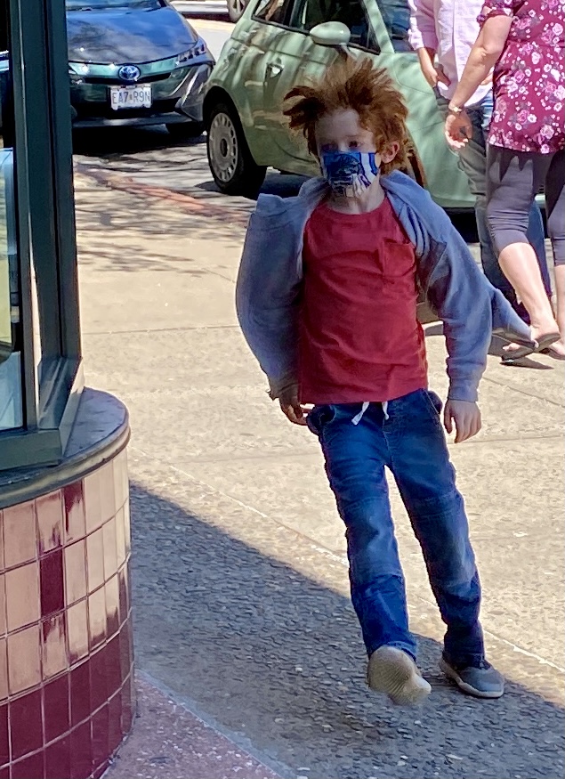
This is a nice image. I do agree with Beverly that it is a little soft. And with Ed about working on the red on her cheeks. |
Sep 4th |
| 80 |
Sep 19 |
Comment |
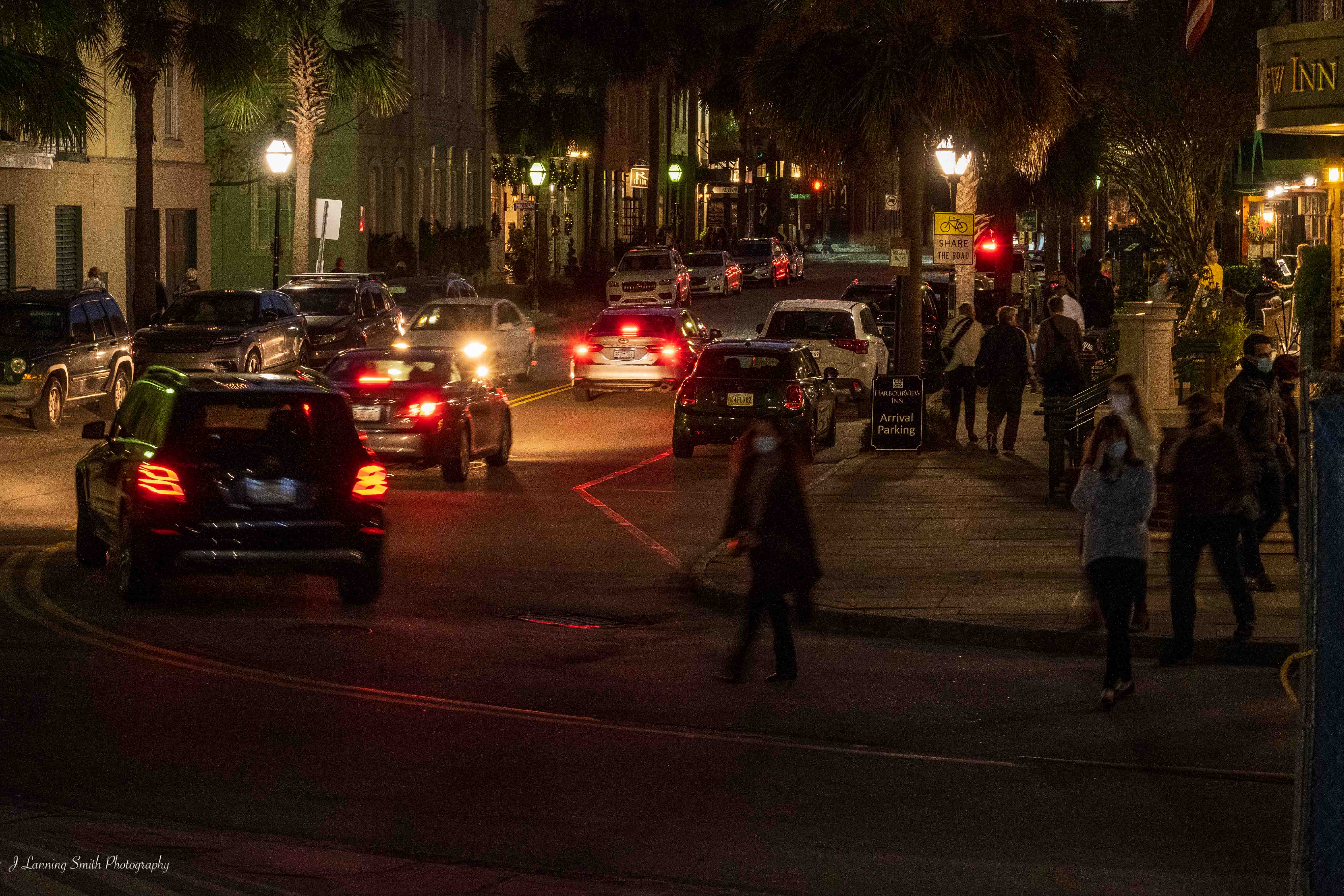
Congratulations on getting your photograph accepted by the exhibit at Rankin Arts Photography Center.
I agree with the discussion about the black & white. You've done a nice job of using the highlights and shadows to draw attention to your subject. And I think black & white is definitely right for this image.
Good job! |
Sep 4th |
| 80 |
Sep 19 |
Comment |
Ed has done a nice job of capturing my thoughts on this image as well. There's nothing more that I can add. It's a nice capture of that moment in time. |
Sep 3rd |
| 80 |
Sep 19 |
Reply |
Thanks Beverly. That's a good idea, and I do it sometimes. But I do admit to not doing it this time. |
Sep 2nd |
4 comments - 2 replies for Group 80
|
9 comments - 3 replies Total
|