|
| Group |
Round |
C/R |
Comment |
Date |
Image |
| 80 |
Jun 19 |
Reply |
You said that very well Karen. Those are the words I was searching for in trying to describe this image myself. |
Jun 17th |
| 80 |
Jun 19 |
Comment |
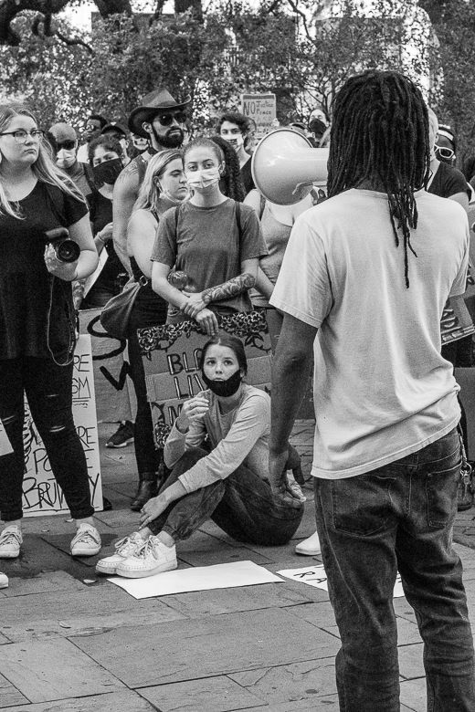
I'm looking at the image as one who wasn't there and didn't witness all that you witnessed. All I see is the image that you are conveying, and it doesn't convey one of friendship. If I saw this hanging in an exhibit and I saw your title, I would find it confusing. |
Jun 17th |
| 80 |
Jun 19 |
Comment |
It's not as sharp when I crop it, but this is along the lines of the thought that I had. |
Jun 6th |
 |
| 80 |
Jun 19 |
Comment |
It is a nice doorway arch, but for me the picture is what comes after the arch. I think where the arch is placed in the picture, my eye doesn't go to it.
I like what's beyond the arch though, especially with the light coming in as it does. And overall, I think there's a nice composition to the picture. I think the three women and the pictures on the back wall are a little soft though. I would like to see them a little sharper. |
Jun 6th |
| 80 |
Jun 19 |
Reply |
Very nice I think |
Jun 6th |
| 80 |
Jun 19 |
Reply |
Nice. I like this. |
Jun 6th |
| 80 |
Jun 19 |
Comment |
I like Beverly's crop better too. I think it conveys the story the best. |
Jun 6th |
| 80 |
Jun 19 |
Comment |
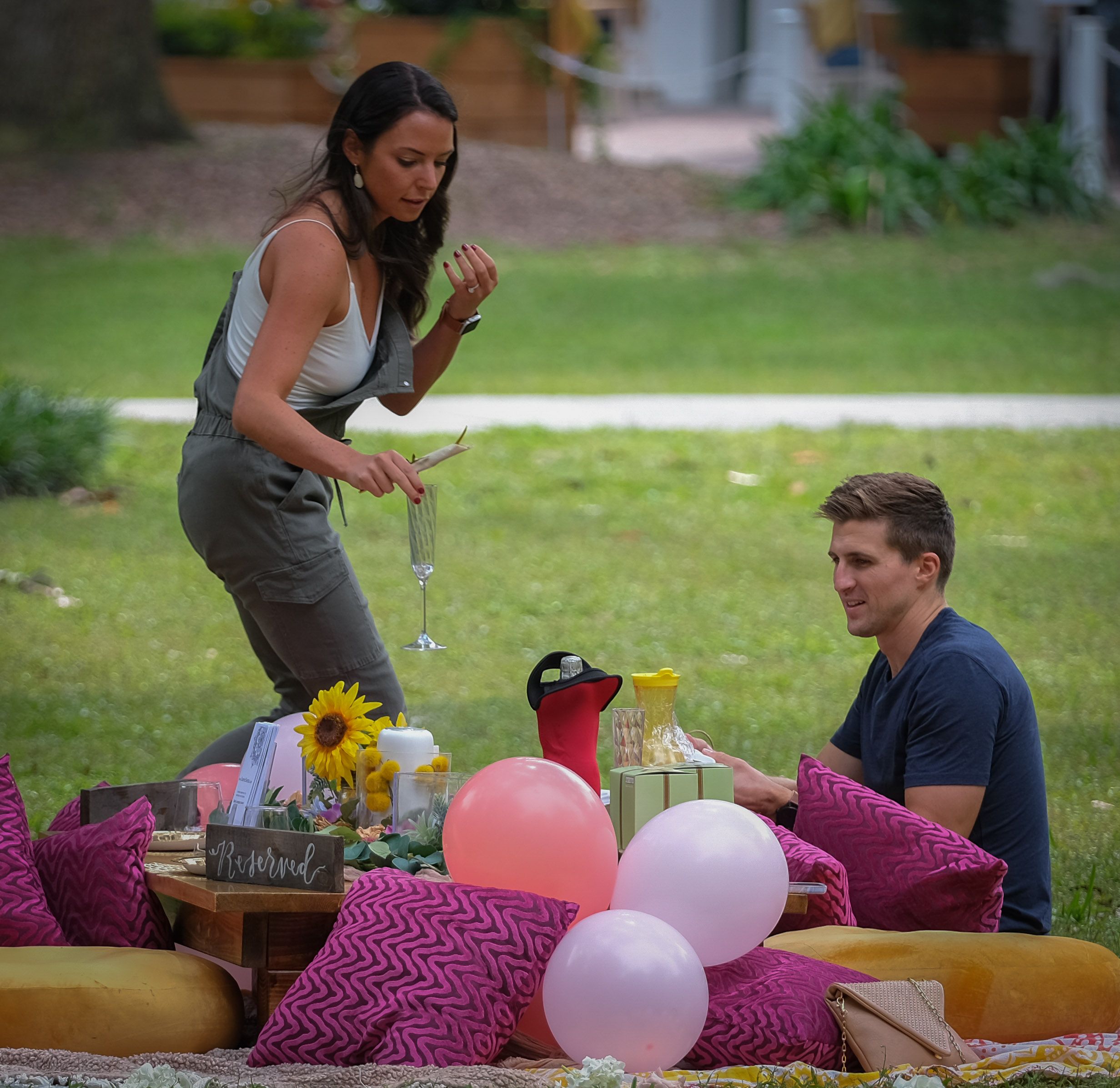
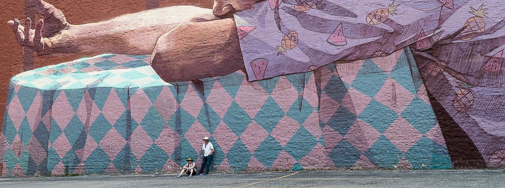
It's a good photograph, but I honestly didn't notice the couple until you pointed them out. I actually thought you had done a very interesting image and post-processed it to look as artsy as it does.
But now that I see the couple and the title you've given the image, I realize that the subject is how large the piece of art is. You might try dropping the top edge of the photograph down to take out his face and just show the arms and the table. Doing that makes the couple stand out more and makes you realize that this is a giant piece of art.
I think your idea is good and your photograph is good, but as shown, I don't think you've reached your objective. |
Jun 6th |
| 80 |
Jun 19 |
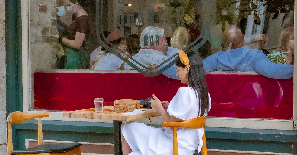
Comment |
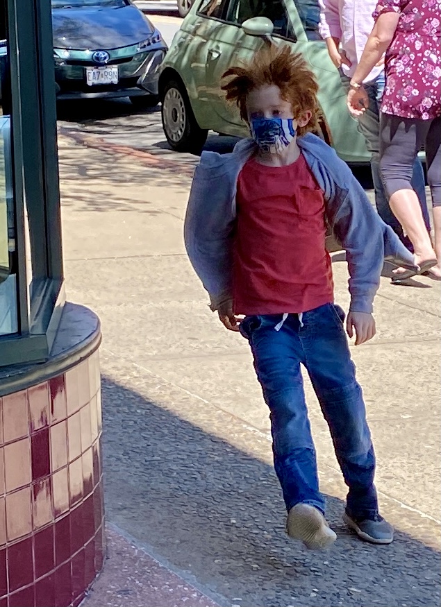
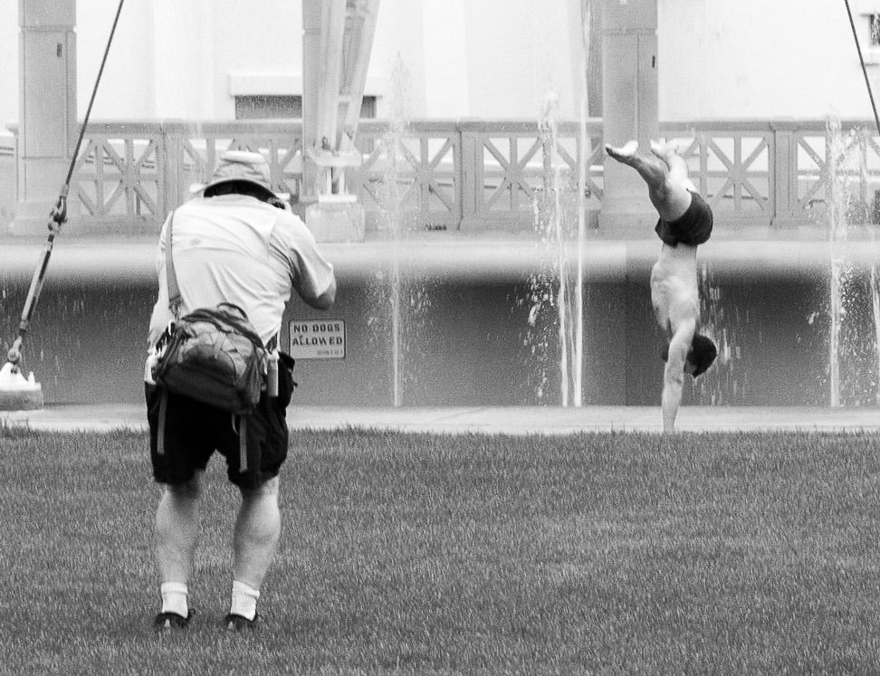
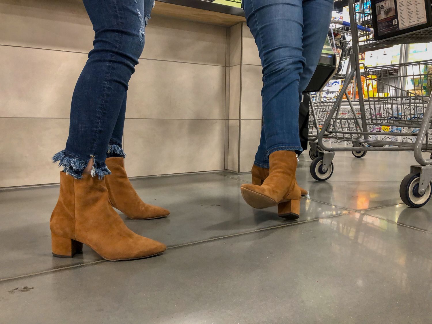
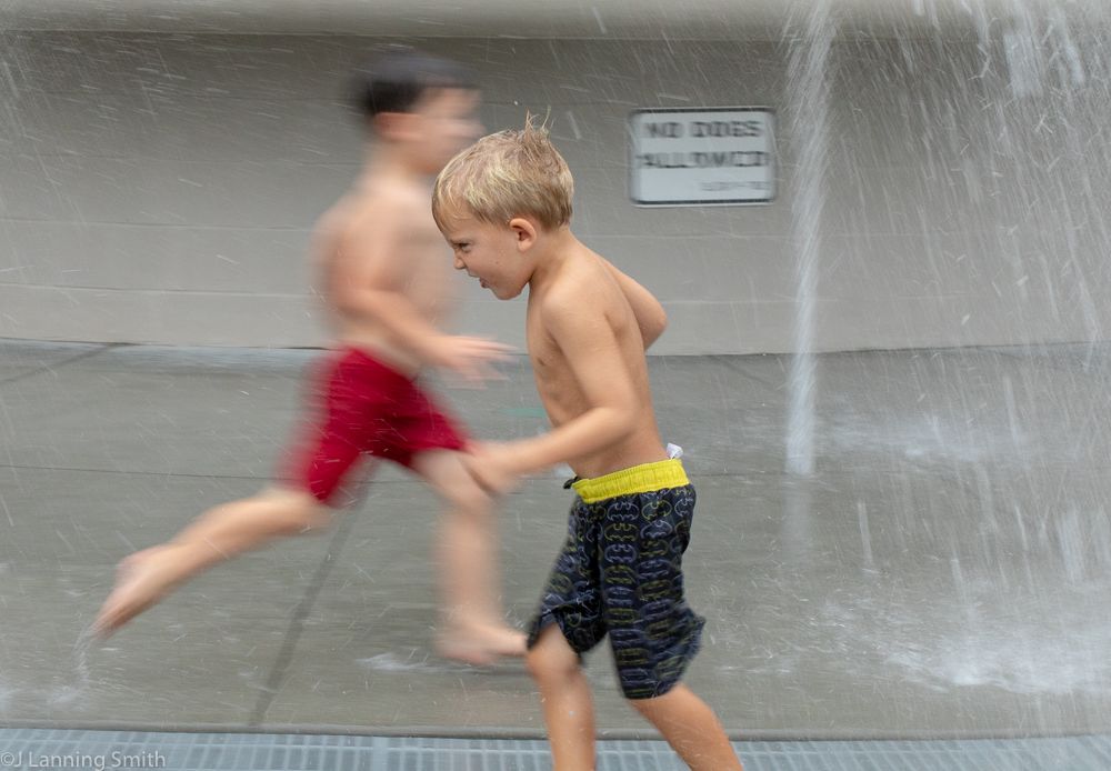
I agree with Ed's comments. My only other thought is the title is telling me the subject is the kid who has fallen, and that's not where my eye goes when I look at this photograph. Plus if that's the subject, then the rest of the photograph is too much. I would pick a different title that describes the overall photograph and its subject. |
Jun 4th |
| 80 |
Jun 19 |
Comment |
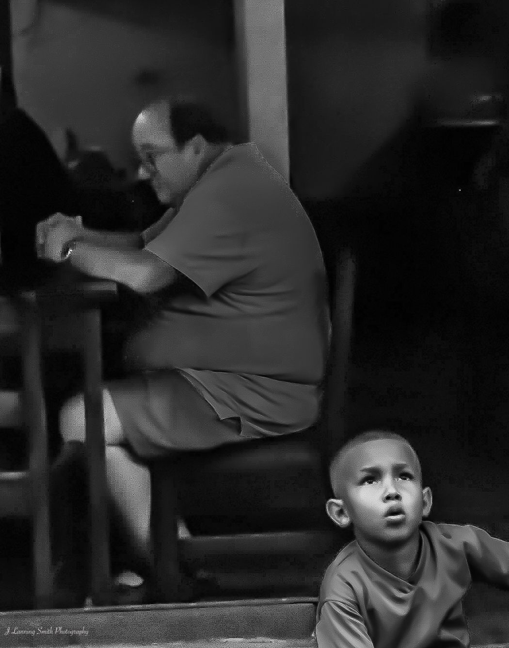
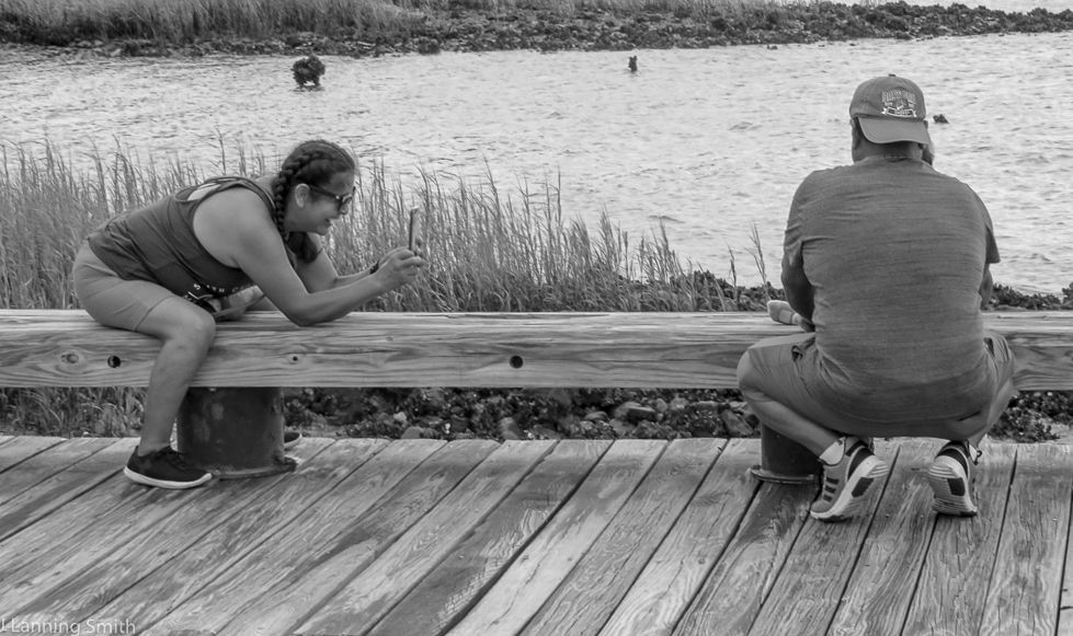
This photograph has an interesting feel to it. Doing it in black and white was definitely the right choice I think. And you've done an excellent job of conveying the kind of day it was in the photograph. A very dreary, cold and wet day and the image itself is very cold, wet and dreary. I like that. Good job. |
Jun 4th |
| 80 |
Jun 19 |
Comment |
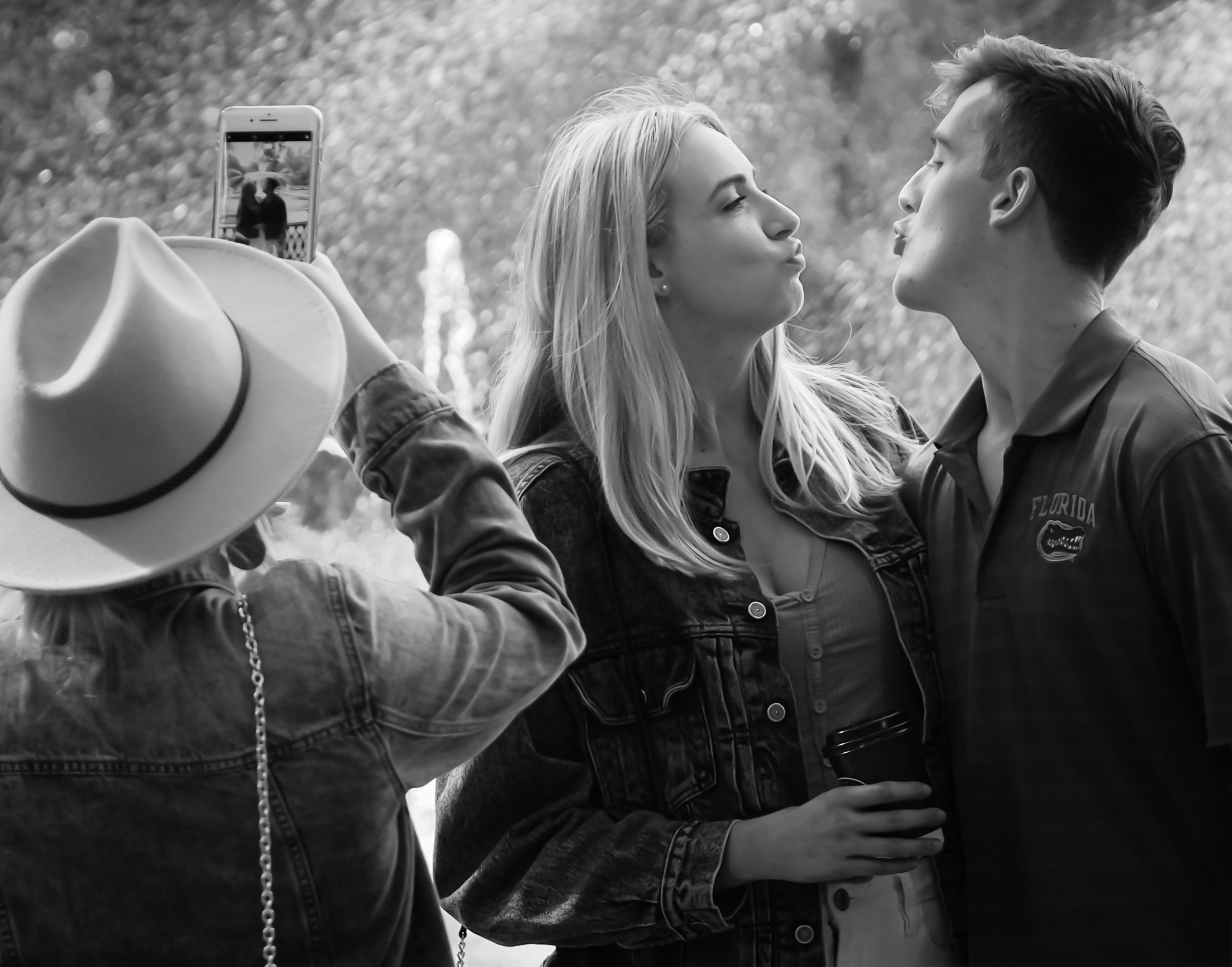
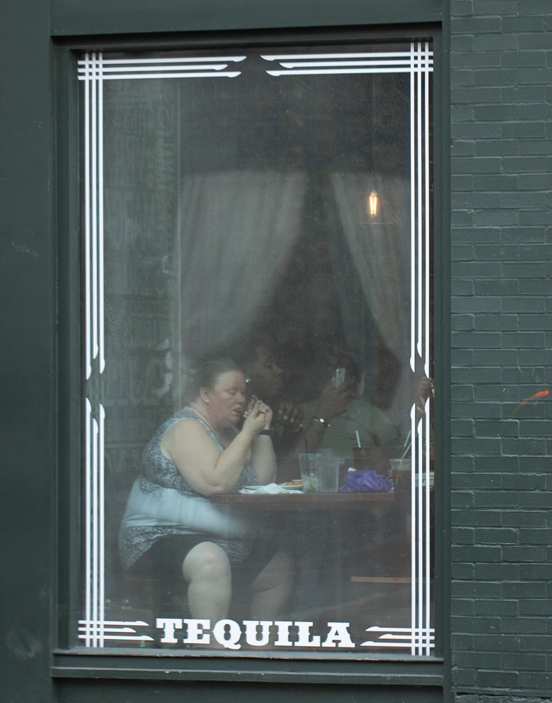
I like this photograph, mainly because of the expression on the woman's face and the mystery about what is being said. And the photograph is sharp. I think the background also lends to the atmosphere of the photograph.
But to me the title doesn't work. While I understand from your description, Bill, that they were old friends based on your observations of their actions, this picture doesn't convey a feeling of friendship. To me, I get the feeling of a stranger on the street saying something shocking or disturbing to this couple. And the woman is showing her shock. I love the mystery of that.
So, I think my only comment is that I would probably pick a different title to put on this photograph. |
Jun 4th |
| 80 |
Jun 19 |
Comment |
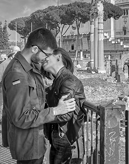
I agree with you Ed. I like the black and white version of this photograph too because of the classic feel. It's a nice sharp photograph. I like that.
I understand your desire to get the Forum in the background of this shot, but for me, it comes across as the photograph having two subjects. One being the Forum and the other being the couple kissing. And I'm not sure that works. I'm a believer in the idea that you need to pick a single subject and make that the focal point of your photograph. The title Amore, plus your description of the image, leads me to believe that the subject is the couple kissing, but that's not actually what I see when I look at this photograph. When I look at it, my eye moves to the Forum and the couple in the corner is almost a distraction.
I'm also a believer in filling the frame with the subject as well. Based on that and the fact that my eye needs to go to the subject, I took your image and flipped it and cropped it. I think putting the couple in the lower left corner of the photograph causes my eye to go to it rather than the background. I cropped it to fill the frame while still leaving in sufficient background to be able to tell where it was taken.
Two additional comments. The top of the building is cut off and it's not sufficiently cut off for me to think that that's intentional. And the other comment I have is that the sky looks dark and threatening but the rest of the picture looks like kind of a sunny day.
I hope I haven't been overly critical. I think the purpose of this group is to help us get feedback that will help each of us to be better photographers. Hopefully you will find my comments helpful. And in the end, it should be remembered that how we view a photograph is subjective and everything I've said here is just my own opinion. |
Jun 4th |
 |
| 80 |
Jun 19 |
Reply |
Thank you Ed |
Jun 4th |
9 comments - 4 replies for Group 80
|
9 comments - 4 replies Total
|