|
| Group |
Round |
C/R |
Comment |
Date |
Image |
| 43 |
Jan 24 |
Reply |
Hi Harley,
Thanks for the comments. I hadn't planned on taking images of floating bergs. Otherwise I would have bumped up the ISO and increased the speed. The Sony is a great camera. It has excellent image stabilization, 5-axis. I think there is also some on-chip stabilization magic as well. On top of that, I use Topaz Sharpen which removes noise and applies sharpening. It has a variety of algorithms to choose from and can do selective sharpening, which I find gives a better result than any technique I've used in Photoshop. |
Jan 14th |
| 43 |
Jan 24 |
Reply |
Thank you Andrew. |
Jan 11th |
| 43 |
Jan 24 |
Reply |
Thank you Bruce. |
Jan 11th |
| 43 |
Jan 24 |
Comment |
Thank you Leo. |
Jan 11th |
| 43 |
Jan 24 |
Comment |
Fabulous image! I love the catchlight in the eye and seeing the bird preening itself. The reflection adds to the aesthetic of the image. Great job. Perfect as is. |
Jan 9th |
| 43 |
Jan 24 |
Comment |
WOW! What a wonderful image. So often my tendency is to go to a black background. When I see a high key image like this, I appreciate the lightness of the image and the detail I can see in the center of each flower. Nice job. |
Jan 9th |
| 43 |
Jan 24 |
Comment |
Hi Leo,
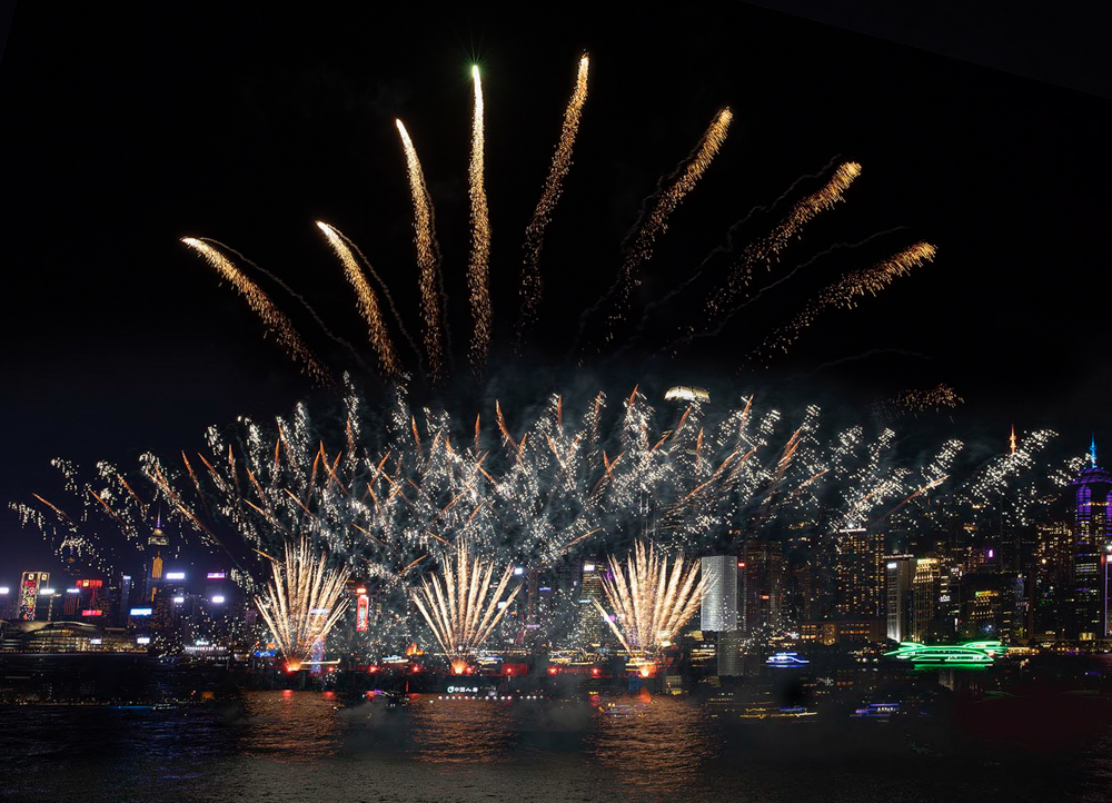
I think I saw this scene streamed on New Year's Eve! Spectacular. You were definitely in the right spot at the right time. Your image communicates the excitement of the new year.
I agree with Lane that the image could use a bit of straightening. The image might actually be straight, but the way the other building are on the shoreline makes it appear about half a degree or so off. Here is one possible crop and straighten. What do you think. |
Jan 9th |
 |
| 43 |
Jan 24 |
Comment |
Photojournalism indeed! Nice capture. I love the story. I live in the Santa Cruz Mountains above Los Gatos, and only 35 minutes from the ocean. I was tempted to go to the coast to see the waves, but decided against it. You really caught the power of nature in this shot. The waves are so tall. The helicopter shows that people were likely in crisis. You couldn't control the color of the helicopter, but the yellow color pops and adds to the story. It's all about being in the right place at the right time. Wonderful!
Lane pointed out the gull who is just chilling. That adds a bit of humor. Is it thinking "Just another big wave, nothing to get excited about." |
Jan 9th |
| 43 |
Jan 24 |
Reply |
A walrus! I have an abstract painting at home. Different friends see different things in it. I find it fascinating that we can each look at the same thing and see something completely different. I am trying see your walrus but I think I've had alligator stuck in my head for too long. LOL!!!! Thanks for your perspective. |
Jan 7th |
| 43 |
Jan 24 |
Reply |
Hi Mark,
Thanks for the comments and suggestion. My original intention was to have the iceberg be surrounded by black, which is why it hadn't occurred to me to include the ice. To my eye, your suggested crop seems a bit imbalanced with so many things on the right. It is possible to make a portrait crop that would include the ice and feel more balanced. |
Jan 7th |
| 43 |
Jan 24 |
Comment |
Hi Harley,
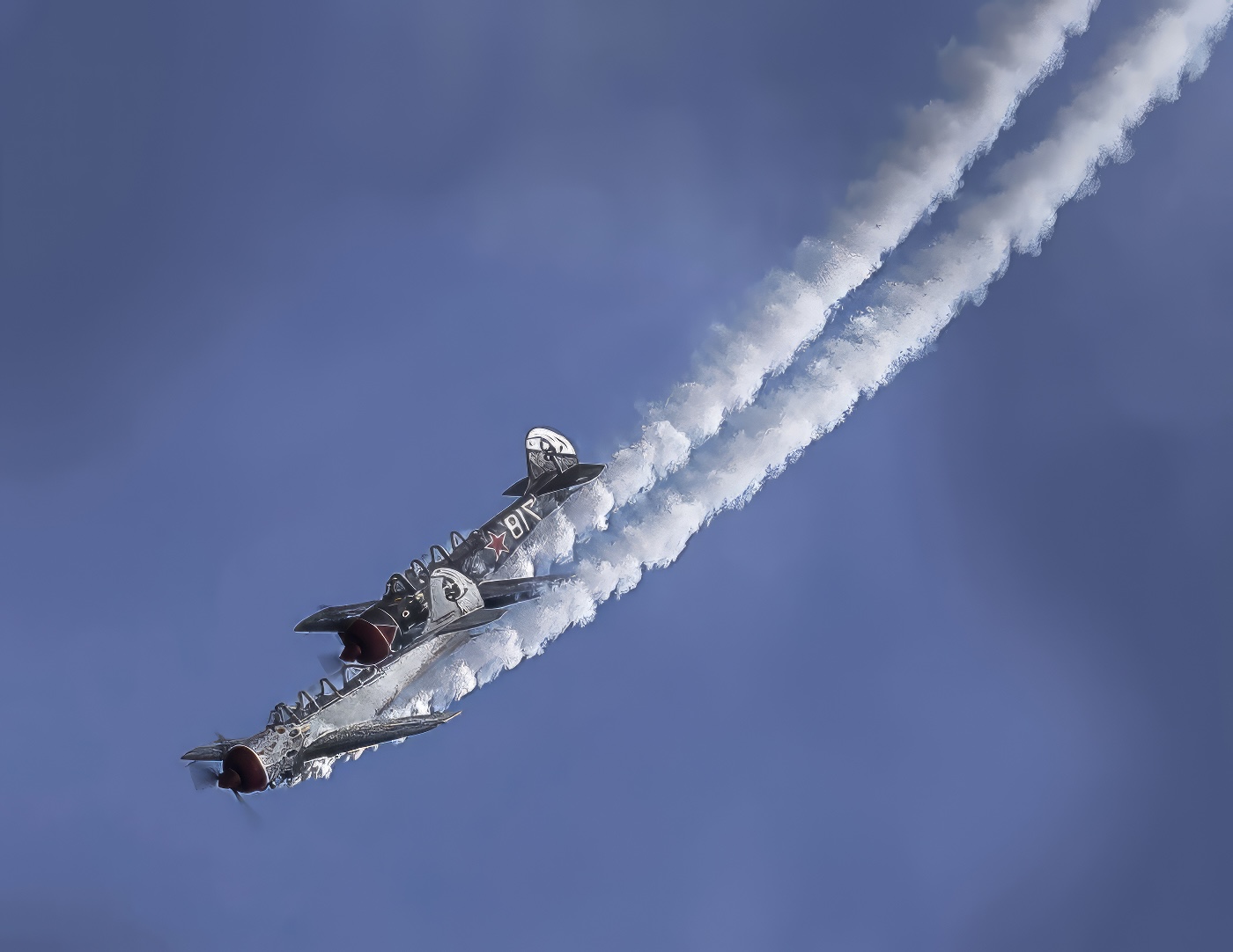
Your image looks fantastic from ANY angle. I just spent time flipping it around and admiring it. Today's software is amazing. I've used Topaz to rehabilitate many a photo. If you have Topaz Studio, I encourage you to experiment with the "Looks." To my eye, your image is a good candidate for making it look even more painterly!! Great job.
Here is a rotated version. (Yours is terrific. I'm just playing around so I hope that's okay.) I'm amazed they didn't crash. |
Jan 7th |
 |
| 43 |
Jan 24 |
Comment |
Hi Mark,
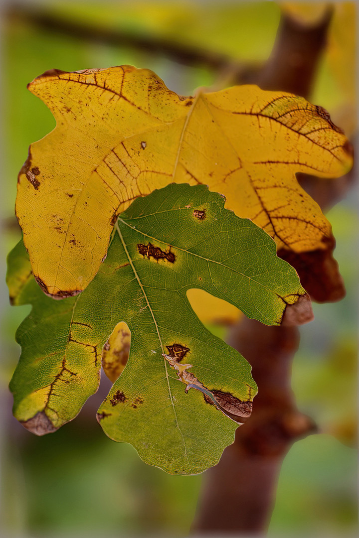
I like your composition. It's Wabi Sabi, showing beauty in nature even when in the state of decay. The leaves do look as if they are embracing. Nice job! I wish I had a fig tree, but I don't think the weather it right for it.
Yes the larger f stop would have created more blur, if that's what you want, but I am enjoying the image as it is. Just for fun, I took your image and applied the Blur neural filter that's in Photoshop. I have been experimenting with it on my own photos, so I thought I'd try it on yours. I hope that's okay. It's different, but whether you think it is better is a matter of aesthetics. |
Jan 6th |
 |
8 comments - 5 replies for Group 43
|
| 62 |
Jan 24 |
Comment |
Thanks Pete! |
Jan 20th |
| 62 |
Jan 24 |
Reply |
Thanks Emil. |
Jan 16th |
| 62 |
Jan 24 |
Reply |
Thanks Mark. |
Jan 16th |
| 62 |
Jan 24 |
Reply |
Thanks Mandy. |
Jan 16th |
| 62 |
Jan 24 |
Reply |
I like it. Nicely done. Mystery solved! |
Jan 15th |
| 62 |
Jan 24 |
Reply |
I like it! |
Jan 9th |
| 62 |
Jan 24 |
Reply |
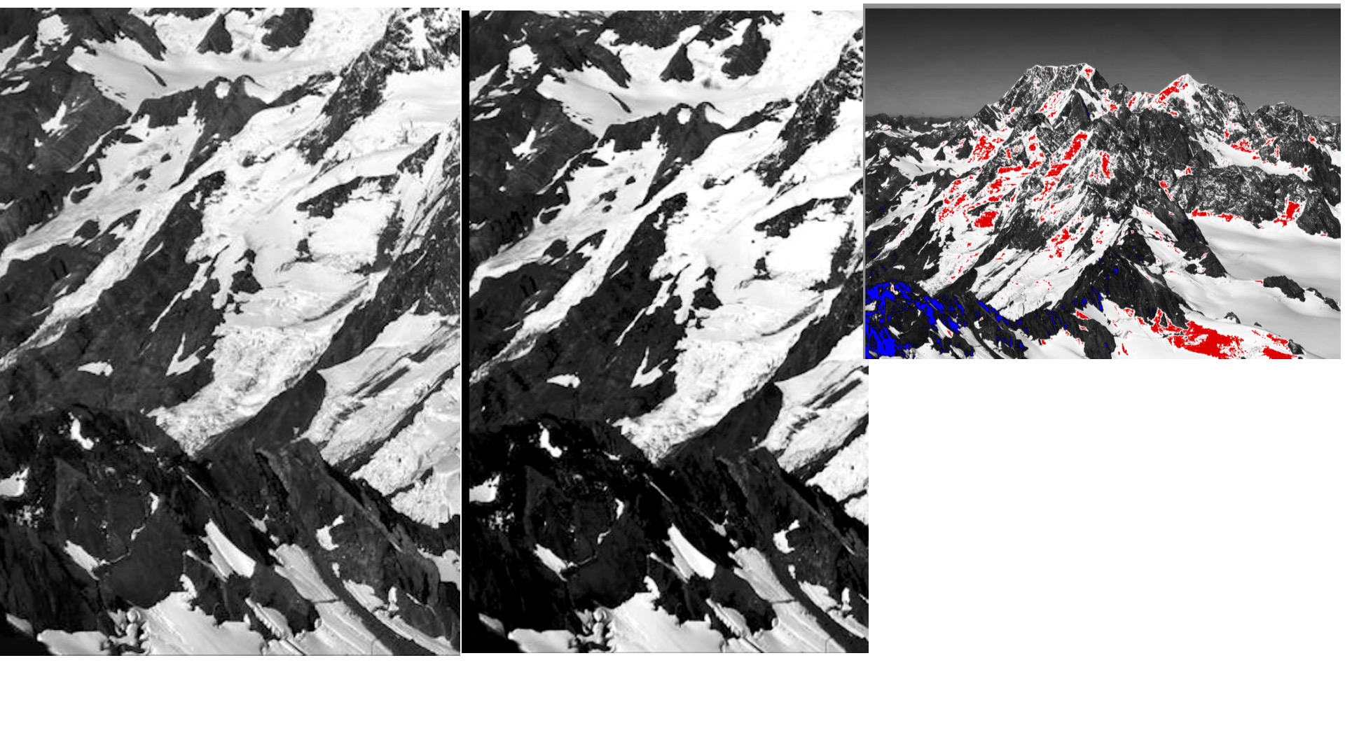
Thanks for posting the image. I prefer my treatment because it preserves detail. The only true black in the image is in the lava field on the lower left. The rest of the granite is dark gray. If you look at the attached, the photo with color shows all the places in your version where the detail is lost. The whites are blown out and the blacks are crushed. Further, I prefer the dark "Ansel Adams" treatment of the sky. When I created the image, I used a histogram to make sure I did not have any "red" or "blue"areas in the image. If you look at the attached, you'll see there is much more detail in my version (left) than in yours (right). What do you think? |
Jan 7th |
 |
| 62 |
Jan 24 |
Reply |
I think it was newer, but the company was fanatical about not scratching the windows. When I've done other sightseeing trips, I never heard the pilot tell people not to put cameras on glass. I think they this company had a higher standard OR took a lot of photographer flying who didn't want to see scratches. |
Jan 4th |
| 62 |
Jan 24 |
Reply |
I don't see an image. Do you upload one? |
Jan 4th |
| 62 |
Jan 24 |
Comment |
Hi Pete,
From just seeing the middle image, I think you did a terrific job merging the images. The patterns in the rock and curve of the bay make the image quite interesting, as do the cloud formations. Are they contrails of some sort of high cirrus clouds? If it is contrails, that's a lot of jets!
By combining the images and making the lightness fairly uniform throughout, the sunset quality in the color version is lost. At least to my eye. It is still a fine image. It's just that the title had me wondering where the sunset was. |
Jan 3rd |
| 62 |
Jan 24 |
Comment |
Hi Israel,
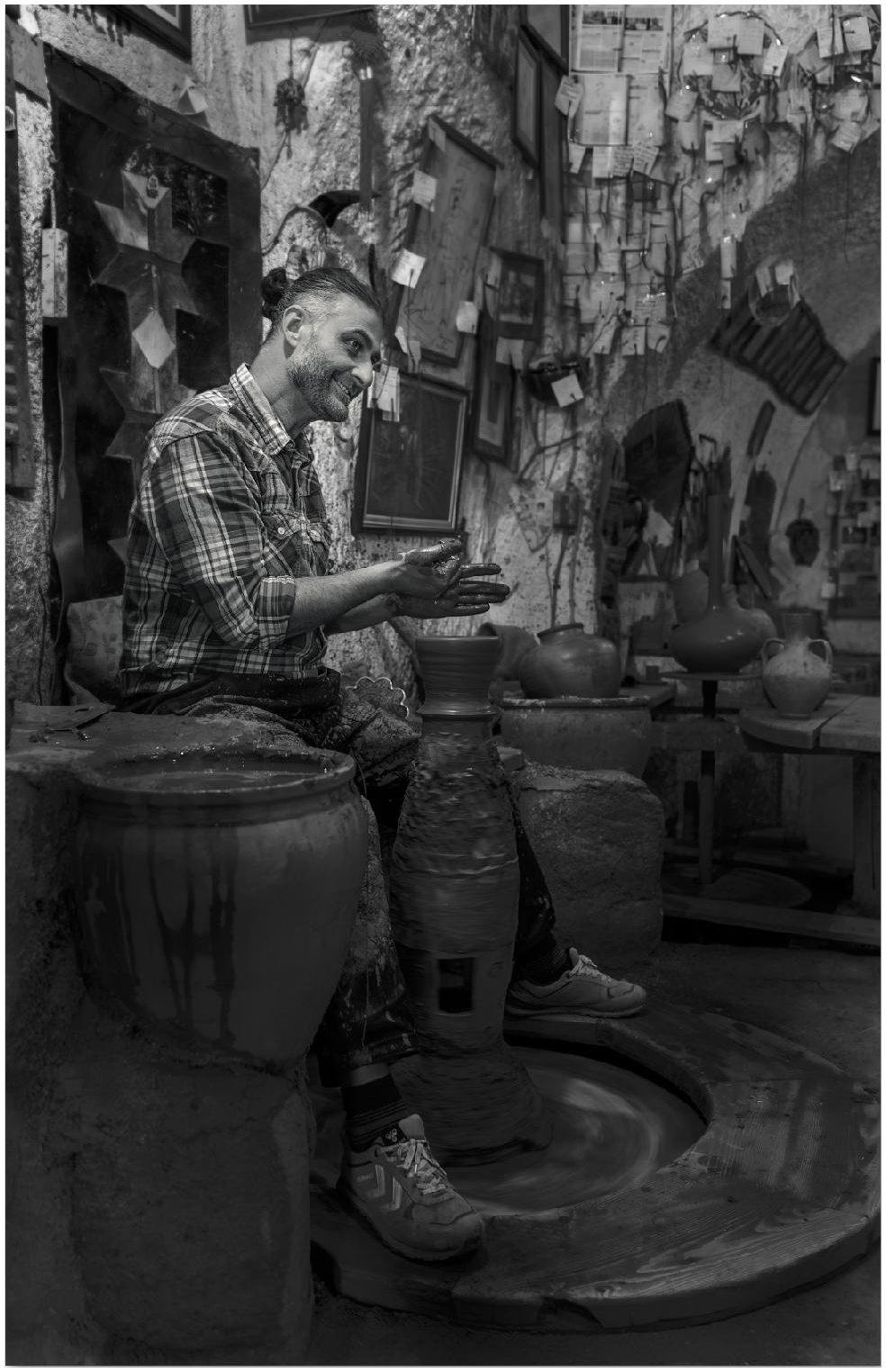
This is a wonderful documentary photo that shows a potter at work. He obviously enjoys his craft. The white border, to my eye, distracts from the image. It's a bit bright and thick. You might experiment with other thicknesses, although I don't think the image needs a border. (I typically don't use them.) What do you think of this thickness? |
Jan 3rd |
 |
| 62 |
Jan 24 |
Comment |
Hi Emil,
You are building quite a portfolio of trees with reflections! I like it. The original is also quite good; I love the gold tones. The image has an impressionistic quality about it that I find pleasing. Nice job. |
Jan 3rd |
| 62 |
Jan 24 |
Comment |
Hi Mark,
You achieved the result you wanted. My eye is drawn to the semi-circle of coils. I enjoy photos of mechanical things. Darkening the background and capturing a close up of part of this generator works well. Great job! |
Jan 3rd |
| 62 |
Jan 24 |
Comment |
Great job Mandy! Half the battle with an image is getting in position at the right time for a shot. Going back just before closing did the trick! Having a person on the escalator gives perspective to the image. I thought he was going into some sort of mine until I read the description. The leading lines draw me in. The BW conversion, to my eye, is much better than the original. I can see more detail. |
Jan 3rd |
| 62 |
Jan 24 |
Comment |
Bob,
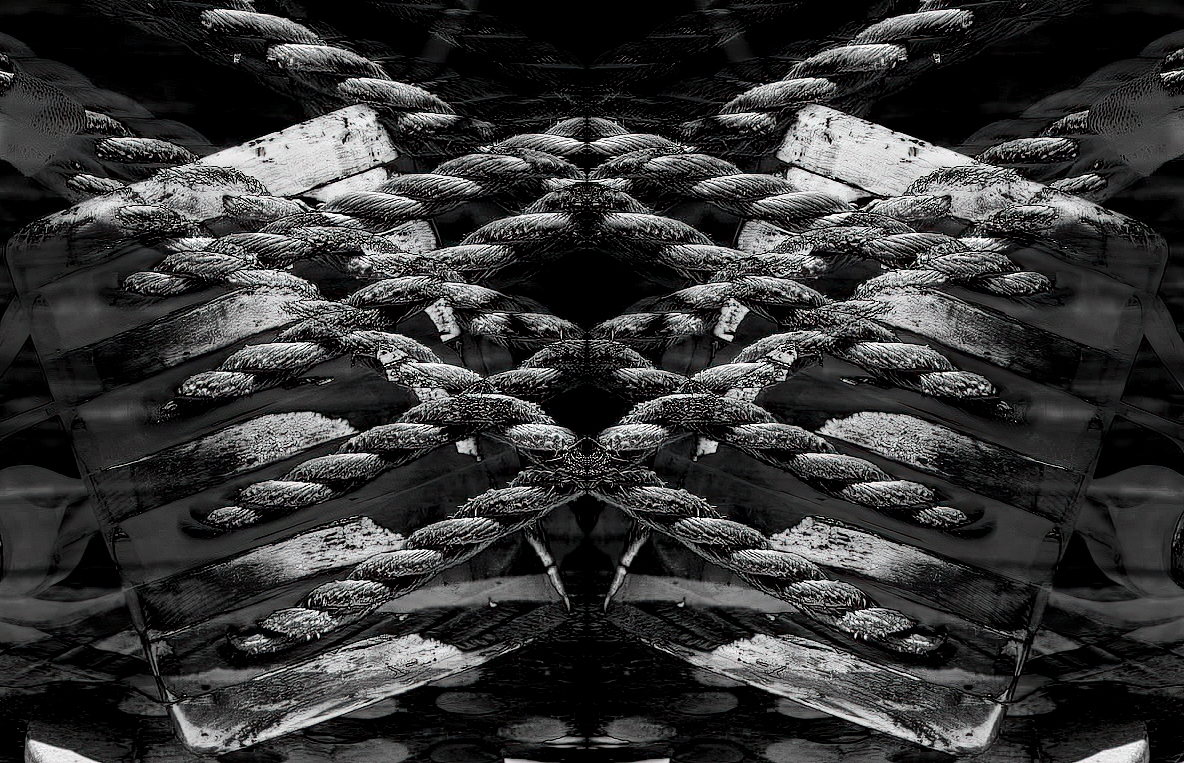
I love this image! I have done many reflections. They fun to do and typically give a pleasing, aesthetic result. You have done just that. Here is the method I use for mirror images.
1. Adjust color balance, highlights, and so forth in LightRoom.
2. In Photoshop, make two layers, and flip one horizontally or vertically depending on the effect you want.
3. Try out different blend modes. For this, I use Exclusion.
4. Back in LightRoom, crop, if necessary.
5. In SilverEfx Pro, convert to BW.
6. In Topaz, apply some sharpening. |
Jan 3rd |
 |
7 comments - 8 replies for Group 62
|
15 comments - 13 replies Total
|