|
| Group |
Round |
C/R |
Comment |
Date |
Image |
| 62 |
May 23 |
Reply |
I like that. Very clever to "peel" back the arch. |
May 11th |
| 62 |
May 23 |
Reply |
Nice! I like what you did. Minor, but makes a difference. |
May 11th |
| 62 |
May 23 |
Reply |
Hi Mark,
I was inspired by other members of our group to use Nik Silver Efex. It has a huge number of BW presets and allows fine tweaking of each. It is amazing how many ways there are to convert to BW, and each gives an image a different sort of feeling. It is easy to use too, and can be used as a plugin to LR. |
May 6th |
| 62 |
May 23 |
Reply |
Hi Israel,
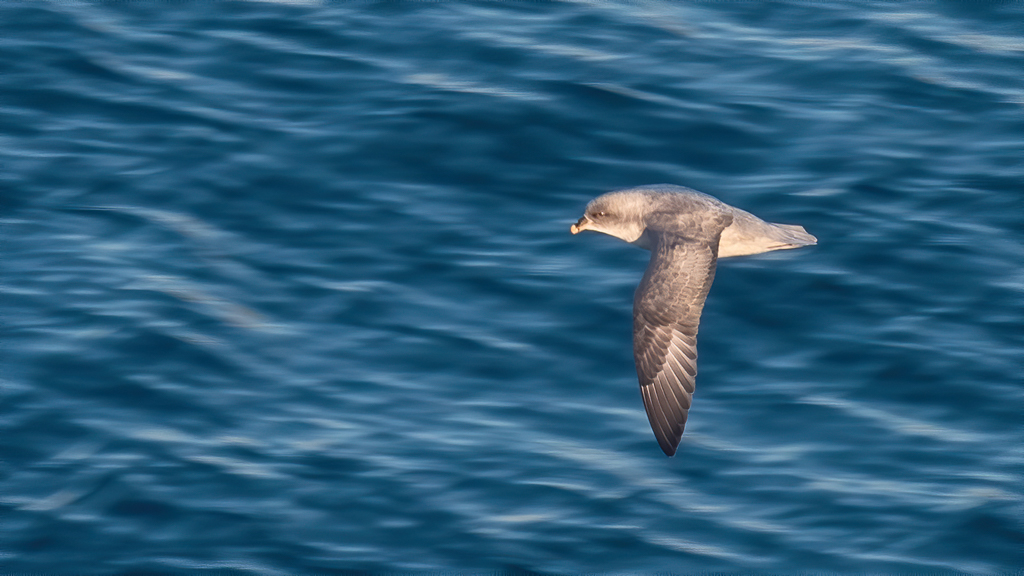
I don't think the image needs to answer the question of who lives there. It merely needs to suggest that someone lives there and that the viewer can imagine a story to fit the scene. Engaging the viewer like that is the sign of a good image. Your photo does that! |
May 6th |
| 62 |
May 23 |
Comment |
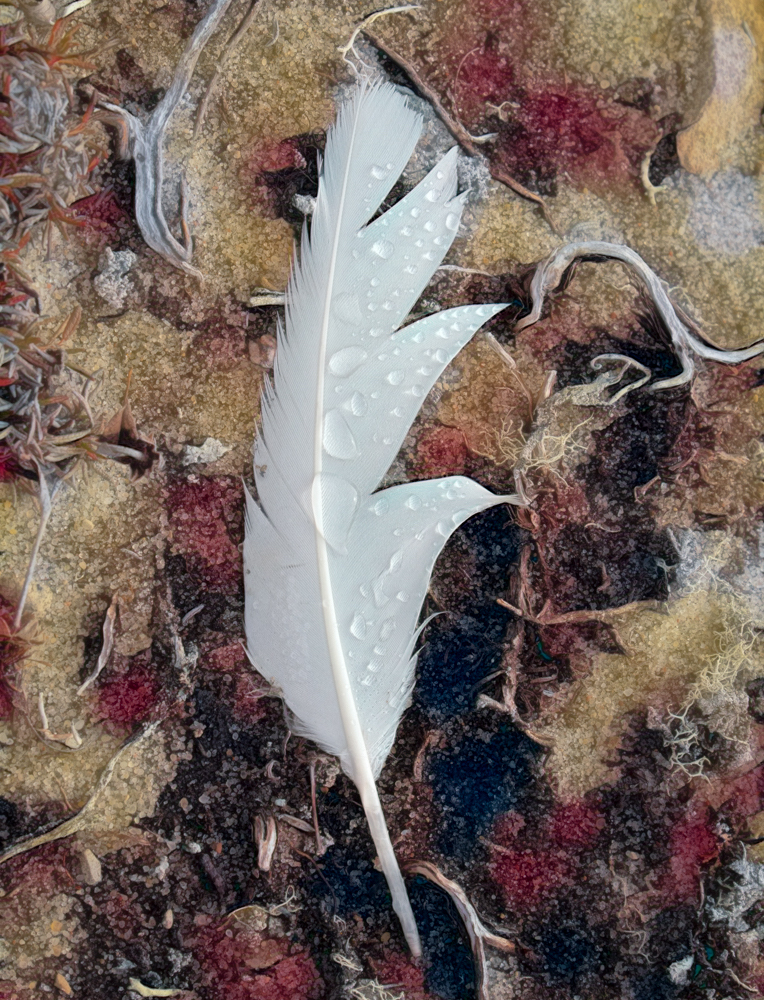
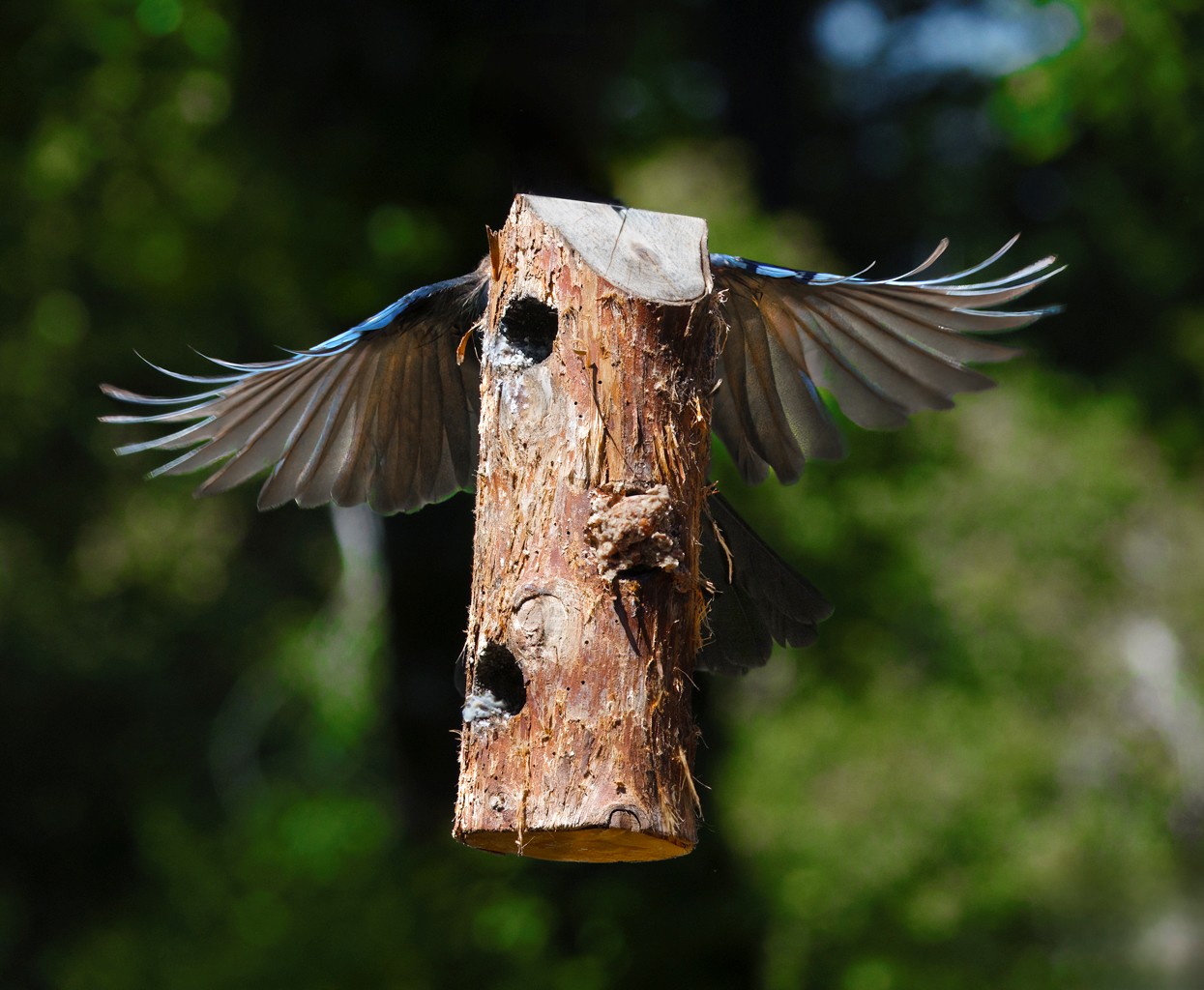
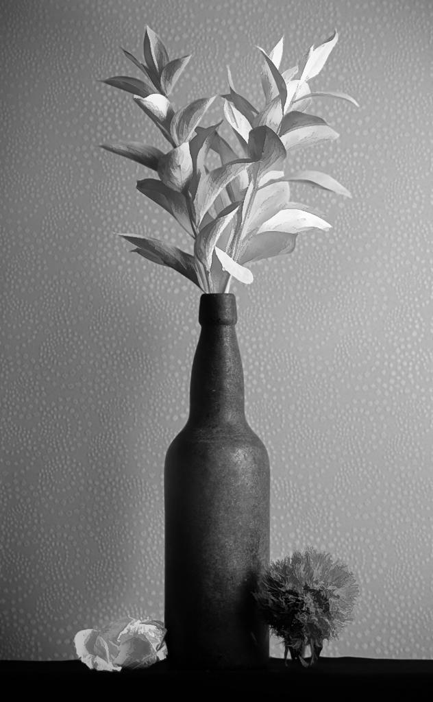
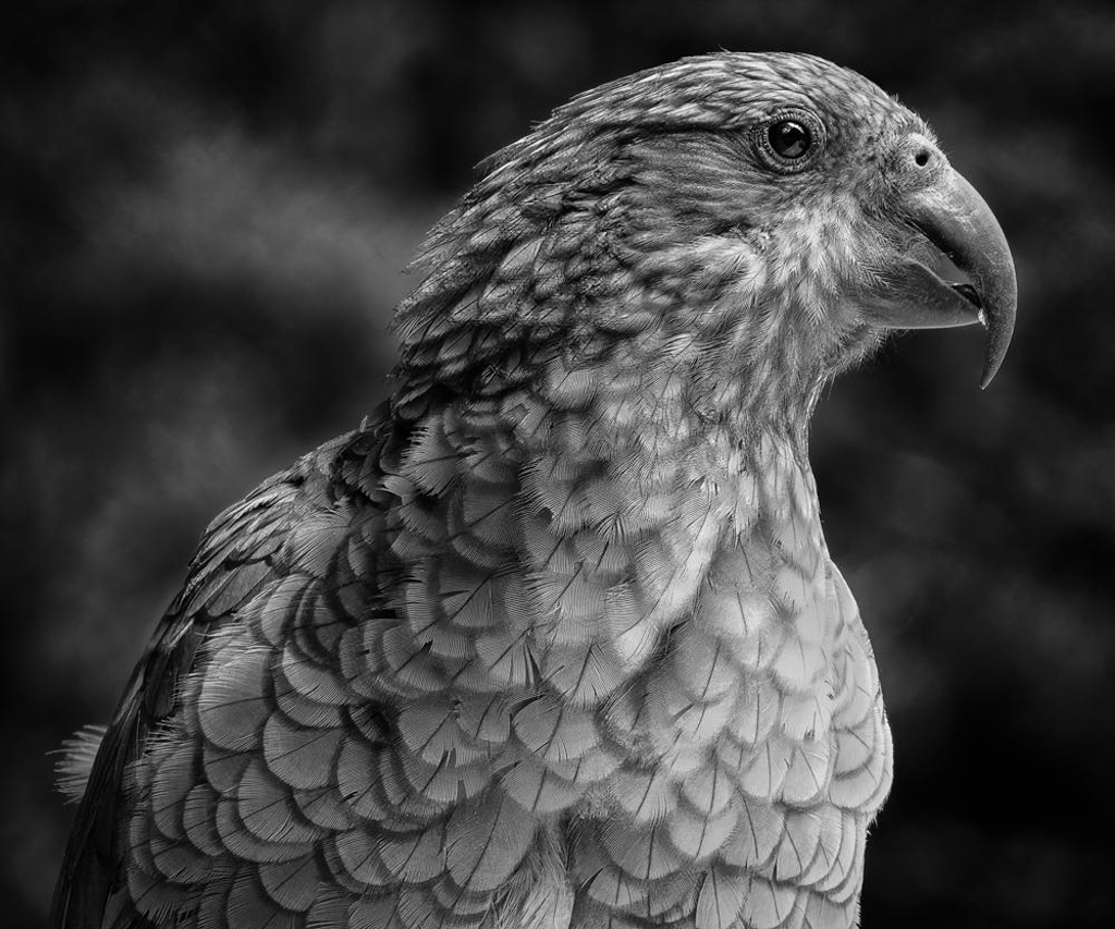
Thanks for your comments Israel. Here is a version that uses LuAnn's suggestions--to tone down the white feathers on the chest of the bird. Did you mean that? Or did you mean making the photo wider and adding whitespace to the right of the image? |
May 6th |
 |
| 62 |
May 23 |
Reply |
What are you thoughts on setting the camera's LCD to show monochrome, even though the camera captures color? I attended a workshop once where the instructor suggested doing that, but I haven't done it. Like you, I am trying to train myself to sort out the shadows and light from the color by using my brain. Also, I don't typically go out just to capture monochrome, so it becomes a bit of a chore to switch. |
May 5th |
| 62 |
May 23 |
Comment |
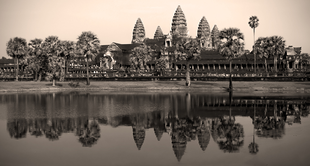
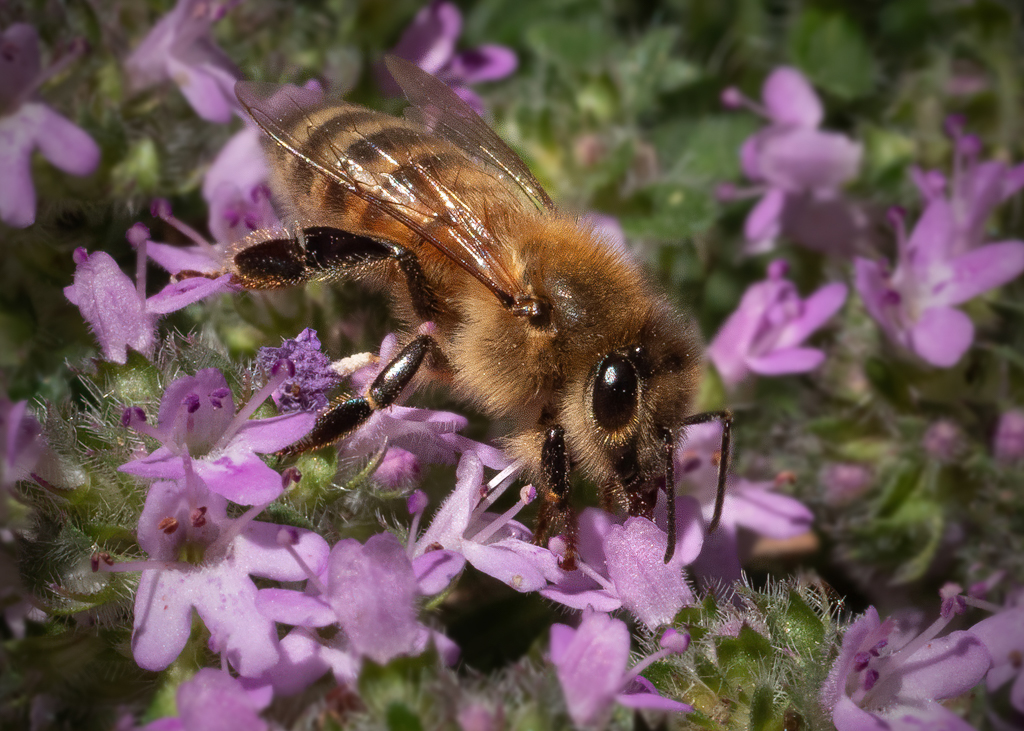
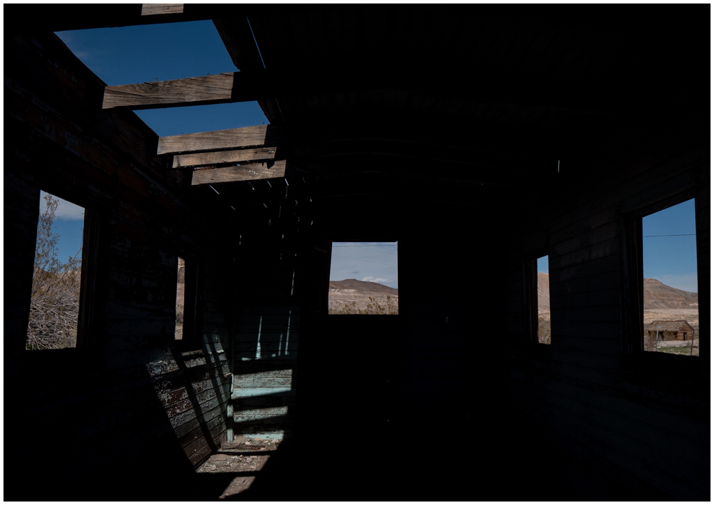
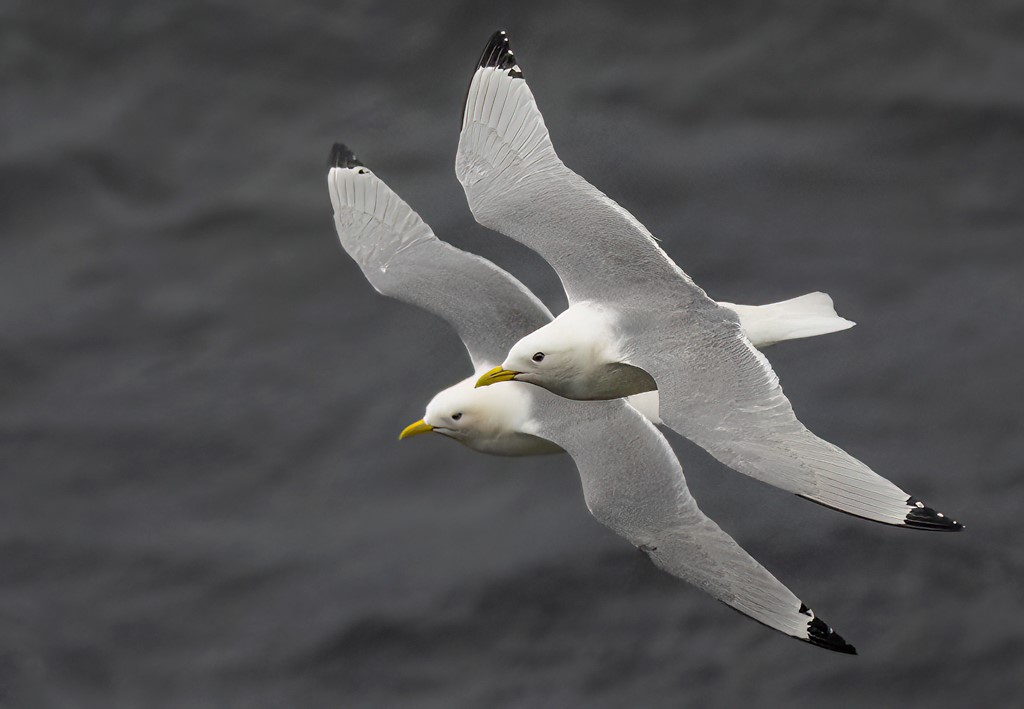
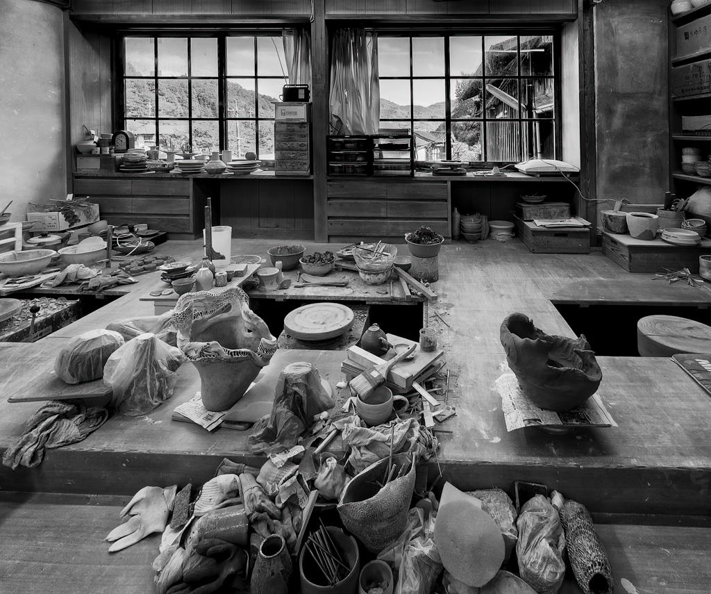
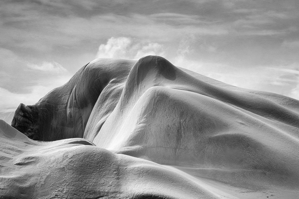
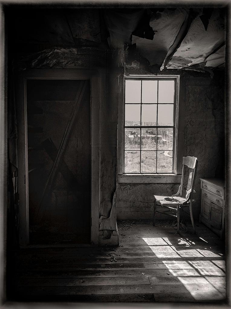
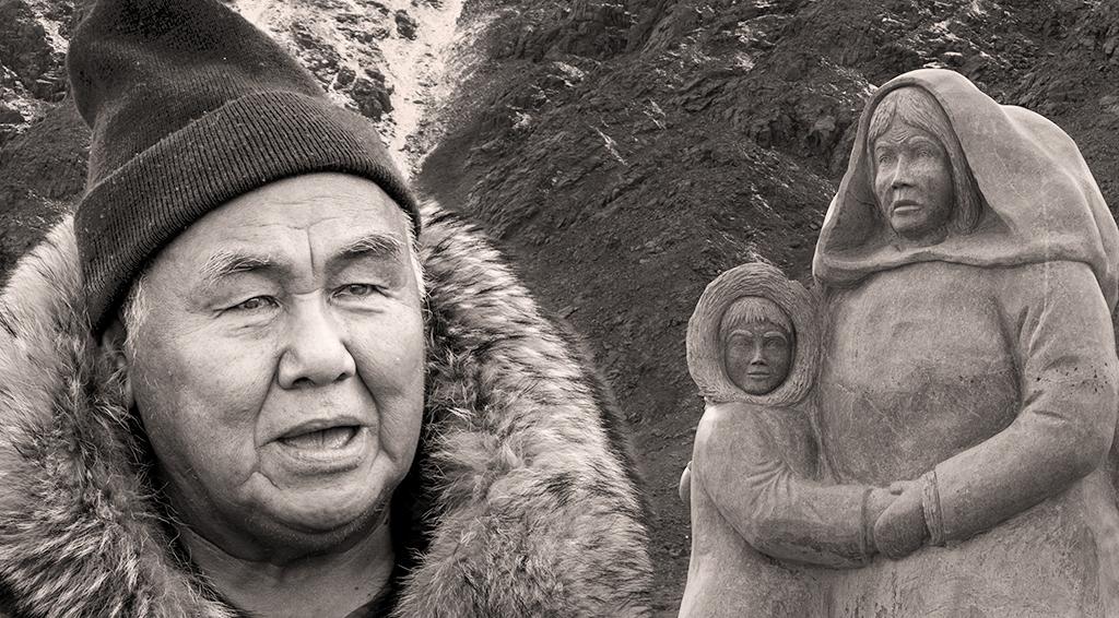
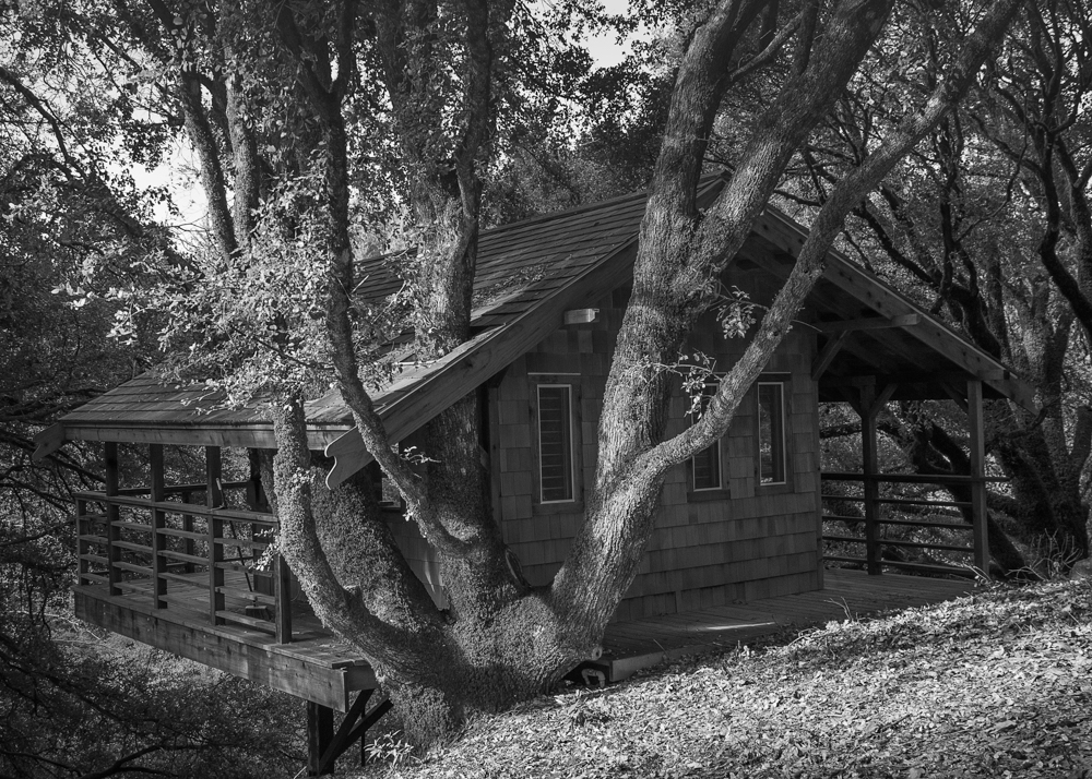
Hi Isreal, There is so much detail in this image, that you might consider making a large print of it. It has so many things to explore--the chickens, donkey, fabrics, boxes, and many textures. It makes me wonder who lives there. I want to know more about this place. The light and shadow in the image create a wonderful atmosphere.
My only suggestion is to straighten the image. To my eye, it looks just a bit tipped to the left. Making the top edge of the building parallel to the ground might look more balanced. What do you think? |
May 4th |
| 62 |
May 23 |
Comment |
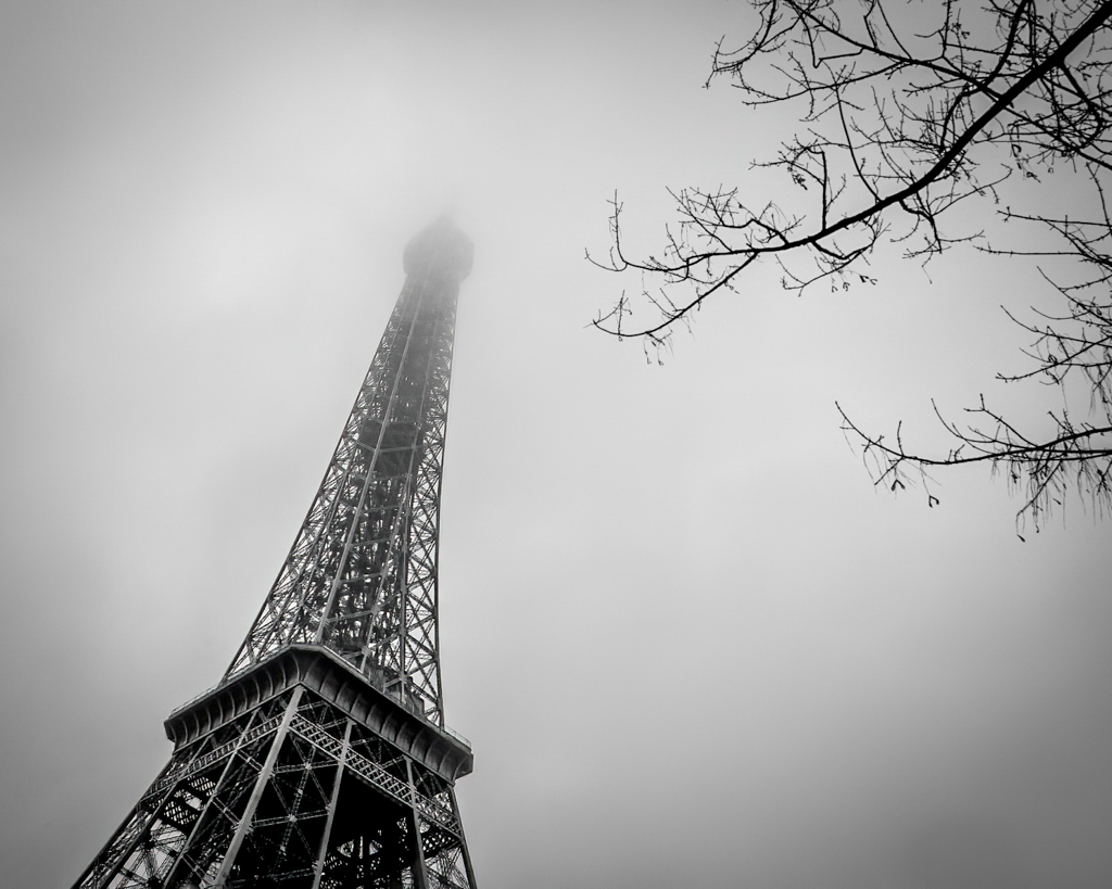
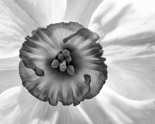
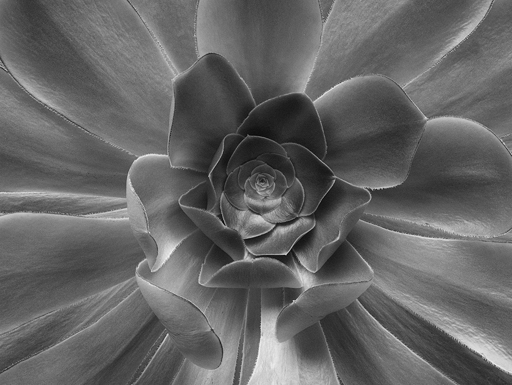
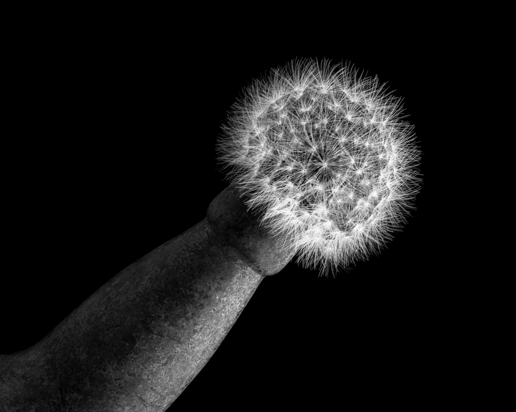
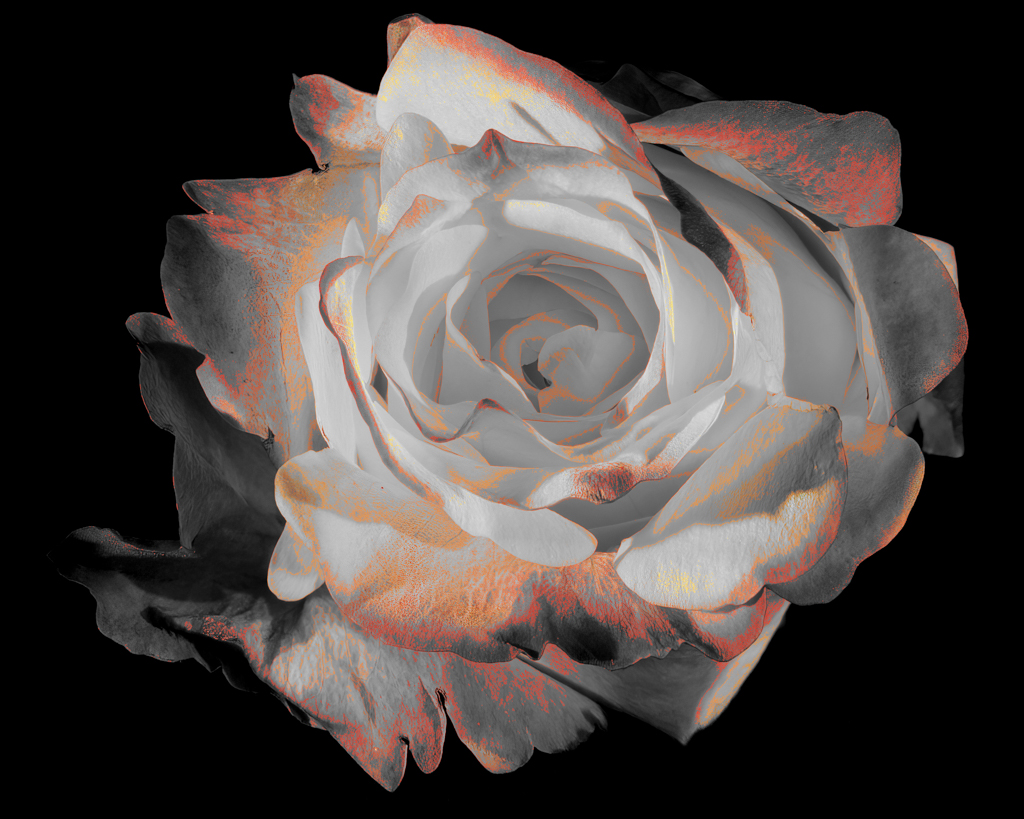
Emil, What a brilliant idea to flip the image. For me, it works much better. The choice of monochrome is great because it emphasizes the subtle texture of the petals. Nice job on the other adjustments. As Pete pointed out, the monochrome version looks sharper. Did you apply sharpening or is this just a side effect of other adjustments you made? |
May 4th |
| 62 |
May 23 |
Comment |
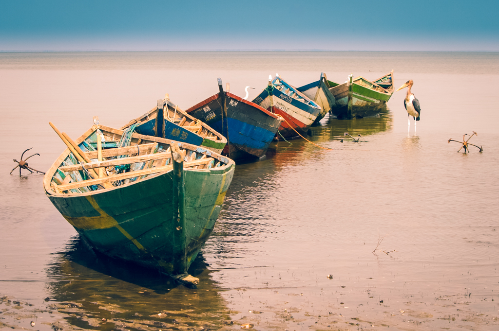
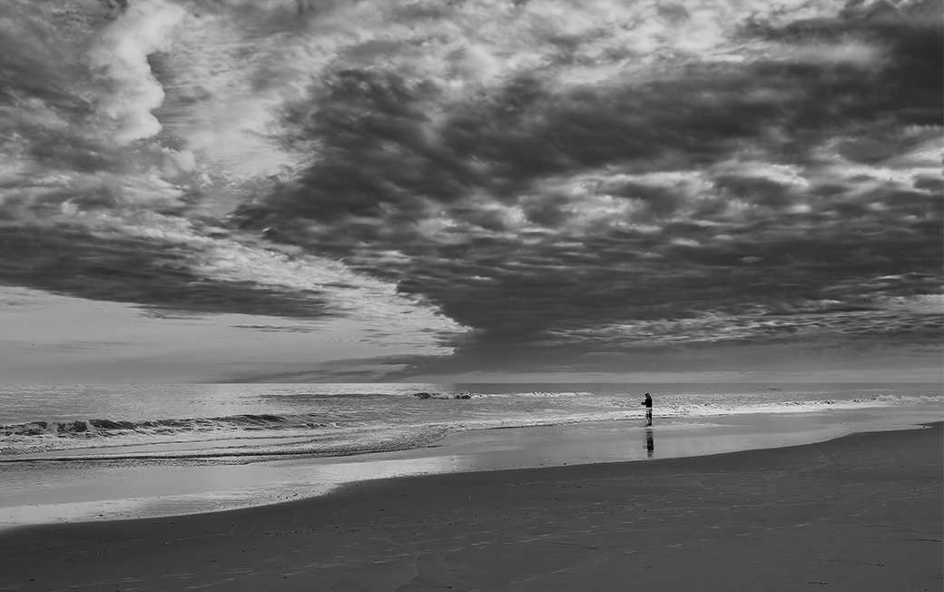
Hi Pete, Any empty beach! That's heaven. You captured a terrific image that gives a feeling of the immensity of the ocean and expanse of the beach. The fisher is positioned perfectly to give a full reflection. I really like it.
My only suggestion is to consider making the transition between the sky and sea just a bit more apparent. (But perhaps you intended to blur the lines?) What do you think? For this I put the color version in one Photoshop layer, your BW on top, and then applied Color blend mode. |
May 4th |
 |
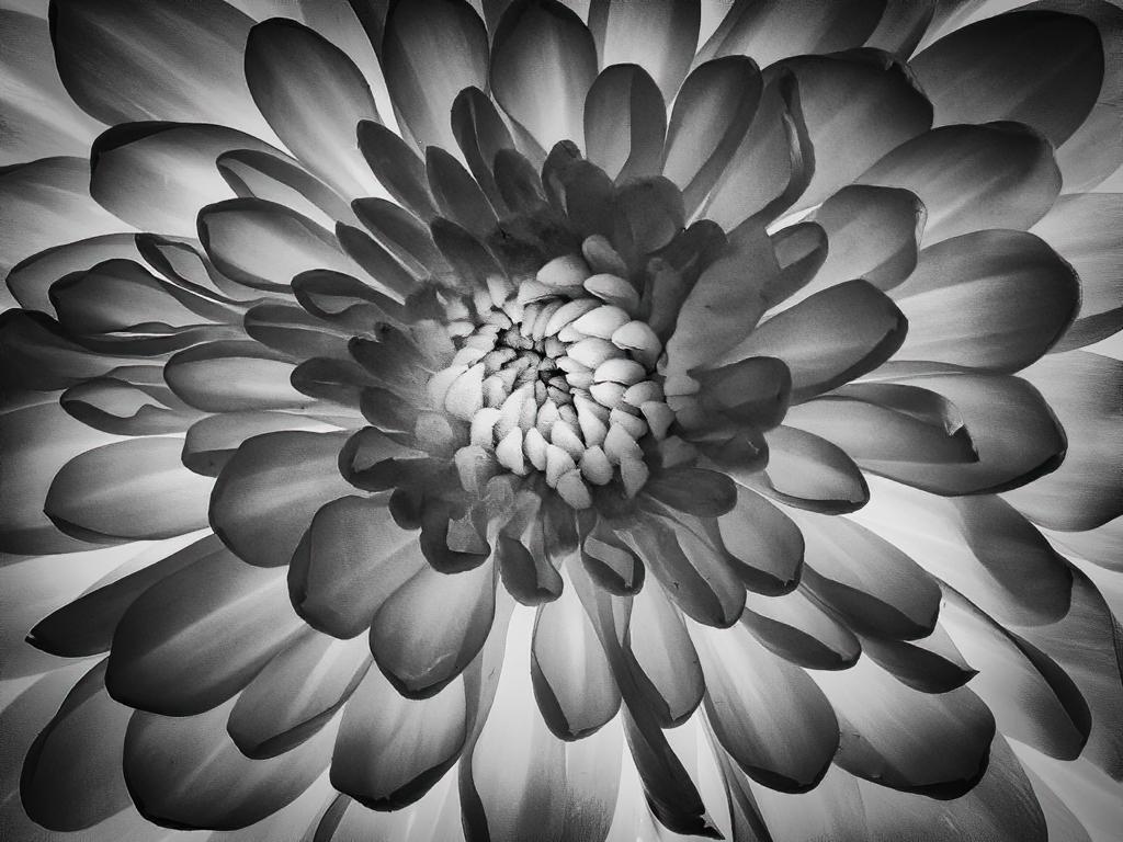
| 62 |
May 23 |
Comment |
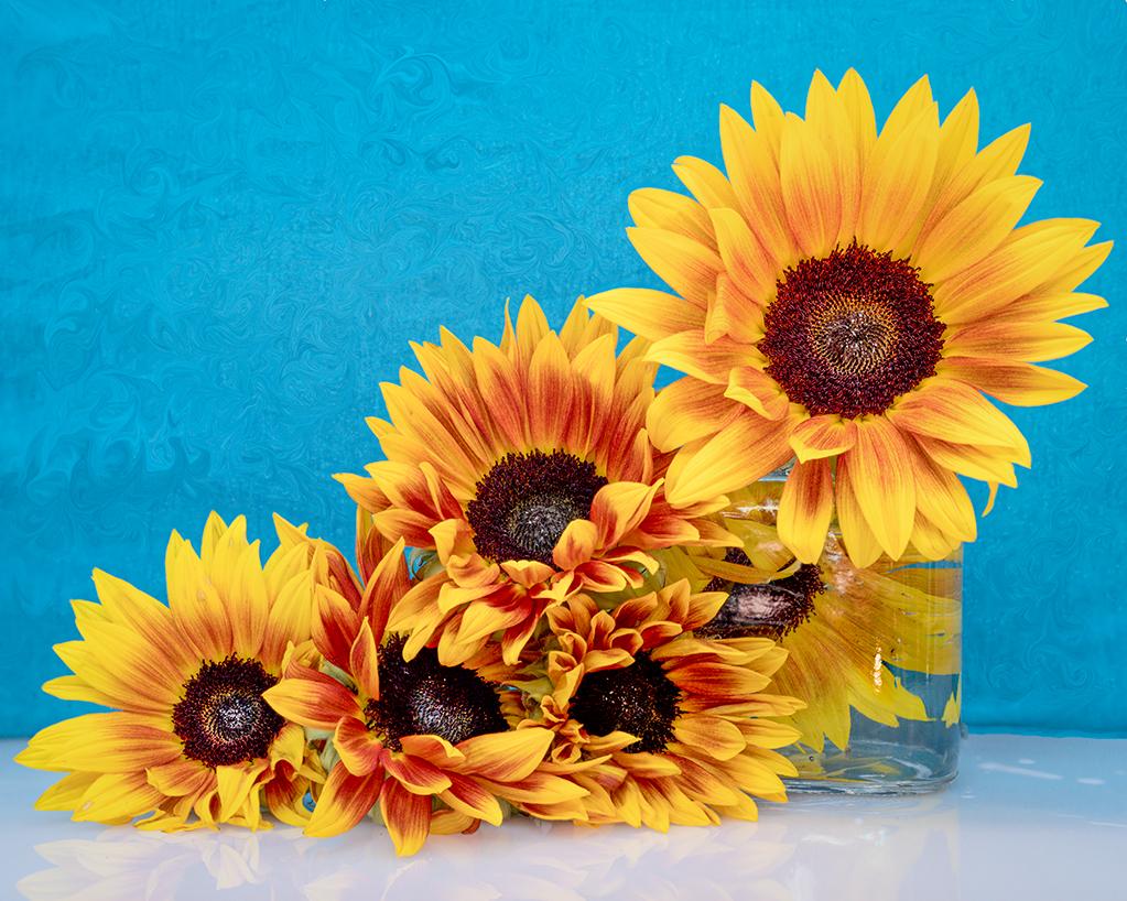
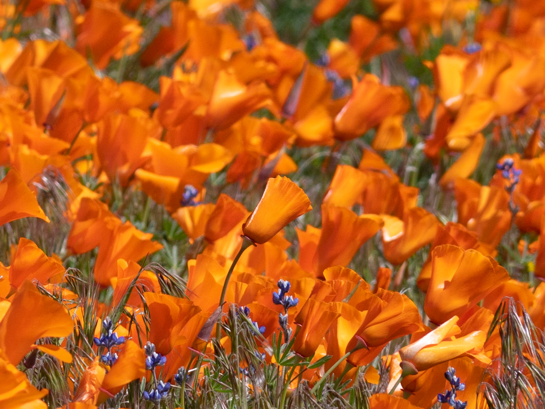
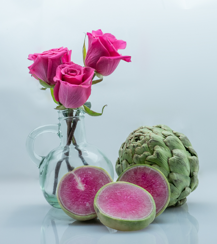
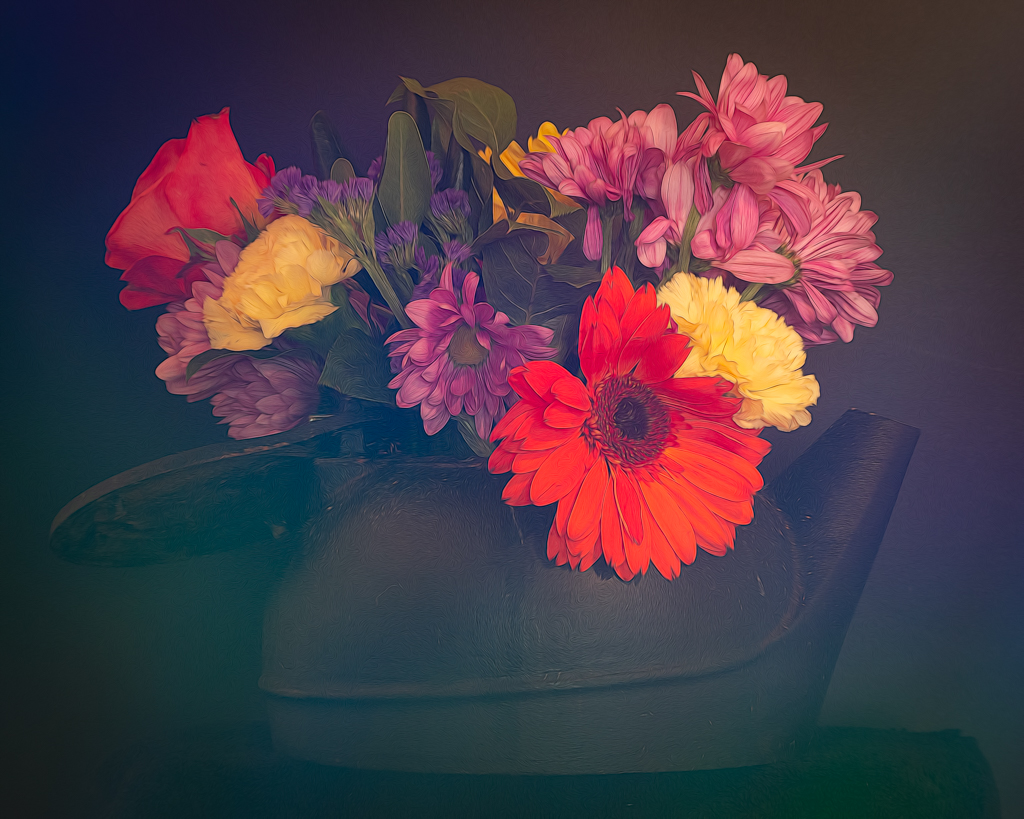
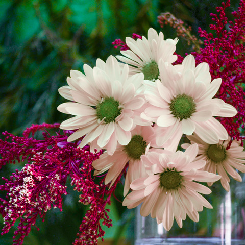
LuAnn, Well done! Rules are made to be broken. In this case, your composition has a wonderful flow from lower left to upper right that draws my eye through the image so that I can enjoy the flowers. Good choice. You left enough hint of the background to give depth.
Your use of monochrome helps me appreciate the subtle texture of the petals and the intersecting shapes of the flowers. Besides, I love Ranunculus! |
May 4th |
| 62 |
May 23 |
Comment |
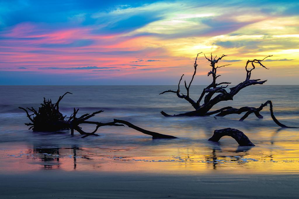
Bob, I love what you did to convert to monochrome. The driftwood and wispy clouds give this image a nice sense of motion. Well done.
HOWEVER, I must stay that I like your color image too. Although you say it "didn't perform well", to my eye, the foreground is a bit too blue. I know this is a monochrome group, but I made a few color adjustments to the color version. What do you think? |
May 4th |
 |
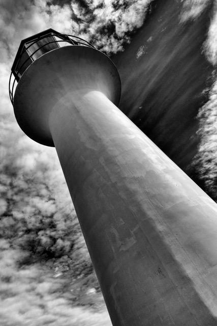
| 62 |
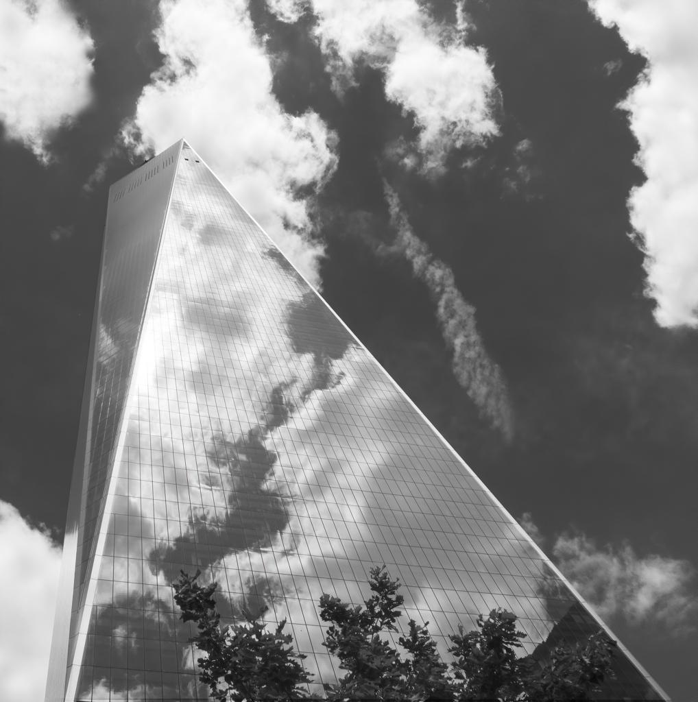
May 23 |
Comment |
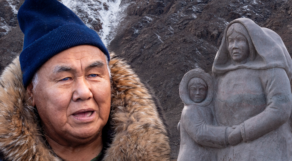
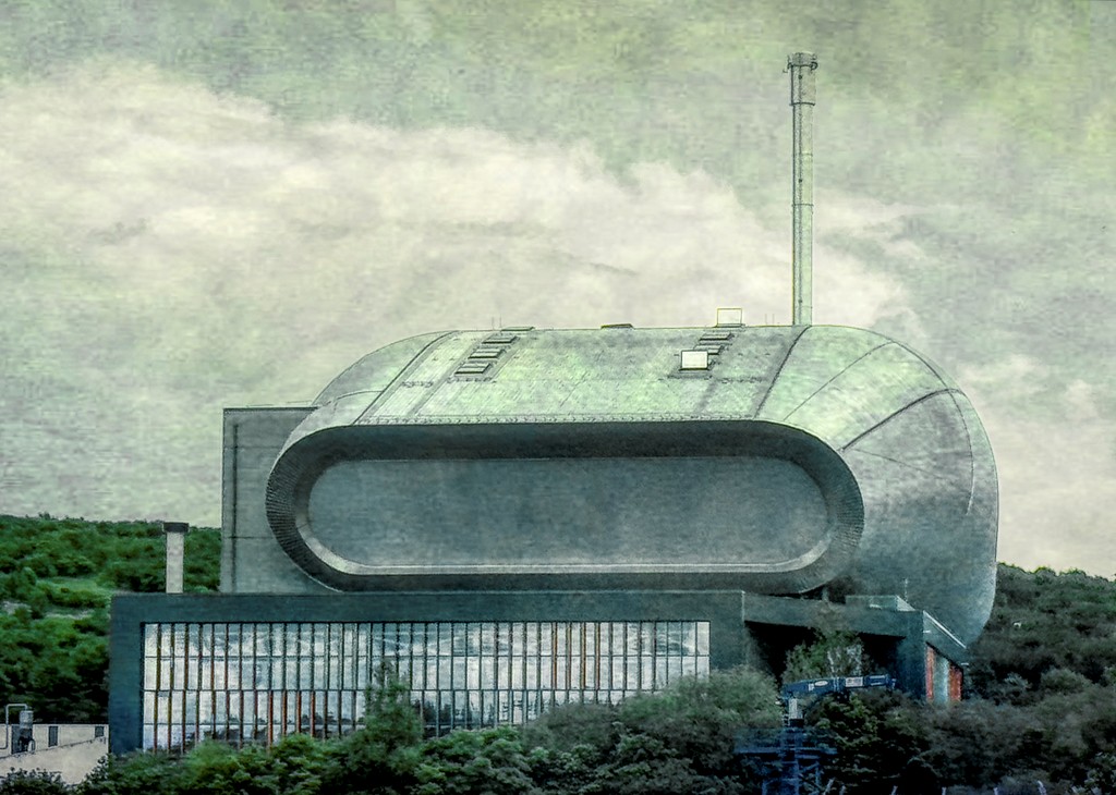
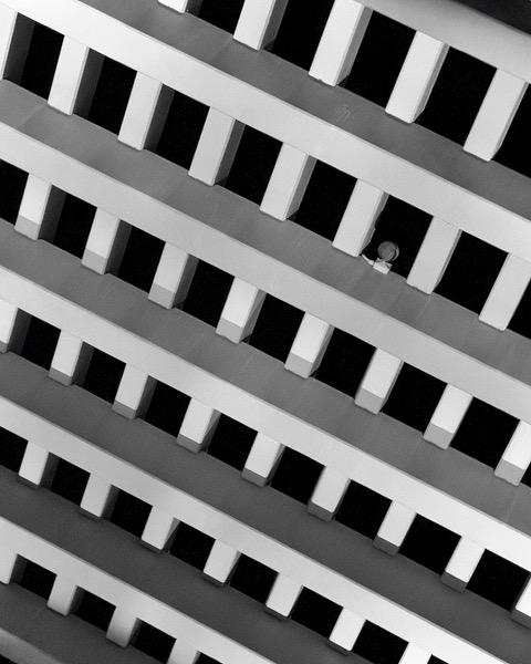
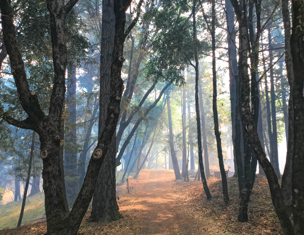
Mark, you did a great job of capturing an unexpected scene! Good instincts. Your BW conversion brings out the wonderful texture of the bricks. The aqueduct frames the family nicely.
I am a fan of off center, but I am wondering if you considered other crops? Here is another crop to consider. I didn't know what you used to convert to monochrome, so ignore what I did. I just wanted to show the crop. |
May 4th |
 |
7 comments - 5 replies for Group 62
|
7 comments - 5 replies Total
|