|
| Group |
Round |
C/R |
Comment |
Date |
Image |
| 62 |
Oct 21 |
Reply |
Hi Stephen,
I agree for photos in certain categories. But there are many images in the creative and fine arts category that use extensive post processing to create a mood or effect that goes beyond a realistic rendition of a scene.
Bunny |
Oct 27th |
| 62 |
Oct 21 |
Reply |
I like that observation! |
Oct 24th |
| 62 |
Oct 21 |
Reply |
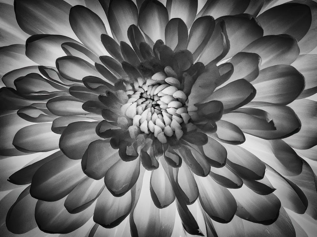
Hi LuAnn, It is interesting that you suggested the white vignette, as my first rendition of this image used that. I submitted it to my club's monthly competition and the judge was pretty firm about the white vignette being unflattering. So I went back for version 2, which is what I submitted here. I think the image has potential, and I agree that a creative approach might lead to "third time is a charm."
I like the pen and ink filter, but in this case I think it adds too much complexity. However, you have inspired me to bring the image into Topaz Studio 2 and investigate other filters that might work well to my eye. Thank you!
On the white vignette side, I would love to get guidance from everyone regarding for which situations it works well. |
Oct 18th |
| 62 |
Oct 21 |
Comment |
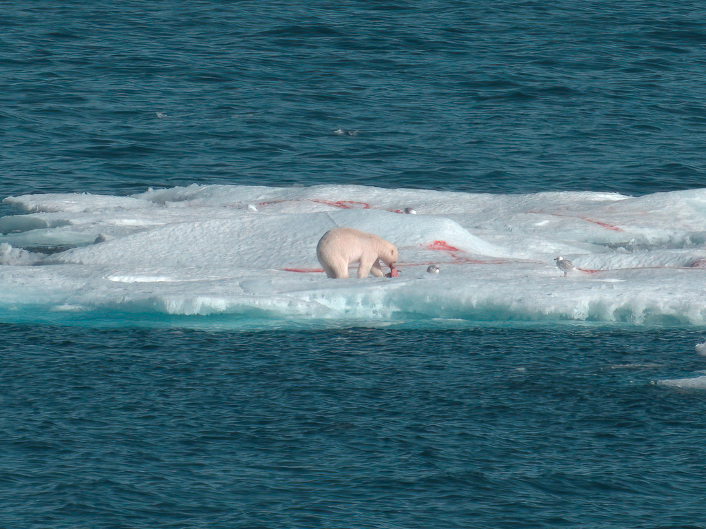
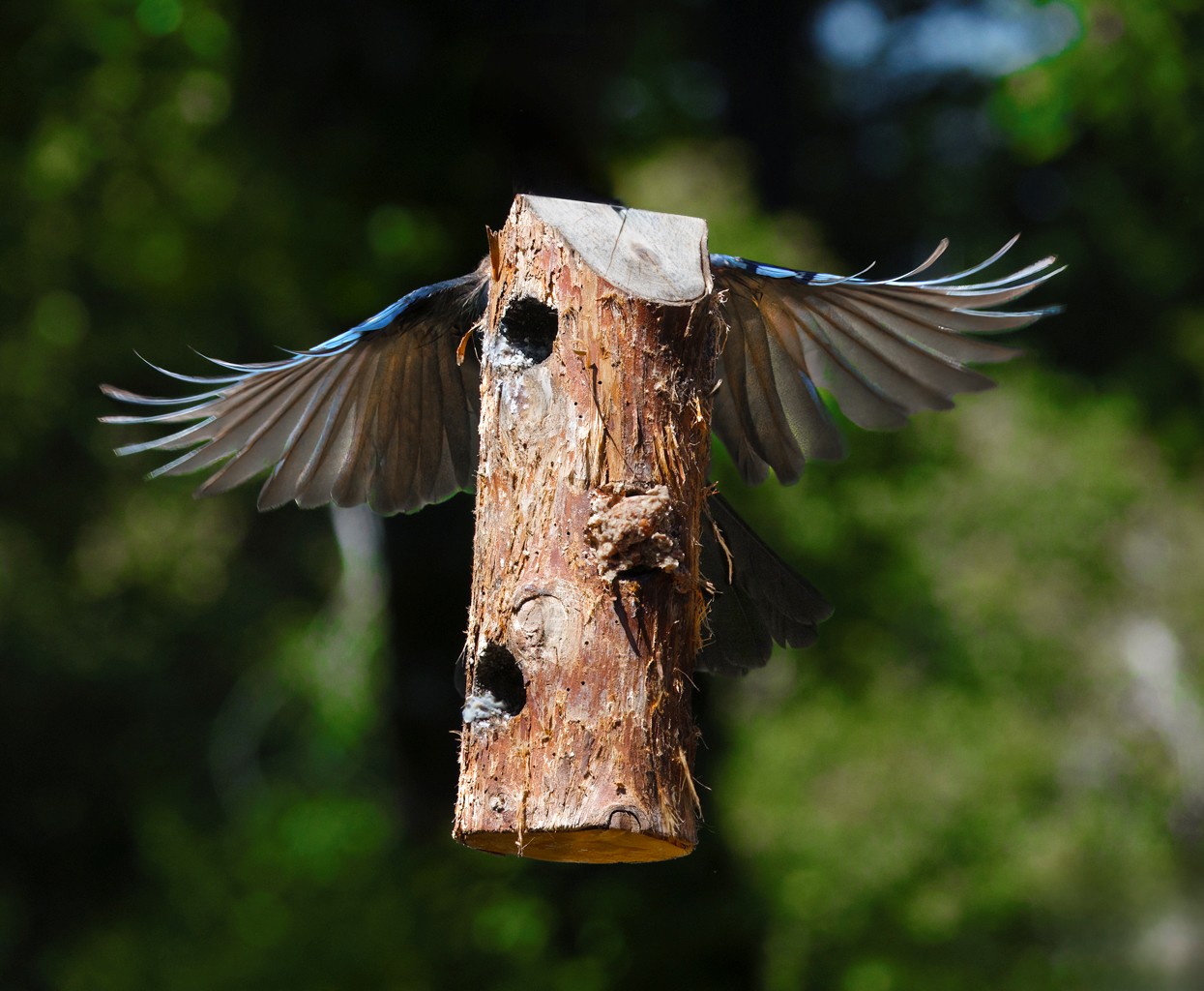
Hi Pete,
What can I say but WOW! I love the composition, the depth of field, the frog's pose, and the detail of the skin. I can't add anything other than to concur with Bob's suggestion of a slight crop on the right. Nice job! |
Oct 17th |
| 62 |
Oct 21 |
Comment |
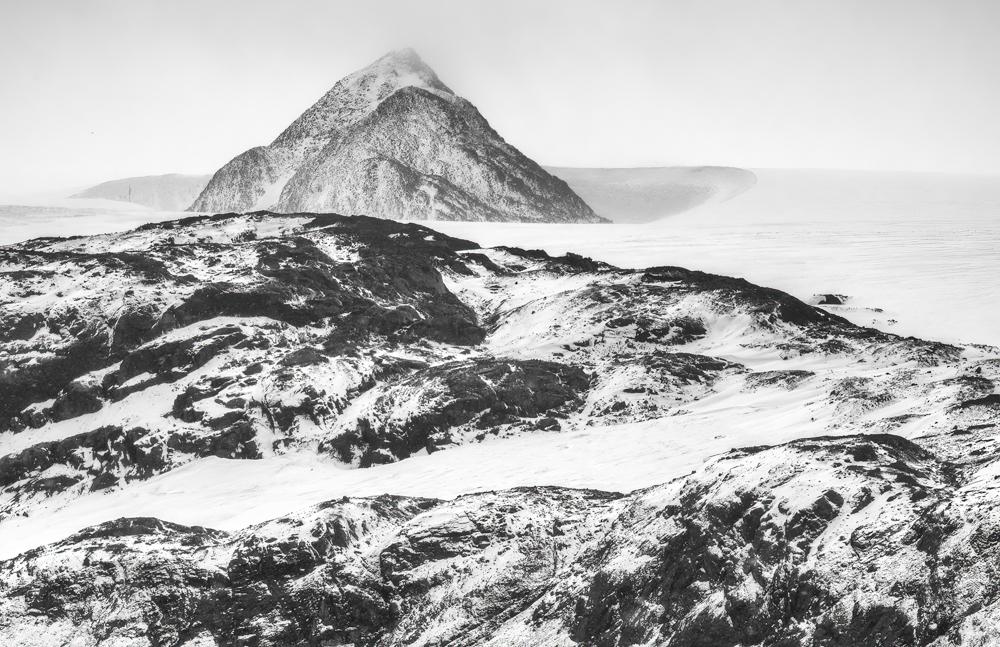
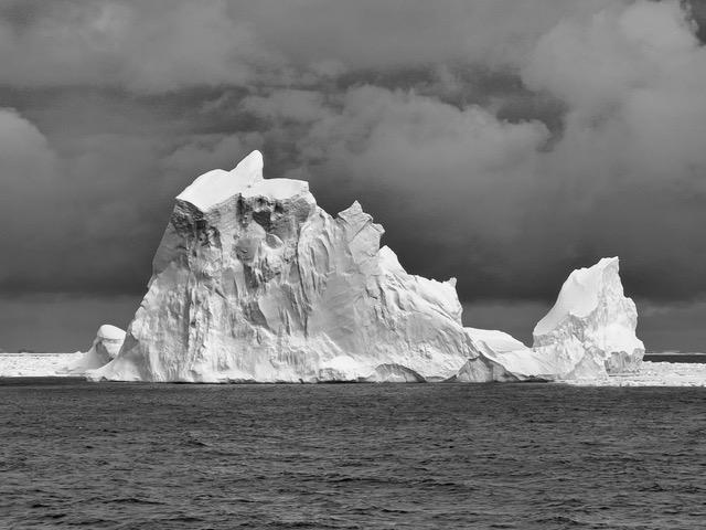
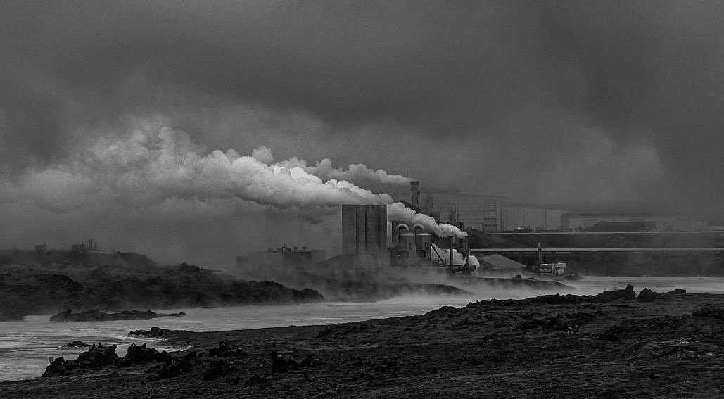
Hi Israel,
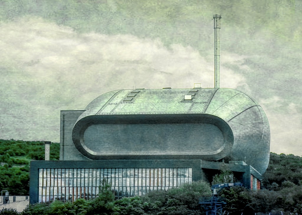
It is interesting how many of the places we think of as pristine have their ugly sides. Do you know what this is? A factory of some sort? A power plant?
Black and white works quite well for the image. I like the way you brought out the contrast in the billowing smoke. There is a very nice range of tones. An amazing feature of your image is the long plume of smoke. I think that a slight crop of the left side would focus my eye on the plume of smoke even more. What do you think? |
Oct 17th |
 |
| 62 |
Oct 21 |
Comment |
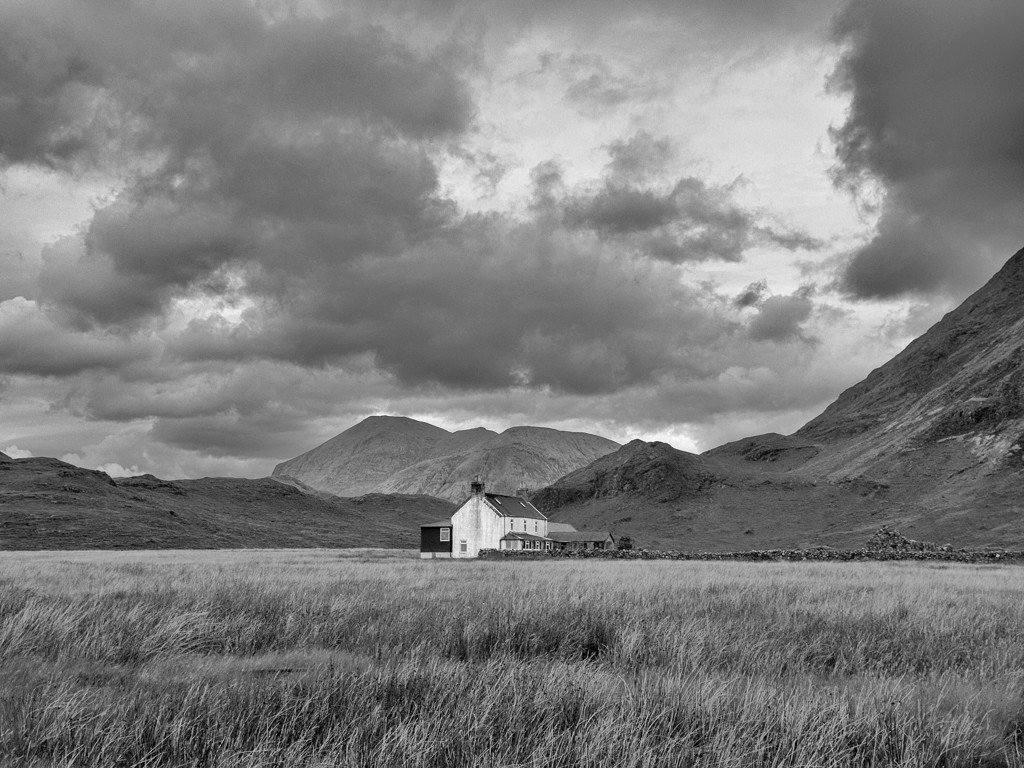
Hi Bob,
Flipping the scene works well. Nice choice! I think the BW conversion brings out the texture in the barn and the stone quite nicely. You might consider lightening the wreaths on the doors to make them more obvious, as barn looks to be decorated for the holidays-tree, wreaths, and basket. While I agree that sky replacement is a great idea, I am wondering what fluffy clouds might look like. To my eye, the dark patch gives a rather sinister look and makes me concerned that the beauty of the barn might be eaten up by that menacing patch! |
Oct 17th |
| 62 |
Oct 21 |
Comment |
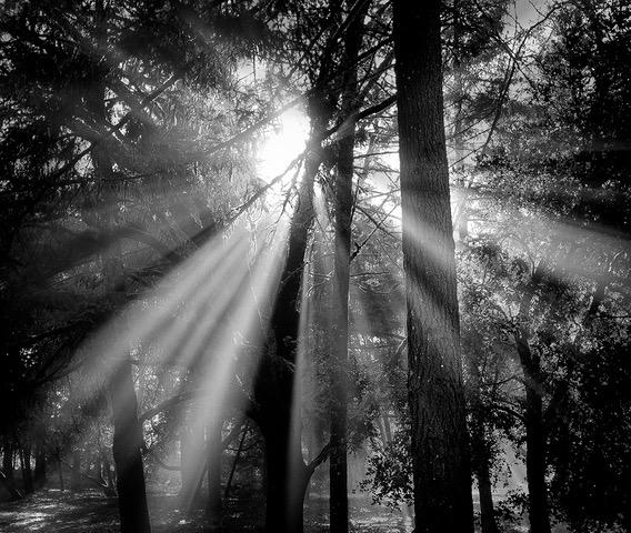
Hi Luann,
I am getting to the party later than Leah! I've taken two trips this month, for which I am grateful. But it does put me behind on other things.
The others have lots of interesting suggestions, so not much to add there. I like the way you captured the light coming through the trees. Titles shouldn't matter, but to some they do. Because the woman is so small in the image, and the river, to me, doesn't look like a river, you might consider a different title that communicates a contemplative nature scene. |
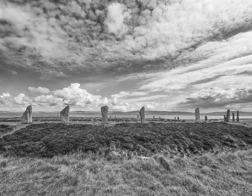
Oct 17th |
| 62 |
Oct 21 |
Comment |
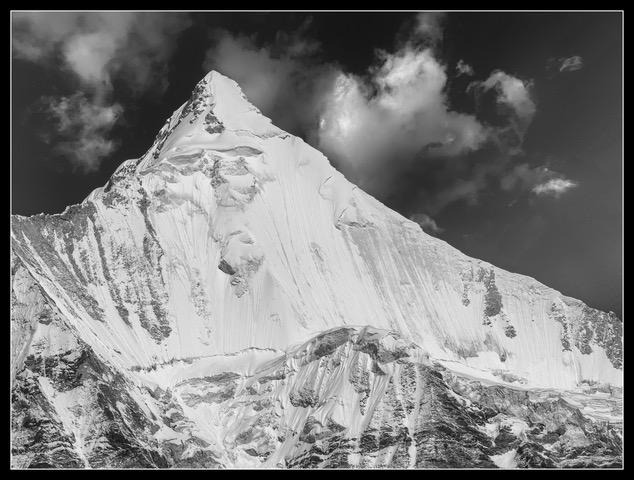
Emil, A couple of years ago I took a workshop in Yosemite on Ansel Adams-style photography. I was told that he avoided clouds, and so when we went out to take photos of the park, we students avoided clouds. I love clouds and think they are some of the most interesting subjects. So I love your image. You are lucky to be in the part of the country were you see the wonderful billowing cumulus (I think) clouds. Here in California I see many, many days of cloudless skies. We rarely have these types of clouds where I live. You have done a find job of bringing out the details. Nicely done! |
Oct 15th |
| 62 |
Oct 21 |
Comment |
Leah, Nice job. Good choice to focus on the stand itself. I like the pattern that you created in the screen. I think you accomplished your goal of bringing out the wood and screen details. You might consider pulling down the highlights on the ground in front of the stand.
|
Oct 15th |
 |
| 62 |
Oct 21 |
Reply |
Thanks Pete. I like what you did! |
Oct 11th |
| 62 |
Oct 21 |
Reply |
Good suggestion Emil. I hadn't thought of that, but it would spotlight the man more. Thanks! |
Oct 7th |
| 62 |
Oct 21 |
Reply |
Thanks for the comments Bob. I can certainly experiment more with the crop. |
Oct 7th |
6 comments - 6 replies for Group 62
|
6 comments - 6 replies Total
|