|
| Group |
Round |
C/R |
Comment |
Date |
Image |
| 62 |
Sep 21 |
Reply |
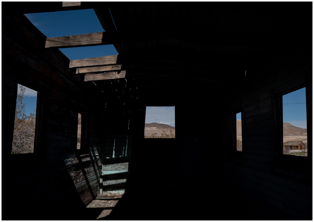
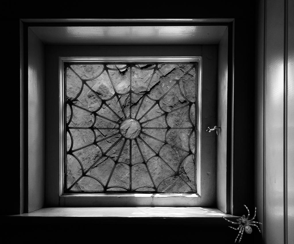
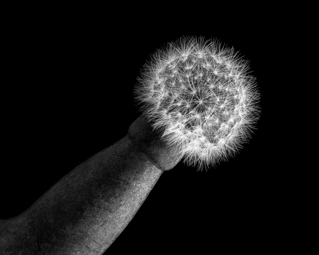
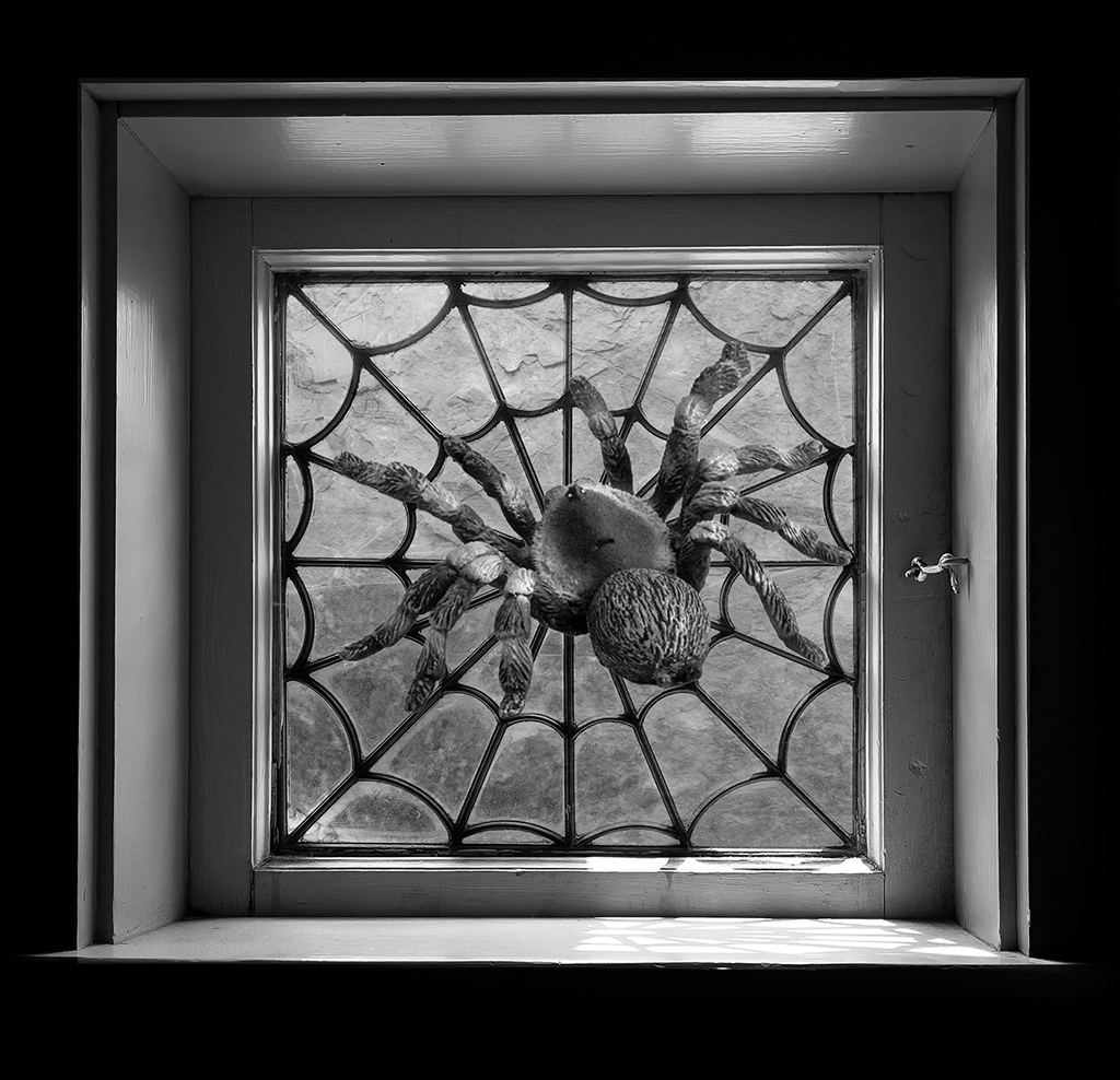
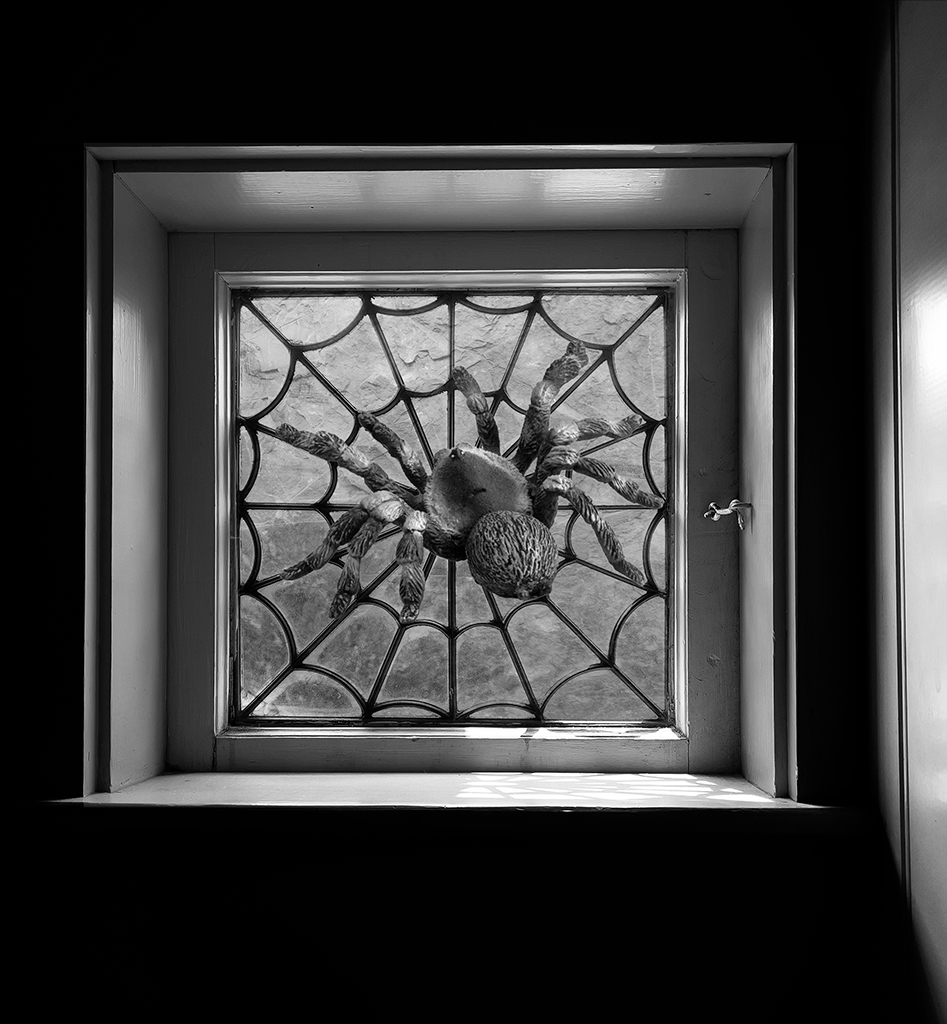
Hi Oliver, Nice idea. I do need to play with the light a bit more. I also tried cropping out the right side, which is another approach. Of course, that makes the spider centered. |
Sep 19th |
 |
| 62 |
Sep 21 |
Reply |
Hi Leah, please see revision that I posted under Emil's comment. |
Sep 19th |
| 62 |
Sep 21 |
Reply |
I made the spider larger and also used a different spider. It is a tarantella and I know they don't make webs, but I think is it more attractive than the previous. I also changed the background to make it less prominent. |
Sep 19th |
 |
| 62 |
Sep 21 |
Reply |
Hi Emil,
Interesting suggestion about cropping out the light frame. I like the way the light falls, but you are now shaking up my thinking! Which is great. So I'll give it a try when I return from travel. Thanks.
As far as moving the spider into the window, I've placed that spider all over but it gets lost in the background. When I try Leah's suggestion I can also manipulate the background to find something more complementary to the spider. |
Sep 3rd |
| 62 |
Sep 21 |
Reply |
Hi Leah
Thanks for the suggestion. It will be easy for me to try your suggestion, which I'll do after I return from a trip on the Columbia River! (Starts today for a week) |
Sep 3rd |
| 62 |
Sep 21 |
Comment |
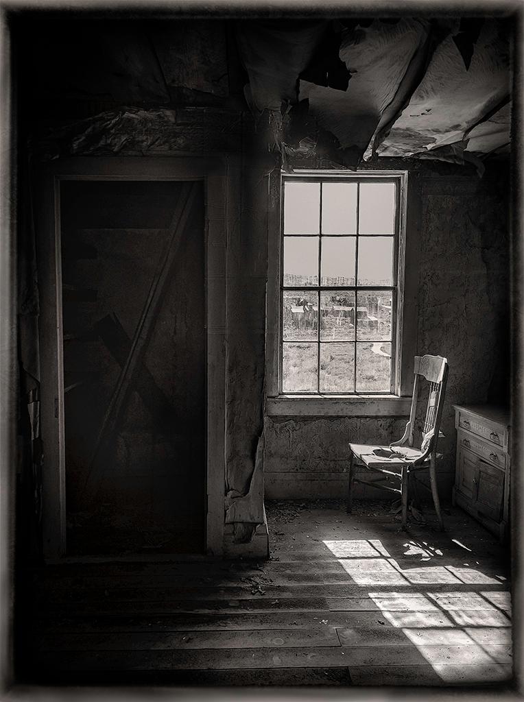
Hi Pete,
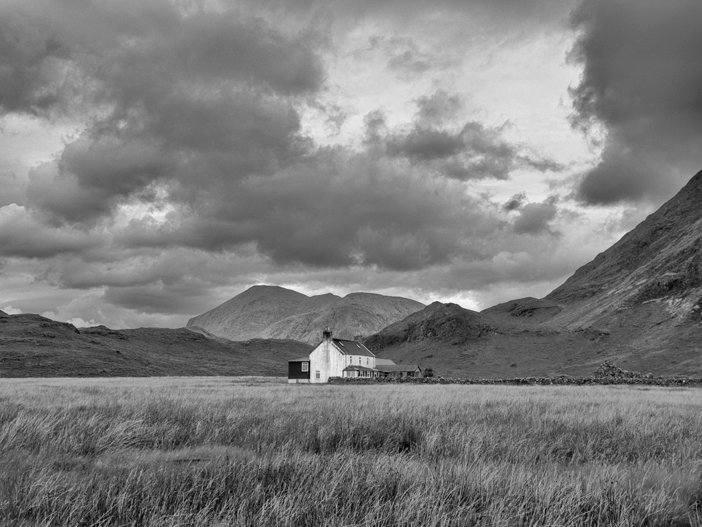
You took a bucolic image and turned it into something quite dramatic and wonderful. The close-in crop works well for me. I like how you brought out the texture of the barn. Your choice to replace the rather dull sky brings the image alive. My eye keeps going to the left part of the sky, as it looks like a cloud waterfall-something that portends that a very severe storm is on the way and is going to upset the relative calm of the barn. I really can't suggest any improvements, as I am enjoying the image as it is. Great job! |
Sep 2nd |
| 62 |
Sep 21 |
Comment |
Hi Bob,
Wonderful scene. It works well in B&W. To my eye, the scene seems to be a pretty leisurely charge. It looks more like "getting ready to charge"! In any case, I am enjoying the image. I think some of the adjustments that Emil suggested would highlight the soldiers a bit more.
I used to be in one of the Fine Arts groups, Group 77. The Group 77 bulletin board has some great discussion on what constitutes a Fine Arts image. See http://psadigital.org/group77/bb.php It is a squishy concept to define. I think your calvary image would be a worthy entry to your Fine Arts group. When you submit it there, let us know the group number so we can saunter over and read the comments! |
Sep 2nd |
| 62 |
Sep 21 |
Comment |
Hi Emil,
Your four-hour wait resulted in a magnificent image. There is something about trains and monochrome that, to my eye, is quite pleasing. Your treatment really brings out the detail in the intricate mechanics of the train. I love the dramatic clouds and darkened smoke. I am enjoying the receding lines of the track. Your processing is spot on. You seem to have enough room in front in the original image to try a different crop, but, I think the image is quite good as it is.
|
Sep 2nd |
| 62 |
Sep 21 |
Comment |
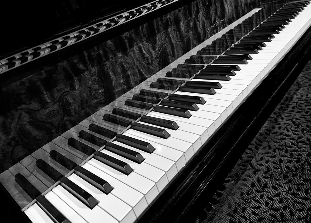
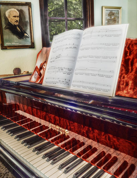
Hi Leah,
A grand piano is a wonderful subject. The fact that you chose to focus on the lid makes the image intriguing to me. At first I thought that you might have captured a metal sculpture, ala Caldor. Then I read your description. You achieved your goal of creating an abstract! The intersection of the curve and the straight line of the folded-back lid is, to my eye, quite pleasing.
One suggestion is that you might work a bit on the area where you removed one of the lid's rubber bumpers. Did you clone, use content-aware fill, or something else? Have you considered leaving the bumper there, but inverting it so that it is black? It might make for an interesting element in the photo. |
Sep 2nd |
4 comments - 5 replies for Group 62
|
4 comments - 5 replies Total
|