|
| Group |
Round |
C/R |
Comment |
Date |
Image |
| 62 |
May 21 |
Comment |
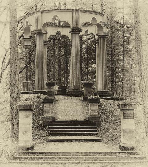
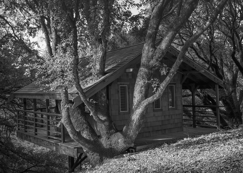
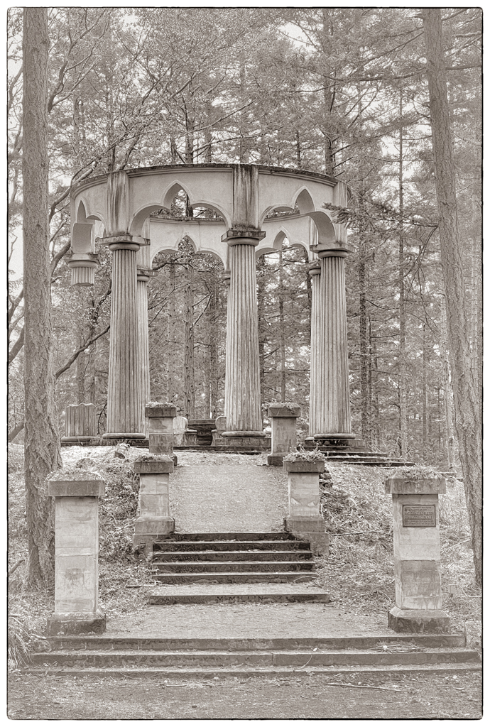
Thanks LuAnn. I like what you did. By not having the vignetting as I did, I think your treatment serves to show how the structure was build to be part of the forest. Thank YOU for your inspiration! |
May 24th |
| 62 |
May 21 |
Comment |
What a story! I love this image. It is a good thing you were able to seize the moment. This camel actually looks happy and talkative. Perhaps because he doesn't have a rider. (All the camels I met didn't seem to be too happy to carry me around.) Your choice of the antique look and the white vignette are excellent. The pop of color, to me, highlights the contrast between the old form of transport (camel) and the new. |
May 23rd |
| 62 |
May 21 |
Comment |
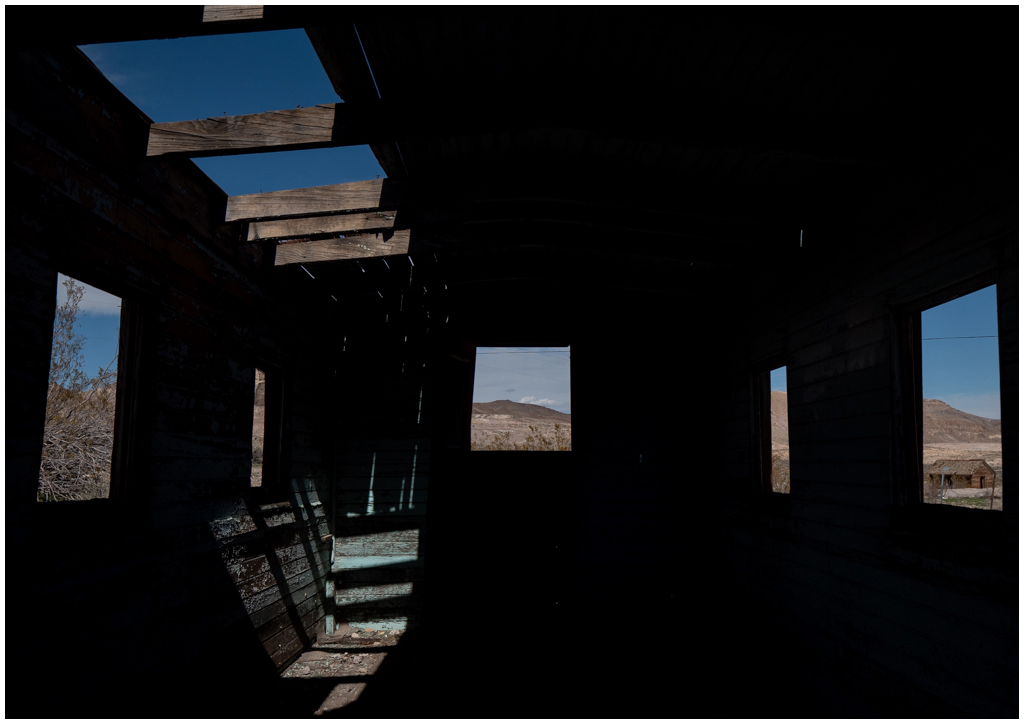
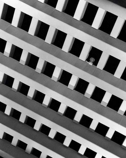
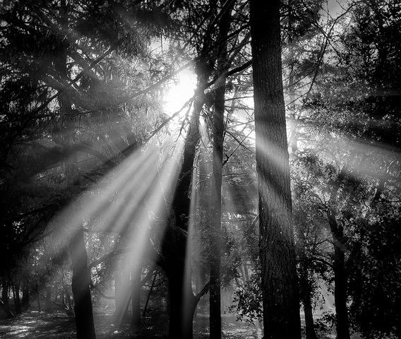
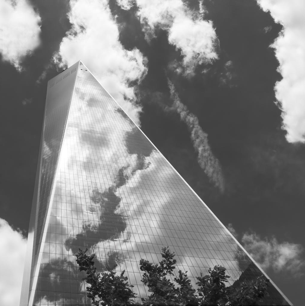
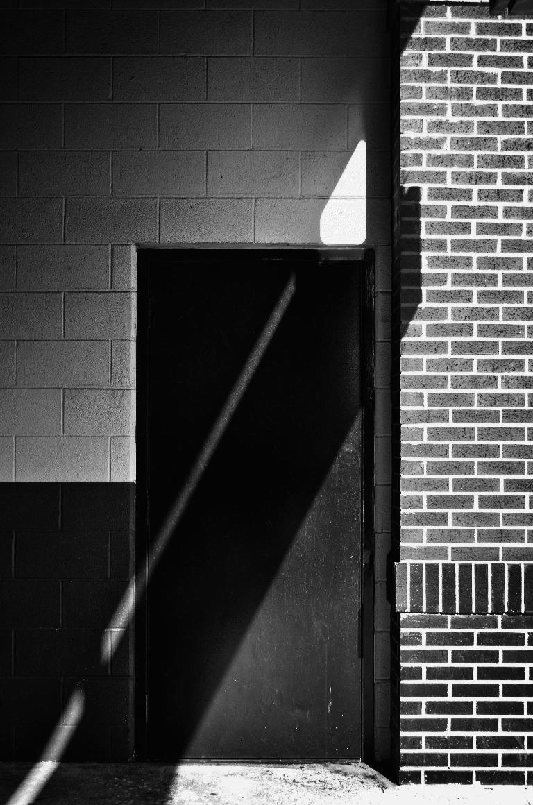
Leah, I love these sort of images---light and shadow playing on architecture. Thank you for deciding to show it to us!
It appears your image is the one we all get to play with this month! I couldn't resist. My only suggestion is to try to work with the overexposed section just over the door. In Photoshop, I used the frequency separation 2.0 workflow just on the high frequency layer. So the bright white is still there (it's in the low frequency layer) but I added texture from another part of the wall. I think that makes that section look bright, but not blown out. What do you think? |
May 23rd |
 |
| 62 |
May 21 |
Comment |
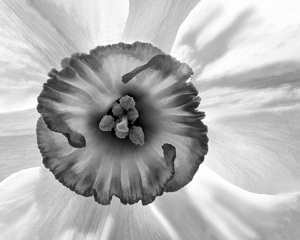
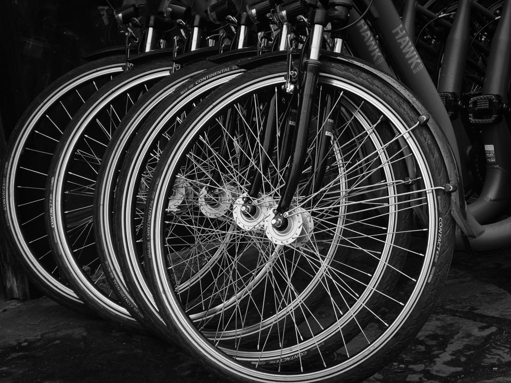
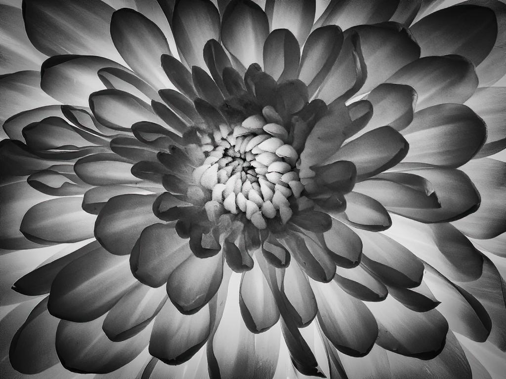
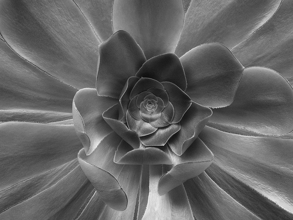
Bob, I am enjoying your image! It's very artistic in the way it brings out the structure of the flower. Great job.
I know what you mean about Topaz. When I first started using it, especially in combination with other tools, I would lose track of what I did. I now use two things to help me. I made a "photo workflow" spreadsheet with all the tools I own. I checkmark the ones I use and make a note about what I did. When I don't think I'll be doing a lot processing, I rename the processed photo to include what I did. For example, IMG_92833-BuzSim55 would indicate the Topaz BusSim filter with a setting of 55. I keep adding onto the name. If it gets too long that means I need to use the spreadsheet! HOWEVER, it took me a year to figure out that so I have many images and no idea what I did. |
May 23rd |
| 62 |
May 21 |
Comment |
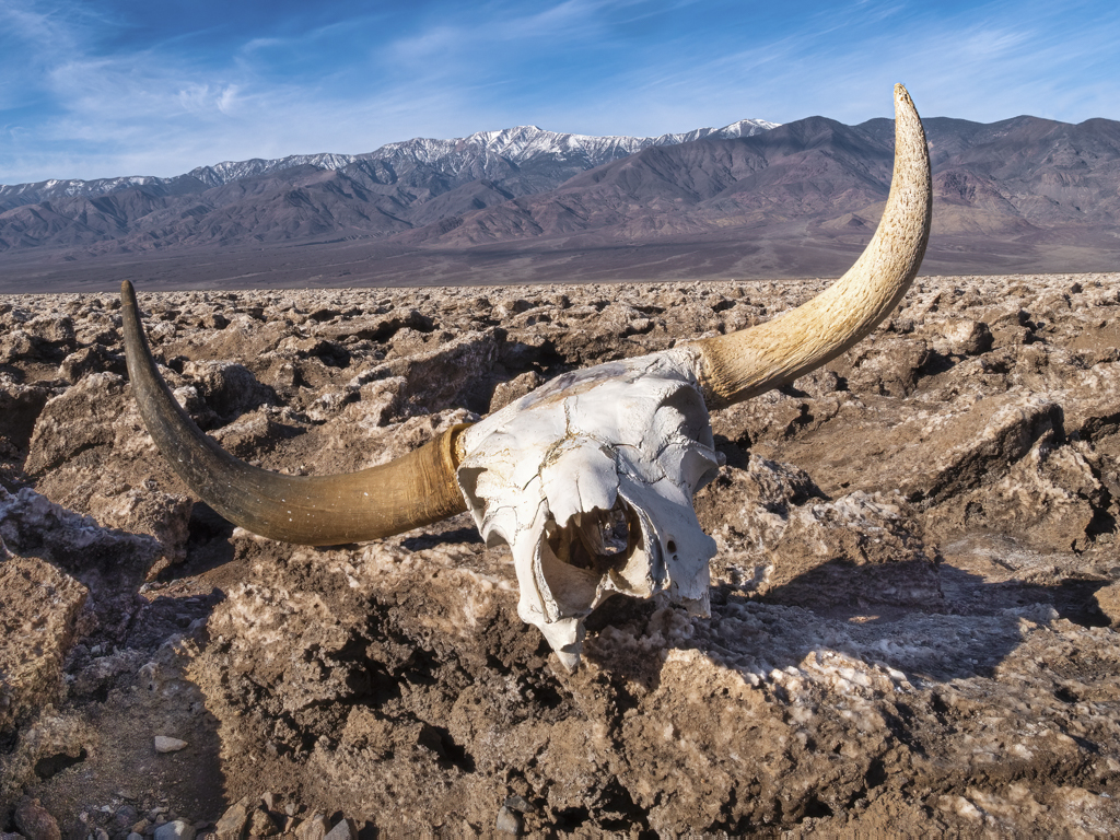
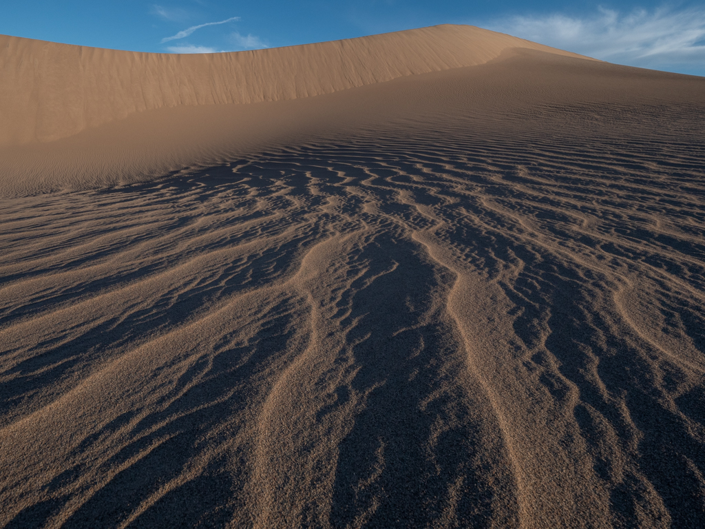
The dead wood, for me, really makes this composition special. You did a great job capturing the sand dunes without footprints or people. I go to Death Valley once in awhile and know how crowded the dunes can get. (I'll be there again the first week in June.) The contours of the dunes and the way they are illuminated works well. You picked a good time of day. My only suggestion is to remove the blemishes in the upper right as they look to be dirt on the lens or sensor.
About clouds, it's a desert, so I would not want clouds added. I think the featureless sky helps tell the story of this hot land and how it got its name-Death Valley!
That being said, I can't tell you how many times I've been in Death Valley hoping to see the stars only to have it cloud up and��..even rain! |
May 23rd |
| 62 |
May 21 |
Comment |
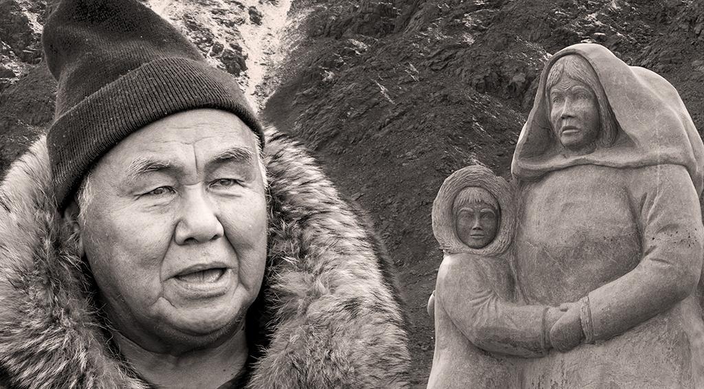
You captured a great, but sad, story. To me, the image is much more compelling as black and white than it is in color. Good choice. I like the variety of textures in the image and how they contrast with the smoothness of the leather coat. I can't think of anything to suggest. Well done. |
May 23rd |
| 62 |
May 21 |
Reply |
Hi Oliver,
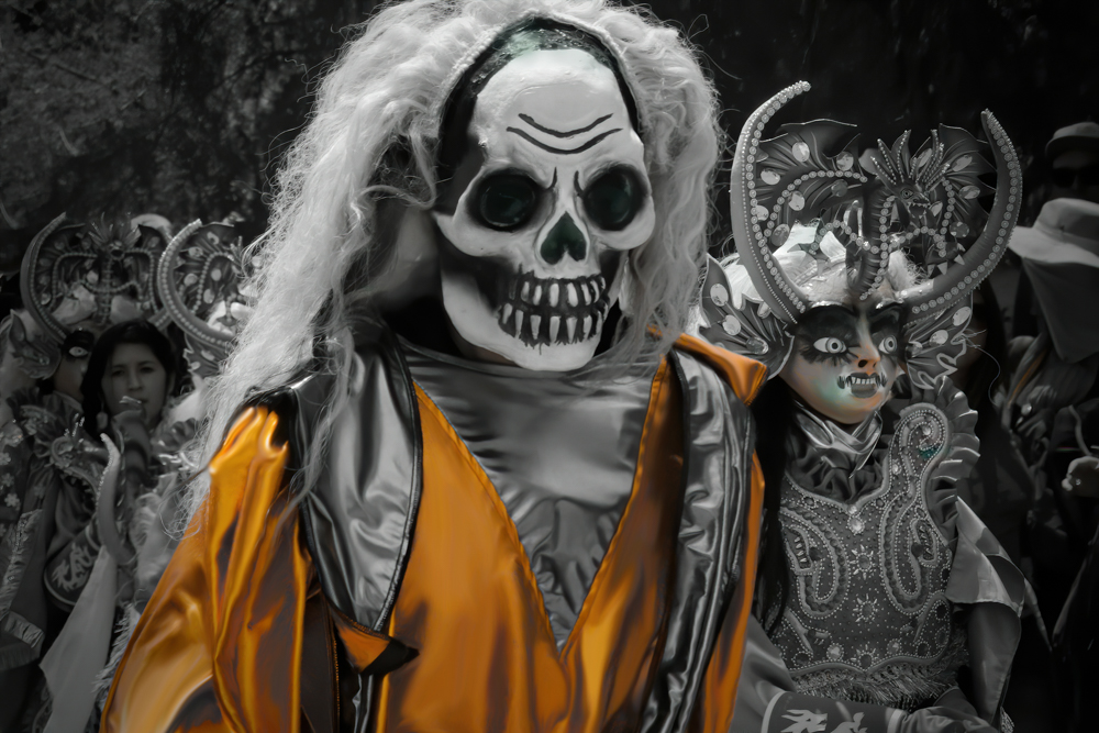
You encountered the same challenge that I did--there are many masking artifacts. I spent quite a bit of time today trying to use masking, but the edges just don't cooperate. Then, to my eye, it looks fake. I think I may give up on this one as a monochrome, as it is much easier to desaturate the background a bit and pop the orange to create more of a separation. |
May 10th |
| 62 |
May 21 |
Reply |
An attempt at incorporating some suggestions.
|
May 10th |
 |
| 62 |
May 21 |
Reply |
Hi Leah, I appreciate your comments. I will revisit the crop at the top. If I crop the bottom, I think I'd remove all three steps, because the number of steps are Masonic symbols. Walking around the structure, steps are in groupings of 3, 5, or 7, deliberately done for the symbolism. |
May 8th |
| 62 |
May 21 |
Reply |
Hi Pete,
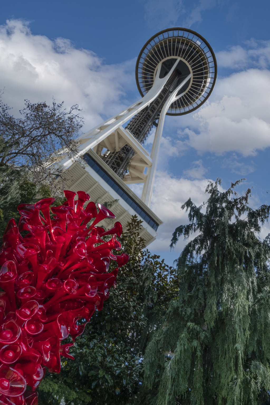
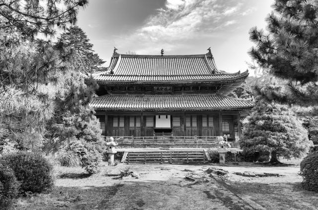
Thanks for the suggestion. Before I made this image, I made another version quickly (which I deleted) that popped the mausoleum in front, sort of similar to your suggestion. But having lived in the Northwest (many years ago), I decided I liked the way the McMillan family placed the mausoleum so it would blend with the Pacific Northwest forest. HOWEVER, I think I will now try to soften the background by using a blur effect. That might work towards the same end you suggest without making it look like the fog rolled in behind the mausoleum. What do you think? |
May 2nd |
6 comments - 4 replies for Group 62
|
6 comments - 4 replies Total
|