|
| Group |
Round |
C/R |
Comment |
Date |
Image |
| 62 |
Jan 21 |
Comment |
Israel,
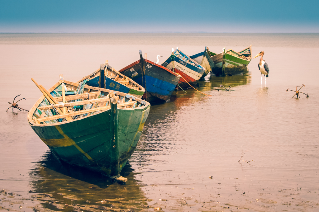
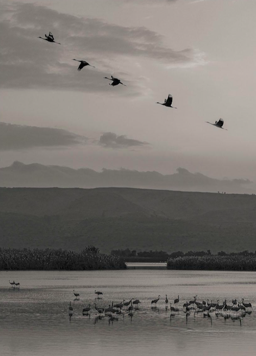
What a great subject! I love that the birds' wings are in different phases as it makes for a very interesting photo. To my eye, the reeds in the front are not as interesting. I think there are many possibilities for cropping the image that will focus my attention on the migrating birds and those in the water. Here is one suggestion. |
Jan 6th |
 |
| 62 |
Jan 21 |
Reply |
Another possibility is to crop is just a bit more like this. |
Jan 6th |
 |
| 62 |
Jan 21 |
Comment |
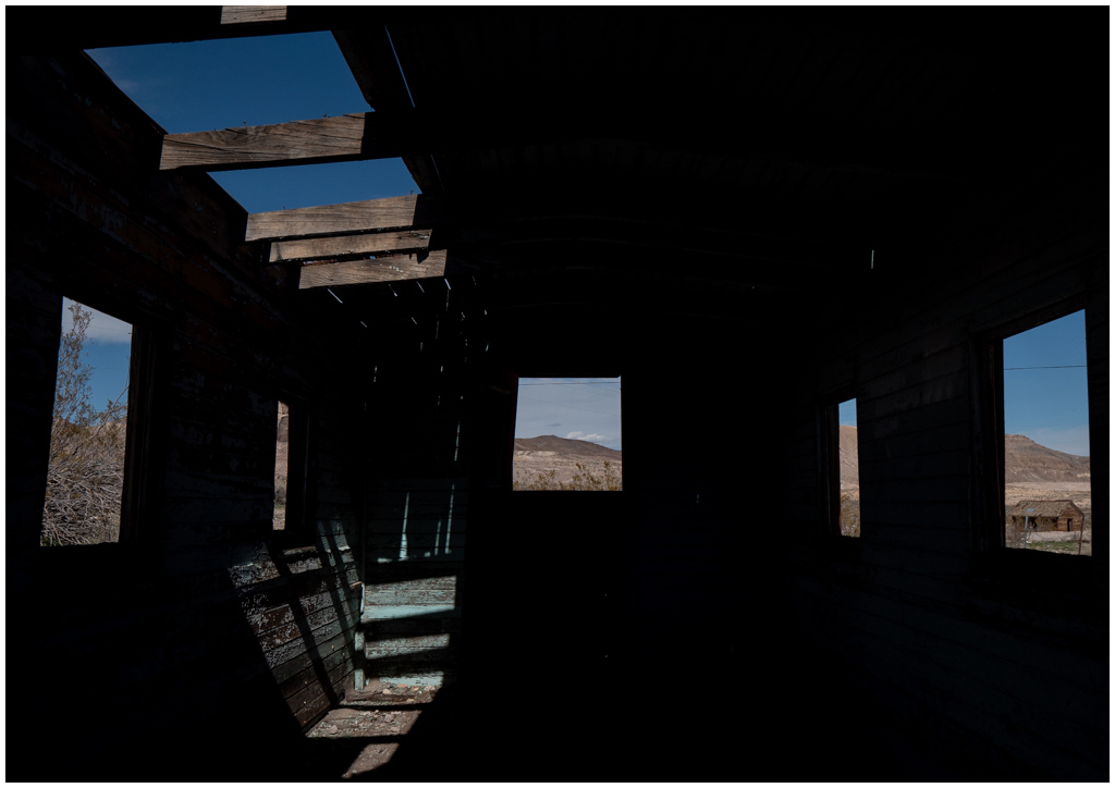
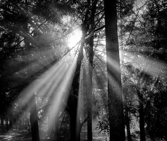
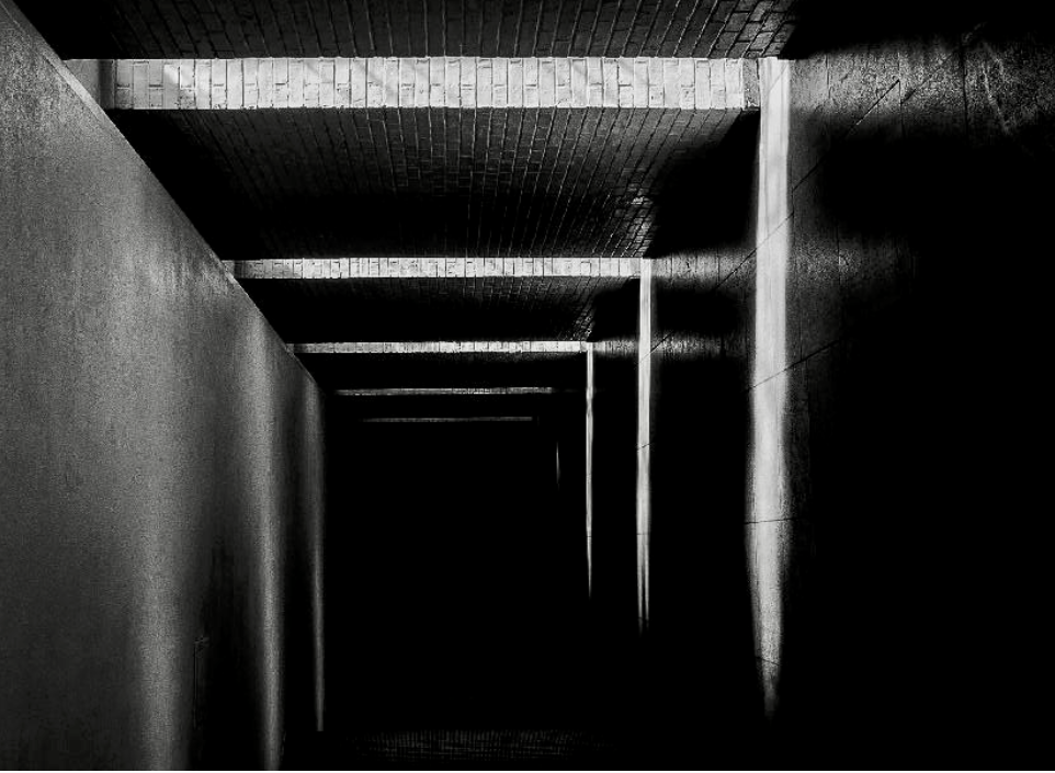
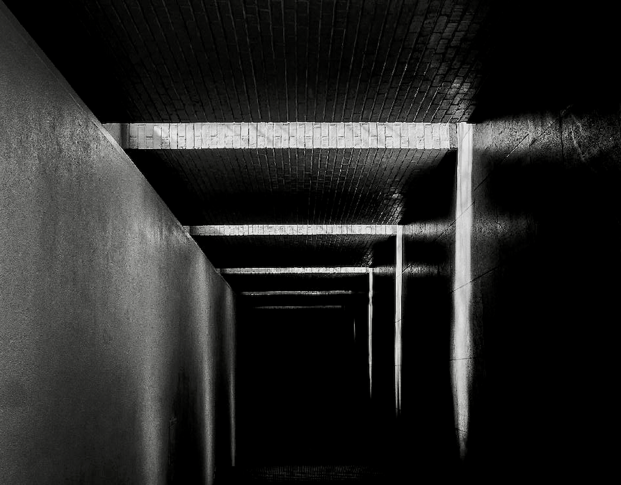
Leah, I love shots like this, that emphasize light streaming into darkness. The only thing I would suggest is to fix the spot on the upper left. It looks like a spot on the lens or a dirty sensor.
That being said, this image has a lot of possibilities. I am a fan of having lines come from the corner, even though I know others say that's not good. I am also one who likes to experiment with orientation. I did a minor crop and a rotation just to point out that this image has many possibilities. |
Jan 6th |
 |
| 62 |
Jan 21 |
Comment |
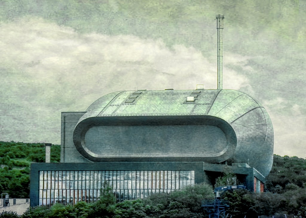
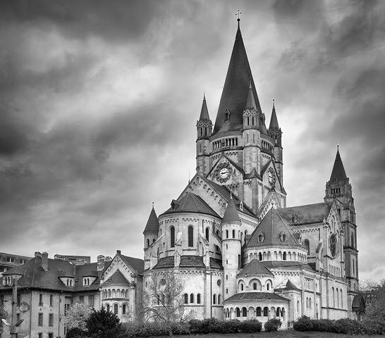
Emil, what a wonderful image! I am enjoying the way you cropped the photo and straightened the perspective. To my eye, the toning you did works quite well to highlight the patterns of the windows in the main building. The sky has some very subtle striations, which I think looks just fine. I would hesitate to add fake clouds, as clouds are not common in many places, such as where I live. With many of the post processing apps offering the cloud option, I am concerned that images will end up with the same clouds!
Just one more thing...it would be helpful to have the actual geographical location in your description. Leah had the initiative to research that those streets are in St. Louis, so I thank her for that! |
Jan 6th |
| 62 |
Jan 21 |
Comment |
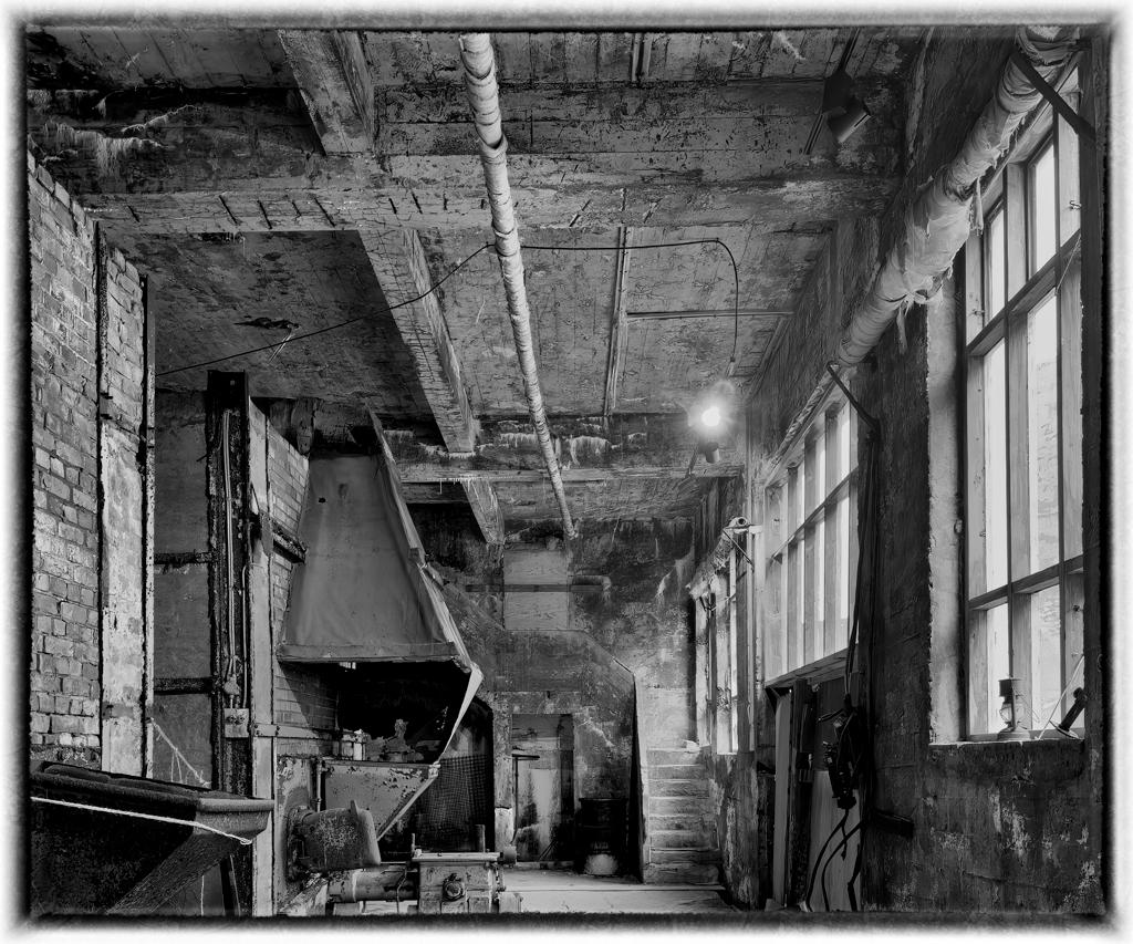
What a find! A tree through a car. When I first looked at the image (without reading your description), I recall my parents saying that "so and so got into an accident and wrapped himself around a tree." I never quite understood it, but the person to whom they referred either ended up seriously injured or dead. This image reminds me of that. It is a good motivation to wear a seat belt and stay sober! I like that the image is so evocative. My only suggestion is to tone down the overly bright sections just a bit. Although I agree that these blown out areas serve to put the viewer's focus on the other parts of the image, just a tad toned down would help. |
Jan 6th |
| 62 |
Jan 21 |
Reply |
I worked for Apple for 22 years, just left about a year ago. I worked on the low-level image processing programming interfaces. I was a big Aperture fan, but sadly, they discontinued it in favor of Photos. So I feel your pain! After trying other options, I became an Adobe subscriber for Lightroom and Photoshop and also for Premiere (for my video work). Lightroom is great for editing and culling. PS, in my humble opinion, is only for the "fancy" stuff. If I can be of any help, let me know. I am not a PS expert, but am always happy to share what I've learned. Actions might be helpful for your memory. Just a thought. |
Jan 6th |
| 62 |
Jan 21 |
Reply |
I agree about the archives. In fact, I am going through mine each day to identify possibilities for post processing. |
Jan 6th |
| 62 |
Jan 21 |
Comment |
In my opinion, your image as shot in color is sort of blah. But with your processing as monochrome--I love it! You brought out the sky as well as communicating the quaintness of a narrow cobblestone street. Well done!
I have been amazed at what I've seen members of this group do with Artisan Pro X. I looked at it online, but it seems, to me, to be a steep learning curve. I tackled Photoshop and Topaz this past year, and even learned an advanced form of frequency separation, but Artisan Pro seems to be so difficult. Do you have any advice for learning it? I think it is a tool that any monochrome photographer should learn. Ideas? |
Jan 6th |
| 62 |
Jan 21 |
Comment |
WOW! This image looks so much better as a monochrome image than in color. Great choice. I love the title, because when I see this image, I am almost breathless thinking about the effort of going up. The graduated filter works well. I am enjoying the contrasting patterns of the brick and the lacy steps. Good job on the crop to remove the distracting windows. Nice job. |
Jan 6th |
| 62 |
Jan 21 |
Reply |
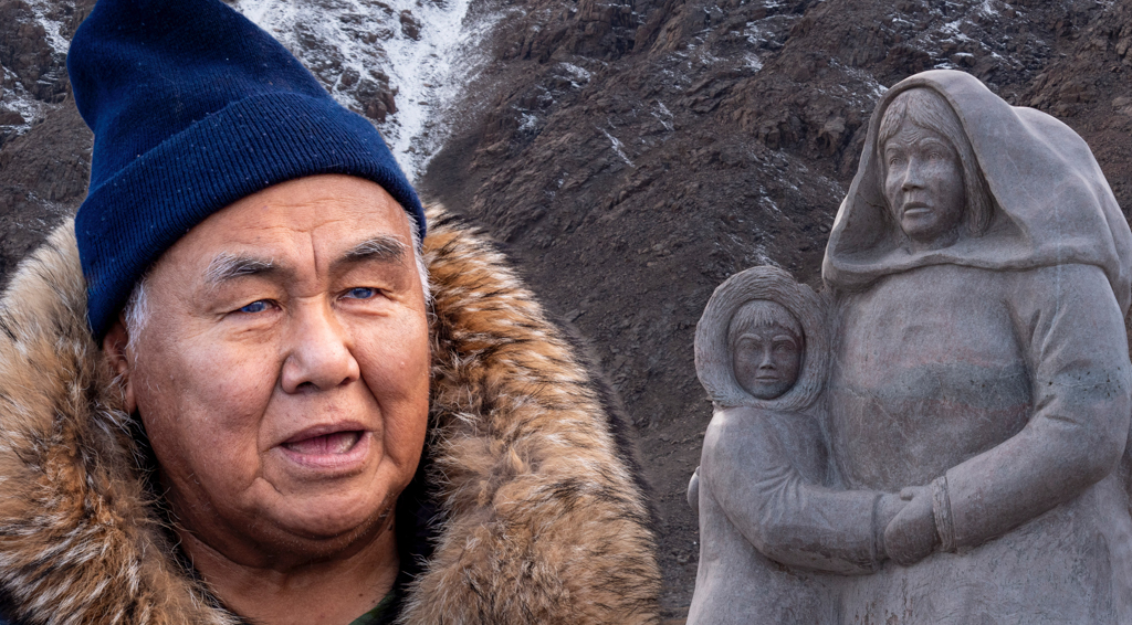
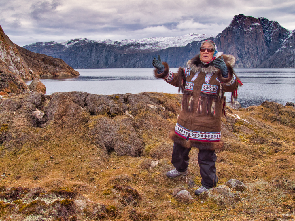
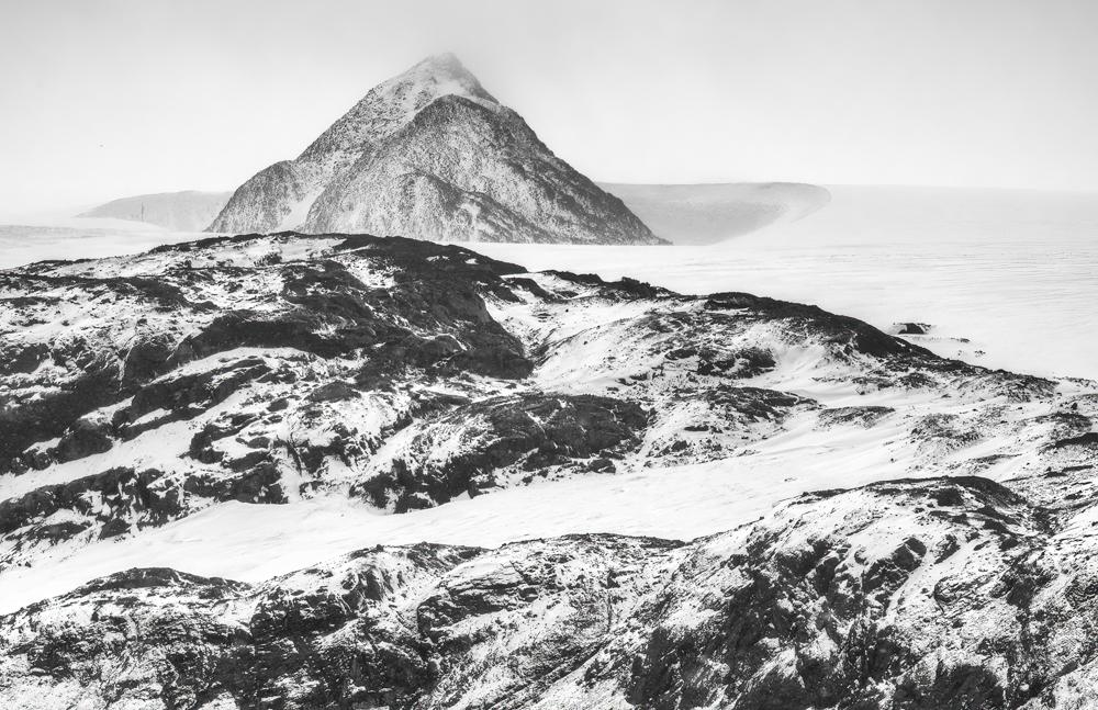
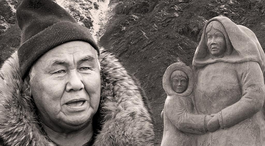
Hi Bob,
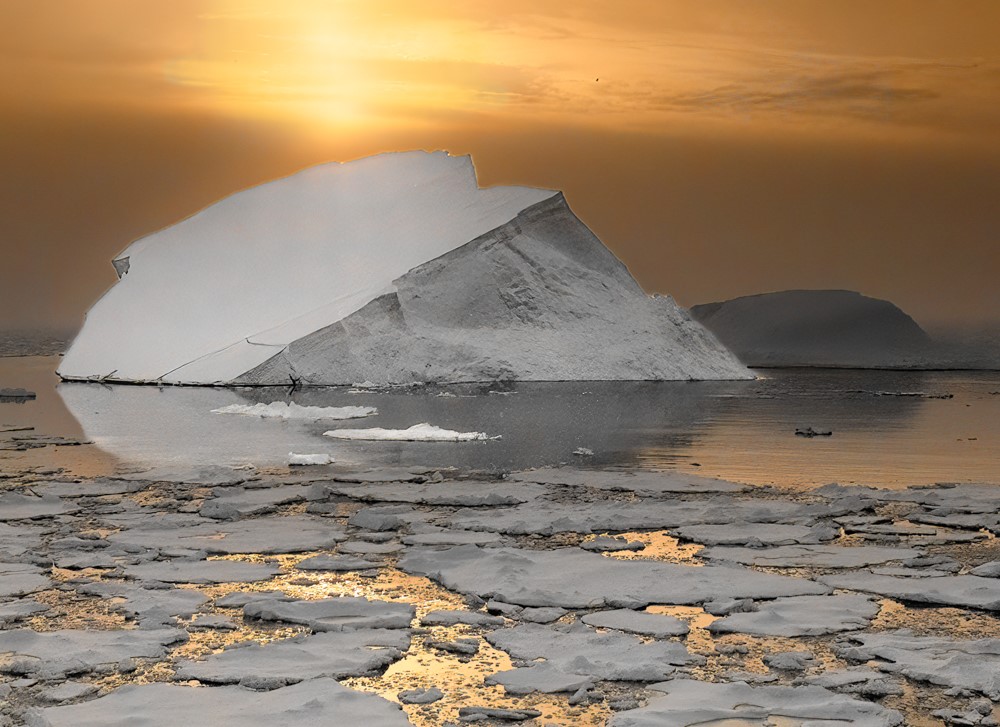
I was still in the world of the "Northwest Territories" until I went on this trip. The lawyer who negotiated the treaty with the Inuit for establishing Nunavut was on the trip, along with about 5 Inuit people. I had many interesting conversations with them and listened to many lectures. Our Inuit guides seemed to have relatives and friends everywhere we landed, so I felt quite welcome. I do agree about the snow and I will try to do something about it. I added it so perhaps I should think about replacing it with granite and have snow show elsewhere in the background.
About PS, I was SO RESISTANT to using it until the pandemic hit. Then I realized I had no excuse for NOT learning. I took a number of online courses and just forced myself to learn it. I'm glad I did. I don't always use PS, but it does come in handy for composites. What do you use? |
Jan 6th |
| 62 |
Jan 21 |
Reply |
Hi Oliver,
Thanks so much for your comments. I agree about the snow. I can absolutely work on toning that down. |
Jan 6th |
| 62 |
Jan 21 |
Reply |
Hi Emil,
I had not thought of providing a copy to Larry and his community. You have inspired me to send a copy to Adventure Canada, the company with which I traveled. The husband of the CEO is an Inuit with relatives in Larry's community. So if they think it appropriate, they will send the photo on.
Thanks for your insight! |
Jan 6th |
6 comments - 6 replies for Group 62
|
6 comments - 6 replies Total
|